• Our software update is now concluded. You will need to reset your password to log in. In order to do this, you will have to click "Log in" in the top right corner and then "Forgot your password?".
  • Welcome to PokéCommunity! Register now and join one of the best fan communities on the 'net to talk Pokémon and more! We are not affiliated with The Pokémon Company or Nintendo.

Screenshot/Music Showcase

Status
Not open for further replies.

Rossay

Quack quack
191
Posts
13
Years
  • Dropping these here:

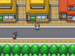
    Two demonstration screenshots of my Pokemon Engine (for Game Maker) which is currently being developed:

    screen1.png


    Screenshot2.gif


    List of credits available on my DA.
     

    Banana_Fiend

    You may remember me as 'Cng'
    1
    Posts
    12
    Years
  • That looks really nicely made so far!
    It's always great to see games being coded from the ground up, it actually means that you've put a great deal of effort in, and it's paid off! :D
     
    189
    Posts
    14
    Years
    • Seen Nov 23, 2023
    Damnit! I knew I'd heard Aurelia somewhere before. It just kept popping into my head while I was thinking of town names and I couldn't figure out why. Now I know, guess it means I can't use it.

    Onto your actual screenie though, very high quality sprites you have there. I like the look of your houses and your PC, though the Pokemon Centre looks...I dunno exactly what, but something. The layout of that particular shot reminds of Saffron City, I should add.

    Oh and with those little bits of fences you have there, you should make the stick out-y bits at the ends curve off or have them continue into the buildings adjacent to them; either way works. At present it just looks like they've been sawn off.
     
    10,673
    Posts
    15
    Years
    • Seen Dec 30, 2023
    Very nice Max, everything looks great overall. Although I recommend you give those fences a darker outline. They blend withe the background path a little too much, on top at least. I also think that your main road would be nice with some texture, even some gritty dots or something along those lines, to give it that paved feeling rather than looking too smooth. Other than that everything looks great to be honest.
     
    3
    Posts
    13
    Years
    • Seen Aug 7, 2012
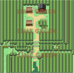
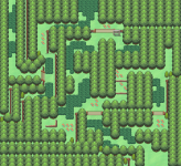
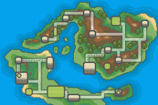
    Some maps and a world map I made for the fun, I might use them later in a project idk... Please tell me what you think of it!
    I'm quite proud of my world map personally... haha.
     

    Attachments

    • Pleasant Mount.png
      Pleasant Mount.png
      50.7 KB · Views: 88
    • Sans titre-2.png
      Sans titre-2.png
      37.6 KB · Views: 70
    • new-map+.gif
      new-map+.gif
      25 KB · Views: 100

    Rossay

    Quack quack
    191
    Posts
    13
    Years
  • :U
    Holy God thats amazing. That looks like Nintendurr made it...
    Amazingness.

    Thanks :D, I did it pixel-by-pixel using the official colour-scheme etc for inspiration.

    OMG That is amazing like nintendo made it themself ;)

    Thankies! :D, it was difficult to get started with, but once you get going it's not too bad.. just very time-consuming.

    A screenshot showing our new style of tiles:

    cavernscreenshot.png

    OOOooooooooo. I really like this. It might be a weird thing to comment on, but I think the ladders look amazing.
     
    10,673
    Posts
    15
    Years
    • Seen Dec 30, 2023
    I'm liking the battle system, though I recommend that you change the text colour, or just the shadow colours as they make the font quite hard to read. On the text boxes that is. Are the sprites animated?

    Though I also recommend making both the HP boxes the same colour.
     
    Status
    Not open for further replies.
    Back
    Top