• Our software update is now concluded. You will need to reset your password to log in. In order to do this, you will have to click "Log in" in the top right corner and then "Forgot your password?".
  • Welcome to PokéCommunity! Register now and join one of the best fan communities on the 'net to talk Pokémon and more! We are not affiliated with The Pokémon Company or Nintendo.

[Showcase] Way Regained

derozio

[b][color=red][font=helvetica][i]door-kun best boi
5,521
Posts
14
Years
  • @SA: Lol, thanks for the insight, Sa. XD;

    @Nimblethumbs: Well, I use photoshop CS5. And as for tutorials, I thought of making one a long time ago. Forgot about it and don't really think I'll be making one anytime soon. As for the renders: I randomly pick up stuff either from planetrenders or from safebooru. Both are pretty awesome. :]

    @moments: Ohmaigawd, thanks a lot for those comments on my icons, Moments! I seriously appreciate all that and will be sure to keep your advise in mind the next time I make any icons. I'll try my best, at least. And as for the eye icon, I couldn't agree more. Hit the nail on the head. Guess I kinda messed up there, haha!

    @qaz: Lol, thanks a lot, buddy! :]

    And well, I've got something to say this time - I've hit a gfx slump/block, I'm afraid. Also, I probably won't really have any access to photoshop for a couple of days and will be out of the gfx scene. Hence, there won't be any updates anytime soon. That's what things seem like at the moment. Will try my best to be back asap, though. Thanks for reading. :]
     

    derozio

    [b][color=red][font=helvetica][i]door-kun best boi
    5,521
    Posts
    14
    Years
  • Lol, thanks for the compliments on the tags, merv. I've been working with tags for a long while now while icons remain something that I started recently. Guess it is pretty obvious. It'll take me quite a while to get the hang of iconing. Icons are kinda..difficult for me. Thanks anyway. :]
     

    derozio

    [b][color=red][font=helvetica][i]door-kun best boi
    5,521
    Posts
    14
    Years
  • Thanks a lot, Toshiro. But haha, I need to work a lot if I wanna improve at icons. I just don't have the eye for colors, it seems. ;;

    LPStupidv2.png

    And an LP update. The one which won me a new emblem. <3
     

    BHwolfgang

    kamikorosu
    3,906
    Posts
    15
    Years
  • ^ I never said this before, but I want to love your graphics. :]

    You've really improved since last year, Vikalp.
     
    10,673
    Posts
    15
    Years
    • Seen Dec 30, 2023
    Dude your colouration on the LP, icons and some of your latest banners is beastly, especially the Sonic one. However, to improve your work I'd recommend doing more tags with renders and real people stocks, and work with using more effects and the likes to further increase your ability. The Nero tag is rather good, though the effects I think should be more compact around the focal rather than lashed around the tag to fill space. Also try working with burning at dodging areas more. Burn the edges of tags when necessary for example. Sometimes a little negative space (empty) isn't always harmful.
     

    derozio

    [b][color=red][font=helvetica][i]door-kun best boi
    5,521
    Posts
    14
    Years
  • BHwolfgang said:
    ^ I never said this before, but I want to love your graphics. :]
    You've really improved since last year, Vikalp.
    I'm so glad to hear that coming from you, Borey. I'm flattered. <3

    Abnegation said:
    Dude your colouration on the LP, icons and some of your latest banners is beastly, especially the Sonic one. However, to improve your work I'd recommend doing more tags with renders and real people stocks, and work with using more effects and the likes to further increase your ability. The Nero tag is rather good, though the effects I think should be more compact around the focal rather than lashed around the tag to fill space. Also try working with burning at dodging areas more. Burn the edges of tags when necessary for example. Sometimes a little negative space (empty) isn't always harmful.
    I'll keep those points in mind. In fact, I've started practising with irl stocks. The results may be ugly, though. But as long as I succeed, who cares? XD; Oh, and as for the burning and dodging, I've incorporated those things in almost all of my recent works. They are a great help, yeah.

    I absolutely love that New Years graphic <3
    Haha, thanks a bunch, Toshiro. :D

    Well, its been a while since I posted here. And in my absence, I've created some tags and a large piece. Although some of you might've seen them already, I'll still post them here. Here they are:

    Tag(s):

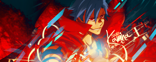
    KaminaTag1-2.png


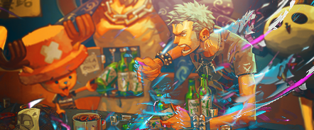
    Zorotag.png


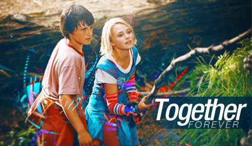
    TogetherForevertag.png


    This forever tag and zoro tag sucks, I admit. XD;

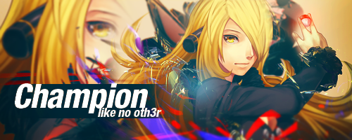
    CynthiaTag.png


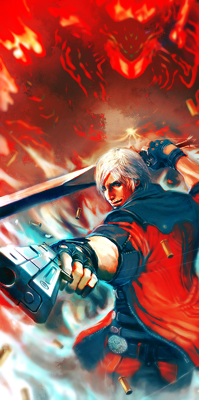
    Dantething.png


    ^ Probably my first vertical tag.

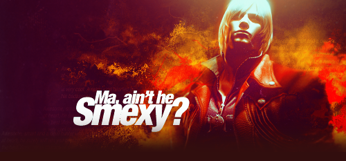
    DanteSignaturebest2PC.png


    Sweetest Dante sig ever. Monotonous? Yeah, I know. u_u'

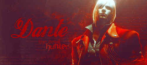
    DanteSignaturebest-1.png


    Dante sig version 2. (the original version, actually)
    Large Piece(s):

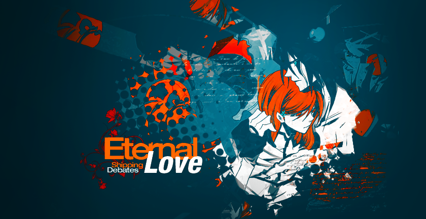
    Ori1abc.png


    Made for shipping debates contest. ^

    LargePiecepng.png


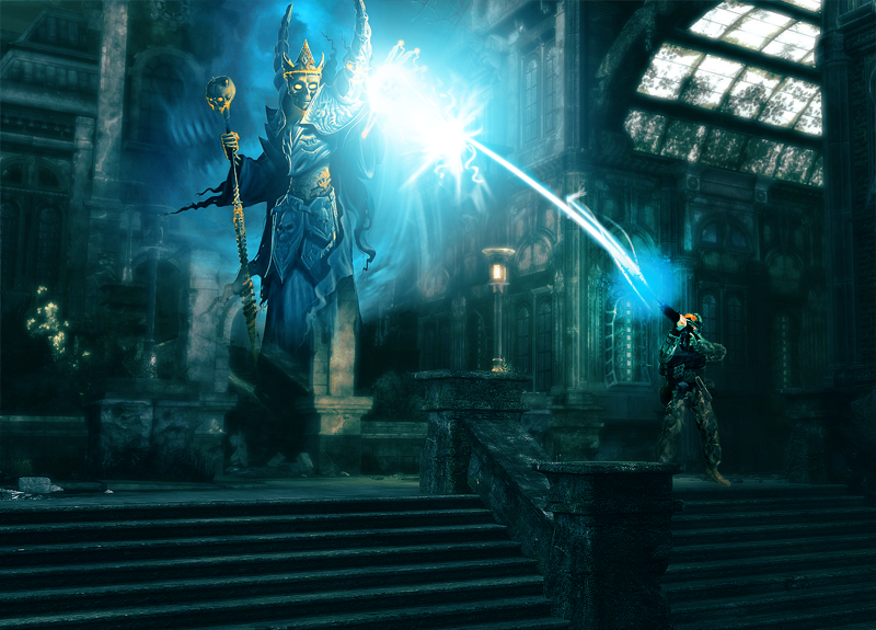
    An LP made on impulse. XD;

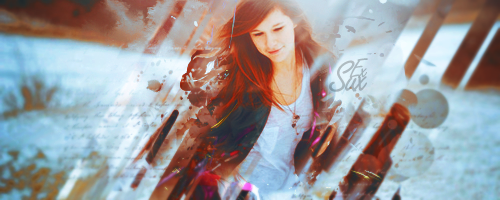
    Oh, and my latest work. An experimentation on irl stocks. Result was kinda okay considering it was my first try, I guess? XD;

    Weirdassexperiment.png


    Edit: Two more. Both are actually the same thing but have slightly different colors. And the third one is slightly different from the first two. Difference on the left side.

    v1:
    Experiment2.png


    v2:
    Experiment2a.png


    v3:
    Experiment2c.png


    Edit 2:
    Experiment3.png


    Another one. And 'Ex Sux' because this experiment sucked. :<
     
    Last edited:

    Alternative

    f i r e f l y .
    4,262
    Posts
    15
    Years
  • It's about time I stopped being lazy and gave you my cnc since you want it and it's forced.

    http://i862.photobucket.com/albums/ab183/ASC303/Zorotag.png
    I like the colouration you've used with this tag, but I'm just not too fond of the tag itself imo. I think what you've done is tried to take a stock and render it into a 3D esque thing with using C4Ds with it, and I think C4Ds are important to any tag, but I just feel as if they don't really work on this tag. Or at least the colours don't anyway. You've tried to go with all the nice pirate colours of brown, white, green etc. and you've ended up throwing some bright blues and pinks in there and I don't understand how it works. Also I think something that doesn't work with this tag is that it's a stock with more than one person in it, and I think you've only tried to make the one person stand out. My opinion is that you should have tried to make Chopper stand out a bit more than he does as it looks like you've blurred him out a bit.

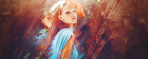
    http://i862.photobucket.com/albums/ab183/ASC303/Experiment3.png
    I'm actually really digging this tag right now. I'm not too sure in what you've used, either a render or a stock, but it still looks great. I like how you've used much exclusion to alter the colours so much that you can tell they're not the original colours, but still making it look good. Props to you on that. Smudging effects look great and the colouration of the focal point looks really good as well. One thing I have a problem with is the text, which can be majorly hard on any tag. You know that, but from your efforts with text on this tag I think you've done quite a good job. Maybe go with a different, more cursive font like Zapfino, or even stay away from truetype fonts, and make your own text.
     

    moments.

    quixotic
    3,407
    Posts
    15
    Years
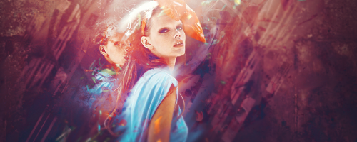
  • Just some sort of general comments about the tags with real life people:

    1. They are all REALLY flat. The only exception here is this one, but that is really forced depth and not really depth anyway. It is like, focal is in front, everything else is behind. Try and get effects going exactly the way you would with an anime focal. You should have some background effects AS WELL as foreground effects. This baby here is easily the best tag of the RL ones, and the only big sort of criticism is this depth issue. Just something to work on.

    2. Clipping masks. In the tag I mentioned above, 'Experiment2c.png', the clipping mask of the face is quite irksome. If you are going to put clipping masks in (especially of the face because it just adds literally a copy of the focal point) make them more distorted with smudging and displacement filters, because really, I never liked the clipping masks just for the hell of it. If the clipping masks make up the effects of the tag, not a single effect, then that's good, but otherwise it just looks iffy.

    Speaking of clipping masks and the effects, the last tag you posted in the update, that is way too messy / undefined. The effects you have added are nearly all literally what is already there in the background. Either sharpen the effects up / make them more defined and stuff because otherwise they just look messy and don't really add any appeal to the tag.

    Sorry if that was a bit vague, I didn't really give positives / focus on individual tags, but next time the update is a bit smaller and I'm not intimidated by the size of it I will comment more!
     

    qaz015393

    pokemon revenge developer
    789
    Posts
    14
    Years
    • Seen today
    wow your updates, since my last post , are great. love the vertical dante tag
     
    10,673
    Posts
    15
    Years
    • Seen Dec 30, 2023
    Alright V. What I want you to work on is depth. Think about what you need to do to make things look more deep. Try working with more dodging and burning and stay away from gradient maps, they're sucking all the necessary saturation and quality from a lot of your tags. Textures also, you need to think about the quality, and don't forget what your focal is dude, bring it out, sharpen it, blend it and still make it stand out. But be careful about quality.
     

    aSeRo141414

    zZJoennZz inside
    377
    Posts
    14
    Years
  • Like abnegation said, the depth is not really too good, and the colors is good to me.
    And this
    He looks not aiming the light, it's looks pasted for me, but it's good effect.

    I like this because of the use of C4D but the text is big and it makes the focal off.
     

    derozio

    [b][color=red][font=helvetica][i]door-kun best boi
    5,521
    Posts
    14
    Years
  • Haha, this has always been the case with me. I used to suck at colors and people used to advise me about how I should try to improve the colors in my works. Now when I've fixed the colors, I started neglecting another important aspect of my works. One of the most important, in fact. XD; But seriously, thank you for the crit, guys. I really appreciate it. I don't really feel like quoting every single crit you guys gave me and replying to them one by one but I can say that I do agree with most of the things you guys pointed out and will try to work on those faults in the future. Once again, thanks a bunch, everybody. I'll make sure that my next real-life tags aren't flat. :D

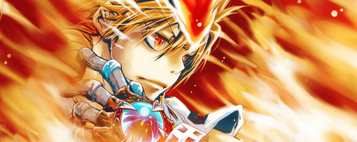
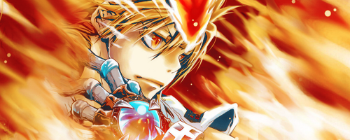
    And I'll just throw this tag which I made today. Since I couldn't think of doing much/adding effects or anything else with the stock, I made a fairly simple one. Idk, it sorta looks good as a signature image, I guess? XD;

    TsunaTag1.png
     

    moments.

    quixotic
    3,407
    Posts
    15
    Years
  • I told you over VM what I think in basic terms could be tweaked, but being predominantly a smudge tag, you really need to mix up the smudging and get some effects going on. Some sharper edge smudges, possibly even with clipping masks and definitely sharpening up what you already have would be a nice way to really add some "pahzaz" to the tag.

    Colours are, as usual, the strong point of this tag, however I would've tried getting some more dark blues in the background.

    One last point, that left side of the focal, the smudging is really weak where it sits on top of him, it looks like soft brushed or something, I think if you can get really hard brushing right up until him, it will help that flow be stronger and possibly add more appeal in the tag. It's a bit, undefined sort of.
     

    derozio

    [b][color=red][font=helvetica][i]door-kun best boi
    5,521
    Posts
    14
    Years
  • Yeah, I had a feeling that this tag lacked any hard edged effects which would make it more splendid and that would basically be the basis of any crits on this tag. :B; But seriously, like I said earlier, I'm still a beginner at smudging and tried my best to make some changes. I didn't do much as I was afraid it would turn out bad/was lazy.

    The only main change I made was at the flames near his hands. They don't look as awkward as they did before. No more 'soft brush' feel. :D

    TsunaTag1b.png


    Anyway, time for another update. Icons this time around! yeahIknowIsuck

    IconEnmaa.png

    TsunaIcona.png
    Fighticona.png
    GiopettoIcona.png


    Made for my friend Erik, actually. :P
     

    Sydian

    fake your death.
    33,379
    Posts
    16
    Years
  • ^ Using his awesome Derozio powers.

    Anyway, I like the stuff you made for your friend there. (I would quote but effort...)

    TsunaIcona.png


    This one might be a little too heavy on the orange though, but that's just me. -shrug-
     

    derozio

    [b][color=red][font=helvetica][i]door-kun best boi
    5,521
    Posts
    14
    Years
  • Thanks for the comments, guys! And lol yeah, I tend to make the reds, oranges and other warm colors heavy in most of my icons. Sorta a habit of mine. :B

    Ryukaa said:
    Hey, it's that badass looking Tsuna tag of yours. |D
    ...How did you make it look so good? xDD;;
    Syd said:
    ^ Using his awesome Derozio powers.
    ^. /not really

    And updates:

    Gokudera.png

    Starring Gokudera. This one took a lot of time. Seriously. Like an hour or so.

    KHRicon-1.png

    ^ Tsuna again. XD;
     
    Back
    Top