- 10,673
- Posts
- 15
- Years
- Seen Dec 30, 2023
abnegation's "art" dump
the freedom to see, is the freedom to be.
the freedom to see, is the freedom to be.
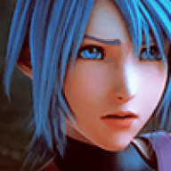
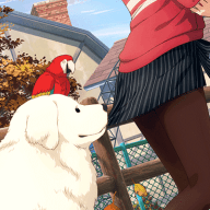
digital art & design.
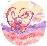
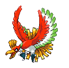
•••icons.
•••icons.
Feel free to use any of these, just add credit!


•••tags


Collab with nano.
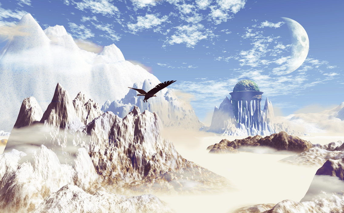
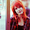
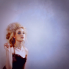
•••digital painting.


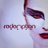
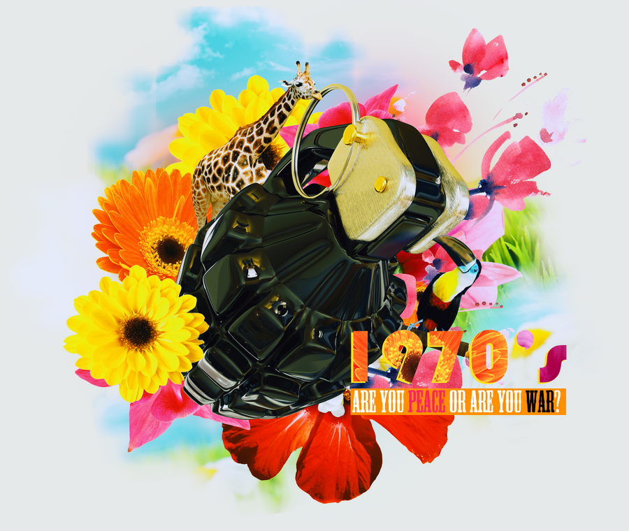
•••large graphic art.
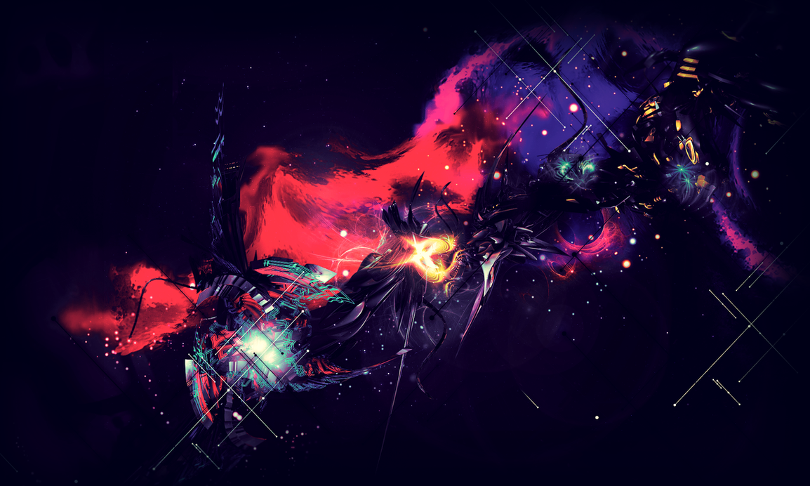
Shut it Down

fin

1980's...?
untitled

Chaos
•••graphic design.
Movie Poster, college assignment.

Graphic Art team website (artistic images are placeholders, not necessarily all by me)

http://www.gavintage.com/fringefx/ - here's the below site, live.

Panem Online Forum Style

Flames of Simplicity Forum Style - Try it

Snivy's Holiday Forum Style - Try it

Nimbasa's Shining Beauty (Collaboration with Morkula) - Try it

•••pixel art.

10 colours. Scratch.
8 colours (and trans). Scratch.
Based on work by an artist named Crayon Chewer, her comment: "Oh wow, I have to say, this is pretty awesome! In some ways I'd say you've definitely improved upon my original picture too! I really love that the palette's been limited to only 8 colors; I've always had a fond love of all things pixelly.
Keep doing what you're doing, it's incredible! "
Based on work by an artist named haisukka. Scratch.

Collab with Cilerba, he did shading, I did lineart and base colours.


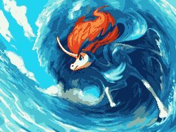
•••maps.
Route 1
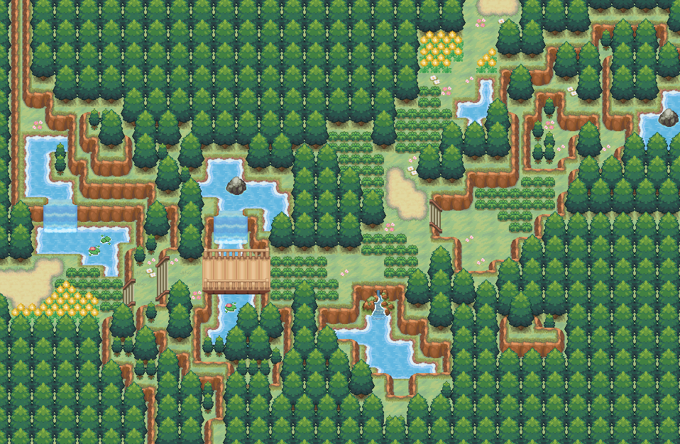
Dencreep Forest
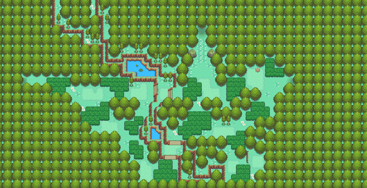
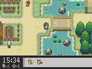
Nocturne Town (water has been vastly improved from the version in the map, as seen in the in-game screenshot)

•••tags
Collab with nano.
•••digital painting.
Spoiler:
Spoiler:
Spoiler:
•••large graphic art.
Shut it Down
Spoiler:
fin
Spoiler:
1980's...?
Spoiler:
untitled
Spoiler:
Chaos
Spoiler:
•••graphic design.
Movie Poster, college assignment.
Spoiler:
Graphic Art team website (artistic images are placeholders, not necessarily all by me)
Spoiler:
http://www.gavintage.com/fringefx/ - here's the below site, live.
Spoiler:
Panem Online Forum Style
Spoiler:
Flames of Simplicity Forum Style - Try it
Spoiler:
Snivy's Holiday Forum Style - Try it
Spoiler:
Nimbasa's Shining Beauty (Collaboration with Morkula) - Try it
Spoiler:
•••pixel art.
10 colours. Scratch.
8 colours (and trans). Scratch.
Based on work by an artist named Crayon Chewer, her comment: "Oh wow, I have to say, this is pretty awesome! In some ways I'd say you've definitely improved upon my original picture too! I really love that the palette's been limited to only 8 colors; I've always had a fond love of all things pixelly.
Keep doing what you're doing, it's incredible! "
Based on work by an artist named haisukka. Scratch.
Collab with Cilerba, he did shading, I did lineart and base colours.
•••maps.
Route 1
Spoiler:
Dencreep Forest
Spoiler:
Nocturne Town (water has been vastly improved from the version in the map, as seen in the in-game screenshot)
Spoiler:
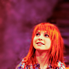
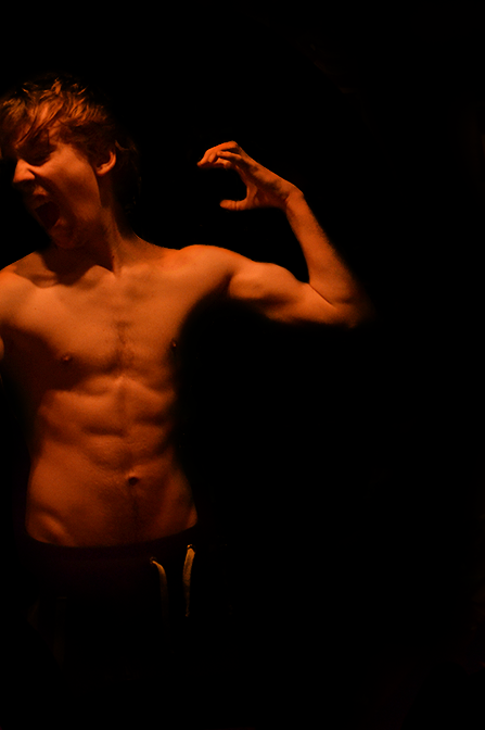
photography.
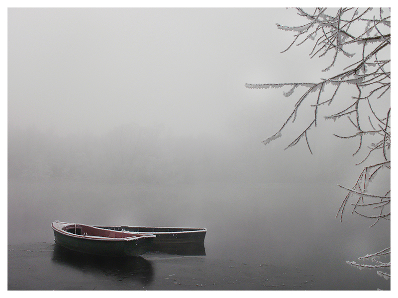


Hope you enjoy my work, I plan on adding my traditional artwork soon also.
Spoiler:
Spoiler:
Spoiler:
Spoiler:
Spoiler:
Spoiler:
Spoiler:
Spoiler:
Hope you enjoy my work, I plan on adding my traditional artwork soon also.