• Our software update is now concluded. You will need to reset your password to log in. In order to do this, you will have to click "Log in" in the top right corner and then "Forgot your password?".
  • Welcome to PokéCommunity! Register now and join one of the best fan communities on the 'net to talk Pokémon and more! We are not affiliated with The Pokémon Company or Nintendo.

Screenshot/Music Showcase

Status
Not open for further replies.

Cilerba

the hearts of lonely people
1,162
Posts
14
Years
  • The BW Save screen looks pretty good, nice job, but if I were you I'd do something to fill the empty space there.
    Also, next time, you should press Alt+PrintScreen so you can capture just the window, and not the entire screen.
     

    zingzags

    PokemonGDX creator
    536
    Posts
    15
    Years
  • The BW Save screen looks pretty good, nice job, but if I were you I'd do something to fill the empty space there.
    Also, next time, you should press Alt+PrintScreen so you can capture just the window, and not the entire screen.

    I forgot to do that, thanks for the comment but which empty space you are talking about?
     

    Cilerba

    the hearts of lonely people
    1,162
    Posts
    14
    Years
  • The empty space above "POKéDEX: 6"
    I suggest adding the bar with an arrow above it like on B/W.
     

    Yuoaman

    I don't know who I am either.
    4,582
    Posts
    18
    Years
  • This is something I was working on today, its complete.
    It has been awhile sense I last posted something here...
    Also tell me how the map looks, easy on the eyes?
    Spoiler:

    Well I was really trying to show the save screen BW style, not the map but thanks anyways.

    From what I bolded it's plain to see that you did ask for comments on the map - just to let you know.
     

    Fraot

    Researcher & Game Developer
    322
    Posts
    15
    Years
  • I actually like the dark themes while battling :) although i think you shouldnt remove the boxes where text appear :s


    EDIT: for some reason I couldnt quote Fraot

    I'm glad you liked my battle background! Actually, I din't place the texture right enough. I'll adjust it.
    But... what do you mean with: "i think you shouldnt remove the boxes where text appear :s"?
     

    Luka S.J.

    Jealous Croatian
    1,270
    Posts
    15
    Years
  • I've finally completed the full version of the B/W look-alike battle system.
    As usual...click the image to see it in full action.
     
    34
    Posts
    14
    Years
    • Seen Dec 29, 2012
    Just a quick cap from the current test room of Saints.
    Spoiler:

    The idea is that you can click-and-drag on the Pokeball on the bottom left and summon your Pokemon onto the field.

    @Luka S.J.: That looks amazing. The video made it look as if it lagged a little, though.
     
    Last edited:

    DarkDoom3000

    Super Pokemon Eevee Edition
    1,715
    Posts
    19
    Years
  • @civil
    The map is awful, but it being a test room, I can't really complain. The items on the side I assume are incomplete. put proper boxes around them and put them in the corner. or somewhere. and make them consistent with the presentation of the pokeball.

    The pokemon inside the ball looks really cool. I love that, and being able to drag and drop your pokemon into the feild is an awesome idea.


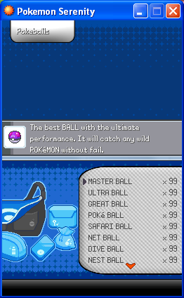
    @zigzags Looks pretty good, the top screen looks way too empty though.
    It feels like theres something missing from the middle.

    Would be nice to see an enlarged graphic of the item in the top screen or something like taht.

    @cavou
    Helemet look ok, seems like it needs one more shade of colour.
     

    zingzags

    PokemonGDX creator
    536
    Posts
    15
    Years
  • @civil
    The map is awful, but it being a test room, I can't really complain. The items on the side I assume are incomplete. put proper boxes around them and put them in the corner. or somewhere. and make them consistent with the presentation of the pokeball.

    The pokemon inside the ball looks really cool. I love that, and being able to drag and drop your pokemon into the feild is an awesome idea.


    @zigzags Looks pretty good, the top screen looks way too empty though.
    It feels like theres something missing from the middle.

    Would be nice to see an enlarged graphic of the item in the top screen or something like taht.

    @cavou
    Helemet look ok, seems like it needs one more shade of colour.


    I was thinking of adding the item in the middle, and the description right under it, also w/ using game variables depending on the "clothing" the player has it will display its charset.
     

    DarkDoom3000

    Super Pokemon Eevee Edition
    1,715
    Posts
    19
    Years
  • The helement looks too flat, actually, I think making the lighter grey a bit more lighter would solve the problem, It should hopefully make it pop a bit more.
     
    Status
    Not open for further replies.
    Back
    Top