• Our software update is now concluded. You will need to reset your password to log in. In order to do this, you will have to click "Log in" in the top right corner and then "Forgot your password?".
  • Welcome to PokéCommunity! Register now and join one of the best fan communities on the 'net to talk Pokémon and more! We are not affiliated with The Pokémon Company or Nintendo.

The Graphics Rating Thread - Read Post #1

10,673
Posts
15
Years
  • Age 30
  • Seen Dec 30, 2023
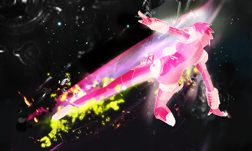
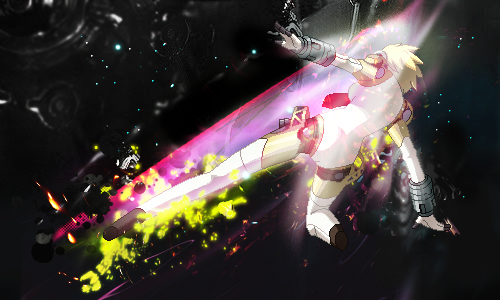
I know this stock. It requires a lot of flow to work with. Which you're lacking here. There's no real attempt to make the effects go in any direction, they're just a little all over the place, and with this stock you need to make it really follow the direction or make it atmospheric to a degree. My biggest issue with it is the concept in general. It lacks one, it lacks any direction. The effects seem sloppy and dolloped instead of placed.

The colours are really drab and harsh. They ruin any sense of depth or appeal to the eye. Not your best piece, I recommend thinking about your concepts before going to Photoshop.
 
177
Posts
13
Years
  • Seen May 9, 2012
@Brane: It's all over the place. The compo and effects just seem off, I'm not feeling it. Effects seem pasted without any thoughts. colors need some work. I'd just scrap it frankly, and go with another one.

oh_g00d_by_trashinatorx-d4quhnu.png
 

Rest

Showstealer Pro: Trial Version
353
Posts
12
Years
@ Cycle : First of all, I'm not too fancy for the colors. I don't like the pairing of green and blue. Both colors are strong here; IMO you should at least have a softer color to complement the stronger one. The hint of softbrushing on the render doesn't look great. Also, you need more details if you want this to go from good to great. Add a smudge orb at the right side of the tag, add small pixels of yellow to complement the render's yellow color, experiment with text, try playing with the C4D that you have if it complements the smudge. Be creative! Right now it feels like a WIP that would be superb if some stuff was tweaked and added.

Your smudge is miles better than what I can ever do though. Keep it up. :3

Here's something I've been playing around with. inb4 no-borders, they're cool and they're not going anywhere. :>

vcopy.png
 

moments.

quixotic
3,407
Posts
15
Years
@Cycle
Rest covered most of the things, the colours are not working so well with the stock, though I wouldn't agree with adding a C4D. You've got some really nice smudge here, you can easily carry the tag with smudge alone. You just need to work in more depth into the smudge, cause it is really flat and a little bland. You can add depth by burning/dodging areas of the smudge which will work to some extent, but also adding more detailed, really fine smudging; that'll help make it more interesting as well.
The smudge also looks quite low quality in some areas, not sure why, but it definitely is detracting from the tag. :(

@Rest
Eh, borders... I actually don't mind the yellow, but the widescreen border I don't really like... Get a thick bar on one side, or something, if you're going to widescreen it, either make them black, or make them large enough to become a feature.
Anyways, not bad, it feels kind of messy and a bit random, and the focus is much to centred, but the colours are pretty cool and the effects are decent. Like I said with Cycle, you need more depth as well. You've got these gradient maps on which just make everything flat... Apply the image and starting burning with a fairly small soft brush, and create some shadows. It doesn't really matter why, how accurate or neat they are, it shouldn't be that noticeable, but will just make it feel more polished, give it a bit of depth etc. Text on this would be really nice as well.
 

Zebra Thunderhead

the avenger
3,159
Posts
16
Years
@Brane: It's all over the place. The compo and effects just seem off, I'm not feeling it. Effects seem pasted without any thoughts. colors need some work. I'd just scrap it frankly, and go with another one.

oh_g00d_by_trashinatorx-d4quhnu.png

do you frequent any other forums? I've seen this smudge style around and it's pretty distinct. the constant jumping around of styles in your tags raises a red flag for me. maybe you're just very versatile. anyways, as far as this one goes, the stock does not blend well with the background the colors are just plan off. there's also no real depth or light source, which is a problem. it's very flat. the flow's right on but it needs work. gradient maps break heartz unless you know how to use 'em.

@Rest: I'm not going to say anything because it's just going to be a regurgitation of moments'

----------
lightsoff-1.png

or
fatal.png
 

Apple Juice

who are you
1,222
Posts
14
Years
  • Age 25
  • Seen Jul 15, 2014

The flow on this one is simply marvelous; the kick is amazingly shown by the background effects, and the sprite aspect of it doesn't made any difference to the quality of the banner. Very well done!


Not ~as~ happy as this one, but still a pretty great banner. I'd like to see the brightness on the left side toned down a bit as the render suggests a more darker-oriented tag imo. I like the lighting though, and the render is well placed. Great job! n__-n

f7k4D.png


I'm a little rusty... It's so messy, I apologize.
 
6,318
Posts
17
Years

f7k4D.png


I'm a little rusty... It's so messy, I apologize.

I've never done anything close to this level in my life so feel free to say my rating makes no sense and just disregard it I guess.

It's obviously a great banner and the only real criticisms I can find with my limited knowledge is how there is a fair amount of the canvas completely untouched I guess. Perhaps the render could stand out a little more too. I wouldn't blame you for not thinking twice about my comment though and it's still a great banner.

Now for my signature aimed a completely different corner of the internet. I might as well be a beginner but be as harsh as you like. I think it's rather simple and obviously I haven't used any advanced techniques or anything.

Borotext.png


EDIT: Whipped this up as well. Fell free to rate either one or both.

98faa876e79c5b71dcf9ddf580fe4e4f.png
 
Last edited:

Brane

-
372
Posts
12
Years
  • Age 30
  • Seen May 10, 2016
inb4 too old.

Tbh they both look a bit plain, the stocks do not interact with the foreground and the background just seems like it's in the way even though it's a part of the stock. The effects look a little random and seem to have no deeper purpose. I'd suggest looking up a few tutorials and starting from their : ).

Need some help on this as it's part of a Uni project. Tutor said something is bugging him, and something is bugging me but we can't figure out what. Help plox :D (Will fix bg shadows aka remove them so ignore them atm).

c9675ff2e568f9fc2fc3ffb2dd28bd9c-d4z6mqw.png
 

Nimblethumbs

my name would look hot in bold
285
Posts
13
Years
  • Seen Feb 21, 2015
I was going to say the shadows, but then nvm. I'm honestly not in the right place to give any advice on that, but one side of the watch is very pastelly, and the other has that shine-detail. I know. i suck.

35hieu0.png


Ok, I haven't done anything in forever. Obviously bit rusty.
 
48
Posts
12
Years
  • Seen Nov 5, 2017
would like some feedback on this i did not draw this i just cropped it and added some words would like to know how good of a job i did.(btw i kinda like the style not all the fancy colors and stuff just the object/thing floating there like it was made into the page)

twisterwords2.png
 

Zebra Thunderhead

the avenger
3,159
Posts
16
Years
would like some feedback on this i did not draw this i just cropped it and added some words would like to know how good of a job i did.(btw i kinda like the style not all the fancy colors and stuff just the object/thing floating there like it was made into the page)

twisterwords2.png

did you add the transparency yourself? there are a few points of choppiness: his tail, part of his fin, and bits on the whirlwind. all in all it's okay for what it is. the font choice isn't the best, though.

---

two wips:

future.png
/
future2.png


zanarkand.png


either one is gonna be used for a battle on another forum but I can't decide which one. I'm leaning towards the second option though
 

Zynth

Snorlax Enthusiast
12
Posts
11
Years
two wips:

The figure in the first image is too bright and vibrant to me, especially around the arms, it looks rough and pixel'ed. The background in both is great and fits with the figure, I like it. Although the faults', it is also great, I like how it blends in. I like the second one more though, the edges are less rough. Good job.

--------------

I'll post mine when I reach 15 posts, can't post external links :c
 
Back
Top