Worldslayer608
ಥдಥ
- 894
- Posts
- 16
- Years
- Age 34
- San Diego
- Seen Nov 10, 2020


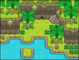
A jungle? In Kanto? Yup. Fuschia Jungle aka old Route 14 and 15.


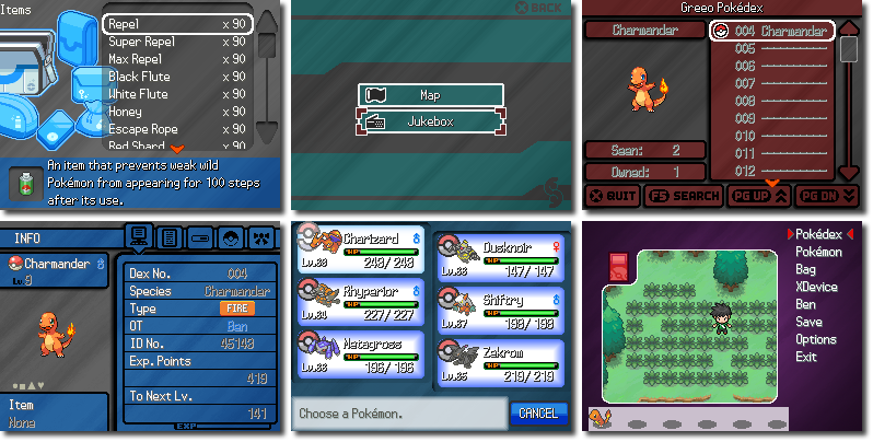
Recently finished all the GUI stuff for Pokémon Chaos.
Spoiler:

Rayquaza. - It looks good. The only thing that is bothering me is the black text on the darker backgrounds. Why not change it to white like in item bag and mart screen?
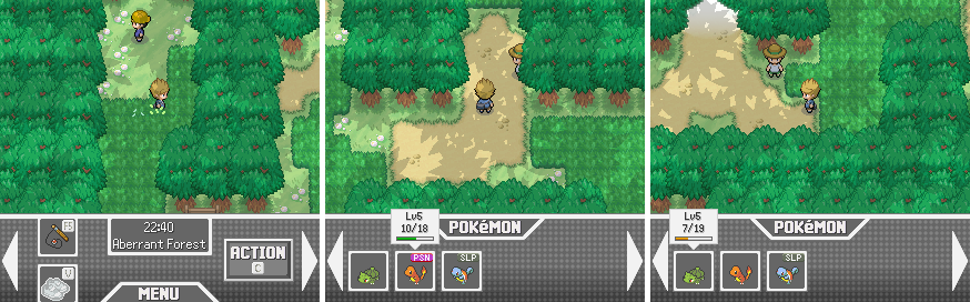


Nothing amazing, like the post above me.
But I'm making my own tiles and testing them out.
Opinions?
Soil and Grass are both WIPs
This looks really cool, I like how you're sticking to the gen 1 and 2 graphics and design, it looks great!
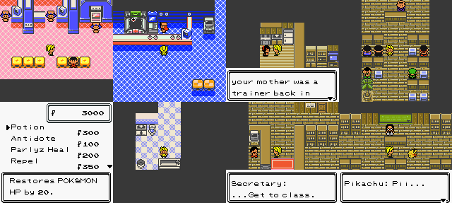
From Top left to Top Right, then second row:
-100% Functional Pokemon Center (No Wifi yet)
-Correct animations for Healing, including nurse bowing (also, PCC)
-Your mother reminiscing
-A School classroom. It's not yours!
-A very accurate Pokemart GUI. The money window is bigger than the one in GSC for font reasons
-A bathroom in your room
-The Secretary enjoying his gameboy color
-You unveiling your new Pokemon, and trying to recall him.
This is one of my oldest projects being remade and drastically changed in storyline.
I dont get it...um, the color scheme on the pokemon summary page clashes with some text, and the type boxes look weird and done wrong, theres little squares on the edges that arent the same color, and it looks like you forgot to make them transparentSpoiler:
I've made some Little GUI changes still WIP. Criticism and opinions appreciated.
I'm trying to make the windowskin more detail better and like x and y.


its a solid start, the grass is too static, its all the same, it needs some varisbe some lighter patches and darker patches all around the standard green (if you get what i mean)
like you have a standard green color, but theres the lighter patch, maybe make a few varying tiles where it has a different pattern, some as light, others darker, etc
as for the soil it needs a color change, it looks weird with 2 colors. Take a look at actual ingame tiles for a reference; but its a good start. The fence is a little weird, if you changed it a bit so it connects to the next one, and flip the existing one so it goes up and down in a zig-zag i think it might look better
This looks really cool, I like how you're sticking to the gen 1 and 2 graphics and design, it looks great!
I dont get it...um, the color scheme on the pokemon summary page clashes with some text, and the type boxes look weird and done wrong, theres little squares on the edges that arent the same color, and it looks like you forgot to make them transparent
the white on yellow on the battle screen clashes; it looks weird, and i dont like how it goes off screen like that with the lv #
keep working on it, if what i see is correct it looks like depending on the move's type it has a different background, thats pretty cool
overall just change the colors so the text doesnt get lost in all of your customization

That's a lot better. The only thing that is bugging me are the graphics of the types of the Pokémon. They look out of place because they are glossy and the rest of the design is flat.I've changed my summary text, working on other things.
Criticsm appreciated, plese tell me if the Colors look good with each other or not.