• Our software update is now concluded. You will need to reset your password to log in. In order to do this, you will have to click "Log in" in the top right corner and then "Forgot your password?".
  • Welcome to PokéCommunity! Register now and join one of the best fan communities on the 'net to talk Pokémon and more! We are not affiliated with The Pokémon Company or Nintendo.

The Graphics Rating Thread - Read Post #1

Rainflower

분홍신
441
Posts
15
Years
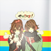
Very nice, but I think the font in your banner could be more-- attractive. (idk how to phrase it, sorry my English is not really that good >.<)
Overall, I like the effect and coloring and the whole lighting effect. Keep it up! :">

tumblr_lmva9pAHkZ1qbxhpr.png
tumblr_lmvaabcn211qbxhpr.png
tumblr_lmva946XwC1qbxhpr.png
tumblr_lmva9hl4Sr1qbxhpr.png


Original art
 
177
Posts
13
Years
  • Seen May 9, 2012
Give it a good sharpen and you should be good to go. Tone down the lighting a bit as well.

butterfly_girl_tag_v2_by_trashinatorx-d3j3lqt.png
 

Alternative

f i r e f l y .
4,262
Posts
15
Years
I like how you've used the C4D's to create flow within the focal, which doesn't really seem to have much flow there in itself. Lighting is nice, but I don't know what's with that weird scribbly line you've done closer to the bottom left corner. It just seems random to me and out of place.

scott-2.png
 

TwilightBlade

All dreams are but another reality.
7,243
Posts
16
Years

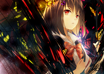
Hmm the dimensions are certainly different but they very well fit the stock. I like the use of the c4ds and space/dust background! I'm not really liking the red and yellow streaks in the c4ds. If you'd like to keep them, make them more similar to the yellows in the butterflies and reds on her bow. If you're using Photoshop, play around some more with layer adjustments, especially gradient maps, photo filters, and color balance to achieve a more natural coloring. I'm alright with the bottom left corner scribble.


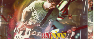
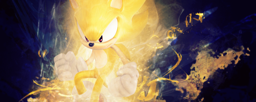
Aaa putting the stock in a clipping mask and in a bar off to the right side is too much for me. What I'd love to see is a clipping mask over the text since it's bothering me. I do like the stock, text placement, cropping and the red/yellow smudge smoke behind him.

I need some help on this one:
supersonic.png
 
Last edited:

Brane

-
372
Posts
12
Years
  • Age 30
  • Seen May 10, 2016

Hmm the dimensions are certainly different but they very well fit the stock. I like the use of the c4ds and space/dust background! I'm not really liking the red and yellow streaks in the c4ds. If you'd like to keep them, make them more similar to the yellows in the butterflies and reds on her bow. If you're using Photoshop, play around some more with layer adjustments, especially gradient maps, photo filters, and color balance to achieve a more natural coloring. I'm alright with the bottom left corner scribble.


[/CENTER]
Aaa putting the stock in a clipping mask and in a bar off to the right side is too much for me. What I'd love to see is a clipping mask over the text since it's bothering me. I do like the stock, text placement, cropping and the red/yellow smudge smoke behind him.

I need some help on this one:
supersonic.png

I'd say positioning and texture is great. But the yellow is too penetrating and sonic blends in with it too much. You should try making the outside of it a darker tone while closer to Sonic it could remain the same. It just takes away from the sharpness. I also think you could lower the tone of the whole thing, and then just add external light sources and darken the bottom of the image a little.

First sig I've done in ageeesss.
mrvj4g.png
 

Shattered_Soul

Just Because :)
29
Posts
13
Years
  • Age 27
  • Seen Jul 27, 2011
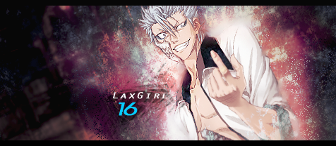
Quite honestly, I don't like the text much at all. The way you placed it would look good in a typography sort of thing, but in this signature it doesn't exactly add to it at all. Try using the rule of thirds when placing text, it helps alot. The whole thing is just a bit over contrasted, especially where your focal is. You have some decent flow going on, just try to emphasize on it a bit more, maybe add some c4ds. Also, it could use a bit more depth, and the right side seems rather empty. Nice job though! I like it! KIU!

grimmjow_tag_by_theshatteredsoul-d3nduxi.png


categoryx_tag_by_theshatteredsoul-d3nxk17.png


Critique whichever one you like! (:
 
Last edited:

[T]ouko

Dedicated Scripter!
46
Posts
12
Years
  • Seen Jul 9, 2013
I'm gonna critique both :)

Overall, I like them both. About the 'Laxgirl' one, I don't really feel that the background fits with the render. And it's a bit 'empty' near the left. Maybe you like it, but the picture I'm posting is more 'busy' and 'full', I like that better most of the time.

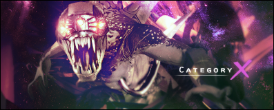
The 'Category X' one is in my opinion better. Because it's an alien / monsterlike that darkness fits really well, I think. The eyes are pretty cool too =)

I feel really weird critiqueing you, 'cause your work is better than mine :P

It's my first-ever Tag, so go easy on me :P But I'd like to know how it can be better. And I hope I didn't make any big mistakes.

2mxonbn.png
 

Azure Wish

Haha. No.
34
Posts
12
Years
  • Seen Apr 7, 2012
Its not bad for your first tag, but a few things that bug me:
One is that you have blurred it waaaaay too much. I get blurring the background a little, but here its so fuzzy that you cant see any details. Touko is also extracted rather poorly; try using the pen tool next time. It seems like the smudging around her was to mask that.
One thing that I did like about this tag was the font. However, blurring it slightly made it look a bit tacky IMO. Moving the T a bit closer also would have helped a bit.
Overall, good start!
Spoiler:
 

[T]ouko

Dedicated Scripter!
46
Posts
12
Years
  • Seen Jul 9, 2013

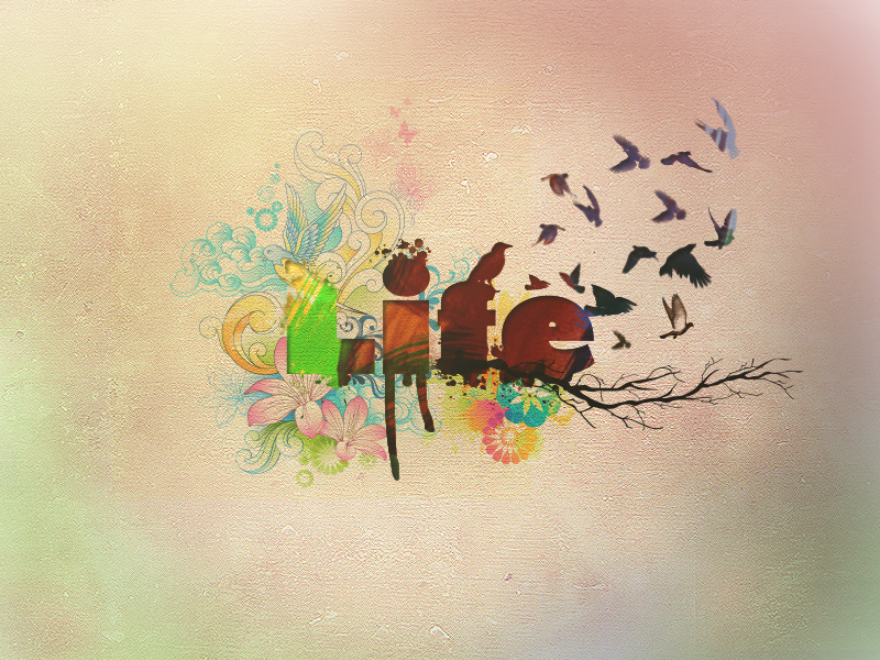
I don't really like that the background is pretty much empty, and in the middle is only the text. But the text is really cool, the letters are made beautifully, the effects around the text go well with the text. The only thing that'd bother me would be the empty background.


Spoiler:
 
3
Posts
12
Years
  • Seen Sep 5, 2011
Oh god, I'm so awful at giving feedback >.>, I'll give it a go any way, I really like the use of blending, It makes it feel like it's there, Not just sticking out like a sore thumb, I just dont like how the nose dissapeared, Makes the person look flat.


Can someone just rate the sig down below? I'm new at GFX and would like some feedback ^^
 

Loki

x
6,829
Posts
18
Years
  • Seen Apr 4, 2024
For being new to GFX, that's not bad at all! I would suggest next time perhaps moving charmander a bit more to the left, so that he's a bit easier to spot. Also, try not to use so many of the same colors. It's a bit bland, if you don't mix things up! Otherwise, there's not much to it save for the texture. I recommend that, as a new GFXer, you should experiment a bit more. Even if it doesn't look good, you'll learn a lot!


You've blended your focal a bit too much, particularly on her arm, and the text doesn't really fit with the style. I like the general idea you've got going on, but the over smudging is really distracting. ^^;;
 
3
Posts
12
Years
  • Seen Sep 5, 2011
Interesting, Perhaps the colours could be a little less "dull"? Other then that great job ^.^ Overall a solid 9/10


I've revised my Charmander forum Signature, Hopefully now it looks less "bland", Also I just realised it changed my previous post's signature aswell, Anyway \/
 

Loki

x
6,829
Posts
18
Years
  • Seen Apr 4, 2024
Eehhh, I can't say I think this green color matches very nicely with your charmander stock, especially considering that for some reason it's way more desaturated than it was before? I wouldn't recommend outer glow being used on the text like that either. The radial blur that centers around your text takes away from your focal, so if you had to use a radial blur on this, you'd probably want to stick it behind Charmander, if at all.


----


Wow I struggled so hard with this just to get this crummy POS. XDDD
Graphics and I don't mix, it seems. But it was fun taking a spin at it. >ah nostalgia

I used a stock by ohmydeanna@dA, and.... a texture by someone I don't remember because I never credited people back in the day. (Lol...)

origamicyclone.png


Origami Cyclone is my #1 Hero, btw.
 

.Mini

Graphics Artist
68
Posts
12
Years
Hmm, looking at it I like it, but INSTANTLY i see something that doesn't fit. At the bottom of the tag, a little effect that looks like it's on softlight is going over the focal. That shouldn't be there, it totally kills the flow and makes the focal look a little tacky. Other then that I like it a lot. Just that ONE LITTLE EFFECT will be on my mind. Forever and Ever ;3.
 

.Mini

Graphics Artist
68
Posts
12
Years
You got part of it, see those black lines, i think it's connected to w/e is going behind him on the right side. The effect or w/e it is ; is on the left side. You see?
origamicyclone-1.png

````````````````````````^^^^
 

Winneon

[b][color=#fb0120]しょう[/color][color=#fc6d24]が[/col
525
Posts
12
Years
Here is a tag I made today honoring 9/11 and all of the innocent lives lost.
neverforget911.png


May I have some feedback?:)
 
10,673
Posts
15
Years
  • Age 30
  • Seen Dec 30, 2023
http://imagedatabase2.wikispaces.com/file/view/neverforget911.png/251804552/neverforget911.png

First of all, I don't want to intrude on any cultural issues here, so my comments will solely be in relation to your work and not its subject matter. At any rate, you're lacking a strong focal point. The flag here doesn't really support the tag well enough, and it also has some inconsistent lighting around in along with very little of the focal point being, well, focused upon. The tag overall lacks any sort of composition, there's no real flow or clarity to it. This is due to a number of things, primarily the fact that you lack a decent focal point. Using inanimate objects (well, a flag is possibly a bad example since it does move, but you know what I mean); is usually bad practice in tag making. You should be aiming to use stock model photos and rendered characters and the likes, for example.

Overall the tag also is very monotone, you have no real contrast in colour. The tag just screams "rust", and has no real attempt to blend a number of colours nicely. People tend to underestimate how important colour is in graphic art. The atmosphere of the smudging is pretty decent, not that it saves this tag at all since it's not really used to a good effect, again, due to things I've mentioned. It's hard to pick out many small issues, when they run pretty deep due to the fact you've made some fundamental errors in choosing your stock, working with colour, and lastly, your text is all off. You shouldn't ever stick text in a corner (very few exceptions). Reason being is that it tends to create a whole new focal point, away from what you're trying to actually focus on. The colours overall on the text seem pretty lazy, pure red, blue and black, give or take a few hexadecimals. Don't really know what the lines around the flag are trying to symbolize either, they just seem distracting again, and being counter productive when it comes to flow.

The tag just lacks complete fundamentals, without trying to sound too harsh. No choice of decent stock, text errors, monotone, lacking in decent effects and flow. From what I see in your work, you tend to rely too much on the power of your programs and their filters. I see them overused in your work. Brushes, clouds (possibly?) and others, I see a lot in your work. Try to think about your concepts a bit more, and learn the basics on graphic art rather than trying to learn the basics of photoshop, or do both at the same time. Creativity does not come without technique, but technique alone is the biggest waste of time if you do not work in other areas. A lot of beginners, and indeed intermediates, try to think too much about what they can "do from scratch" or how "much" they can do with an image, but they're way off the mark. Eventually, some graphic artists realise that technique is not what they should strive for, it's actually getting some good ideas and trying to pull them off is what gets them places. Anyway, bit of a rant, but hopefully you find some relevance. I'm aware you may want to address some of what I've mentioned, but feel free to VM/PM me, rules of the thread disallow further discussion as you may already know.
 

moments.

quixotic
3,407
Posts
15
Years
neverforget911.png
Gav covered most of the points that need to be made, so this is just adding little bits and pieces here and there.
Firstly, you've got some funky black patches down the bottom. I don't know if you've used the burn tool too heavily, or if you've got some black smudged there, but either way, it contrasts too much from the rest of the background and is actually drawing a bit of focus as well.

Another thing regarding the background is sort of a lack of details. You've got your basic clouds / smudge there which is alright, but alone it isn't enough really. You've added those lines either side of the flag, but as Gav said, they sort of lack any real substance and don't really add anything to the tag. If you take away those, you are left with a very basic background, with nearly no details under a flag. Now, you can do this a few ways, but in keeping with what you already have, some splatter / brushes with clipping masks might work. Not clipping mask the flag, but do the background, and then just move it a few pixels just so it looks like there are more intricacies in the background which aren't going to draw the focus. If done well, it should be hard for somebody else to know you've done clipping masks.

Alright, I made this purely as experimental. I know this isn't what I normally do, and it's not as detailed or anything as my other stuff, but this was an experiment on a really small canvas duh and using less natural and more vibrant colours. So yeah, don't think I'm going to pursue this style, just mucking around.

roxas.png
 
10,673
Posts
15
Years
  • Age 30
  • Seen Dec 30, 2023
http://i233.photobucket.com/albums/ee207/mattimogalli/roxas.png
roxas.png


Never did like the mini-tag fad, I don't think it'll last very long in all honesty. Anyway, I actually like the colours in this, but since it's pretty empty; there's not a whole lot to comment on. When blending, it looks better when you avoid making the background that is smudged over the focal not slightly opaque. The triangles are a little distracting, it's something I assumed you'd take on board, that they distract from the focal also. Since it's not something you're pursuing, I'm assuming you're not too happy with how it came out overall. I actually like your composition on the background, but everything else doesn't blend extremely well.

The tag is rather easy to look at in all honesty, due to the colours, and good approach by large, but just think about my comments. Since the tag is pretty unfinished, I won't go into too much detail on what it lacks. But it would be good to see a little more around the focal, with a few more effects and some depth added to the overall piece. Either way, you're best off sticking to larger tags, they're practice enough for small pieces in my opinion. Either way, yeah, I agree with your attitude, and I enjoy the colours, but it's a far cry from a complete and you're best suited to larger stuff for sure.
 
Back
Top