• Our software update is now concluded. You will need to reset your password to log in. In order to do this, you will have to click "Log in" in the top right corner and then "Forgot your password?".
  • Welcome to PokéCommunity! Register now and join one of the best fan communities on the 'net to talk Pokémon and more! We are not affiliated with The Pokémon Company or Nintendo.

Art Critique & Showcase Thread

Status
Not open for further replies.
10,673
Posts
15
Years
    • Seen Dec 30, 2023
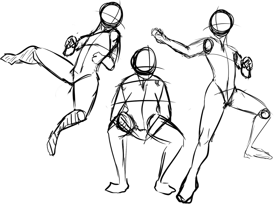
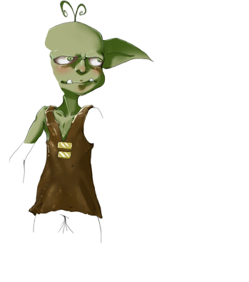
    If you're looking for critique on your work or just want to showcase, and do not have enough for a gallery post here.

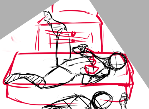
    You can also give a visual paint over as seen in this thread. If you do not know much about the medium above, simply add anything you feel they could improve on, and admit you could know more about the subject.

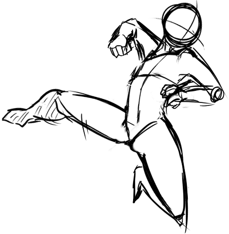
    It does not matter what your art is, if it is graphic art, traditional or otherwise, please post up and of your work in progresses, or finished pieces in which you're looking for help in!

    Let's get started.
     
    Last edited:

    Snowdrop

    Back and ready to babble!
    630
    Posts
    11
    Years
  • Just a head's-up, I'm an extremely harsh person when it comes to critiquing art =P Also be 100% honest with me, you won't hurt my feelings.

    I think there's some problems with the facial muscles and throat here =P
    thylacostenchus_snarl_by_all_powerful_lioness-d4vxjz3.png
     
    10,673
    Posts
    15
    Years
    • Seen Dec 30, 2023
    Alright, before I get to the drawover, I think that in your facial muscles, the eyes are overly close together. The sockets are too far from the base of the face, meaning there's overly pronounced scowl lines between the eyes. You should also always draw all features, meaning that you should include ears. They're an important part of a base sketch, the same as with eyes and mouths. Overall, the proportions are a bit all over the place. If you were going for something abstract and stylistic then you should be consistent in doing so. If you're going to exaggerate the mouth, ensure that you do the same for the rest of the body. The head feels too heavy for the body. In the paintover I concentrated on making the proportions a bit more realistic, I went with making them suit a real tiger(?) rather than something more mystic and abstract. If you wanted to over-exaggerate the drawing, as I say you should run with exaggerating all proportions.

    Spoiler:


    Excuse the messy lines, Photoshop is a pain to draw with. The main issue was the draw, it needed to be brought up and feel more supported. The jaw before looked as if it was broken and had fallen. You also need to give room to the teeth to the left on the bottom jaw. Again, for support. You can draw in your teeth again, they're drawn quite nicely. The head also needs to be raised a bit, otherwise it looks like the tiger lacks a brain or forehead to keep it in. The shoulder blades also needed to be more gradual and slightly more muscular looking. Same goes for the legs, the thighs needed to be a bit bigger, animals are heavy, they need strong legs. Especially ones which run a lot. Some other small things included the left side of the nose which needed to be more rounded, and the tiger needed a stomach towards the back. The feet also needed to be raised, and the foot behind the foreground needed to be brought forward to be seen.

    Take all that with a pinch of salt, Kura would have much more knowledge on proportions. But hopefully you can take something from this. Best of luck with finishing it up if you plan to!
     

    Snowdrop

    Back and ready to babble!
    630
    Posts
    11
    Years
  • THANK YOU ^^ This is not a tiger, however, it's an imaginary marsupial beast from the Ice Age period. I agree with everything you said except with the jaw, it's based partially off of thylacine (my monster here is called thylacostenchus) and thylacine could open its jaws ridiculously wide. However, you opened my eyes up to the shoulder blades because that's how I draw all my animals: with small shoulder blades and now that you've pointed that out, I'll make them a lot longer and more muscular-looking.

    It has no ears, it's just a hole in the side of its head. However, most marsupials have ears so I probably should've included some :P

    Thank you for everything, the thicker proportions fit her much better :D
     

    derozio

    [b][color=red][font=helvetica][i]door-kun best boi
    5,521
    Posts
    14
    Years
  • Don't want anybody else to see our secret little discussion, you know. But yeah, this is kinda funny. XD;
     
    Last edited:

    Khawill

    <3
    1,567
    Posts
    11
    Years
  • I'm posting 3 pics, the first two are the ones I want critique on (they are the best drawings of people I can find)
    Spoiler:


    The next one is a picture of Anima that I drew using a tutorial, I think it is a much better picture but I'm just showing that I'm not a completely incompetent artist. (It was completely shaded but I can't find a pic of that one)

    Spoiler:


    The reason I ask is because I really want to be able to draw people and eventually move onto doing it on a tablet.
    *Edit The second human was drawn sort of hastily but the first one took me a while and I went through like 5 pieces of paper.
     

    Loki

    x
    6,829
    Posts
    18
    Years
    • Seen Apr 4, 2024
    ^ Hey Khawill! I was hoping to help you out there, but I can't see your images! Something must've gone wrong with the links?


    As for me, I have three poses I've never tried before-- so I kind of have no idea what I'm doing haaaahaha OTL I hope there's enough to work off of so far.

    Red line, tips, etc would be much appreciated. Uhhh if it helps I'm going for a boyish-female body type.

    posesidk.png


    And um.... yeah the feet on the seated pose are strange, but I was too lazy to fix those-- you can ignore that if you'd... like haha....
     
    2,413
    Posts
    16
    Years
  • As for me, I have three poses I've never tried before-- so I kind of have no idea what I'm doing haaaahaha OTL I hope there's enough to work off of so far.

    Red line, tips, etc would be much appreciated. Uhhh if it helps I'm going for a boyish-female body type.

    snip snip

    And um.... yeah the feet on the seated pose are strange, but I was too lazy to fix those-- you can ignore that if you'd... like haha....

    So I'm not really the master on action poses. I'm not even going to give you a real red line, but there's really something missing from these poses, especially the first one.

    If the first pose isn't a flying kick just ignore everything but I'm pretty sure it's supposed to be a flying kick!!

    Like I said earlier, they are action poses. What defines action is unbalance, as walking is just controlled falling. We control our movements with muscles, by either relaxing or contracting them. Contracting a muscle is hard work, and you can see the tension in the figure. The problem with your poses is that you can't see any tension.

    This is meant as a light hearted humor, please don't take offense. My professor sees silly things in out\r art all the time and it's more fun then telling you it sucks or something.
    I can balance your figure. Instead of in the middle of a flying kick, if you turn it around it can easily look like...someone laying down. Eating noodles, resting their leg on something else or doing those leg exercise things. Or something...else. Those are very opposite positions, laying and fighting.

    loki_pose.png


    Now to fix it, you need show the tension in the arms and legs, holding that body against gravity and pushing force into it. Horribly, I can't really explain how to 'draw' tense muscle. You just, have to either keep bending the arms or legs back farther and drawing them with much more...force. I'm sorry so bad at explaining.

    Just google "flying punch fighting" or something along those lines and see if you understand?
    1M4J1275-1.jpg
     

    Loki

    x
    6,829
    Posts
    18
    Years
    • Seen Apr 4, 2024
    Thanks so much for your feedback Lornami-- and no it wasn't offensive at all! LOL I actually laughed a little when I realized what the drawing was. The feedback was really helpful though, and I hope I've edited the pose to a point where it looks a little more natural and a little less noodle-y?

    I'm still not really satisfied with it, to be honest though haaa....

    idkanymore.png
     
    2,413
    Posts
    16
    Years
  • Ah, I really like that one!! The arm being pulled back and and up, you can really feel it's about to strike! I see little slight adjustments making the figure bend in hard spots and it really comes together. The upper body looks really good and powerful.

    That bent leg really helps establish that you're unbalanced and in the air. I feel you, that there's something that's not satisfying, and it's in the lowerbody. But the further you go down from the face/head the further I'm still trying to master myself, so I think that's all I can help you with specifically.

    In general advice, just keep looking at references (do not look at comics, I'm sorry but unless you know for a fact the artist practices from at least semi-reality be careful) and if you want an action or emotion to get across, exaggerate it as much as you can, then scale back with reality.

    Oh! That reminds me, you may have already done it by try starting with action lines when you think of theses poses. Oh, I just tried to do you one for those but they uh...work a lot better in charcoal than on the computer, oops. (Do you see the darkest remnants inside the body? I'm pretty sure that was my action line, or more in this case a flow line in absence of a a big action.)

    Hey, is anyone going to or is able to fix the capital H in SHowcase? hahaha
     
    Last edited:
    348
    Posts
    12
    Years
    • Seen Dec 26, 2020
    Here's a picture I did of Rosa wearing Nate's jacket.
    Spoiler:


    You look so silly. It doesn't even fit properly!
     
    17
    Posts
    17
    Years
    • Seen Dec 26, 2013
    Spoiler:


    Fennekin Evo!
    - Photoshop
    - Took about 2 hours
    - Feel free to use it in whatever way, get rid of the signature if you must but if you're just sharing the pic, I'd prefer you left it in :)

    Also, @Loki above, I love your line quality. It's real dynamic and really portrays the movement. One small thing to note though, (I haven't seen any of your non-sketch pieces so I'm not sure if this applies to all your outlines) the head should generally be more ovular. You should also try working in perspective more, it can really get you the feeling you want. (EG. Leaping towards the viewer, having a fist pointed towards the viewer)
     
    Last edited:

    Kurui

    Kageroza's Waifu
    286
    Posts
    11
    Years
  • I suck at giving critique because, I suck at art in general XD.......
    kiriban_1_wip_2_ahmagerd_by_glumshanksgirl-d5s1aoy.png


    There's my WIP. I tried to draw that cartoony proportion of him, didn't work, looks still like it's trying to be an anime, oh well. Still gotta fix his ear too, I know. =w=

    Program: Photoshop CSwhatever (I have no idea)
    Time (so far): 20-30 minutes-ish on and off.

    Yeah I don't work like I should. I barely use sketches to draw from, do not reference, and alternate between line art and colouring. That's because I'm impatient and I swear i have ADD or something.

    jitter_doll_shizo_cover_by_glumshanksgirl-d5kkp9i.png


    'nother recent-ish piece.

    Program: Same as above.
    Time: Near 2 hours.
     

    Adin Terim

    Absolutely Insane
    64
    Posts
    11
    Years
    • Seen Jul 17, 2021
    Drew these during the day today. I was planning on coloring them, but neither my roommate or I have any sort of markers, colored pencils or crayons xD I'll finish these drawings up when I do get some thing to color it in with. Till then I'll work on drawing hands.
     

    Adin Terim

    Absolutely Insane
    64
    Posts
    11
    Years
    • Seen Jul 17, 2021
    Need some advice about my Sableye head, something seems off about it. I've reworked the eyes about three times and can't seem to get the angle right. Any ideas on what I should do?
    View attachment 67238
     
    17,133
    Posts
    12
    Years
    • she / they
    • Seen Jan 12, 2024
    Need some advice about my Sableye head, something seems off about it. I've reworked the eyes about three times and can't seem to get the angle right. Any ideas on what I should do?
    View attachment 67238

    Hey there! You mentioned something about a Sableye in your gallery, didn't you? Is this the one you were struggling with? Well, hopefully I can give you a hand! :D

    As it stands, your Sableye head is too vertical. You need to expand it horizontally a bit more. Honestly, it might help you a bunch to draw out the eyes first (even though that's not necessarily a traditional way of doing things). Because Sableye's eyes are established hexagons, it'll be helpful to draw, or even trace, those out perfectly with even sides and expand on the rest of Sableye's head from that point. That way, you'll be able to reference the scale and positioning of the eyes to make the rest of the head proportional, if that makes sense.

    Here, I red lined a few things for you. I also drew some arrows around the ears because they should be smaller overall. Make sure you lightly sketch everything first before you go in there with ink or dark lines. There's an awful lot of smudging and eraser marks in that drawing, so be careful you don't outline everything too heavy-handed, or those lines will never go away completely.

    I hope this was helpful! n_n; I can't wait to see the finished product!
     

    Adin Terim

    Absolutely Insane
    64
    Posts
    11
    Years
    • Seen Jul 17, 2021
    I get that Sableye's head is football shaped, what I am trying to draw is the head from a side view. I did take your advice on the ears, made them much smaller. I also tried making the eyes into more clear hexagon shapes. Added the barebones of a body ... it needs to be rotated to fit with the head more :\ (I seem to see my problems after I scan). If I can't salvage this drawing I will just redraw it using your tip about drawing the eyes first then drawing the head around that. Maybe I need to change the mouth and bring the jaw line up?

    The Sableye that I mentioned earlier is actually three posts up in my sketch sheet, it is more accurate to the official drawing. After I finish my drawings I usually go back and smooth out the lines, then I can remove all the smudging digitally - the abra that I have in my gallery had twice as dark smudging before I fixed it. Thank you very much for your help so far. Does this look any better to you?

     
    Status
    Not open for further replies.
    Back
    Top