Circuit
[cd=font-weight: bold; font-style: italic; backgro
- 4,815
- Posts
- 16
- Years
- Berlin
- Seen Jan 6, 2021
[alink id="tags"]tags[/alink id] | [alink id="icons"]icons[/alink id] | [alink id="digital"]digital art[/alink id]
[alink id="about"]about[/alink id] | [alink id="requests"]requests[/alink id] | [alink id="thanks"]thanks[/alink id]
.
[a id]tags[/a id]
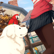
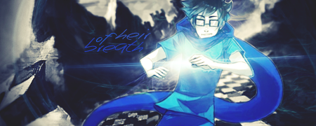
Sound Waves
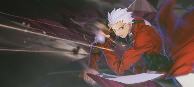
Blade Works
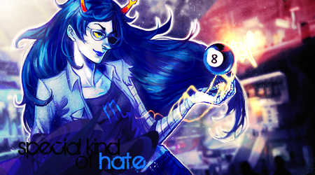
A Special Kind of Hate
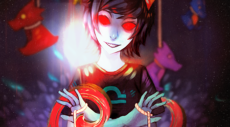
Blind Poison

The Moon Also Rises

Thoughts

Shining Fairy

Magestic Mage
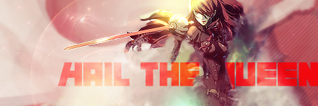
Hail the Queen

One Wing Crisis
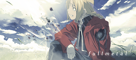
fullmetal
Wandering Light
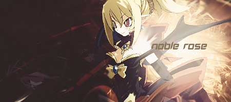
Noble Rose
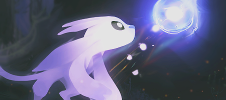
[a id]icons[/a id]


[a id]digital[/a id]

Click for larger image!
[a id]about[/a id]
[a id]requests[/a id]
[a id]thanks[/a id]
Hi everyone! My name is Aiden, for those of you who don't know me already, and I'm an electrical engineer in training, living in Berlin. I began doing graphics some many years ago now, originally inspired by previous artists here on PC, an example of whom was Derozio. Most of the time I've been doing graphics it's been in some way related to either Tags or LPs but lately I've begun to broaden my horizons, and digital art has been added to the list. I'm also a dab hand when it comes to CSS. I'm also the founder of the Art School, the sub-forum of A&D, which you should definitely get involved with! To browse my works, click any of the links on the right or, to keep reading, click the links on the left!
[a id]requests[/a id]
I am open for requests!
If you want a signature made for you, all you have to do is ask! Fill out this little guide sheet and I will do the best I can with it. If you don't know what one of the terms means, in the Art School there is a resource thread where most terms are explained, take a look :)
What you want: This can be a tag or icon (you can request more up to three icons, only one tag)
Render/Stock:
Colours (if any):
Text (if any):
Other: If you want something specific that isn't covered above, specify it here
Favourite Piece: a short couple of sentences saying which of my pieces you like the best and why. This will help me decide what style is best for you!
And it's that simple to request your tag or icon! Please note that it may take me a while to finish your request, depending on how busy my life is. Usually expect it within 1-3 days, but in rare cases it may take longer. Also do not forget to credit me wherever you use these! Now then, go wild!
Current Requests:
[a id]thanks[/a id]
Thanks for taking the time to view my little gallery here! It's still growing, so make sure to come back often to see what's new, and for a new request if your current one is getting a little old.
I'd like to thank first of all every source used in this gallery. Unfortunately, I don't remember every source, and citing them all would be a nightmare, but if you would like credit for something that is yours, feel free to message me and I'll credit you as soon as I see it!
Thanks to the mods for keeping A&D a growing environment, where people can come freely and give their opinions, and thanks to all of you who have taken the time to leave C&C. This helps me more than you can imagine, and motivates me to try new and better things. So thanks to all of you!
Last edited: