PageEmp
No money puns. They just don’t make cents.
- 12,708
- Posts
- 8
- Years
- with an axe
- Seen yesterday
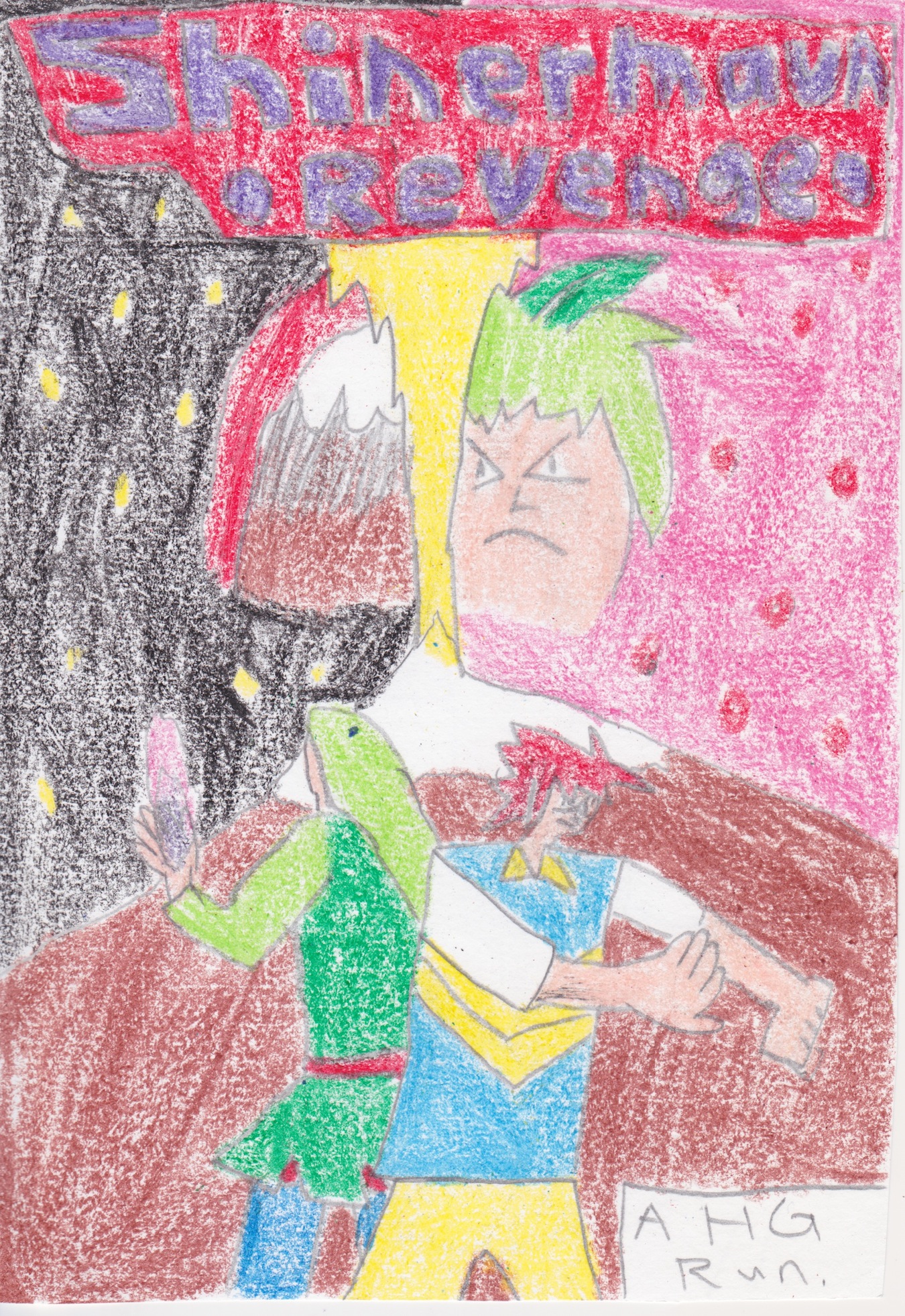
So this is technically a Nuzlocke run of HeartGold that I made in comic form, and I will use Gijinkas to make it different. I've been working on it for 2 weeks and I will share it with you guys now.
Synopsis:
Spoiler:
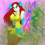
Johnny K. Hannings was awoken from a deep slumber, only to realise he had suddenly transformed into an 10 year old, having the powers of a Totodile, and only having a memory of how he died. He moves around the place discovering new friends such as Sal Kinsaro, who has the powers of a Caterpie, and finding out how he could possible conquer the area.
Rules:
Spoiler:
1. I must catch the first encounter, dupes clause on.
2. I must box any fainted mons.
-New Rules-
3. If a mon survives an attack with red HP, it will be under the injured status. An injured mon cannot hold items, and must be at most 2 levels behind the gang.
4. Injured status lasts for 2 gyms. If someone get injured before the league or before Red, don't worry, everyone will be cured before those.
5. Once I get a full team, I cannot box anybody.
6. I can buy up to 6 potions. then, I cannot buy any other kind of potion.
7. If I lose my starter, I lose the run.(This could be a challenge since I haven't kept a starter alive for a long time.)
8. No day care.
9. I cannot heal in the center in towns(not everywhere, just towns.)
10. I MUST use the egg.
11. The badge's number tells me how many mons I should bring into the gym.(e.g. I must use only 1 mon in the 1st gym, 3 mons in the 3rd gym.)
12. On the 6th and 7th gym, I can only use 4 and 5 mons respectively. The last gym is the only gym where I can use my full team.
13. I cannot encounter the same type mon twice in a row.(e.g. If my first encounter on a route is a grass mon, I cannot catch another grass mon in the next route.
14. I am not allowed to catch Rattata, even if it's my first encounter. Do I need to say why?
15. Wish me luck!
Prologue:
Spoiler:
Death. Anybody, whether it's you or your loved ones, will have to suffer through during one point in your life. However, scientists have soon invented a brand new program to give people who have died from tragic, unexpected means(such as quakes, plane crashes, anything that wasn't their fault), a chance to become reincarnated, and come back into their life. This is known to help them prepare for the time where they get back to their own respective bodies and expect the unexpected.
It goes like this: the deceased person is brought into an imaginary world. He or she must fight for him or herself. They must visit every town, and beat that town's leader. After defeating all 8 leaders, they can have a chance to go to a so-called 'league'. They will fight four powerful teams, and finally go against the champion; a major boss, who will then grant them to become alive again.
These people will gain Pokemon-like powers. They can fight opponents with this, and make their way to victory with it. The opponents will also have these powers.
However, there are strict rules. If any of the deceased people get defeated in battle, they will really die, and will never get resurrected, and no one, NO ONE must know what they are going through, the plan of this scheme, or how these powers came about. If a dead person is caught saying out loud that they know what's going on, they are immediately disqualified, as well as being sent to HELL. Technology has also been improved, so now if a dead person completely knows and is aware of what's going on, the same thing would happen.
This system, while being effective, has received numerous controversy. The normal death cycle has always been going well, as the way people know it. But the creators still continue to ignore it. They fell it would revolutionise the way the human being behaves, thinks, feels, and finally, survives.
They call it Nuzlocke.
The table of contents:
Spoiler:
For now, I will update on Thursdays. I will keep you guys updated with my schedule! If there are any problems, go ahead and tell me, I would like to see how I can improve this for you guys!
http://www.pokecommunity.com//www.pinterest.com/pin/create/extension/
Last edited: