
You are using an out of date browser. It may not display this or other websites correctly.
You should upgrade or use an alternative browser.
You should upgrade or use an alternative browser.
Wunderbare Gallerie (REVAMPED)!
- Thread starter Circuit
- Start date
More options
Who Replied?
Circuit
[cd=font-weight: bold; font-style: italic; backgro
- 4,815
- Posts
- 16
- Years
- Berlin
- Seen Jan 6, 2021
Hello! I really like your work, I can see the vastness in style and in varied techniques
Tag or icon: Tag with one icon, please!
Render/Stock: http://www.renders-graphics.com/image/upload/normal/Sans_titre-1-52.png
Colours (if any): Whatever you think is best
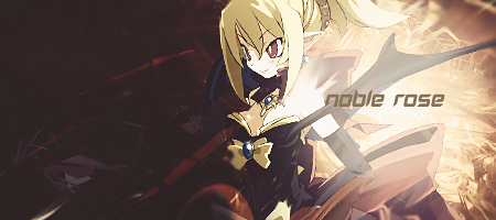
Text (if any): Noble Rose
Other: Could the icon be 150x150?
Finished! Here you are, and I hope you like the results! I did a little bit of experimentation on both parts, so if you want something changed or you aren't happy let me know, but I like it :3
And the icon:

Loki
x
- 6,829
- Posts
- 18
- Years
- Seen Apr 4, 2024
In your latest piece, the left side is really on point-- I like the dark mood and how it meshes nicely with the stock... and the sort of circular outward movement is a really nice touch which would've been even better if it was more noticeable...! But I do think you color adjusted it a little too much- the stock got a little LQ in the process and it's kind of pixelly-- and the transition between dark on the left of the stock and bright on the right is a little too abrupt...! It feels like the right side is a completely different tag from the left. (You can kind of see what I mean if you cover up the bright or dark side with your hand.) I think maybe that really big light source underneath "noble" is partially what's causing the right hand side to be /too/ bright, so maybe if you condense it it'll seem less jarring...! Really good on the flow though, and the light is in all the right places if only just too strong for the overall piece in my opinion!
Tag or icon: Just a tag, please :)
Render/Stock: i1379.photobucket.com/albums/ah122/PokeMew151/kirito_render_d62gm8y_zpsxrqq1btn.png
Colors: Whatever you think will fit best!
Text: BEATER
Other: I'm not experienced with art, so you can basically do whatever with the stock and text if it looks good to you :P
Favorite Piece: "Thoughts" I'm not really sure what I like about it but I like it. It feels like there is a lot going on in the picture (being that the picture is in action), making it something to look at for a good while.
Thanks! :)
Twisted Cuteness
Always a team
- 542
- Posts
- 14
- Years
- Va
- Seen Apr 24, 2016
Thank you so so much for both! I really like them! Thank you for your time!
Circuit
[cd=font-weight: bold; font-style: italic; backgro
- 4,815
- Posts
- 16
- Years
- Berlin
- Seen Jan 6, 2021
Okay, I'm done. If any of them don't fit to what you wanted tell me which, and what is bad and I'll touch it up for you as best as I can! Hopefully you enjoy these though!
One:
Two:
Three:

Circuit
[cd=font-weight: bold; font-style: italic; backgro
- 4,815
- Posts
- 16
- Years
- Berlin
- Seen Jan 6, 2021
Hey, good to see you´re still doing art stuffs!
What you want: Icon and Tag, please.
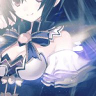
Render/Stock: http://www.renders-graphics.com/image/upload/normal/Sailor_Chibi_Moon_full_1184881_copie.png
Colours (if any): Soft colors
Text (if any): None.
Other: Nothing I can think of. Thanks for your time
Favourite Piece: Majestic Mage. I like the colors as well as the way it looks a tad like paper.
Alrighty here you go!
Enjoy!
Silver Soul of Johto
Journey's end
- 123
- Posts
- 13
- Years
- Seen Apr 10, 2016
What you want: Both, please!!
Render/Stock: http://pre01.deviantart.net/78d0/th/pre/i/2013/049/7/8/blanka_by_tysuyo-d5vd4bl.png
Colours (if any): Artist´s choice!
Text (if any): Blanka
Other:
Favourite Piece: Your Homestuck pieces are so great. I can´t choose! I think those have the best text in my opinion
Render/Stock: http://pre01.deviantart.net/78d0/th/pre/i/2013/049/7/8/blanka_by_tysuyo-d5vd4bl.png
Colours (if any): Artist´s choice!
Text (if any): Blanka
Favourite Piece: Your Homestuck pieces are so great. I can´t choose! I think those have the best text in my opinion
Circuit
[cd=font-weight: bold; font-style: italic; backgro
- 4,815
- Posts
- 16
- Years
- Berlin
- Seen Jan 6, 2021
Tag or icon: Just a tag, please :)
Render/Stock: i1379.photobucket.com/albums/ah122/PokeMew151/kirito_render_d62gm8y_zpsxrqq1btn.png
Colors: Whatever you think will fit best!
Text: BEATER
Other: I'm not experienced with art, so you can basically do whatever with the stock and text if it looks good to you :P
Favorite Piece: "Thoughts" I'm not really sure what I like about it but I like it. It feels like there is a lot going on in the picture (being that the picture is in action), making it something to look at for a good while.
Thanks! :)
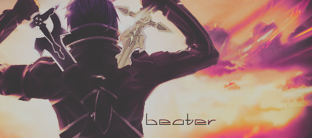
So I'm done. I'm really pleased with the turnout, sadly with this render it's quite hard to get more of a chaotic or active looking tag but I hope you like it nonetheless :D
So I'm done. I'm really pleased with the turnout, sadly with this render it's quite hard to get more of a chaotic or active looking tag but I hope you like it nonetheless :D
It's amazing! The colors you picked are perfect, as none of them are bright/standout-ish which matches Kirito well, and are all blended great. Thank you so much for your time! :)
Circuit
[cd=font-weight: bold; font-style: italic; backgro
- 4,815
- Posts
- 16
- Years
- Berlin
- Seen Jan 6, 2021
What you want: Both, please!!
Render/Stock: http://pre01.deviantart.net/78d0/th/pre/i/2013/049/7/8/blanka_by_tysuyo-d5vd4bl.png
Colours (if any): Artist´s choice!
Text (if any): Blanka
Other:
Favourite Piece: Your Homestuck pieces are so great. I can´t choose! I think those have the best text in my opinion
I'm very sorry, but I'm not actually going to be around to finish this :/ I highly recommend you request from one of the other tag designers here in A&D, since they are also very good :3
Circuit
[cd=font-weight: bold; font-style: italic; backgro
- 4,815
- Posts
- 16
- Years
- Berlin
- Seen Jan 6, 2021
Double post to get this back on the first page for a) easy access and b) to let everyone know I'm active again!
New stuff is on the way, so be patient for that but also requests are opening anew again. My apologies to any waiting members, outstanding requests have not been carried over, so you will have to make a new one. Anyway folks, that's all for now, Aiden out.
New stuff is on the way, so be patient for that but also requests are opening anew again. My apologies to any waiting members, outstanding requests have not been carried over, so you will have to make a new one. Anyway folks, that's all for now, Aiden out.

Pebbles
BE YOUR OWN HERO
- 960
- Posts
- 8
- Years
- in your Heart
- Seen Sep 14, 2016
oh i like your stuff!
and omg i just realised you got a shop just like i wanted mine to be
coding wise
and mods told me it wasn't possible but it is!
imma pm you soon {XD}
and omg i just realised you got a shop just like i wanted mine to be
coding wise
and mods told me it wasn't possible but it is!
imma pm you soon {XD}
Circuit
[cd=font-weight: bold; font-style: italic; backgro
- 4,815
- Posts
- 16
- Years
- Berlin
- Seen Jan 6, 2021
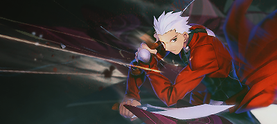
Alrighty. New piece e'rybody. This time featuring Archer from Fate/Stay Night. That's a good anime. Anyway, here it is:
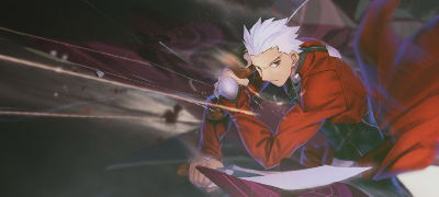
what are your thoughts? I used a lot more c4ds than I normally do, and I also tried messing around more with gradient maps. God I love those things.
what are your thoughts? I used a lot more c4ds than I normally do, and I also tried messing around more with gradient maps. God I love those things.
Circuit
[cd=font-weight: bold; font-style: italic; backgro
- 4,815
- Posts
- 16
- Years
- Berlin
- Seen Jan 6, 2021
Those C4Ds are really well placed and blend in just right. I feel like this is a halfdone job though, the background could use a little more details and certain parts have unexploited potential. Like that C4D touching the swords, you could've used a fractal to make it look like sparks, or the render's back for instance, there's a great depth potential there, something could be surrounding him. There's also light effects missing, the render's blue lights on his borders are a little off, because there's no blue/light whatsoever. Idk how you missed this though, you realized this and used it well on your last request, with the SAO render.
Aight. Cba to make excuses but you're right in that it's unfinished and rushed. Probably me just being lazy since I haven't done this in a while. The SAO render is crappy so don't compare to that.
Got a new one. I realised way too late that the render was chopped off at the side so couldn't be more central, but hey whatevs. Good practise for awkward renders I guesssssss. More c4ds, more blending, more blurring and more gradient maps and blending options. That's the way to my heart I think right there. Just show me tons of gradient maps with different blending options lel.
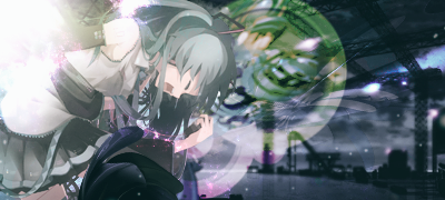
Thoughts?

- 1,542
- Posts
- 16
- Years
- Boston, MA
- Seen Oct 9, 2017
Got a new one. I realised way too late that the render was chopped off at the side so couldn't be more central, but hey whatevs. Good practise for awkward renders I guesssssss. More c4ds, more blending, more blurring and more gradient maps and blending options. That's the way to my heart I think right there. Just show me tons of gradient maps with different blending options lel.
Thoughts?
Ey,
I'd say for sure you have a sense of direction in a lot of your work. Especially the most recent tags. I think this also has depth to it - However, I think you can push it a little further!
I messed with curves and used the sharpen edges filter. I think with the extra sharp quality and a little more contrast with the values, it adds an extra flare(?)
I'm not sure how I feel about the magenta around so much cooler tone colors. If I can come up with a suggestion, I'll you know privately or edit this post. You mentioned the render was cut off - I think maybe cropping that end will help? Not only for the cut off, but it takes its super bright in vlaues. It takes attention away from the rest of your render.
For your previous tag, I did a slight selective coloring - you don't have to follow that, but I thought the color would make the red stand out a little more.
The sharpening might be a little harsh on some spots, but I think you get extra depth with extra sharpening (regular sharpen filter or sharpen edges) and maybe a little more play with the values. Other than that, I think you're in a good direction to playing around with c4ds for effects. I don't disagree for more c4d effects, but I think for practice I like the limitation. I'm a bit rusty, so I can not suggest further on blending options! I hope the suggestions helped!
Pebbles
BE YOUR OWN HERO
- 960
- Posts
- 8
- Years
- in your Heart
- Seen Sep 14, 2016
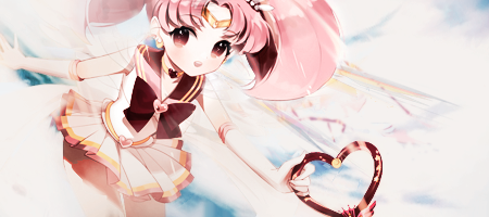
the girl one, like i said before but got told to shut up and post it here, may be kinda confusing for the first two seconds because of the somewhat unique angle you put the render in.
the green and pink don't totally go with the background image in my opinion , the c4d , dark one infront of her seems a bit out of place as well.
the second one with the guy, face area looks a bit on the ''too sharp'' side, the blurry/smudged part between hand and face looks a bit strange.
i like what you did with the guy in the corner like that making it look like he is coming out of that red flow
i think your tags could improve if you tried adding more coloring layers so your stuff stands out even more
would love to see you do text on your tags as well :)