Trainer Jun
Team Rocket Veteran Trainer
- 26
- Posts
- 11
- Years
- Lavaridge
- Seen Feb 16, 2014
I'm sorry, guys! I've been gone for a while...
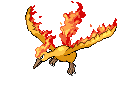
So, to "fix" the visual issue, I'm going to post the sprite in a thumbnail and a link.
This is Retribution's character:

And, if all else fails, here's a link to my album:
http://www.pokecommunity.com/album.php?albumid=8546
So, to "fix" the visual issue, I'm going to post the sprite in a thumbnail and a link.
This is Retribution's character:
And, if all else fails, here's a link to my album:
http://www.pokecommunity.com/album.php?albumid=8546