First of all, it's difficult to learn "the craft" on your own without looking at mapping done right to draw techniques from. Since you're going for a more natural, overgrown look for this town, I'd suggest studying some Hoenn maps to see how they do the natural style, and work from there.
Hoenn's Route 119 is a great map to look at when starting out natural mapping, showing you the basic do's while avoiding the don'ts. Obviously, this map is huge compared to your village, but the principles it demonstrates will scale down well. Some of the maps in the unofficial mapping competitions are also a good source of mapping done right (while some are obviously not). Because they're not the maps that you grew up playing on, you may have an easier time drawing techniques from them, as you won't be caught up on how the maps are "supposed to look". I have a seaside route entry in one of them that is in the natural mapping style that has some elements of overgrowth. Who knows? Maybe you can draw some knowledge from it?
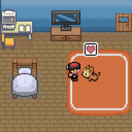
As for your actual map, your tree shadows are wrong, you will most likely have some border issues, and the random bush and three rocks detract from the map in my opinion. On the right, where you have the rock and bush, you're missing the top to that tree. You're also missing a treetop on the bottom where the Secret Base tree is on top of a border tree. Oh, and on the bottom right with that flower. Your flowers are placed strangely. In general, flowers should be two in a group and situated diagonally from each other. They also tend to not look great when directly adjacent to tall grass tiles. You're using Secret Base trees here which is fine if you don't plan on using the Secret Base feature, but if you are you may want to get rid of those in favor of the normal trees. Might I suggest, instead of using the tall grass as decoration, you steal the grass tiles from Verdanturf town and use those instead? Tall grass in a town (even if it doesn't have any Pokemon in it) tends to look weird to most of us, but this is a style choice on your part. If you keep the tall grass, you should rethink the placement. Just dropping them randomly doesn't look good and causes the map to feel scattered and cluttered (this goes for routes too!). Try to keep them in clumps. Not using the default houses here would also improve the map immensely, but thank you for putting windows in the houses. So many newbies neglect windows and their houses are all awful. You may want to expand the size of the map just a smidge to give you more room to play with this, as I can tell the small size stifled you a bit. Making the map slightly bigger will also allow you to place the details (like your tall grass and flowers and such) correctly, and in a way that is aesthetically pleasing.
I can tell you have talent just by looking at this map though! And I know that if you put a little more time into it and studied up on how GameFreak itself uses this theme and tiles in their own maps, your second try will be 10x better than this.
Also, though you said you weren't looking at other maps, I would caution you anyway against taking a lot of the advice you'll see around the Map Rating and Review Thread, as that's mostly the-blind-leading-the-blind. Many people will just go "10/10 I like it" on horrible maps so that they can post their own horrible maps (you need to rate another map before you can post your own). If you see someone post a map that is undeniably good, that's your queue to read that person's rating of the map before theirs. Otherwise, ignore anything you see in there. Seriously.
EDIT: I found the post where I critiqued all of the entries in one of the mapping competitions. You may want to look at it and the maps I'm talking about to get a general sense of what does and doesn't make a good map. Many of the maps in the competition that month focused on natural mapping, so you could pick up some style tips too.
This is the post.