• Our software update is now concluded. You will need to reset your password to log in. In order to do this, you will have to click "Log in" in the top right corner and then "Forgot your password?".
  • Welcome to PokéCommunity! Register now and join one of the best fan communities on the 'net to talk Pokémon and more! We are not affiliated with The Pokémon Company or Nintendo.

Diamond, Pearl and Platinum style fake card corner.

55
Posts
9
Years
    • Seen Feb 18, 2021
    So it seems this forum section isn't too active. Oh well I'll see how it goes anyway.

    Credits for images and resources:
    Templates: Nod3rator; Metagross101
    Artwork: Pancham: xous54, Background Kagomechan23 | Pangoro Flows-Backgrounds | Pangoro Lv. X TheAngryAron, background mirani97
    Symbol Sheet: PKMNCardMaker264, aschefield101

    Now that's out of the way, I've started off by doing Pancham, Pangoro and Pangoro Lv. X. If anyone objects to the use of images please let me know. Feedback is more than welcome.

    pancham5luu2.png


    pangorox9uqi.png


    pangoro-xuhu27.png
     
    22,953
    Posts
    19
    Years
  • Fair warning: I'm not a Photoshop wiz by any means, but I'll be basing these off of how they look compared to other DP era cards, as well as attack text and balance from the DPPt era.

    Your text spacing for the attacks is not big enough on the cards where there's room for spacing.

    Take a look at Charizard here, for instance:
    Spoiler:


    Notice how much room is between the two attacks? Quite a bit. Pancham has some good spacing between the two attacks, but on Pangoro that needs to be fixed.

    Pancham's first attack, however, sits too close to the picture box. Empoleon, for comparison:

    Spoiler:


    Notice how there's slightly more space between the first attack and the picture? I want you to emulate that.

    Also, Pangoro Lv. X is lacking holofoil in the picture, which is something every Lv. X card has. And the "busting out" portion on the Pangoro Lv. X needs some work, as it looks quite plain compared with Lv. X cards and basically looks shoehorned in. The "busting out" portion also covers some of the text of the PokeBody for Pangoro, so the PokeBody text needs to be shifted down some.

    Also, for Brick Break it should be "1 Energy", not "one energy".

    Just things that stuck out to me tonight.

    What font are you using? I may have some tips for that.
     
    55
    Posts
    9
    Years
    • Seen Feb 18, 2021
    Thank for the constructive criticism :D

    The font I use are the derivatives of Gill Sans MT.

    As for the problems with Pangoro Lv. X, I accidentally flattened and saved the layered .pdn file, so there was a limit to what I could do without starting over. Holofoil wise, how would I achieve that affect?

    Issues with wording, it's a long time since I played it so I am a bit rusty on the correct terms.

    I do intend to return to these cards and improve them when I get better at it.
     

    icycatelf

    Alex
    3,558
    Posts
    19
    Years
  • Yay! Glad to see another faker posting in this subforum!

    Are these your first image fakes? Not bad at all! The only major issue I see are the fonts. These are what you should be using along with the settings (other than font size, as those vary with blank size). They may not be 100% accurate, but they seemed pretty darn close when I typed over an official DPPt card.

    Pokémon Name: Gill Sans Condensed (Bold; Smooth rendering; -20 tracking; 99% height; 102% width)
    There should be a space after the name with -200 tracking and 97% width
    Level (the "L"): Futura LT ExtraBold (Smooth rendering; 80% width)
    Level (the "V"): Futura LT ExtraBold (Smooth rendering; 80 tracking; 80% width)
    Level (the "."): Futura LT ExtraBold (Smooth rendering; -40 tracking; 80% width)
    Level (the numbers): Futura LT ExtraBold (Smooth rendering; -60 tracking; 64% width)
    HP (the "H"): Futura LT ExtraBold (Smooth rendering; 80% width)
    HP (the "P"): Futura LT ExtraBold (Smooth rendering; 140 tracking; 80% width)
    HP (the numbers): Futura LT Medium (Bold; Smooth rendering)
    Evolves/Levels-up from: Futura LT Medium (Bold Italic; Smooth rendering; 99% width)
    Stats: Frutiger CE 55 Roman (Smooth rendering; 102% width)
    Attack/Power names: Gill Sans Condensed (Bold; Smooth rendering; 95% width)
    Attack/Power effects: Gill Sans (Smooth rendering; 88% width)
    Damage (the numbers): Futura LT Medium (Bold; Smooth rendering; 101% width)
    Damage (the modifier): Futura LT Medium (Smooth rendering)
    If you use a damage modifier, be sure to set the tracking of the modifier and the last digit to 20
    Description/Flavour: Sanvito (Smooth rendering; 101% width; Faux Italic)
    Only put descriptions/flavour on DPPt blanks with the thin bar below the attacks.
    Illustrator: Futura LT Medium (Italic; Smooth rendering)
    Weakness/Resistance (the modifier): Futura LT Medium (Bold; Smooth rendering; -40 tracking; 2px baseline)
    Weakness/Resistance (the numbers): Futura LT Medium (Bold; Smooth rendering; -40 tracking; 98% width; 1px baseline)
    Set Number: Futura LT Medium (Bold Italic; Smooth rendering)

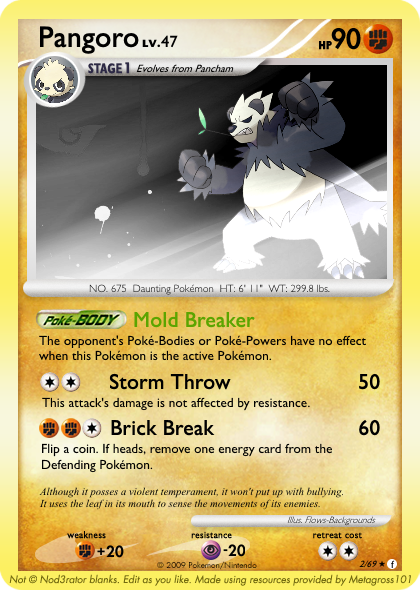
    I used these settings on this card:
    Spoiler:


    As for holofoil, you'd need to download a holo sheet and apply it to the image background using blending modes (usually Multiply 40-70% under Dodge 70-100%). It's easier to apply a holo sheet if the Pokémon and background are separate layers, but if they aren't, you have to use the Lasso Tool to cut out the part that covers the Pokémon. I prefer applying holo sheets in GIMP as opposed to Photoshop. Seems like they blend better in GIMP, imo.
     
    Last edited:
    55
    Posts
    9
    Years
    • Seen Feb 18, 2021
    I did do some fakes, but these were 5+ years ago, and I didn't have the skill with paint.net I do now.

    I can't set font width on Paint.Net, this would have to be done by stretching the text to fit.

    The HP and weakness/resistance values are copied from a resource sheet found on deviantART.

    Holosheet - on all except the LV.X card I have them layered, (I accidentally saved over the Lv.X card).

    Anyway, I'll make some more tomorrow and see what I can do.
     

    icycatelf

    Alex
    3,558
    Posts
    19
    Years
  • It's hard to make accurate fakes without being able to set width and such, but you could get by with just using the fonts I listed without the settings.

    Yeah, those look fine. I just listed all the details rather than only the incorrect ones.

    You can still apply a holo sheet even if you have already merged your layers. A little more cutting is involved, though.

    Keep it up! Practice makes perfect. :)
     
    Back
    Top