Now, my maps!
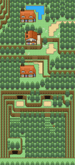
Name: Palmetto Town
Game: Fire Red
Comments: This is the second map I've ever made. And my first attempt at a town. :)
Mapshot:
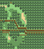
Name: Route 1
Game: Fire Red
Comments: This is my first map! I hope you'll like it. Tell me where to improve and such. :))
Mapshot:
I can honestly say that I'm very impressed. Your first two maps turned out quite well in comparison to many others I've seen. Either you have a knack for this sort of thing, have studied good maps in this thread or in game, or both.
Now for your rates.
Palmetto Town:
The structure itself is nice. However, it is a bit bland. I know that this is most likely the starting town, but you may want to experiment a bit to add some more variety. Perhaps this town could have a small gimmick? Something that sets it apart from the others. Like how Cianwood was the "island town", Fuschia the "Safari Zone town". Of course, it doesn't have to be this drastic. Maybe this town has some more height variety in it? I see your lab is on a higher elevation than the rest of the town. Maybe put the houses in an even lower elevation by making a crater around them? Of course, whatever you come up with to make it a little less bland would be fine. Experiment! That's how you improve!
Your tree shadows are off. Actually, you haven't used them at all. In the stock Firered maps, you'll notice that trees in groups among other trees have a darker background shadow then the ones you've used. In the default tileset 0, they should be right next to the tree with no shadows that you've used for this map.
Your flower placement is good. Beginners seem to plop them down anywhere, but you have some structure there. Good flower placement takes practice. Though I can't say that you've done it "wrong" in this instance, I can say there's room for improvement. Flower placement is also an important piece of the removing blandness process. It's difficult to give advice on exact flower placement with a map like this and the job you've already done. No blaring errors, but to me they're very uninteresting. Experiment, again. I could be completely wrong!
I can appreciate the "flow" of this map. Mostly because your pathing is done very well. My gripe is that they don't connect near the Trainer Tips sign, when there's no reason for them not to. It is a very rare occasion that Nintendo made maps have paths that don't connect so obviously and directly. Also, a tile error was created by how you decided to do the paths to the left of the houses. To the left of those house tiles below the roofs there are like 1 or 2 pixels worth of regular grass there. A solution would be to wind the path border around the house and have it end normally, without reaching under the house of overlapping with it at all, in front of the doors. This is usually the preferred method of pathing, but style and preference can affect this. Try it out! If it doesn't mesh right with you, block edit and fix the tile error.
You filled space very well, but there seems to still be a lot of empty, useless space left. Many comments warn against unnecessarily restricting the player's movement. And those comments are absolutely right, when the player is
restricted from going where they need or are supposed to go. You needn't worry about compressing the available, walkable space in your maps as long as the player isn't squash or restricted to incredibly narrow or difficult to traverse paths. To that effect, more trees could be placed in that empty expanse of grass towards the bottom off your map, to the left of the path. Also, to the left of the northernmost red house near the mountain could use similar treatment, as it is also empty. Filling in empty space actually adds to a map's playability if done correctly. A balance should be maintained, and practice will dictate when to leave space empty and when and how much to fill it in. For future reference "cramping in" a town sometimes gives it a quaint, rugged feel which does much for the atmosphere of the map if done right. Again, that takes practice and experimentation.
You will have border errors near the lab with the set up you have now. Consider expanding the map to avoid that.
Just as a side, before I forget and move on, your mountains were very good. Natural without being excessive.
Route 1:
Again, great for a first map. However, some improvements and fixes could be made.
Like the last map, you've not used tree shadows. Simple fix, as it is with the absent shadows in Palmetto Town.
You have a mandatory one-tile pathway towards the upper right. That is the kind of cramping and space filling that destroys playability. In that area, you might want to keep the available walking space to three spaces at all times. The reason I say this is that that area will most likely be the player's first impression of that route. As it is now, no matter how open the rest of the map is, the player will feel like the entire map is cramped and restrictive. Those first areas are important to maintain a good feel and flavor to a map. You know what they say about first impressions.
Your grass placement leaves something to be desired. Like flower placement, it is difficult to nail down advice for this sort of thing. I'd say, confine your wild grass to well defined areas. Try to keep it natural, occasional "bald spots" or patches are fine, but don't overdo it. Make sure that the player has respite in between your well defined clumps of grass where wild battles aren't possible. These don't have to be long stretches of your routes, but it is important to have small areas without wild grass, even if it's only a couple tiles big, separating your larger clumps. As an aside, these spots are perfect to put trainers in.
Again, you've followed the basic guidelines for flower placement, but in this case it is a bit excessive. Cut down on some, perhaps even a majority of those flowers. In natural, windy styled maps like this one, it's incredibly easy to overdo the flowers. With practice, you'll learn how to balance the placement and amount of flowers you put in with the size and available space in a map. Generally, flowers in the bald patches of wild grass aren't too appealing aesthetically. But that is opinion. Again, experimentation is key.
Tree placement is good, mountains are again good. There's always room for improvement however. Practice makes perfect.
I like your lake and waterfall. It adds some scenery and a more interesting boundary than the trees you could've put in that spot. You may consider putting an item ball only accessible with surf or waterfall here, just as an extra.
That ledge prevents backtracking. Unless that is your intention, consider removing it or opening a part of it up. Though keep in mind the first impression and one tile path rule when doing so. Ledges are a great way to show differences in elevation in combination with, or even without mountain tiles. That may be a good thing for a beginner such as yourself to experiment with. Downhill slopes are perfectly illustrated by ledges, and when done right add a professional touch to a map and increases playability.
---
Overall, these maps are very good when considering they're your firsts. You obviously have some talent with mapping, and with these as your early forays, you're bound to become truly great. Practice and experimentation are key to developing your skills as a mapper. Keep it up, I look forward to seeing some more of your maps in the future!