• Our software update is now concluded. You will need to reset your password to log in. In order to do this, you will have to click "Log in" in the top right corner and then "Forgot your password?".
  • Welcome to PokéCommunity! Register now and join one of the best fan communities on the 'net to talk Pokémon and more! We are not affiliated with The Pokémon Company or Nintendo.

Map Showcase and Review Thread

Status
Not open for further replies.

ppooookkkkkkk

Banned
229
Posts
11
Years
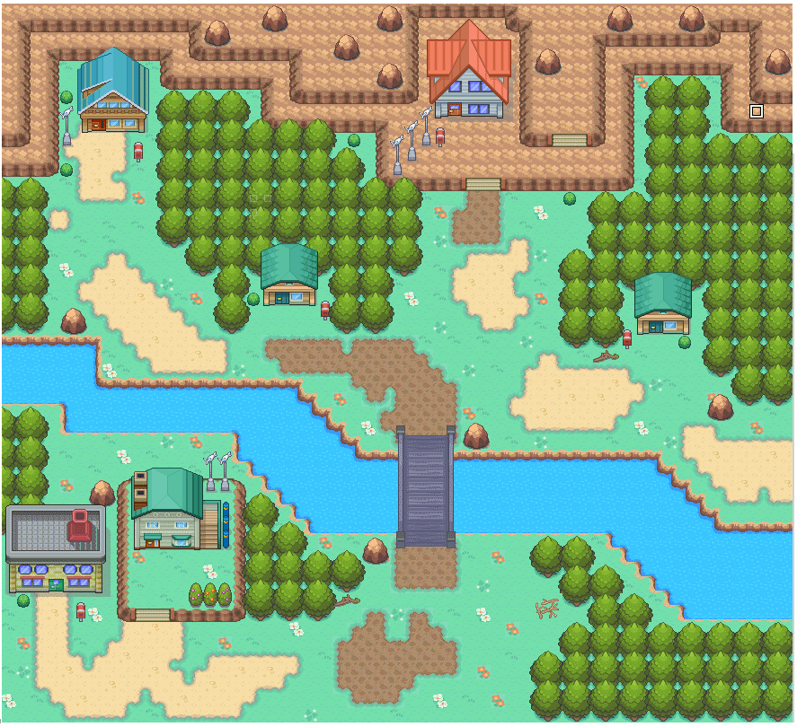
I revised my games starting town as I've started the mapping and eventing from scratch.


pokemon_morning_night_newbud_town__revised_by_ahmad2334-d6e00u2.png
 

Arma

The Hyena
1,688
Posts
14
Years
The layout is nice, however, there are a few things you should work on, pook.
The water looks really bad, like you just drew a rectangle across the map. The right side of the town is a bit empty... fill it up with trees or a pond. The few trees near the exit look a bit lonely. .. a few more above them will make things look more natural.
Hope this helps you!
 

Harvey_Create

Pokemon Apex Team Member
187
Posts
11
Years
  • Age 27
  • Iowa
  • Seen Jul 12, 2015
Here is the starter town for my personal game (yet to have a permanent name. for now its Pokemon Zentro)
Spoiler:


The top left house is the Players.
 
189
Posts
14
Years
  • Seen Nov 23, 2023
Harvey, that map looks great! The tiles look wonderful and the mapping itself is also very well done. There's a very clear sense of direction amongst the paths, and it perfectly balances the need to like the area has been cleared for inhabitants and the sin of making it too square. It reminds me of my own maps. 9/10.

I do, however, have a couple of point to make: first, those stairs in the Northwest, while drawn on the correct angle (something many maps miss), defy the laws of physics. The cliff is two tiles high and yet the stairs only descend by one to reach the bottom. You should have another "layer" of stairs as it were, either cutting into the top part of the cliff on the left or extending beyond the cliff on the right. Either option means you'll have to redo the paths on that side though.

Secondly, The mass of trees at the Southeast that are shifted one tile left; in small doses, like the couple of trees near the lab (?) and on the clifftop it looks okay, but in such a large mass like that it is quite jarring. I'd recommend aligning them with the rest of the trees or inserting a cliff or the like to break up that seam.
 

ppooookkkkkkk

Banned
229
Posts
11
Years
Harvey, that map looks great! The tiles look wonderful and the mapping itself is also very well done. There's a very clear sense of direction amongst the paths, and it perfectly balances the need to like the area has been cleared for inhabitants and the sin of making it too square. It reminds me of my own maps. 9/10.

I do, however, have a couple of point to make: first, those stairs in the Northwest, while drawn on the correct angle (something many maps miss), defy the laws of physics. The cliff is two tiles high and yet the stairs only descend by one to reach the bottom. You should have another "layer" of stairs as it were, either cutting into the top part of the cliff on the left or extending beyond the cliff on the right. Either option means you'll have to redo the paths on that side though.

Secondly, The mass of trees at the Southeast that are shifted one tile left; in small doses, like the couple of trees near the lab (?) and on the clifftop it looks okay, but in such a large mass like that it is quite jarring. I'd recommend aligning them with the rest of the trees or inserting a cliff or the like to break up that seam.

Hey dude would you review mine?
(I've changed the sand path tile as well as the color of the trees. Besides the layout)
pokemon_morning_night_newbud_town__revised_by_ahmad2334-d6e00u2.png
 

Harvey_Create

Pokemon Apex Team Member
187
Posts
11
Years
  • Age 27
  • Iowa
  • Seen Jul 12, 2015
Hey dude would you review mine?
(I've changed the sand path tile as well as the color of the trees. Besides the layout)
pokemon_morning_night_newbud_town__revised_by_ahmad2334-d6e00u2.png

Your map looks better. I still suggest adding in some cliff to add more dimension to the town.
The trees on the exit are a little thin. also try altering the placement of the trees. makes it less uniform and more natural.
That river down at the bottom is looking better. I think its a little long, but yeah.
This map will look loads better with Overworlds running around in it!

Harvey, that map looks great! The tiles look wonderful and the mapping itself is also very well done. There's a very clear sense of direction amongst the paths, and it perfectly balances the need to like the area has been cleared for inhabitants and the sin of making it too square. It reminds me of my own maps. 9/10.

I do, however, have a couple of point to make: first, those stairs in the Northwest, while drawn on the correct angle (something many maps miss), defy the laws of physics. The cliff is two tiles high and yet the stairs only descend by one to reach the bottom. You should have another "layer" of stairs as it were, either cutting into the top part of the cliff on the left or extending beyond the cliff on the right. Either option means you'll have to redo the paths on that side though.

Secondly, The mass of trees at the Southeast that are shifted one tile left; in small doses, like the couple of trees near the lab (?) and on the clifftop it looks okay, but in such a large mass like that it is quite jarring. I'd recommend aligning them with the rest of the trees or inserting a cliff or the like to break up that seam.

I shall attempt to draw a 2 tile staircase. i didn't think about that while putting that one together. Haha
As for the clump of trees off by one tile, i meant that. i also forgot to add my more natural look with the trees , so its technically unfinished. I have updated it a bit, but will work on those things, and post a new map soon!
 
Last edited:
189
Posts
14
Years
  • Seen Nov 23, 2023
ppooookkkkkk: I've attached an image below for clarity. Yellow denotes appropriate paths. Orage denotes places where trees should be added, save for that single circled tree near the bottom left house, whichc should be removed. Red denotes the area of the water; if the player is supposed to go somewhere on it, use the full outline; if not, use the dotted outline.

Spoiler:


Harvey: just to be clear, when I say a two-tile stair case, I mean like the following:

Code:
           _
  |        \| 
  \        \\ 
  \\        \
  |[U]\[/U]  Or    |
Though the first would be easier to make.
 

Harvey_Create

Pokemon Apex Team Member
187
Posts
11
Years
  • Age 27
  • Iowa
  • Seen Jul 12, 2015
Harvey: just to be clear, when I say a two-tile stair case, I mean like the following:
Code:
           _
  |        \| 
  \        \\ 
  \\        \
  |[U]\[/U]  Or    |
Though the first would be easier to make.

I sprited out a better staircase.
azdi5c.png

It needs tweaking abit.
I have events set on them, so if tyour on the the mountain, the middle part of the stairs will make you walk diagnally down and over, and the vise versa for bottom. Making it look as though you actually are using the stairs correctly. Haha. I dont remember who told me to do that. I also added another cliff to give the town more dimension.

Hey dude would you review mine?
(I've changed the sand path tile as well as the color of the trees. Besides the layout)
pokemon_morning_night_newbud_town__revised_by_ahmad2334-d6e00u2.png

Here is a basic remake of your map(So i could show you what I meant in all of my posts, that way, you could apply them better.
Spoiler:


As you can see, i am using my tiles, and dont have the benches or trash bins. (im still working on my set, so yea.


Here is what I would do, keeping you basic layout of the map
Spoiler:

I added a cliff, added more trees, and made the river wider. I dont have a north stair tiles sprited out yet, but those planks are a basic idea of stairs. I personally like to add cliffs in all my maps(Not just just my cliff tiles look cool) because it adds more detail, and demension, breaks up large clumps of emptiness, and trees. I hope you can take my advise, and use it to your Advantage.
 
Last edited:

ppooookkkkkkk

Banned
229
Posts
11
Years
ppooookkkkkk: I've attached an image below for clarity. Yellow denotes appropriate paths. Orage denotes places where trees should be added, save for that single circled tree near the bottom left house, whichc should be removed. Red denotes the area of the water; if the player is supposed to go somewhere on it, use the full outline; if not, use the dotted outline.

Spoiler:


Harvey: just to be clear, when I say a two-tile stair case, I mean like the following:

Code:
           _
  |        \| 
  \        \\ 
  \\        \
  |[U]\[/U]  Or    |
Though the first would be easier to make.

I sprited out a better staircase.
azdi5c.png

It needs tweaking abit.
I have events set on them, so if tyour on the the mountain, the middle part of the stairs will make you walk diagnally down and over, and the vise versa for bottom. Making it look as though you actually are using the stairs correctly. Haha. I dont remember who told me to do that. I also added another cliff to give the town more dimension.


Here is a basic remake of your map(So i could show you what I meant in all of my posts, that way, you could apply them better.
Spoiler:


As you can see, i am using my tiles, and dont have the benches or trash bins. (im still working on my set, so yea.


Here is what I would do, keeping you basic layout of the map
Spoiler:

I added a cliff, added more trees, and made the river wider. I dont have a north stair tiles sprited out yet, but those planks are a basic idea of stairs. I personally like to add cliffs in all my maps(Not just just my cliff tiles look cool) because it adds more detail, and demension, breaks up large clumps of emptiness, and trees. I hope you can take my advise, and use it to your Advantage.

Thank you guys I will surely follow your advices, jim just one thing; I don't need to add trees on top of yhe map is it is going to be connected with route 1.
 

Harvey_Create

Pokemon Apex Team Member
187
Posts
11
Years
  • Age 27
  • Iowa
  • Seen Jul 12, 2015
Thank you guys I will surely follow your advices, jim just one thing; I don't need to add trees on top of yhe map is it is going to be connected with route 1.

If you Connect the maps correctly, in the Editor.exe, and map the route1 correct, you will have seemless maps. Just go to your route 1, and add the rest of the tree
 

Whitney's Shaymin

Creator Of Pokemon Grace
596
Posts
12
Years
Here is a sketch of what my starting town will look like. I know I need to do something special with it but I don't know what it is. Helpful criticism would be nice! (Yes I know it's very plain thank you)

2afwvwo.png
 

Harvey_Create

Pokemon Apex Team Member
187
Posts
11
Years
  • Age 27
  • Iowa
  • Seen Jul 12, 2015
Here is a sketch of what my starting town will look like. I know I need to do something special with it but I don't know what it is. Helpful criticism would be nice!

2afwvwo.png

Take a look at a couple of my last posts here. Make your town a bit less linear, and closer together. add some flowers and maybe a bench or 2. And some lamps
 
55
Posts
10
Years
  • Seen Jul 21, 2015
Hey this was going to be the starter town of my fan game, but i'm restarting it, so yeah.
Comments and critique is really appreciated! :)

birchleaf_town_by_0_rufus-d6ddmx5.png
 
378
Posts
10
Years
  • Seen Oct 18, 2017
Hey this was going to be the starter town of my fan game, but i'm restarting it, so yeah.
Comments and critique is really appreciated! :)

birchleaf_town_by_0_rufus-d6ddmx5.png

Personally, I like it! Of course, I am not an experienced mapper at all, but from just a quick glance, it looks great!
 

Harvey_Create

Pokemon Apex Team Member
187
Posts
11
Years
  • Age 27
  • Iowa
  • Seen Jul 12, 2015
Hey this was going to be the starter town of my fan game, but i'm restarting it, so yeah.
Comments and critique is really appreciated! :)

birchleaf_town_by_0_rufus-d6ddmx5.png

Your map is good, but EXTREMLLY open, and has no border for half the map. try condensing the size a bit, and make sure there is a 3 tree border around the map. Or since you have mountains, 6 tiles thick for a border.
 
55
Posts
10
Years
  • Seen Jul 21, 2015
Personally, I like it! Of course, I am not an experienced mapper at all, but from just a quick glance, it looks great!

Thanks! :)

Your map is good, but EXTREMLLY open, and has no border for half the map. try condensing the size a bit, and make sure there is a 3 tree border around the map. Or since you have mountains, 6 tiles thick for a border.

Thanks! At first i was going to have about 3 entrances into the town, hence the no border thing. I decided not to. I'll have your advice in mind whenever i'm creating my new starter town though! :)
 

Harvey_Create

Pokemon Apex Team Member
187
Posts
11
Years
  • Age 27
  • Iowa
  • Seen Jul 12, 2015
Thanks! :)


Thanks! At first i was going to have about 3 entrances into the town, hence the no border thing. I decided not to. I'll have your advice in mind whenever i'm creating my new starter town though! :)

No problem. If you can, upload multiple versions of the map. Dont worry about us not like it. I am am mapper and i see all potential in maps, so i never think they are bad. with starter towns, i recommend about 30x30 maps.
 

Wootius

Glah
300
Posts
11
Years
  • Seen May 31, 2022
As one can tell, I am not the world's best mapper. But I try. Pallet town, will probably get rid of the 3D homes and add jaggles to the terribly straight ocean cliff. Oak's reserve is small now because I hope to expand it via an Investment system.

Spoiler:


pokemoner2500, don't be afraid of adding things. Add a bike/minigarden beside homes. Trees don't have to be straight lines. The lamps are an example of what I'm talking about, but instead of anchoring them to the left sides of buildings use them on road corners. That'll alternate them a bit and let you show off layer 3 usage.
 
Status
Not open for further replies.
Back
Top