Aquacorde
⟡ dig down, dig down ⟡
- 12,507
- Posts
- 19
- Years
- he/him
- Ankh-Morpork
- Seen yesterday
hi I'm Anna I do graphic manipulation sometimes and photography and other things? i most likely wont post a ton until i really get in the mood to play with things. i will make this good later probably
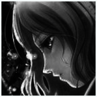
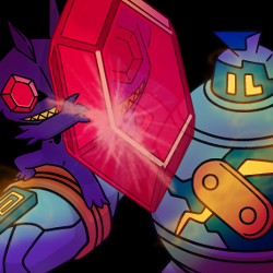
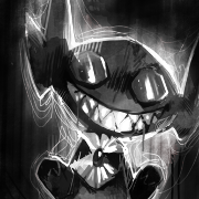
GRAPHICS NONSENSE // 2015

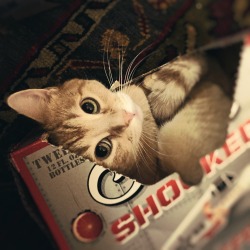
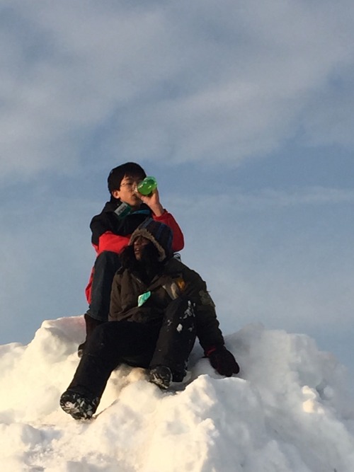
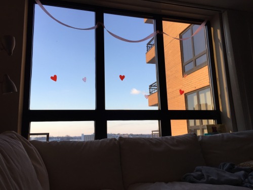
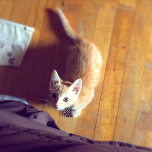
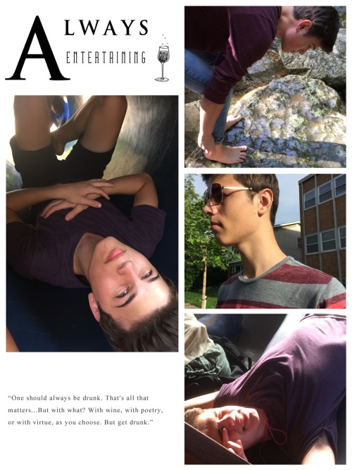
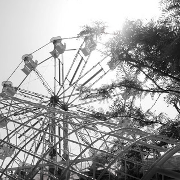
IPHONE PHOTOGRAPHY // FEB - JUNE 2015

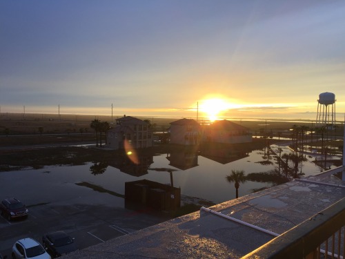


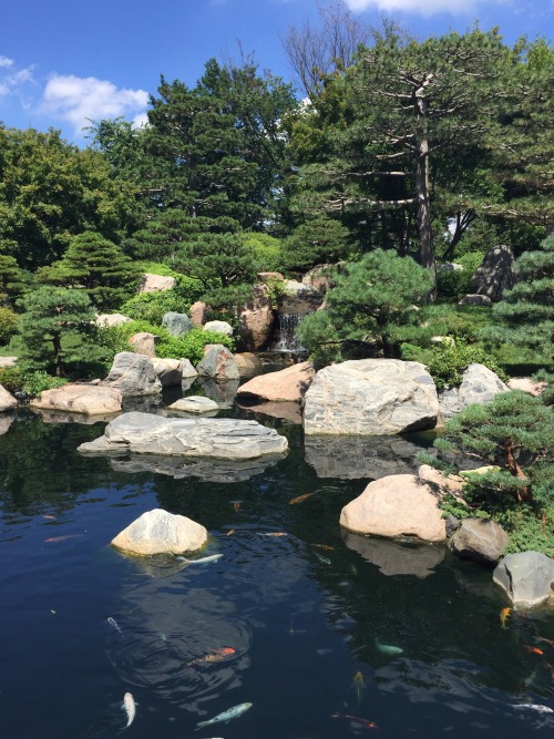
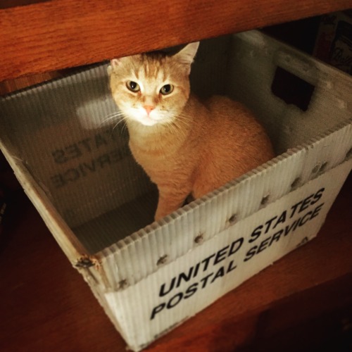
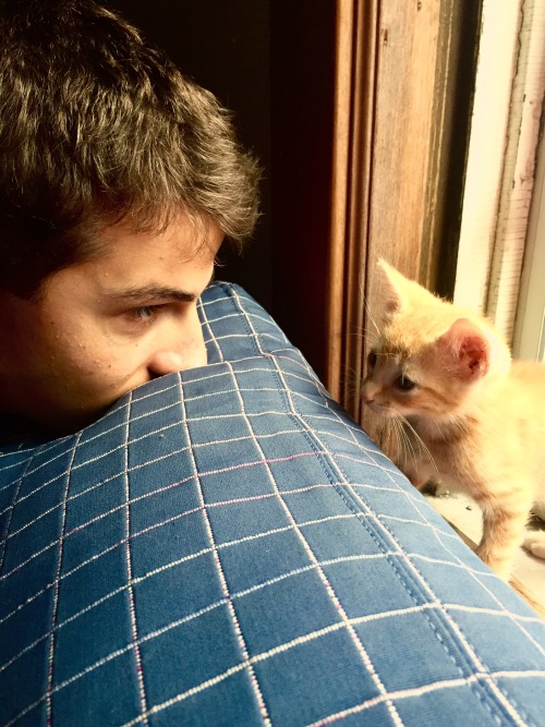
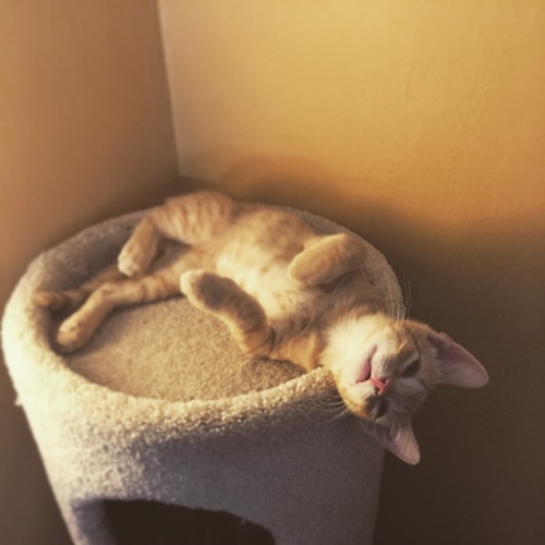
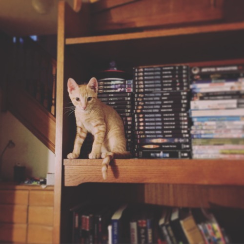
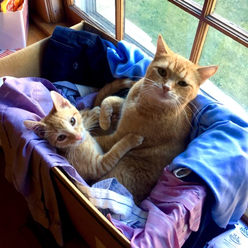
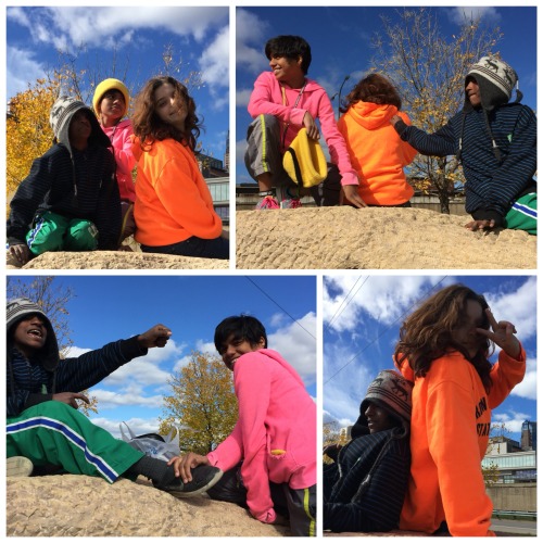
IPHONE PHOTOGRAPHY // JULY ONWARD 2015


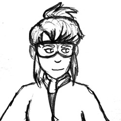
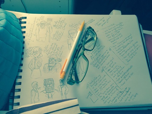
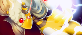
TRADITIONAL ICONS // 2011 - 2014


 http://www.pixiv.net/member_illust.php?mode=medium&illust_id=41876543
  http://www.pixiv.net/member_illust.php?mode=medium&illust_id=39994030
  http://www.pixiv.net/member_illust.php?mode=medium&illust_id=40850302
  http://www.magic4walls.com/wallpape...hy-muscle-cars-turkey-ford-mustang-17324.html
  http://zemotion.deviantart.com/art/Waltz-61973149
  http://www.pixiv.net/member_illust.php?mode=medium&illust_id=40014874
  http://www.pixiv.net/member_illust.php?mode=medium&illust_id=18610493
  http://img.booru.org/drawfriends//images/16/65a696e07ff92b8ca1ede7ae9f6f46a06767bff2.png
  http://beautifulsouthasianbrides.tumblr.com/post/79271628823/mu-by-noor-zara
  https://www.behance.net/gallery/we-are-all-made-of-stars/14269093
130x130 & UP // 2014
 http://www.pixiv.net/member_illust.php?mode=medium&illust_id=39311477
  http://www.pixiv.net/member_illust.php?mode=medium&illust_id=16247930
  http://www.pixiv.net/member_illust.php?mode=medium&illust_id=24792808
 http://www.pixiv.net/member_illust.php?mode=medium&illust_id=25532538
  http://userserve-ak.last.fm/serve/_/95589749/Ariana+Grande+1506420_717499611606357_116267.png
  http://www.pixiv.net/member_illust.php?mode=medium&illust_id=7379063
  http://hdwallpapersbase.com/wp-content/uploads/2013/01/Treasure-Planet-disney-wallpapers-.jpg
  http://img1.wikia.nocookie.net/__cb20110719005751/namco/images/1/17/SRTEFEXiaomu.png
  http://alternative-pokemon-art.tumb...artist-a-beautiful-picture-of-wallace-and-his
  http://luniy.tumblr.com/post/81071927425
  http://deeralice.tumblr.com/post/82397877030/musee-du-chocolat-coordination-for-enchanted-event
 http://www.pixiv.net/member_illust.php?mode=medium&illust_id=20873189
TAGS & THINGS // 2010 - 2014


 http://www.pixiv.net/member_illust.php?mode=medium&illust_id=41559544

 http://www.pixiv.net/member_illust.php?mode=medium&illust_id=7227802
 http://www.pixiv.net/member_illust.php?mode=medium&illust_id=36827474
 http://www.pixiv.net/member_illust.php?mode=medium&illust_id=37207257
 http://www.pixiv.net/member_illust.php?mode=medium&illust_id=40117344
 http://starexorcist.tumblr.com/post/82822218274/gavins-heist-was-a-good-one
 https://41.media.tumblr.com/af57b9a5115961ce228fbf5245e40d18/tumblr_ne1vp4rLKh1t3b7nvo1_1280.jpg
 http://www.pixiv.net/member_illust.php?mode=medium&illust_id=39979372

thanks for lookin :D
GRAPHICS NONSENSE // 2015
Spoiler:
IPHONE PHOTOGRAPHY // FEB - JUNE 2015
Spoiler:
IPHONE PHOTOGRAPHY // JULY ONWARD 2015
Spoiler:
TRADITIONAL ICONS // 2011 - 2014
Spoiler:
 http://img.booru.org/drawfriends//images/16/65a696e07ff92b8ca1ede7ae9f6f46a06767bff2.png
 130x130 & UP // 2014
Spoiler:
http://www.pixiv.net/member_illust.php?mode=medium&illust_id=39311477 http://www.pixiv.net/member_illust.php?mode=medium&illust_id=16247930 http://www.pixiv.net/member_illust.php?mode=medium&illust_id=24792808http://www.pixiv.net/member_illust.php?mode=medium&illust_id=25532538  http://userserve-ak.last.fm/serve/_/95589749/Ariana+Grande+1506420_717499611606357_116267.png http://www.pixiv.net/member_illust.php?mode=medium&illust_id=7379063
  http://hdwallpapersbase.com/wp-content/uploads/2013/01/Treasure-Planet-disney-wallpapers-.jpg
  http://img1.wikia.nocookie.net/__cb20110719005751/namco/images/1/17/SRTEFEXiaomu.png http://alternative-pokemon-art.tumb...artist-a-beautiful-picture-of-wallace-and-his http://luniy.tumblr.com/post/81071927425 http://deeralice.tumblr.com/post/82397877030/musee-du-chocolat-coordination-for-enchanted-eventhttp://www.pixiv.net/member_illust.php?mode=medium&illust_id=20873189
TAGS & THINGS // 2010 - 2014
Spoiler:
http://www.pixiv.net/member_illust.php?mode=medium&illust_id=41559544http://www.pixiv.net/member_illust.php?mode=medium&illust_id=7227802http://www.pixiv.net/member_illust.php?mode=medium&illust_id=36827474http://www.pixiv.net/member_illust.php?mode=medium&illust_id=37207257http://www.pixiv.net/member_illust.php?mode=medium&illust_id=40117344http://starexorcist.tumblr.com/post/82822218274/gavins-heist-was-a-good-one https://41.media.tumblr.com/af57b9a5115961ce228fbf5245e40d18/tumblr_ne1vp4rLKh1t3b7nvo1_1280.jpghttp://www.pixiv.net/member_illust.php?mode=medium&illust_id=39979372
thanks for lookin :D