So after reading the rules I am still a bit hazy about some things so I hope I'm doing this right. I would like some feedback on something i made for an upcoming Lets Play to tweak it and make it perfect. Its not really a gallery since there is one image, and I hope to promote discussion with it so I hope the tag is appropriate. Without further ado, the image!

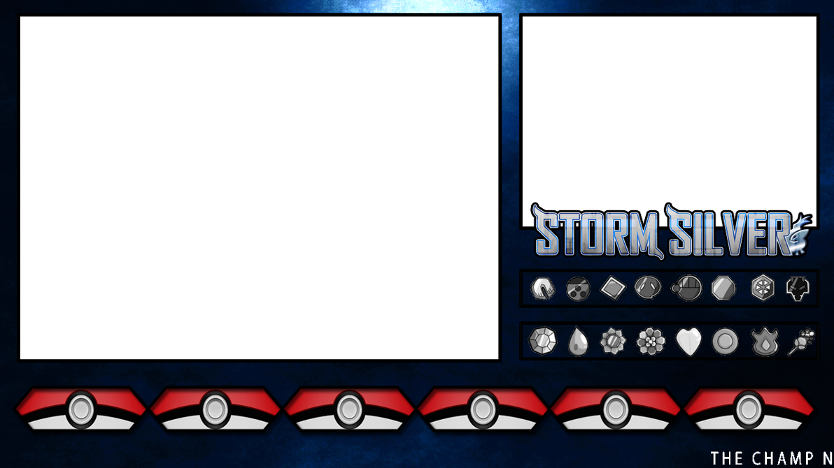
The Layout:
The thumbnail:
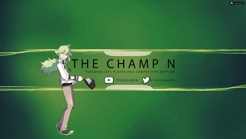
and the YouTube banner:

The Layout:
Spoiler:
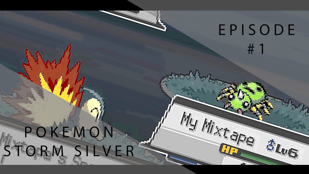
The thumbnail:
Spoiler:
and the YouTube banner:
Spoiler:
Last edited: