♔ ART BATTLE #5 ♔ LIZE VS GIGGLESWEE : Graphics (signature)
LIZE
pllfftt you guys broke my css, I need to make a better one for this. specially giggles yours doesn't work if it's centered.
LIZE VS GIGGLESWEE
LET'S DUEL
The specifications:
LET'S DUEL
The specifications:
I'll pick a theme!
How about Digimon?
I wanted to start getting more exercise, but running for my life wasn't what I had in mind!
Lize
view my art shop & gallery here
CSS queen & lonely stone.
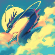
LIZE
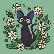
GIGGLESWEE
Voting lasts for one week!
Use the poll, but go ahead put your thoughts about the work in the thread!
Don't forget that you too can sign up for your own art battle here!
Get in the queue today!
Voting lasts for one week!
Use the poll, but go ahead put your thoughts about the work in the thread!
Don't forget that you too can sign up for your own art battle here!
Get in the queue today!
pllfftt you guys broke my css, I need to make a better one for this. specially giggles yours doesn't work if it's centered.