

- 171
- Posts
- 10
- Years
- Seen Jan 9, 2021
Hello! I thought I would post a few of my graphics here for maybe some input. I have only been making graphics for a bit more than a year now and have had many graphic request shops on another forum, but I'm not very good so I'm hoping to improve some more. ^_^
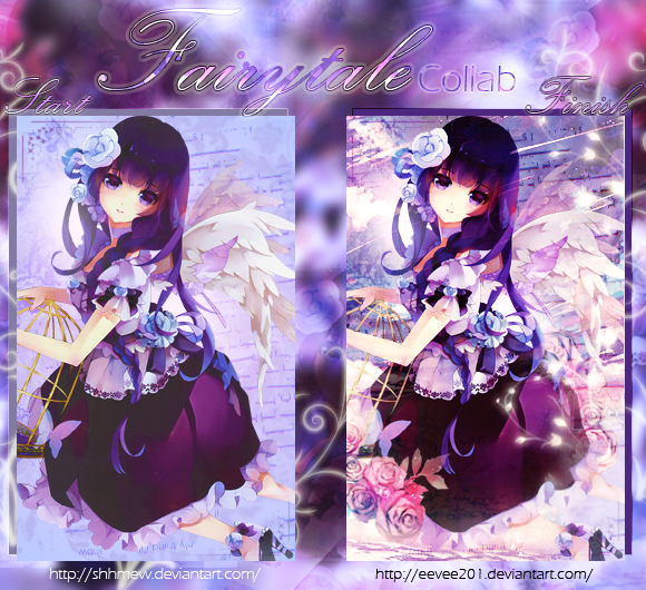
This is something I made today:

I have a lot of problems with flow and depth, but most of my signatures use PNGs so any tips on those would be lovely =)
Icons


Signatures


Large Tags


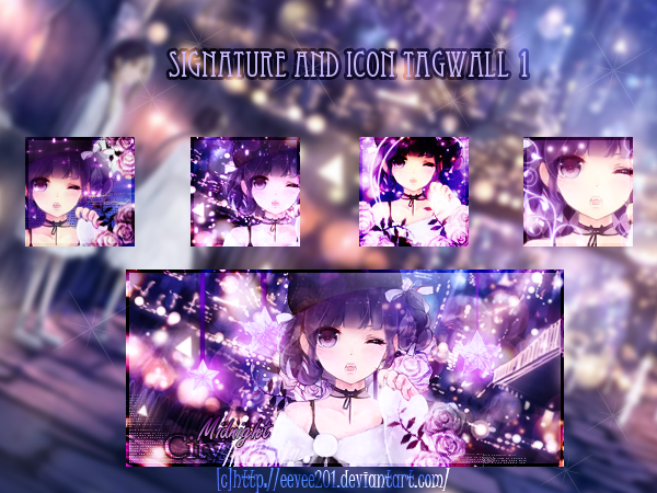
Tagwalls
This is something I made today:
I have a lot of problems with flow and depth, but most of my signatures use PNGs so any tips on those would be lovely =)
Icons
Spoiler:
Signatures
Spoiler:
Large Tags
Spoiler:
Tagwalls
Spoiler:

