• Our software update is now concluded. You will need to reset your password to log in. In order to do this, you will have to click "Log in" in the top right corner and then "Forgot your password?".
  • Welcome to PokéCommunity! Register now and join one of the best fan communities on the 'net to talk Pokémon and more! We are not affiliated with The Pokémon Company or Nintendo.

Pokémon Sprite Discussion [from RBYG to XY]

HoodieDoodie

The Electric Soldier
50
Posts
13
Years
  • Let's do my favorite, Umbreon.

    G/S/C:
    Spr_2g_197.png
    AW ITS SO CUTE! 10/10


    R/S/E:
    Spr_3r_197.png
    HateHateHate. 0/10


    D/P:
    Spr_4d_197.png
    Eh, much better. 7/10


    HG/SS:
    Spr_4h_197.png
    I love this so much, 9/10


    B/W:
    Spr_5b_197.png
    Best one imo, 10/10


    I love both the B/W and G/S/C sprites <3

    erm, HG/SS and B/W are exactly the same, yet you rate B/W's higher than HG/SS'?
     

    Sydian

    fake your death.
    33,379
    Posts
    16
    Years
  • ^ I was wondering the same thing haha. Plus he left off some sprites. Gold and Silver had different sprites. Umbreon's Crystal sprite is the best. ;)

    Spr_2c_197.gif
     

    Yoshikko

    the princess has awoken while the prince sleeps on
    3,065
    Posts
    12
    Years
    • Seen Apr 27, 2020
    Agree on that, the Crystal sprite is the best for me too because firstly it's the only one in the Eevee line that has it's back to you, which sort of contributes to you know, the concept, dark type, all that stuff. And I love how it kind of ..vibrates?! dithers?!?! It reminds me of bees which is cool cause you know his colours etc.
     

    HoodieDoodie

    The Electric Soldier
    50
    Posts
    13
    Years
  • ^This! I'd say that Umbreon had some quite good sprites, and the only one that stands out as not being as good as is the R/S/E one, because the eyes are a bit too large. Otherwise, sprite perfection!

    I also love the darkness of the colours on the G/C ones. The more recent games seem to lighten the colours as the colour palette widens, but it sort of takes away the darkness of the pokemon, even if it is closer to the original artwork. Dark pokemon, well, should be dark.
     
    6,302
    Posts
    15
    Years
  • I filled that out in July guys...

    But yeah, idk what I was doing when I rated the HGSS/B&W ones. I think I rated B/W differently because it continuously moves unlike the HGSS one? I honestly dont remember haha.

    Agreed about Umbreons crystal sprite. Its awesome. Dont know why I skipped it either.
     

    Sydian

    fake your death.
    33,379
    Posts
    16
    Years
  • Toshu, you were on drugs. :( I drugged you when you posted about Umbreon. And I saw it more of an evil shudder lol. Or like, if it were a cat, it's like it's raising the hairs on its back or something. It does really give it that Dark type feel, unlike the Gold sprite where it looks like a floppy doggie. It's cute, but doesn't really express Umbreon-ness. It's a word.

    I actually dislike the DPPT sprites as well as the RSE/FRLG sprites for Umbreon, though. It looks uncomfortable in DPPT and Gen III. :( In HGSS/BW, it looks very alert lol. I just think Crystal had it the best.
     

    Yoshikko

    the princess has awoken while the prince sleeps on
    3,065
    Posts
    12
    Years
    • Seen Apr 27, 2020
    Yeah so since we're talking about Eeveelutions anyway, what happened here lol??
    Spr_2g_196.png
    >>
    Spr_5b_196.png


    I DON'T like how the newer sprites are so fragile and thin and AIRY. What happened with that tail, it looks all crooked?? The Gold sprite is just so solid and it looks powerful and mighty and sort of you know, patient and kind of ominous as it should cause it's Espeon.
     
    6,302
    Posts
    15
    Years
  • Agreed about the Espeon sprite. Espeon looked badass in G/S/C, and the newer ones just make it look like a regular cat ._.
     

    Sydian

    fake your death.
    33,379
    Posts
    16
    Years
  • I DON'T like how the newer sprites are so fragile and thin and AIRY. What happened with that tail, it looks all crooked?? The Gold sprite is just so solid and it looks powerful and mighty and sort of you know, patient and kind of ominous as it should cause it's Espeon.

    I agree. I can't stand how so many older Pokemon look so fragile now, like you could snap them in half. And lol that tail bothers me SO much.
     

    vaporeon7

    My life would suck without you
    5,143
    Posts
    13
    Years
  • Yeah so since we're talking about Eeveelutions anyway, what happened here lol??
    Spr_2g_196.png
    >>
    Spr_5b_196.png


    I DON'T like how the newer sprites are so fragile and thin and AIRY. What happened with that tail, it looks all crooked?? The Gold sprite is just so solid and it looks powerful and mighty and sort of you know, patient and kind of ominous as it should cause it's Espeon.

    And it matched what one of Red's Pokémon should be. Him having Espeon suited well back then.
     

    blue

    gucci
    21,057
    Posts
    16
    Years
  • I love some of the newer sprites compared to the dated ones, some of the older ones I still like but for the likes of some it just shows how far they have came:

    025.png

    025.png
     

    Sydian

    fake your death.
    33,379
    Posts
    16
    Years
  • Yeah it's interesting to see how even designs have changed, of course, that's judging by sprites alone and not looking at official art. Dratini for example had a segmented belly, but it was later removed. Most notable physical differences are just like...some Pokemon went on diets, like Pikachu above lol. And then some get palette swaps, like Jynx and Gligar. So yeah it's neat to see how they've changed over time, whether on purpose or not.
     

    Yoshikko

    the princess has awoken while the prince sleeps on
    3,065
    Posts
    12
    Years
    • Seen Apr 27, 2020
    Tbh I like that old Pikachu sprite better. He has sort of a distinction between his belly and his other fur, and the stripes on his back are clearer, his tail is also more like thin and black and then becomes the yellow lightning shape while in the new one it's just a fat zigzag.
     

    Sydian

    fake your death.
    33,379
    Posts
    16
    Years
  • It was always like that in the anime, though. So I guess they were trying to go along better with official art and such. Raichu's the one that gets to keep his black cable tail with a thunderbolt at the end, at least. Cause you know. He's cooler.
     

    WasSollDas

    Fighting / Psychic ROOLZ!
    64
    Posts
    12
    Years
    • Seen Nov 8, 2016
    Yeah, Charmeleon's backsprite looks fat, compared to it's front one. Venusaur's was just atrocious, looked nothing like it. And that thing on Machoke is it's crest xP Backsprites in B/R were just all pixilated, and horrible looking.
    I think the Backsprites were pixilated to give the impression that these Pokemon are closer to you than the enemy's (like, in distance), but it really is ugly.

    I hated how Charmeleon looked like a......horned......pig, I guess.
    Also, Pidgey's backsprite looks like a chicken.
     

    Yoshikko

    the princess has awoken while the prince sleeps on
    3,065
    Posts
    12
    Years
    • Seen Apr 27, 2020
    tumblr_lsr78jmjvi1qz4ghlo1_500.png


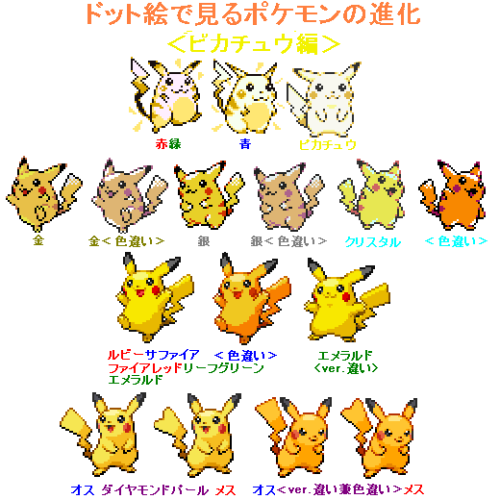
    Which reminded me, saw this pic a while ago on Tumblr where you can see basically the evolution (no pun haha) of Pikachu's sprites. I think I like them up till 2nd gen and 3rd gen is where they start going down for me. Although I do like the orangy colour in some of the later sprites, but not the model at all.
     
    Last edited:
    Back
    Top