• Our software update is now concluded. You will need to reset your password to log in. In order to do this, you will have to click "Log in" in the top right corner and then "Forgot your password?".
  • Welcome to PokéCommunity! Register now and join one of the best fan communities on the 'net to talk Pokémon and more! We are not affiliated with The Pokémon Company or Nintendo.

Map Rating/Review Thread

Status
Not open for further replies.

Binary

え?
  • 3,977
    Posts
    16
    Years
    • Seen Apr 7, 2014
    Hello and good day to everyone! ^^
    I would just like to ask you all to rate my map.
    This is the only map where I put almost all my attention for 3 days.

    Spoiler:


    Thanks in advance.
    Nice map.
    Rating:8/10
    Reason:Very well done but I can just see one tile error
    Map Rating/Review Thread


    new map
    ruby again
    if i start a hack this is the place you would start
    Rating:6.5/10
    Reason:some tile errors and the map is abit empty
     

    destinedjagold

    I do not exist.
  • 8,593
    Posts
    17
    Years
    • Seen May 26, 2024
    Elow! XD
    It's me again, and thanks for rating my previous map, which was Destral City.
    Now I'm gonna wish that you'll rate this little route o'mine. It's IRON PATH, that would be available later in the game.
    Thanks in advance! ;)
    Spoiler:
     

    zel 2.0

    Gold Remaker
  • 1,955
    Posts
    17
    Years

    Obviously, first thing that caught my attention on this map was the four contest-like buildings (hopefully they are not all the four level of contests in the same city, are they? that would be pretty silly). I am not quite sure about having all of them so close to each other and that (I'm not even sure if so many buildings of the same kind should coexist), but, anyway, as an idea it is interesting...
    In terms of mapping it looks pretty good, there's also the idea of the cycling road to reach the town, which is something I don't see often around the maps on PC.
    The only thing I don't like is the light-fluo-with-red-flowers path, it really disturbs the normal green of the ground.
    But, overall, this map includes interesting ideas, and is nicely done, it gets...
    Rating->9/10


    I could be a bit exigent and tell you that you have a few tiles errors around (like, using the wrong tile to end the small pine-like trees, or using the one to end the small pine-like trees in the middle. Or also, using the wrong tiles for the middle of the bigger trees that stand alone), however I'm not that good at explaining those kind of small tiling errors (Don Patch is better at that than me), and in any case, I don't pay that much attention to them (still, they exist)
    The map does not such that much creativity, you should try putting more grass in the middle road, not just to the left, because that road will most likely be avoided (and perhaps the trainer should have a battle quite early) I guess it's fine for a Route1...
    Rating->7/10


    How about putting more grass on the part that looks a bit empty?
    You should also do something with the area that has that little sand patch (maybe add a few other sand patches to the side?), always add something when you see a part that contains always the same kind of tile, to add variation to your map.
    Rating->7/10


    Hmmm, even though the map's idea was fine, the mapping was quite bad (wrong tiles used everywhere, and I am not that much of a fan of "trees growing on sand" (unless they look like palm trees))
    Again, try adding something where there is a lot of the same kind of tiles (I'm talking about the beach)
    Fix those tile errors, and try again
    Rating->5/10


    Ah! What a big sized map! (Too bad the player gets to see about 3/4 of the map :P)
    Anyway, it's very good (though I'm not sure if you should truncate the high grass tile with the green+border tile... Doesn't look as if it was supposed to be that way)
    There's only one thing I think you should be adding, if the map is supposed to be close to mountains, you should be using more that lone rock tile around the map, it'll give you more variety, and in any case, it just adds realism to the map, don't you think?
    Rating->9/10
     

    destinedjagold

    I do not exist.
  • 8,593
    Posts
    17
    Years
    • Seen May 26, 2024
    Thanks zel, and to everyone who rated my maps!
    Spoiler:
    :)
    That really inspires me to go on! Thanks again! and have a great day! :D
     
  • 92
    Posts
    16
    Years
    I could be a bit exigent and tell you that you have a few tiles errors around (like, using the wrong tile to end the small pine-like trees, or using the one to end the small pine-like trees in the middle. Or also, using the wrong tiles for the middle of the bigger trees that stand alone), however I'm not that good at explaining those kind of small tiling errors (Don Patch is better at that than me), and in any case, I don't pay that much attention to them (still, they exist)
    The map does not such that much creativity, you should try putting more grass in the middle road, not just to the left, because that road will most likely be avoided (and perhaps the trainer should have a battle quite early) I guess it's fine for a Route1...
    Rating->7/10
    I didn't put any grass on the middle, because you will get a starter... in secend town ;)

    Newest maps:
    https://img220.imageshack.us/img220/8805/firsttownis1.png
    https://img209.imageshack.us/img209/2127/secendtownqk7.png
    https://img264.imageshack.us/img264/8823/secendroutexf2.png
     

    Binary

    え?
  • 3,977
    Posts
    16
    Years
    • Seen Apr 7, 2014
    Elow! XD
    It's me again, and thanks for rating my previous map, which was Destral City.
    Now I'm gonna wish that you'll rate this little route o'mine. It's IRON PATH, that would be available later in the game.
    Thanks in advance! ;)
    Spoiler:
    Nice good map,
    It has alot of pathways and good ideas of paths, but I could see some teeny weeny errors of the grass there,
    But it gets a good rating>>9/10
    Firstmap:Nice map, its plain and simple but it could be done better if you hade put some ideas into it.
    Rating:7/10


    Second map:This one is plain and simple but just a little bit empty, and some tile errors of the fence.
    Rating:6.5/10


    Third map:
    Good, this is abit complex than your other maps. I could see no errors there.
    Rating:8/10
     
  • 1,118
    Posts
    17
    Years
    • Age 118
    • Seen Jan 25, 2022
    Thank's Zel Ill take your suggestions


    Your maps are okay but meh

    Map one

    It's just pallet town with different tile's
    2/10
    map2
    very nice looks good
    no errors
    6/10
    3rd map
    These keep getting better
    8/10
     
    Could somebody rate this?

    Name: Morning Rise City (working title)

    Game:Game: Fire-Red

    Additional Comments: I'm making this as the second city in my hack. The thing in the upper left hand corner is supposed to be a small stadium, with windows built into the wall for the spectators.

    I just can't decide weather I absolutely love this map, or if I hate it, and should send it to the recycle...
    [img=https://img440.imageshack.us/img440/1485/morningriseqq0.th.png]

    EDIT: Sorry, I left the grid on with the mapshot. If its a problem to view, PM me and I can upload a clean version..
     
    Last edited:
  • 860
    Posts
    17
    Years
    Could somebody rate this?

    Name: Morning Rise City (working title)

    Game:Game: Fire-Red

    Additional Comments: I'm making this as the second city in my hack. The thing in the upper left hand corner is supposed to be a small stadium, with windows built into the wall for the spectators.

    I just can't decide weather I absolutely love this map, or if I hate it, and should send it to the recycle...
    [img=https://img440.imageshack.us/img440/1485/morningriseqq0.th.png]

    EDIT: Sorry, I left the grid on with the mapshot. If its a problem to view, PM me and I can upload a clean version..

    Looks nice but you could change the tiles so they will fit better and a few errors etc..I give it a 6.5/10...
     
  • 26
    Posts
    17
    Years
    Could somebody rate this?

    Name: Morning Rise City (working title)

    Game:Game: Fire-Red

    Additional Comments: I'm making this as the second city in my hack. The thing in the upper left hand corner is supposed to be a small stadium, with windows built into the wall for the spectators.

    I just can't decide weather I absolutely love this map, or if I hate it, and should send it to the recycle...
    ht tp://img440.imageshack.us/img440/1485/morningriseqq0.th.png

    EDIT: Sorry, I left the grid on with the mapshot. If its a problem to view, PM me and I can upload a clean version..

    That looks nice, apart from some minor errors mentioned above.

    7.5/10
     
  • 1,104
    Posts
    16
    Years
    Could somebody rate this?

    Name: Morning Rise City (working title)

    Game:Game: Fire-Red

    Additional Comments: I'm making this as the second city in my hack. The thing in the upper left hand corner is supposed to be a small stadium, with windows built into the wall for the spectators.

    I just can't decide weather I absolutely love this map, or if I hate it, and should send it to the recycle...
    [img=https://img440.imageshack.us/img440/1485/morningriseqq0.th.png]

    EDIT: Sorry, I left the grid on with the mapshot. If its a problem to view, PM me and I can upload a clean version..

    2/10. It sounds harsh, but sorry, it's my opinion. So many problems with this map.
    I'll list a few. I won't mention the windows in the top right hand corner but you should try and get new tiles to make it suit what you think it should look like.
    • That whole dusty path in the top right hand corner especially the pokemon center roof parts.
    • The black spot in the green roof.
    • The bottoms of the flowerboxes infront of the green roofed house.
    • Both Signposts.
    • Why is there a double doored house?
    • Most of the mountain edges.
    • A lot of the pokemart roof.
    • Most of the edges of paths.
    • The house with part of the pokemart roof.
    I think that's enough.
    You should take a good look at your maps and not mix tiles that shouldn't be used together.
     

    Binary

    え?
  • 3,977
    Posts
    16
    Years
    • Seen Apr 7, 2014
    I kind of agree with thethethethe
    Your map is kinda full of errors, I see what you were trying to do, but you should sometimes remove the grid to see your mistakes,
    There are a whole bunch of mistakes like the paths, buildings etc.
    I would rate this map 3/10 sorry

    -Celebi
     
    2/10. It sounds harsh, but sorry, it's my opinion. So many problems with this map.
    I'll list a few. I won't mention the windows in the top right hand corner but you should try and get new tiles to make it suit what you think it should look like.
    • That whole dusty path in the top right hand corner especially the pokemon center roof parts.[It's comming out of a canyon, but I see what you mean. It doesn't mix up to well with the road...
    • The black spot in the green roof. I thought you needed that there for the warp to come out back...Guess not
    • The bottoms of the flowerboxes infront of the green roofed house.
    • Both Signposts.
    • Why is there a double doored house? Its supposed to be a barn...:surprised:
    • Most of the mountain edges.
    • A lot of the pokemart roof.
    • Most of the edges of paths.
    • The house with part of the pokemart roof.I'll probably scrap it, I was trying to make a different looking house for a visitors center...
    I think that's enough.
    You should take a good look at your maps and not mix tiles that shouldn't be used together.

    Well thanks for you imput Everyone. I'm going to redesign it with better fitting edited tiles, and then I will resubmit the changed version.
    *Scuries off to learn pallet editing*
     

    EarthsVisitor

    Jolly Good
  • 385
    Posts
    18
    Years

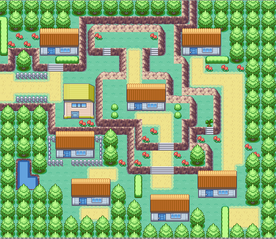
    Map Name:Mondercose Town
    Spoiler:

    I acutally enjoy this town quite a bit.
    The Mountain level are very nicely done, and Houses are nicely placed.
    The whole map flows and looks good.
    There is one tile error though. For the back of the grass on top of a mountain, you shouldn't be using a mountain tile, there is a grass tile that has a little brown peice on the end of it you should be using.

    Some suggestions:
    1. The mountain level in the back, I think should be connected, it looks odd, just stopping then continuing again.
    2. Eliminate most the use of the green stuff (bushes) in front of the houses, and to block places.
    3. The house at the bottom is sort of out of place.

    9/10
    Good Job!
     

    - Sigma -

    Bam!
  • 48
    Posts
    16
    Years

    Mondercose Town
    Spoiler:

    Wow, this map, like EarthsVisitor said, is very enjoyable. I can see not many mistakes, all I can see is one, really.

    Just the back mountain, where that last flower is. Maybe you can make that area all mountain, it looks a bit glitched like that.

    Good luck with your hack, Neminoa.
     

    Nytkoi

    Pokemon Copper!
  • 1,625
    Posts
    16
    Years

    Wow, this map, like EarthsVisitor said, is very enjoyable. I can see not many mistakes, all I can see is one, really.

    Just the back mountain, where that last flower is. Maybe you can make that area all mountain, it looks a bit glitched like that.

    Good luck with your hack, Neminoa.

    Thnx. I am working on another map.
    Oh, and... Your rating?
     
  • 1,118
    Posts
    17
    Years
    • Age 118
    • Seen Jan 25, 2022
    Nice map not complicated at all lol

    but i think you should edit the pallets

    Thats would be a very good idea.

    and mayby edit some tiles.

    7/10
     
    Status
    Not open for further replies.
    Back
    Top