Our software update is now concluded. You will need to reset your password to log in. In order to do this, you will have to click "Log in" in the top right corner and then "Forgot your password?".
Welcome to PokéCommunity! Register now and join one of the best fan communities on the 'net to talk Pokémon and more! We are not affiliated with The Pokémon Company or Nintendo.
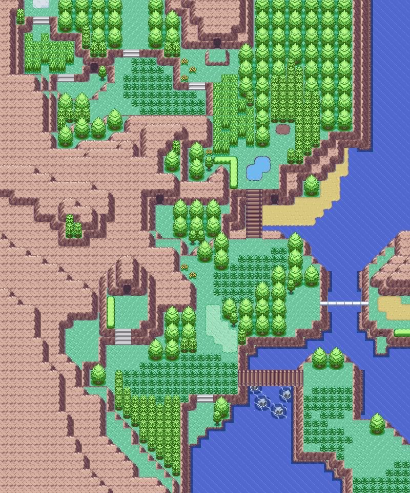
Map Name: Cliffall City Game: FR Comments:
This is the first gym city. It's rock type, obviously. The cave entrance at ground level leads to a small cave with a museum in it. The upper one is a normal cave an there's going to be a smash-rock blocking the path. I KNOW THERE ARE A FEW BORDER ERRORS BUT IGNORE THEM!
Ugh. I might be a little harsh here, but this map really isn't all that good. Upon first glance, it looks like you've done an OK job, but when I looked closer I spotted several flaws that - when added up - really make this map look pretty bad.
The first and most obvious error is too many mountains. Mountains, if you look at any nintendo-made map, are used sparingly. In the north of your map, near the Gym, there are eight layers of mountains stacked on top of each other, which really looks horrible.
The other big issue is the great distance between buildings. The buildings to the northwest are okay, but the distance between those and the Pokémon Center & Mart is simply ridiculous. Even if this did look good in a map - which it doesn't - it would be very irritating for the player, which, is assume, is not what you're trying to accomplish.
The smaller issues are the tree shading, which is off, and the Pokémon Gym, which lacks a roof.
Rating: 4/10 Suggestions: Remove some of the mountains, remove some of the space between buldings, redo the tree shading, give the Gym a roof.
_________________
Map Name: Elabra Hills Map Game: Emerald Credits: Nintendo Comments: Another map made just for fun. Map:
Reason: This map is interesting. I'm guessing you tried to make it nature-like but seeing the pretty playable path you have to take if you don't have surf makes me wonder.
If it's natural the right part looks forced. If playable the left side is pointless...
But if you aimed for something in between, though, it's a very good outcome :)
I'm going for a review based on my third theory!
The good: The flow of the river looks natural and the form of the mountain doesn't seem forced in any way. The path seems to have been put in after creating the landscape giving it a very natural look.
It has some good possibilities as a playable map too: If you for example make the ledge to the north a little bigger so you when you go up you can't get back down until you get surf.
Or you can create some secret stuff at places where you can only reach with waterfall/surf. Or maybe split the route so you'll have to wait a long time to take the left path. Think about it. The bad: There are quite a few tile errors regarding mountain corners with grass under them where they shouldn't have had it. The ledge at the north seems very forced and out of place so unless it has got something to do with the game, replace it.
Also the grass sometimes seems forced. There's a little too big of a contrast between the right and the left but I don't know what makes it so...
And this is not a tile error but... the waterfalls seem very unnatural. One tile long waterfalls look very stupid, and the upper waterfall doesn't seem to be complete... it needs that white stuff at the bottom of it.
The trees at the middle left really seem out of place. If they should look natural, place some more trees like 'em!
Suggestions: Make the route more like a whole rather than a split or explain a little about the gameplay if you intended it to be for a game. Fix the tile errors and maybe cover up some empty space at the grass-part.
Reason:
As with the previous map it has a very natural though playable design. But maybe not AS playable...
You've really made it natural, though, and the bridges work quite well.
The good: It looks really natural. It looks exactly like a natural environment only disturbed by a few man-made objects.
The path you'll have to take really shows off the nature to the player and there are a lot of possibilities for gameplay again.
You could get HM cut in the house to get back north and be able to continue. Or get surf and go down the waterfall with no chance of coming back... The bad: Again, one tile long waterfalls look really stupid. The other waterfall looks okay butthe fact that it turns right to start with is odd...
Unless you place a few trainers the route is quite boring though beautiful. Also it seems to be missing a bit of grass...
Also the bridges are always one tile too long except for at the bottom left. It looks a little stupid...
Suggestions: Place some trainers and/or make some grass. Fix the bridges and think about how you could use it for a game.
Thank you very much for the thorough and thoughtful review! Really opened up my eyes.
The thing is, I accidentally screwed up my ROM in AdvanceMap, so I can't really do corrections on Valley Pass.
I did have a correction on the other map though, from my post above yours. Link:
It's a village, actually. Albeit a super-empty one, because you live with your grandpa alone in the mountains. Grandpa dies at the start of the game, prompting you to leave the area ASAP (should've included that in the comments, sorry).
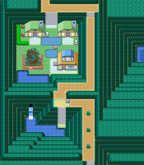
My map now :3 Map Name: Cliffall City Game: FR Comments:
This is the first gym city. It's rock type, obviously. The cave entrance at ground level leads to a small cave with a museum in it. The upper one is a normal cave an there's going to be a smash-rock blocking the path.
Spoiler:
img846.imageshack.us/img846/3306/cliffallcity.png
I KNOW THERE ARE A FEW BORDER ERRORS BUT IGNORE THEM!
3/10, I'm harsh but sorry. I agree with almost everything HD said up there, but I want to add on my own stuff.
The Good: The paths are mostly well-spaced and quite consistent, and that's good.
I'm liking that bit where you see the Gym sign, then walk up a staircase to face the Gym. There are enough staircase tiles to keep it from being tedious, but still dramatic. Keep that idea!
The Not Good: i1202.photobucket.com/albums/bb366/IC-Claws/17cliffallcity-1.png Cliff
It's obvious that the HUGE wall of cliffs was made solely to support the waterfall, and maybe the gym as an afterthought. It looks very unnatural, what with repeating layers and such.
If you want straight mountains, be consistent with them, but you have those protrusions at the bottom (Green Circles). They look like they're there to force a natural feel, or just fill up extra space. Solution: I really suggest you remake the mountain. With natural mapping. Such that there are no odd protrusions. Entrances
This doesn't count as "border" errors right? If so my friend, you have FIVE entrances to your town (Black Arrows). Many of which are pointless. Solution: Seal up the extra ones. Leave one or two. Tile Errors
(Red Circles) Tree shading is wrong; the middle tile shouldn't have shadows. The one on the river edge, see for yourself. Unnecessary Fences
(Yellow Circles) A whole lot of them. Why not make them surround the river or something (bar the bridge)? That would make sense. Flavor
It's Cliffall City but the river/fall is hardly emphasised. Solution: Make it like my map (heh). Have the river divide the city, then make it so that you have to walk across lots of river bridges to get around the city.
Overall: I hope I didn't discourage/confuse you with all this. Just fix up the bad parts and it should be good. Hope to see more!
The Good: Paths are narrow enough to be awesome, but wide enough for breathing space and trainer placement. Good.
There's plenty of variety in the tiles, and that's good too.
The Not Good: i1202.photobucket.com/albums/bb366/IC-Claws/16ElabraHills-1.jpg Tile Errors
(Yellow Circles) What happened the strips of land below? I believe it's missing tiles but meh.
After uploading, I also discovered the small strip of land to south of the vertical bridge. Why isn't it a mountain edge like the others? Map Connections
(Black Arrows) Man, if you surf there from the beach, you have a huge area to go around, and have access to two other maps? Is it intentional? Hedges
(Orange Circles) Intrigues me as to why beautifully-cut hedges pop up in mountain routes. Narrow Areas
(Red Circle) That one part looks like it's going to suffocate the player, maybe widen it by a few tiles.
Overall: Nothing much, really. The errors are mostly minor, and don't stop this from looking like a fun map to play through. Keep it up!
Ugh. I might be a little harsh here, but this map really isn't all that good. Upon first glance, it looks like you've done an OK job, but when I looked closer I spotted several flaws that - when added up - really make this map look pretty bad.
The first and most obvious error is too many mountains. Mountains, if you look at any nintendo-made map, are used sparingly. In the north of your map, near the Gym, there are eight layers of mountains stacked on top of each other, which really looks horrible.
The other big issue is the great distance between buildings. The buildings to the northwest are okay, but the distance between those and the Pokémon Center & Mart is simply ridiculous. Even if this did look good in a map - which it doesn't - it would be very irritating for the player, which, is assume, is not what you're trying to accomplish.
The smaller issues are the tree shading, which is off, and the Pokémon Gym, which lacks a roof.
Rating: 4/10 Suggestions: Remove some of the mountains, remove some of the space between buldings, redo the tree shading, give the Gym a roof.
_________________
Map Name: Elabra Hills Map Game: Emerald Credits: Nintendo Comments: Another map made just for fun. Map:
Hey, I really like this, reminds me of Ghetho Hills.
What I like; pretty much everything, the shape, silhouette and design of the map are wonderful, shows you have imagination :D
What I don't like; the overused grass tiles in the bottom, along with the small trees and the repeative ground tiles seem quite dull. It would seem that you were bored to finish it or something? lol, but grounds and trees don't matter since player can't see most of them.
Also the borders seem a little screwed up; unless you have connections to the map above, beneath and next to this... what I'm saying, is that if you exit that cave in the sand, you can Surf anywhere, making those rocks blocking the way pointless anyway.
This map is pretty beautiful. I like how there are all these different layers to it - the cave entrances mean there are three or four different isolated segments of the map, yet they're all part of the one map and they're all very smoothly linked together. The general shape is great too, except for the huge patch of small trees up the top-ish, which seems out of place. Maybe it's just me (I hate small trees), but it looks weird. Anyway, the route feels like it would be an adventure to play through, with some epic music like you'd find in a similar route in Emerald. It's a good map.
Now, my turn! A fresh type of map.
Map Name: Chapter 7 (Carga's Crusaders) Map Map Game: Fire Emblem 7 Credits: Intelligent Systems Comments: ignore the weirdness of some of the tiles (namely the beaches) because it looked fine in-game. Map:
Map Name: Chapter 7 (Carga's Crusaders) Map
Map Game: Fire Emblem 7
Credits: Intelligent Systems
Comments: ignore the weirdness of some of the tiles (namely the beaches) because it looked fine in-game.
Map:
Spoiler:
Well, that got your attention. Normally I'd write huge blocks of text in my never-ending attempt to get the Shut Up emblem, but right now I just want to do a quick review, post my map, then I haz chicken wings to eat.
Besides the obvious matter of no way in or out, effectively rendering it useless, it's also ridiculously small for an underwater cave. If you look at any of the underwater caves in Ruby/Sapphire/Emerald you'll see that they're often very large, whereas yours is tiny. Uh...2/10.
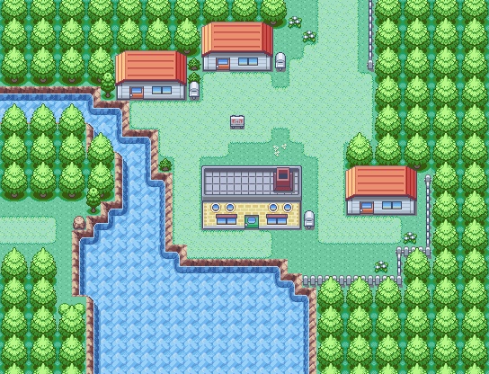
My Map Map Name: Sunset Town Map Game: Pokémon Coral Credits: Laidjon*, Zein, lalo0101 Comments: New hack, so this is a starter town. My attempted theme with this map was colorful. I think I got it. ;) Map:
My Map Map Name: Sunset Town Map Game: Pokémon Coral Credits: Laidjon*, Zein, lalo0101 Comments: New hack, so this is a starter town. My attempted theme with this map was colorful. I think I got it. ;) Map:
Overall pretty good. It does make a good stater town, too.
The pathways are a little weird, though I kind of like it. Only, for the bottom right house, the pathway doesn't yield to the door like it does for the middle house/lab.
The way the river opens at the bottom is inconsistent with the smallness at the top. In MY opinion, adding trees to the right of the third tree by the bottom left would make it look really good.
The small tree to the left of the river... is nice. Normally I hate those trees, but good placement.
The two little shrubs in the bottom left aren't really needed -- they just create a smaller walking space. I'd take them out, but it's not a huge deal.
There's a lot of good things about this map. Much better than your other one, in my opinion. It's natural, but not natural enough to look like sh!t. (bad censoring ftw). Rating: 8/10.
My map:
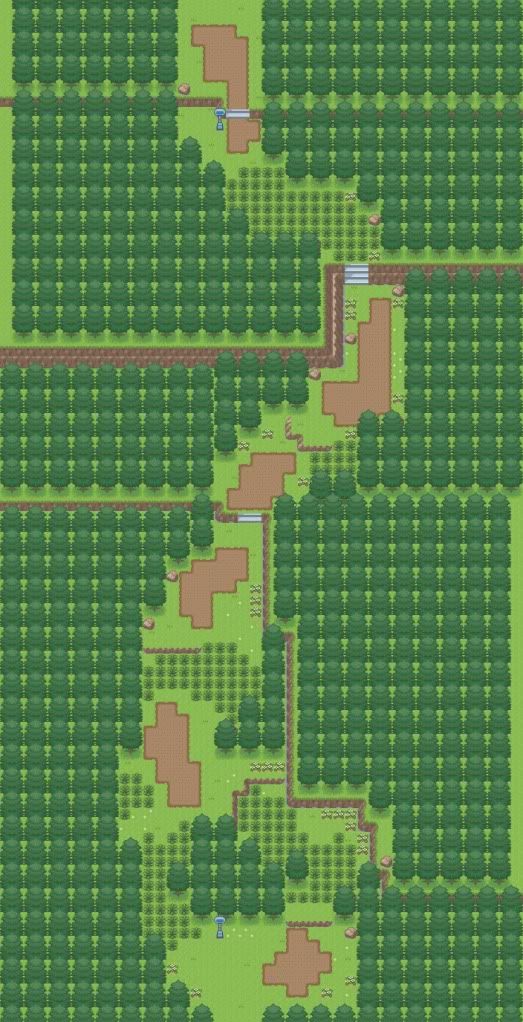
Comments: A winding forest-y Route. I'm not sure how good it is, and need outside thoughts.
It's pretty good, however there are ridiculously large space between each patch of grass, which makes it look - in my opinion - like someone grabbed it and stretched it. It doesn't look good. The tiles are alright. The mountains are way too straight in my opinion, even in Nintendo-styled maps, the mountains are never straight.
6/10.
Map Name: Utopi City Map Game: Pokémon ShadowStone Version Comments: "City of Greenery".
Map:
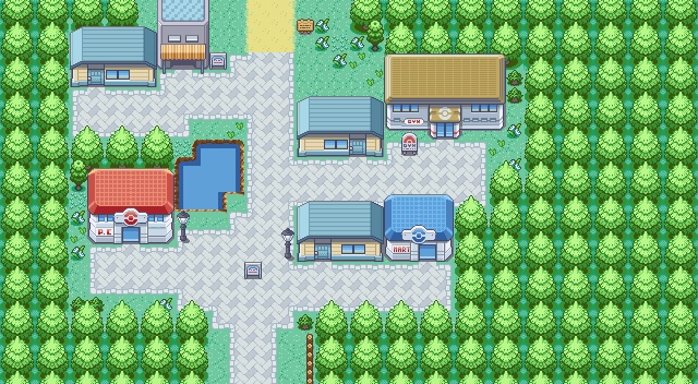
The choice of tiles fit well with the Firered look. mapping is also good if you consider it a gamefreak styled map, only thing that seems odd to me is how the path goes from a brick road, to a dirt road. it doesn't look right to me, you could try making a tile to it transitions from a brick road to a dirt road.
Map name:None
Map Game:a hack i might make
Credits:Javs,Erma96,Red-ex, xiros, kyledove, steven, seiyouh, zein, Wesley FG, knockentrocken (something like that), Newtiteuf.
Comments: first town. the sea water palletes need changing.
Map:
Ohh i like this map its got shape and i actually couldnt fine many or any errors to say :/ i love the pallete change that fits the trees and those mountains i dont like the shadow as it just well shows on the mountain :/ but other than that great map
8/10
Map name:None
Map Game:None
Credits:Wesly fg shawn forst me
Comments: First town of a game i inserted and mapped tiles for mainly using shawn frosts tiles.
oops i only skimed the rules
i think thats base is either R S or E
rating 9/10
like: i really liked the frozen lake and i cant see any tile errors witch is great and where did you get the frozen lake tiles cuz i could use them in my hack
dislikes: for some reason i don't like the little flowers in the trees maybe its just me.
now for mine
base: FR
hack: STARCRUSER 10
map: space port
description: its a space port on an asteroid you go to other planets in the space ship (using the boat and island system,thank you nintendo, that would have taken forever) you bounce on the trampoline (the circle) and slide on the slide the big building is the control center gym is lightning and there is a house n each one that took forever i'm aware of the tile errors on the space ship and the edge shown in second picture
Its sqaure Like its seriously sqaure all the house are in line like all of them (is it a complex) the plain is underdetailed and in the middel of the map dont you think it would be better at an airfield with a runway instead in the middel of the town? i see all those errors :/ this map is boring and has no shape :/ try and fix it up add more shape dont align every house i meen i would like privacy :/ fix the plain give the mountains shape i think the plane is ment to be the only way out right? well then extend your map a plane needs a runway xD
sorry but ill rate your map 1/10
Ohh i like this map its got shape and i actually couldnt fine many or any errors to say :/ i love the pallete change that fits the trees and those mountains i dont like the shadow as it just well shows on the mountain :/ but other than that great map
8/10
Map name:None
Map Game:None
Credits:Wesly fg shawn forst me
Comments: First town of a game i inserted and mapped tiles for mainly using shawn frosts tiles.
Its sqaure Like its seriously sqaure all the house are in line like all of them (is it a complex) the plain is underdetailed and in the middel of the map dont you think it would be better at an airfield with a runway instead in the middel of the town? i see all those errors :/ this map is boring and has no shape :/ try and fix it up add more shape dont align every house i meen i would like privacy :/ fix the plain give the mountains shape i think the plane is ment to be the only way out right? well then extend your map a plane needs a runway xD
sorry but ill rate your map 1/10
like it now?
and it is true that most asteroids are shaped like peanuts
and i like houses in rows...
and the spaceship is the only way out its on an asteroid!
it took me about two hrs to do all this.....
i'm not too good of a drawer on paint witch explains how suckish the plane looks
later i might post the other planets and i know i shouldn't make them so square
The choice of tiles fit well with the Firered look. mapping is also good if you consider it a gamefreak styled map, only thing that seems odd to me is how the path goes from a brick road, to a dirt road. it doesn't look right to me, you could try making a tile to it transitions from a brick road to a dirt road.
Map name:None
Map Game:a hack i might make
Credits:Javs,Erma96,Red-ex, xiros, kyledove, steven, seiyouh, zein, Wesley FG, knockentrocken (something like that), Newtiteuf.
Comments: first town. the sea water palletes need changing.
Map:
In my opinion, it's very graphically appealing and it serves good playability, which is always good. The only thing I'd change in the map is the colours of the trees; they look wooden to me.
You're pretty much scraping a 10/10 from me. The only thing letting the map down is a tile error I've spotted (the eastern mailbox) and the colours of the trees. Everything else is pretty much immaculate.
Great map.
Map Name: Dent Mountain
Map Game: Pokémon Apokélypse
Credits: Neti
Comments: Ignore the tile error on the cave.
Rating:7/10
Comments:I like this map its pretty simple although i think the bottom of the trees should be recolored a darkish blue. Good use of nintendo tiles.
-----------------
Map Name: Kajoten Town
Hack: Pokemon Lost Time
Credits allistair (for the mountains)
Comments: The Flowers that I used are revamped tiles from G/S/C tiles and they move like in the G/S/C games. I made the Gyrados statue myself, and I edited the pallets to look like I wanted them to. and ignor the errors on the top left, bottom right and the right side, I just noticed them.
rating: 7/10
like: how you used lots of mountains even though people say not to
the flowers
houses
dislikes: the house on top of the other house because it looks weird and there are tile errors every where
get rid of the house on the house if you're trying to mace a two stories tall house try copying the house in littleroot town in RSE
now for another one of mine
i love this one and its my 2nd map
name: HALO sect.1
base: FR
hack: STARCRUSER 10
a part of a halo ring
map2
HALO sect. 2
same stuff
other sections posting soon
yes alot of tile errors until i make more tiles
Well i see not to many errors but there are plenty errors with the sea.....
its easy going but you say its an astroid and i dunno how a pokemon astroid should look i would think more dead? or has water and everything on this astroid it must be large then :/
5/10
Rom:firered
Map:testmap
Comments: testing the map and tiles...
Credits. Of-Nihiltiy
Prince legandario
Shaun frost
Well i see not to many errors but there are plenty errors with the sea.....
its easy going but you say its an astroid and i dunno how a pokemon astroid should look i would think more dead? or has water and everything on this astroid it must be large then :/
5/10
The design looks clean, yet natural at the same time. The tileset, I think, is what really helps sell it. You have a tile error on the ledge near the patch of sand -- the ledge just cuts off, instead of tapering or going behind the tree -- but besides that, the map looks wonderful (though, to be honest, the tileset does much of the heavy lifting). 8.5/10.
Well i see not to many errors but there are plenty errors with the sea.....
its easy going but you say its an astroid and i dunno how a pokemon astroid should look i would think more dead? or has water and everything on this astroid it must be large then :/
5/10
Rom:firered
Map:testmap
Comments: testing the map and tiles...
Credits. Of-Nihiltiy
Prince legandario
Shaun frost
Honestly, I dont really care for this map too much. Definitely not the worst ive seen, but it could definitely be better. the pathways seem really thin, and yet theres only one patch of grass that youre forced to take more than a few steps through. and on that subject, there is a LOT of grass on this map. there usually shouldnt be that much grass on a map, at least in my opinion, because it starts to look kinda cluttered. and unless this is on of the really early routes, id suggest adding an alternate path, at least in one direction. i hate being forced to take a certain path all the time
i realize this was about half opinion, half actual review, but i just called it as i saw it. id probably give it a 5/10
on a side note, i dont really care for the tiles or the palettes either. they seem too washed out, but this isnt the place for reviewing those, so ill stop there.
anyway, here's my map
Map: Acacia Forest
Rom: Firered
Tile Credits: Skillmen, ThePokemonChronicles,
When you first go through, youre going west to east
also in the actual game, it uses the cloudy weather effect, and that darkens the palette just right
I do like the map, but it seems like a route more than a forest. In order to be a forest, a darker palette and more grass would be nice. There are quite large amounts of open space in the map, and a forest would be more compact. I give this a 7/10, due to large spaces. I do like the multi-layered-ness of it though. Fun.