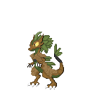
I really like these designs. And with enough practice and knowledge I think you will be able to make some even better quality sprites. This is my extensive tips to you and hopefully you can make use of it.
My edit is on the left and your original is on the right.
I can narrow the critique into a few general notes that can help you improve your future sprites.
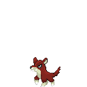
1. Try not to use banding for shading, even if it realistically makes sense. It doesn't work well as it seems.
Here is an example of your banding vs. my fix
Banding is pretty much
when pixels line up and they look too uniform and clustered together. It doesn't look as natural and makes the overall sprite/piece look robotic and too uniform. Of course, personally I would say this isn't a rule to follow always as there will be times even I find that I have pixels line up. It happens and sometimes it just works to a smaller degree. But generally it is something to avoid especially in single small sprites like this.
2. Use less colours, there are are a few shades on the blue fur that is difficult to see and therefore unnecessary.
From my edit you can see I've narrowed it down to pretty much 3 colours vs. 5 colours. I would say the colour count isn't the overlying issue but more so the colour choice. Try to provide
contrast between the colours
Here are 4x Zooms of the sprites so you can see the difference easier.
There are a few other things to note, so I wouldn't mind going over them if you'd like but I'll leave it off here. Don't forget there are amazing resources online that you can look for to help you improve. For Pokemon/Fakemon pixel artists I always recommend
to study and look at the original sprites themselves. I believe the main point is to keep the same style to the originals (as they are fan games/rom hacks).