• Our software update is now concluded. You will need to reset your password to log in. In order to do this, you will have to click "Log in" in the top right corner and then "Forgot your password?".
  • Welcome to PokéCommunity! Register now and join one of the best fan communities on the 'net to talk Pokémon and more! We are not affiliated with The Pokémon Company or Nintendo.

[Showcase] Tha Donut Factory - Art Cafe

Circuit

[cd=font-weight: bold; font-style: italic; backgro
4,815
Posts
16
Years
  • It's May boys and girls!
    Spoiler:

    More May? Yup.
    Spoiler:

    Ok, because I am always eager to hear some truthful C&C myself, I am going to be brutally honest here, with advice for improvement of course. Anyway.

    I really think these two, compared to your previous pieces, are bad. Yes, bad. May's features are just all wrong. In the first picture, her face is flat! Like whaaaat? Has she been slamming her face against a wall or something? And in the second, her proportions are completely wrong. I don't know about you, but the only beings I've seen with arms and legs that long are the Kaminoans from Star Wars! She also has NO muscles on said features, so I don't know how the hell she is standing, her legs probably should have snapped by now!

    On a more upward note, your style is evolving. But I personally much prefer the more water-colour style your pieces had, compared to the more cartoony feel these recent pieces give me. But if you want to move to a cartoony style then that is good! By all means, go where you want to go, I just prefer your previous style n__n

    On to improvements then. Firstly, study the human body please. Like, I know cartoons and anime have simplified features, but those features are still there. They still have muscles in their bodies, even if that only makes their limbs wider. The problem with proportionality with body features and limbs has been carried over from your Gardevoir piece. For example, if I stand up straight, like May in your second piece, my arms drop to just below my hips. My hands are the only part of my arms that extend below my buttocks. I'm quite an average-sized person, so try and remember that. In the first piece her FACE! I'm sorry, but it really scares me. There is no definition there at all. She's like the new Wilson haha. Seriously though, define her face please. Give her a nose at least! She's not Voldemort. Define her chin too. Honestly, the face is a VERY important feature of a drawing of somebody; important to get RIGHT, it should take you a big portion of your time to draw, and should be made as good as you can get it, I think. More practise will improve that, but there are aspects you really shouldn't be forgetting from the start (HER NOSE OMG). For anatomy, try looking at how muscles make a person's arm appear, if they aren't anorexic, which May currently appears to be. A person's leg also isn't perfectly straight. Look at your own, the muscle extends two thirds of the way down from the knee, then stops. That's when the leg starts to become thinner. These seemingly small important aspects really improve the appearance of a character, try and improve them for your next piece.

    But seriously. Next May piece you draw, let me see a nose and some facial definition and I'll be super happy, okay? :D

    Don't let me put you off, it's great you're trying something new, and I'm super happy you keep posting and improving and developing! It's a wonderful thing to see :D
     

    Circuit

    [cd=font-weight: bold; font-style: italic; backgro
    4,815
    Posts
    16
    Years
  • Your faces and proportions are still off, in my opinion, but I see it becoming more of a style, and less of a particular 'fault' should we say. I don't really know if I should critique your May pieces now, since they seem consistent, and not overall 'bad', just not the kind of style I particularly go for.

    Your proportions are still a bit off, with very long arms and legs compared to body. This is most important in your Gallade piece, but I feel you could improve your May pieces too, but I've already said I am now unsure on whether to critique them, since you have begun to show that this is your style. If you want me to, say so, and I will come back. But otherwise I will leave it at that, since I don't want to put you off creating art your own way, nor do I want to force you down any one route, since the path you take should be your own. Hence it being art and not some factory produced product :)

    Keep drawing dude, since you'll only get better with whatever style you choose.
     

    Ice1

    [img]http://www.serebii.net/pokedex-xy/icon/712.pn
    3,447
    Posts
    9
    Years
    • Seen Nov 23, 2023
    Ow man, that looks cool. I would totally use that as an album cover if I were to ever release an indie album, haha. Great work!
     
    17,133
    Posts
    12
    Years
    • she / they
    • Seen Jan 12, 2024
    Oh wow, I really like your interpretation of Mt. Coronet. It's really simple but also very striking, and definitely leaves an impression. I know this sounds silly, but I would definitely use that as a wallpaper for my phone or something, haha.
     

    Circuit

    [cd=font-weight: bold; font-style: italic; backgro
    4,815
    Posts
    16
    Years
  • I really like that Mt. Coronet piece too. Its really striking. Simple, yet effective, and I think its really great.

    I agree with Fairy, it is definitely something I would use as a wallpaper for my phone.
     
    2,413
    Posts
    16
    Years
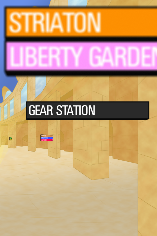
  • Here's a piece of game scenery for you guys:
    Spoiler:

    The first thing I look at it the space between the signs and the border of the image.
    And that's all I can see! Negative space is very tricky, and especially with geometric shapes having something that close to the border but not touch it or extending past it really hurts visually. With the blurriness meaning to show that's it's not what is focused on is an attempt to create depth doesn't work if the objects further than the focal point are not blurred as well. At things get further they get blurrier and shouldn't be as bright. You can get things so infront that they are out of focus, but it's really strange here. On your ground plane, what is further away is brighter than what is close to you, along with also bringing your eye too close to the border and gettting stuck in it, it doesn't help enforce the perspective you want to show.

    I think having this kind of perspective on a curved thing is a pretty bold idea! It sure makes it interesting, but I think there are too many errors that keep it from being believable, like the signs being on different levels per piller, and the first two signs not having as perspective applied to them like the last two have. I think not having the first signs so in your face can give you more room to work with establishing a space people can understand better.
     
    Back
    Top