
You are using an out of date browser. It may not display this or other websites correctly.
You should upgrade or use an alternative browser.
You should upgrade or use an alternative browser.
#32 - Legendary Pokémon [Voting]
- Thread starter Abnegation
- Start date
- Status
- Not open for further replies.
More options
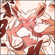
Who Replied?![#32 - Legendary Pokémon [Voting]](https://img521.imageshack.us/img521/5885/deoyxsiotw32.png "#32 - Legendary Pokémon [Voting]")
![#32 - Legendary Pokémon [Voting]](https://i56.tinypic.com/29gijc2.png "#32 - Legendary Pokémon [Voting]")
![#32 - Legendary Pokémon [Voting]](https://i862.photobucket.com/albums/ab183/ASC303/Enteifinal.png "#32 - Legendary Pokémon [Voting]")
![#32 - Legendary Pokémon [Voting]](https://i835.photobucket.com/albums/zz277/LOVEgasoos/random/JARACHii.png "#32 - Legendary Pokémon [Voting]")
![#32 - Legendary Pokémon [Voting]](https://a.imageshack.us/img843/589/darkrai.png "#32 - Legendary Pokémon [Voting]")

TwilightBlade
All dreams are but another reality.
- 7,244
- Posts
- 17
- Years
- Age 32
- Florida
- Seen May 28, 2024
Although I adore the composition of Ana's and Kephyxy's icon, Derozio gets my vote. I am impressed by what he did with a simple, horrible quality anime screencap. Stunning entry; love the fire.

curiousnathan
Starry-eyed
- 7,753
- Posts
- 14
- Years
- Australia
- Seen Mar 11, 2024
All amazing icons but my vote has to go towards:
Spoiler:
BINARYPEACHES.
- 10,674
- Posts
- 15
- Years
- Seen May 19, 2024
Hands down, Anastasia.R deserves to win this contest, her icon is vastly superior. It's innovative, it's technical, it's appealing to the eye and quite simply it's the only one I would use personally. It's effect is not busy, it doesn't take away from the stock, nor does the burning on the right, in fact it adds to depth very much. The stock placement is perfect, it's an icon not following the same path most icons follow these days, it's very artistic and looks beyond the obvious. I'm amazed no one else seen it in the same regard D;
IR's was just a little bit of a colour touch up, lightning, and image improvement probably, then go go go submit. It doesn't really differ greatly from the stock. So, due to very little changes made, I didn't go for it.
BP's, I must admit I liked this a lot, I thought it was probably second in my opinion. The colours are nice but she also added the heart which fits well here, it matches the style. It's simplistic yes, but it's the kind of simplistic you want to see in an icon. But unfortunately, just a little too simplistic this week.
Derozio's is all flare and no trousers, the effects are everywhere, it's far far too busy for an icon. The added dust texture was pointless due to there already being enough effects going on once the flame was put in. The colours are very monochrome, with little attempt to be diverse, too dark and too obvious given the stock. It's saving grace is the addition of the flame, which I felt was a nice effect. But it's just far too busy over all, icons need negative space, this has none.
Keph's, well it's a little too empty, the text is very very off, text should never be stuck so far out of site and away from the focal. The stock doesn't look like it was changed a lot. Kudos for attempting to go in a different direction, sadly it just didn't suffice to get my vote. Icons need to be on point, this is just a little off, especially with the stock placement, I dislike the overall shape.
So, Ana GMT.
kephxy
xeem xyooj
- 27
- Posts
- 13
- Years
- LAND OF 10,000 LAKES
- Seen Jul 28, 2011
Yes, I agree, I'm in love with Anastasia.R's. It's amazing. & I also like Derozio's too.
@Abnegation: I'm totally with you. xD I know I did a poor job but, this was fun. :D Thanks for the critiques <3
@Abnegation: I'm totally with you. xD I know I did a poor job but, this was fun. :D Thanks for the critiques <3
Enigma
[i][font=Noto Serif][color=#e2ad53]The [color=#d94
- 1,221
- Posts
- 16
- Years
- California
- Seen Aug 25, 2016
I'd like to take the time to say that everyone who entered is awesome. You guys are all on a much higher level than me, obviously. :pink_laugh: Curse not having Photoshop. Thanks for the critique, I'll work hard to figure out how to improve my style, decent program or not<3
- Status
- Not open for further replies.