• Our software update is now concluded. You will need to reset your password to log in. In order to do this, you will have to click "Log in" in the top right corner and then "Forgot your password?".
  • Welcome to PokéCommunity! Register now and join one of the best fan communities on the 'net to talk Pokémon and more! We are not affiliated with The Pokémon Company or Nintendo.

5qwerty's Pixel Art

lx_theo

Game Developer
958
Posts
14
Years
    • Seen Nov 2, 2013
    Thanks you for that boost of confidence, just something to ask, what does Cell Shading mean? I know who Cell is, but I actually never got to the Cell Games Saga.

    As for the trainer, it was my first, so you wouldn't really expect much.


    I really doubt their referring to that. I believe they're talking about a style of shading. Someone correct me if I'm wrong, please
     

    5qwerty

    [b][font="open sans"]WHOLLY MOLEY[/font][/b]
    2,102
    Posts
    15
    Years
    • Seen today
    Oh, I see now. I thought you meant from DBZ...
    So you mean there's Cell Shading on the Water Starters, right?
     

    Cloche

    エスパーレディ
    788
    Posts
    18
    Years
  • Yes. But, sometimes, pixel shading may look like Cell shading, because of lack of dithering. I don't mean it looks "bad" I think it looks good actually. Just something I noticed. ^,^
    I actually really like your pixels. <3
     

    = GPR =

    Birding Extraordinaire
    655
    Posts
    15
    Years
  • Revamps look great. on surface view, i don't see anything wrong with them. Nice job, btw, on the leaves.

    Now, your project sprites seem to have the right idea with the shading and the outlining, but the anatomy is just a bit too blocky for my preference.

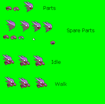
    Thordog and badylug may need some shading near the legs. This shading isn't for diffusing light/dark spots made by shading, but instead, for giving the body and anatomy more structure. This technique is called chiaroscuro. What it does it make the sprite look more "3D". By adding a line of a darker tone, it makes an extension of the legs. In that respect, it pretty much makes it so the sprite doesn't have four little stubs coming out of his belly.

    As for the shading, it's pretty much on track, but it's a bit rigid, such as on the snail evo's shell, or on flartle. When the anatomy is round, you want to make the shading more rounded as well.

    Overall, your sprites are not bad at all. They have some work needed, but they are getting there.

    I would rate thorndog a 5/10. He needs more definition for his legs. The same can be said for badylug, it needs more leg defintion, but it's eyes are also a bit strange. So i give badylug a 4/10.

    Flartle gets a 6/10. His shading is good, but there needs to be more of a roundness on the shell, and the head is a bit too light overall.

    Slug gets a 7/10. It's a bit cylindrical, but is a good sprite overall. You could maybe improve this sprite by lightenting the outline of the yellow to a more brownish tone. Especially between the blue. As for the snail, i give it a 8/10. Defintely your best. Again, just round the shading a bit more. Also, i'd recommend curving the left antennae beneath the eye, only because it looks a bit to rigid going strait up. I like the idea of the other eye wrapping around it though, and recommend you keep that anatomy factor.

    I'll leave you with that, since it's a mouthful to write, and an earful to read... (that sound's funny actually, but is technically true on the internet...)

    You have some good work here, and good ideas. You just need to keep touching them up! Keep trying though... and of course...

    Keep Spriting!
     

    5qwerty

    [b][font="open sans"]WHOLLY MOLEY[/font][/b]
    2,102
    Posts
    15
    Years
    • Seen today
    4, 5 ,6, 7, 8! (lol)

    Yeah, thanks guys, I always thought I wasn't that good, I'll get working on it.
     
    58
    Posts
    14
    Years
    • Seen Jul 9, 2011
    The one that bothers me the most is Submashel.

    the eyestalks look plain outright weird, and the outlining is way too dark. The outlining on the portion of head near the stalks is very crooked and jagged (3-1-2 where it should be 3-2-1), and I'm pretty sure the shell's darker shade is too dark.
     

    = GPR =

    Birding Extraordinaire
    655
    Posts
    15
    Years
  • 4, 5 ,6, 7, 8! (lol)

    Yeah, thanks guys, I always thought I wasn't that good, I'll get working on it.

    I didn't say that!

    I actually think that you're doing a great job. With more practice, you'll get WAY BETTER! It's only natural. Look at my stuff on my thread for example. When i first started, the shading was horrible, the outlining was way off, and to be honest, i had some scary color choices... but with practice, you'll get better!

    Keep Spriting!
     

    5qwerty

    [b][font="open sans"]WHOLLY MOLEY[/font][/b]
    2,102
    Posts
    15
    Years
    • Seen today
    Thanks guys, and I will try to update as soon as possible. But there are some reasons that I can't update:

    1. School is starting/has started.
    2. I am trying to work out concepts right now.
    3. My spriting computer is not connected to the Internet.
     
    22
    Posts
    14
    Years
    • Seen Aug 26, 2011
    I them see good, I liked them. Only the alternative evo of cacnea I see her almost = deveria to have other things, good I expect to see mas good-bye.
     

    5qwerty

    [b][font="open sans"]WHOLLY MOLEY[/font][/b]
    2,102
    Posts
    15
    Years
    • Seen today
    Huh? What?

    Sorry, School's just keeping me busy.
     

    5qwerty

    [b][font="open sans"]WHOLLY MOLEY[/font][/b]
    2,102
    Posts
    15
    Years
    • Seen today
    Whipped these two up in 20 minutes or so, C+C please.
     

    Chesu

    Boss Carrot
    583
    Posts
    15
    Years
  • There's a bit too much contrast between the shades of the ones on the left... and too little between the shades of the one on the right! How did you manage that? XD
     

    5qwerty

    [b][font="open sans"]WHOLLY MOLEY[/font][/b]
    2,102
    Posts
    15
    Years
    • Seen today
    What? Between the shades? Okay then.
     

    5qwerty

    [b][font="open sans"]WHOLLY MOLEY[/font][/b]
    2,102
    Posts
    15
    Years
    • Seen today
    IN my next hack, yes.
    Some C+C please?

    Haunter for something else.
     
    Last edited:

    Josh B

    You better slam her dizzy!
    26
    Posts
    14
    Years
    • Seen Oct 13, 2009
    ya know im loving the bayleaf! idk why haha. your not too shabby ant pokemon spriting. i gotta say though the trainer is just a little off. I think it maybe the arms. i think theyre too long, maybe too thin, maybe both?

    Dont take offense please. I gotta say you have some good stufff going there. keep it up
     
    Back
    Top