• Our software update is now concluded. You will need to reset your password to log in. In order to do this, you will have to click "Log in" in the top right corner and then "Forgot your password?".
  • Welcome to PokéCommunity! Register now and join one of the best fan communities on the 'net to talk Pokémon and more! We are not affiliated with The Pokémon Company or Nintendo.

Aura's Gallery

Aurafire

provider of cake
  • 5,736
    Posts
    16
    Years
    Aura's Gallery

    (and a few requests)


    Examples (earliest to latest):

    Comments are appreciated

    Aura's Gallery


    Aura's Gallery


    Aura's Gallery


    Aura's Gallery


    Aura's Gallery


    Requests:


    One request at a time. If I'm working on a request, please don't post another until I'm done with the first one. I'll attempt icons but they're not my forte. I reserve the right to reject any stock for any reason. No pokemon please. "Give credit where credit is due." Use this form:

    Stock:
    Icon set or theme:
    Specifics:
     
    Last edited:

    moments.

    quixotic
  • 3,407
    Posts
    15
    Years
    Just comments for now, you have improved sooo much since last time I saw your arts!
    You've got the clean, crisp aesthetic of some of Loki's old tags especially the third and fourth tags which i feel are your best.
    Love your use of lighting and colours and am adoring the use of renders as effects (fourth tag).

    Keep up the amazing work!
     

    Aurafire

    provider of cake
  • 5,736
    Posts
    16
    Years
    Just comments for now, you have improved sooo much since last time I saw your arts!
    You've got the clean, crisp aesthetic of some of Loki's old tags especially the third and fourth tags which i feel are your best.
    Love your use of lighting and colours and am adoring the use of renders as effects (fourth tag).

    Keep up the amazing work!

    Thanks a lot! I still think there's a fair bit of improving I could do but yeah, compared to a year ago I'm much more comfortable with my work.
     

    JeXsus™

    I don't need an avatar!
  • 132
    Posts
    13
    Years
    • Age 31
    • NY
    • Seen Apr 3, 2016
    I'm just commenting, They all look really good and well done, nice and clean. The last one is my favorite. Also the coloring is amazing. ^_^
     

    Aurafire

    provider of cake
  • 5,736
    Posts
    16
    Years
  • 10,674
    Posts
    15
    Years
    • Seen May 19, 2024
    Good to see you back Aura, not requesting today I'm afraid, though I'm here to drop by a few comments on your latest works.
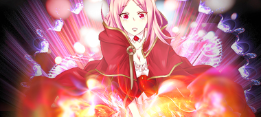
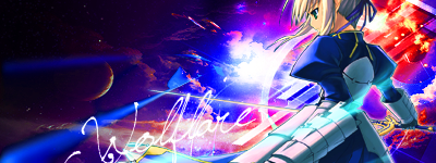
    What impressed me a lot and really put you on the map in my eys was the tag you did for Twilight Blade. The pen tooling is really nicely done here and works well with the text and is quite evident in the tag. The red lighting at the bottom is just delicious and tasteful. The elegance of the font used suits the stock. What I think this tag could have done with was a little blurring here and there, notably the edges of the tag as a whole.
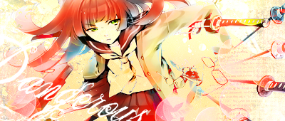
    What dissapointed me a little was your SotW entry, it's just that monotone really kills the tag, I don't much like the stock though to be honest but there's a little too much of the same colour in this one.
    I looove the soft palette in this, it really spreads flow throughout the entire tag, it's really eye pleasing. Though again, not a big fan of the stock but in turn, you managed to make it appeal to me.
    This was so close to being perfect, but it doesn't lend to well mainly on the left hand side. I like the effects used and I like the style, it looks really high quality just a little unfinished imo.
    Your last, again, monotone kinda kills this one because it's hard to make out details. Though I can feel a sense of flow, just not a great choice on colours.

    You're really pushing the boundries with some tags and proving yourself to be on your way to be a very good artist. Though, if you want to challenge yourself, try doing some stuff with real stocks (IRL stocks) and see how that works out for you. Keep it up, I'm liking your style.
     

    Aurafire

    provider of cake
  • 5,736
    Posts
    16
    Years
    Good to see you back Aura, not requesting today I'm afraid, though I'm here to drop by a few comments on your latest works.
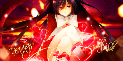
    What impressed me a lot and really put you on the map in my eys was the tag you did for Twilight Blade. The pen tooling is really nicely done here and works well with the text and is quite evident in the tag. The red lighting at the bottom is just delicious and tasteful. The elegance of the font used suits the stock. What I think this tag could have done with was a little blurring here and there, notably the edges of the tag as a whole.
    What dissapointed me a little was your SotW entry, it's just that monotone really kills the tag, I don't much like the stock though to be honest but there's a little too much of the same colour in this one.
    I looove the soft palette in this, it really spreads flow throughout the entire tag, it's really eye pleasing. Though again, not a big fan of the stock but in turn, you managed to make it appeal to me.
    This was so close to being perfect, but it doesn't lend to well mainly on the left hand side. I like the effects used and I like the style, it looks really high quality just a little unfinished imo.
    Your last, again, monotone kinda kills this one because it's hard to make out details. Though I can feel a sense of flow, just not a great choice on colours.

    You're really pushing the boundries with some tags and proving yourself to be on your way to be a very good artist. Though, if you want to challenge yourself, try doing some stuff with real stocks (IRL stocks) and see how that works out for you. Keep it up, I'm liking your style.

    Thanks for the C&C Gav.

    Honestly my SotW entry was just a filler, I probably have a better tag sitting around somewhere, just too lazy to find it. I really want to put something new in place of it though, hence me taking a few requests here or there.

    RL stocks...I've tried multiple times to work with them and they just aren't my cup of tea I guess. I find it easier to make animated stuff flow together with c4ds and effects. Obviously I need to improve here :/

    I'll definitely take your comments to heart :D

    Woah, you've gotten so good since I last saw you xD It was just us working at that god knows who shop lmao

    https://i421.photobucket.com/albums/pp297/noskralc90/random.png?t=1278982157
    I lurve this one =3=

    Hahaha oh god, the graphics shop days. Man I was bad.

    Thanks, I'm happy with how that one turned out :)
     

    Aurafire

    provider of cake
  • 5,736
    Posts
    16
    Years
    Small update. A tribute to my excitement for Gen 5 :D

    Aura's Gallery


    And my crappy icon from IOTW

    Aura's Gallery


    Idk icons confuse me :(
     

    TwilightBlade

    All dreams are but another reality.
  • 7,244
    Posts
    17
    Years
    SO HOTTTT /not ~totally~ biased cuz of N
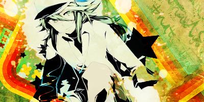
    Ah let's see why I adore this tag... I love how you created depth by adjusting the opacity settings of the orange bars, as well as flow by positioning the orange bars as such. Also, I love how you emphasized a black and white stock on such a creative, colorful, and playful background. The white splatter spots are okay as they balance the black stars. However, I do not like how his left arm, our right, has that dash of green from clipping mask fail lawl. Interesting calligraphy texture; overall sexy.

    Not digging, sorry. It's just the colors ruining it, but idk how to explain it (red and green ew?). Too dark, should have positioned the gaze at an angle similar to where her eyes are directed to, the simplicity is nice.

    P.S. Alice signature is the best kthx
    P.S.2. ilu
     
  • 10,674
    Posts
    15
    Years
    • Seen May 19, 2024
    Alrighty Aura good to see you back in action. I'm just gonna rush by here and comment on your new tag & icon.

    https://i421.photobucket.com/albums/pp297/noskralc90/BWdude.png?t=1279669378
    Bascially, you're having an issue with colour on this one. It's well composed and the lines look like they could have been awesome but because the colours are so all over the place and sort of clashing it ruins it. The stock is gone B&W (on purpose?) which is cool because it actually looks pretty well buuut, it's not matching the background. The background totally contradicts the stock in front of it which is a real pity.
    To be honest, if the colours weren't so saturated and in many ways clashing, I would like this tag a lot. The structure is amazing, but a lot of the key elements are missing.

    https://i421.photobucket.com/albums/pp297/noskralc90/iotw.png?t=1279670713
    I think icons might be something you're newish to. I haven't seen you work on them very often. You haven't quite nailed it with this one though. You see, with icons, basic colour manipulation of a nice high quality standard often is all you need to do. Generally go with brighter colourds than the stock as opposed to darkening it as you have. The clipping mask, effects and lighting could all be taken out because they're not needed. Icons are small and can get cluttered very esaily if you try to do too much. When it comes to icons, you should be thinking about "quality not quantity". A lot of my best icons were made with 4 or 5 layers and made with 3 or 4 options. Having an eye for colour really helps. I've made a tutorial on one of my icons if you'd ever like to read it, it's pretty hard to find icons tuts I think. If you can find some, it'll help you grasp them and then you won't be confused.
    Look forward to your next update buddy.
     

    .Gamer

    »»───knee─►
  • 1,523
    Posts
    14
    Years
    hey aura your graphics look like poop.


    poop graphics


    yeah you heard me


    POOP GRAPHICS


    jk ilu


    these are good. i dont have any requests i just wanted to support you and your endeavors in the art world. good job.
     

    Aurafire

    provider of cake
  • 5,736
    Posts
    16
    Years
    *uses defibrillators on gallery*

    Ok after a pretty good break, here's some new stuff:

    Aura's Gallery


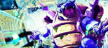
    Theme made for thoughts, didn't do a whole lot to the stock and I still think it came out pretty decent. I wish I could have emphasized the blurring in the background because that's probably my favorite part of this piece.

    Aura's Gallery


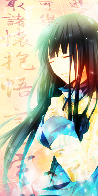
    Horrid vertical sotw entry...Way too simple. Big ugly hole of nothing at the bottom of her hands. Everything I tried to do to spice it up didn't really so I basically just added lighting and coloring and called it a day :(

    Aura's Gallery


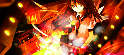
    This one looks a little over-saturated at the bottom, but I do like those bars with the lights on them, which were originally part of the stock but they looked too awesome to leave out.

    Aura's Gallery


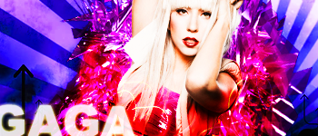
    GAGA! My first irl stock attempt that actually came out ok. Didn't really feel the need to over-work this one. I attempted the big bold text that Dukey seems to be a master of but it didn't work out too well, so I just lowered the opacity a little and added some outer glow.

    RATE-MY-TAGS?? (That means you Gavin >:D)

    EDIT: New icons that don't suck!

    Aura's Gallery
    Aura's Gallery
    Aura's Gallery
    Aura's Gallery
    Aura's Gallery
    Aura's Gallery


    Made as a set for Syndrome.
     
    Last edited:
  • 45
    Posts
    13
    Years
    • Seen Nov 27, 2013
    Stock: img195.imageshack.us/i/axelisland.png
    Icon set or theme: Theme please, and make the icon 100x100

    Specifics: Uhmm, just surprise me.
     

    Aurafire

    provider of cake
  • 5,736
    Posts
    16
    Years
    Stock: img195.imageshack.us/i/axelisland.png
    Icon set or theme: Theme please, and make the icon 100x100

    Specifics: Uhmm, just surprise me.

    That link sends me to a 1x1 px. image :(

    But thank you for your interest, I haven't done a request in a while.
     
    Back
    Top