
You are using an out of date browser. It may not display this or other websites correctly.
You should upgrade or use an alternative browser.
You should upgrade or use an alternative browser.
Captain Fabio's Photography Gallery
- Thread starter Captain Fabio
- Start date
More options
Who Replied?
- 12,201
- Posts
- 18
- Years
- Age 34
- London, UK
- Seen Nov 4, 2021
Got bored last night and started to see what I could do with a pitch black room and a lighter! XD
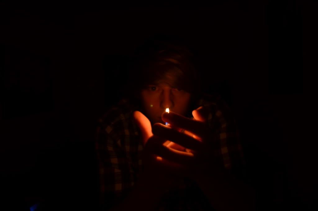
I know I am not center and there is a slight flame glare but I think it is pretty cool and dark in a sense.
Spoiler:
I know I am not center and there is a slight flame glare but I think it is pretty cool and dark in a sense.
Overlord Drakow
Banned
- 3,655
- Posts
- 16
- Years
- Down Under
- Seen Nov 6, 2019
Did you just say dark?
It's a decent photo, it looks like the flame is burning one of your fingers though lol.
It's a decent photo, it looks like the flame is burning one of your fingers though lol.

- 12,201
- Posts
- 18
- Years
- Age 34
- London, UK
- Seen Nov 4, 2021
Thank you elarmasecreta and Drakow. =]
Ok, so I was playing around with my Macro Lens today and produced these two. Note, that the strange focusing was done on purpose. :3
I love Macro photography, so fun, but it is tough at times.
Ok, so I was playing around with my Macro Lens today and produced these two. Note, that the strange focusing was done on purpose. :3
Spoiler:
Spoiler:
I love Macro photography, so fun, but it is tough at times.
Last edited:
- 12,201
- Posts
- 18
- Years
- Age 34
- London, UK
- Seen Nov 4, 2021
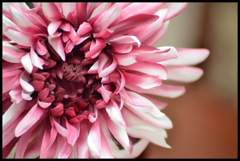
Basic macro picture, but I think the lighting and the colour makes is something else.
:::EDIT:::
Took a new one! XD
Spoiler:
:::EDIT:::
Took a new one! XD
Spoiler:
Last edited:
- 12,201
- Posts
- 18
- Years
- Age 34
- London, UK
- Seen Nov 4, 2021
I am on fire this weekend! XDD
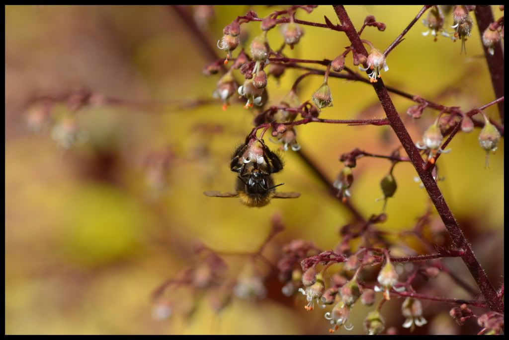
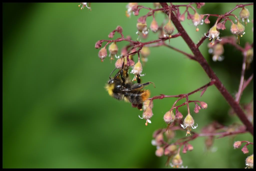
Note, if you don't like bees, I wouldn't look! :P
Note, if you don't like bees, I wouldn't look! :P
Spoiler:
Spoiler:
Alright, I'm not going to give huge in depth comments for all of the photos, but I can see some trends going on that I can address a couple of photos to each.
Firstly, Rip-1.png, bee.jpg and bee2.jpg all are great photos. Good depth of field, nice colours and the focus is nice (bee.jpg seems to be a tad out of focus on the actual bee, but probably just because it moved or something, hard to get a clean, accurate focus). However all these photos have centred focal points. Going by the basic rule of thirds rule which I know you know, these images have either been cropped funny, or you just took them like that. While there is nothing wrong with the photo itself, the placement of the focal points and the composition is the only thing letting it down in my opinion. They just feel a bit weak and don't stand out as much as they could.
The next bunch are flower.jpg and tap.jpg. Basically, I think these images are executed nicely, nice colours and beautiful depth of field and accurate focusing, however, I think the composition again is lacking. Both of them just feel sort of boring, mainly because of the framing / how you have actually arranged everything. Firstly, I'd argue that the flower is way too big in the frame and because you have a lot of it included, but the outermost parts outside the frame, it isn't balanced and seeing a macro of just a flower and not showcasing the depth of field too much is nothing special and a little plain...
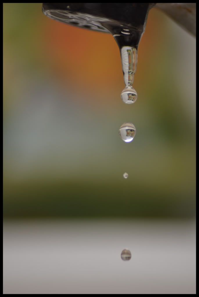
tap.jpg is the same deal, I'd try and get more of the actual tap in the frame so it feels more rounded and balanced. Also, maybe try adding artificial light to brighten parts up and make it a little more exciting. It is a little flat, not in terms of depth, just in elements. It is like background blurred, then tap + water. Try add some foreground or more elements in the background in between the furthest point and the focal.
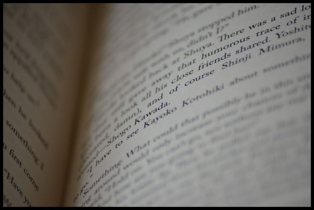
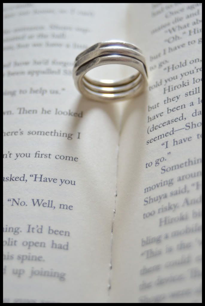
As for book.jpg, I love these kinds of photos, however because yours does not show a quote or line that can stand by itself and remain meaningful, it is quite boring. Yes, technically it is a lovely photo and well shot, but the content is boring and doesn't connect with the viewer. It is like you saw the book open, and just took a photo wherever it was open to. It could have been so much better if you looked for a line to keep in focus that could mean something to the viewer without reading any of the rest of the page / book. Right now it is just foreign and confusing.
Hopefully that wasn't too harsh! ;)
Firstly, Rip-1.png, bee.jpg and bee2.jpg all are great photos. Good depth of field, nice colours and the focus is nice (bee.jpg seems to be a tad out of focus on the actual bee, but probably just because it moved or something, hard to get a clean, accurate focus). However all these photos have centred focal points. Going by the basic rule of thirds rule which I know you know, these images have either been cropped funny, or you just took them like that. While there is nothing wrong with the photo itself, the placement of the focal points and the composition is the only thing letting it down in my opinion. They just feel a bit weak and don't stand out as much as they could.
The next bunch are flower.jpg and tap.jpg. Basically, I think these images are executed nicely, nice colours and beautiful depth of field and accurate focusing, however, I think the composition again is lacking. Both of them just feel sort of boring, mainly because of the framing / how you have actually arranged everything. Firstly, I'd argue that the flower is way too big in the frame and because you have a lot of it included, but the outermost parts outside the frame, it isn't balanced and seeing a macro of just a flower and not showcasing the depth of field too much is nothing special and a little plain...
tap.jpg is the same deal, I'd try and get more of the actual tap in the frame so it feels more rounded and balanced. Also, maybe try adding artificial light to brighten parts up and make it a little more exciting. It is a little flat, not in terms of depth, just in elements. It is like background blurred, then tap + water. Try add some foreground or more elements in the background in between the furthest point and the focal.
As for book.jpg, I love these kinds of photos, however because yours does not show a quote or line that can stand by itself and remain meaningful, it is quite boring. Yes, technically it is a lovely photo and well shot, but the content is boring and doesn't connect with the viewer. It is like you saw the book open, and just took a photo wherever it was open to. It could have been so much better if you looked for a line to keep in focus that could mean something to the viewer without reading any of the rest of the page / book. Right now it is just foreign and confusing.
Hopefully that wasn't too harsh! ;)
- 12,201
- Posts
- 18
- Years
- Age 34
- London, UK
- Seen Nov 4, 2021
Firstly, Rip-1.png, bee.jpg and bee2.jpg all are great photos. Good depth of field, nice colours and the focus is nice (bee.jpg seems to be a tad out of focus on the actual bee, but probably just because it moved or something, hard to get a clean, accurate focus). However all these photos have centred focal points. Going by the basic rule of thirds rule which I know you know, these images have either been cropped funny, or you just took them like that. While there is nothing wrong with the photo itself, the placement of the focal points and the composition is the only thing letting it down in my opinion. They just feel a bit weak and don't stand out as much as they could.
Hate to tell you this, but I don't crop photos. So none of these are cropped. The full size of the picture is 5028 x 3364, so that isn't cropped at all; I don't crop my photos.
Photobucket reduced the size, but the full sized versions are on my DA: http://alinthea.deviantart.com/
Photobucket reduced the size, but the full sized versions are on my DA: http://alinthea.deviantart.com/
The next bunch are flower.jpg and tap.jpg. Basically, I think these images are executed nicely, nice colours and beautiful depth of field and accurate focusing, however, I think the composition again is lacking. Both of them just feel sort of boring, mainly because of the framing / how you have actually arranged everything. Firstly, I'd argue that the flower is way too big in the frame and because you have a lot of it included, but the outermost parts outside the frame, it isn't balanced and seeing a macro of just a flower and not showcasing the depth of field too much is nothing special and a little plain...
The reason behind these photos was to take some type of 'stock' photos. They are very simple, very basic, but can be beautiful at the same time.
tap.jpg is the same deal, I'd try and get more of the actual tap in the frame so it feels more rounded and balanced. Also, maybe try adding artificial light to brighten parts up and make it a little more exciting. It is a little flat, not in terms of depth, just in elements. It is like background blurred, then tap + water. Try add some foreground or more elements in the background in between the furthest point and the focal.
If you mean artificial lighting as a flash gun, then I know. I didn't have it on me because I am at home where it isn't.
As for book.jpg, I love these kinds of photos, however because yours does not show a quote or line that can stand by itself and remain meaningful, it is quite boring. Yes, technically it is a lovely photo and well shot, but the content is boring and doesn't connect with the viewer. It is like you saw the book open, and just took a photo wherever it was open to. It could have been so much better if you looked for a line to keep in focus that could mean something to the viewer without reading any of the rest of the page / book. Right now it is just foreign and confusing.
I know what you mean, this was the first picture I took with my new macro lens, so it is bound to be worse than the rest.
Hopefully that wasn't too harsh! ;)
Not at all, thank you for the feedback.
I have only just got my new camera and just using the new lens, so these aren't really the most amazing pictures, so I am working on that.
Thanks though!
I have only just got my new camera and just using the new lens, so these aren't really the most amazing pictures, so I am working on that.
Thanks though!
Last edited:
- 12,201
- Posts
- 18
- Years
- Age 34
- London, UK
- Seen Nov 4, 2021
Some new macro photography with a new lens that I got.
Leaf Droplets

Shades of Green
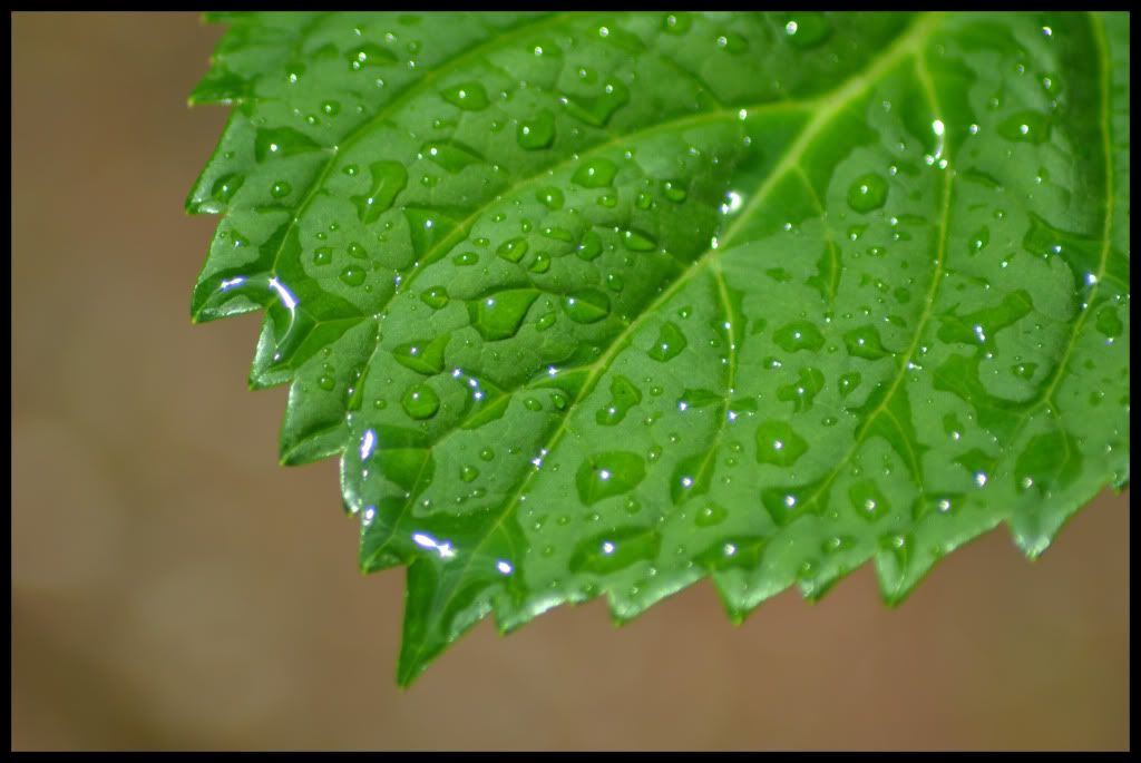
Leaf Droplets
Spoiler:
Shades of Green
Spoiler:
- 10,673
- Posts
- 15
- Years
- Seen Dec 30, 2023
I really love the first one Fab, how did you pull off such serious blurring around the edges? I've never seen it so heavy like that.
- 12,201
- Posts
- 18
- Years
- Age 34
- London, UK
- Seen Nov 4, 2021
Like I told you on MSN, but I will repeat it for anyone else.
The advantage I have is I have a special Macro lens for my camera and I only use manual focusing to get that harsh depth of field!
The advantage I have is I have a special Macro lens for my camera and I only use manual focusing to get that harsh depth of field!

- 593
- Posts
- 13
- Years
- Seen May 1, 2024
Wow, they are so great Captain Fabio. If I had to choose one, my favorite is Falling Water, by looking at photos I feel as if the water is moving. Great!! =)

- 4,001
- Posts
- 19
- Years
- Age 32
- Santa Isabel, Mexico
- Seen Jul 7, 2018
Wow, you went to Kinkaku-Ji! It's been my dream to visit that place. I take it from the pictures, you went to both Kyoto and Tokyo.
I'm off to Japan next semester, and I hope I can take pictures as nice as yours. Is there any way you can provide Exif info on the Faling Water & Shades of Green photos?
edit / just read you use a "special" macro lens for the last one, at least. May I know which lens exactly? :)
Thanks in advance.
I'm off to Japan next semester, and I hope I can take pictures as nice as yours. Is there any way you can provide Exif info on the Faling Water & Shades of Green photos?
edit / just read you use a "special" macro lens for the last one, at least. May I know which lens exactly? :)
Thanks in advance.
Last edited:
- 12,201
- Posts
- 18
- Years
- Age 34
- London, UK
- Seen Nov 4, 2021
Thanks guys! Love the comments.
Only got Internet because a friend let me use theirs, but I have 3 pictures to upload; experimenting with a lighter...
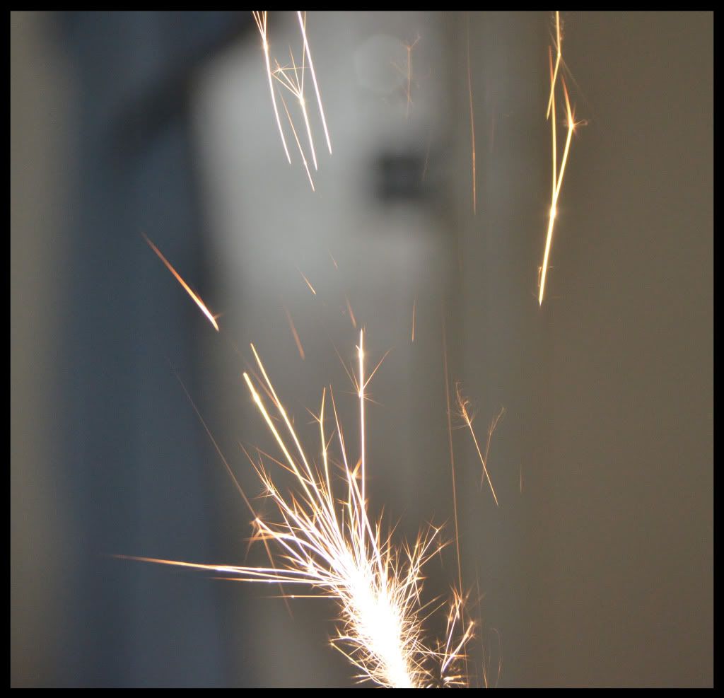
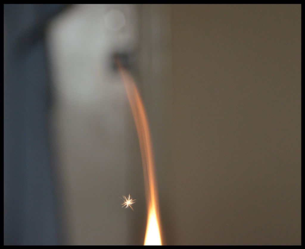
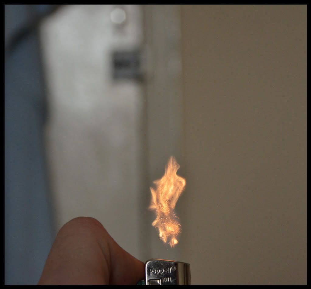
Only got Internet because a friend let me use theirs, but I have 3 pictures to upload; experimenting with a lighter...
Sparks
Spoiler:
Star
Spoiler:
Flame
Spoiler:
- 12,201
- Posts
- 18
- Years
- Age 34
- London, UK
- Seen Nov 4, 2021
Shadow Heart
Spoiler:
Nothing special but meh, thought I would put it up.
I have to say, your new camera does wonders and you take excellent use of Micro. Rip and Flame are two of my favorites of some of your most recent work. My only nitpick would be with Flame. It would have been better if you had a better background so it didn't take away any beauty from the flame. However, I was highly impressed with Water Droplets. You got a great effect on that one. The blurring around the edge of the leaf was done brilliantly. Plus, you really feel the texture of the leaf ─ or is it a blade of grass? Definitely one of your best works on here.
A noticeable mention would be Nature's Beauty. This was taken so well I could tell it wasn't a real flower, haha.
I hope you keep experimenting and taking more photographs with your camera, because I'll be looking forward to it. Just keep me posted when you do.
A noticeable mention would be Nature's Beauty. This was taken so well I could tell it wasn't a real flower, haha.
I hope you keep experimenting and taking more photographs with your camera, because I'll be looking forward to it. Just keep me posted when you do.

Brane
-
- 372
- Posts
- 12
- Years
- Age 30
- Seen May 10, 2016
The flame and spark ones are pretty nifty, I'm guessing you cropped them but that doesn't matter. One thing I have to say is that it would be better if you had a dark background or took the photos outside at nighttime, that would really help to strengthen the lighting and you'd get a sort of soft glow around them.
But with the ring one, I don't get it?
But with the ring one, I don't get it?
- 12,201
- Posts
- 18
- Years
- Age 34
- London, UK
- Seen Nov 4, 2021
I am sorry guys, I have been so busy recently, that it has been hard to get my photography on.
However, I was at a family wedding at the weekend and managed to snap this quick picture, which I love.
However, I was at a family wedding at the weekend and managed to snap this quick picture, which I love.
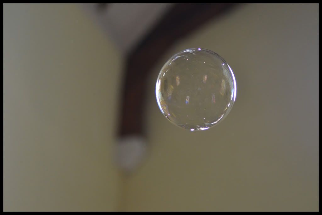
Bubble
Spoiler:
Now that is a nice crisp photograph!
I'm assuming you were manual focusing which I can imagine would've been a bit fiddly because the bubble is always moving... :P
But yeah, a technically great photo, I just feel it is a little sort of boring. I know it was at a wedding, so you can't set up elaborate lighting or anything, but catching the image with a busier background and then the bubble in focus could've had some nice overtones, or somewhere with stronger lighting so it refracts through the bubble and gets those colours in the liquid popping. They always look nice! :D
But yeah, great photo, I'd like to see some more planned shots by you, sort of set up environments where you move things so it isn't necessarily 'natural'. I reckon you could get some really great photographs!
Keep it up!