definitely not digging it, I already hated the style for let's go, but the overworld sprites here bother me even more.
But before I get into that let me be real for a second.
This, right here, is the only thing that bothers me about the battle sprites, yeah they're somehow both flat & oddly bulgey but its this that ruins it to me.

Hand looks great, (which is far from easy so points for that) but how is that a face...
It's vaguely creepy and will always bother me. The flat painted on face is just really jarring to me especially in comparison to the
3d and properly contrasted depth of everything else.
Ok that's it, now overworld sprites...

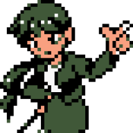
The heads are freakin massive!! look at this comparison, compared to the old sprite is bad enough, but her head alone is bigger than the pokemon!

And I feel with the switch they could have done
much better with the sprites in the overworld, if the bodies were exactly like mii fighter from smash
I would be absolutely happy.

No A-posing, and joints actually bend, and it completely works for a cartoonish aesthetic.
Its already a nintendo property and that's for a game that came out like what almost 10 years ago?
the lighting and shadow effects are nice though. but I'll prob pass on this and go for arceus instead, provided that isn't messed up somehow.