Chura's Art Spam 2023
Hello!
This thread's going to be my documentation for my yearly challenge. I'll be putting in here my suffering, my scuff, my learnings... but mostly my art. Hopefully I finish my thing gfjkds
[2/14] Art Studies
[2/12] Monthly Art Pieces


This thread's going to be my documentation for my yearly challenge. I'll be putting in here my suffering, my scuff, my learnings... but mostly my art. Hopefully I finish my thing gfjkds
[2/14] Art Studies
Spoiler: Anime-Style Background Design by Illustrator HayateLuc
The class that teaches all about Composition and Perspective in designing backgrounds. It's pretty basic and gave just a good jumping point on starting out. I stopped at the composition chapter for now to do more of those before moving on to perspective since I'd wanna nail down composition first before everything else. Something something foundation or whatever.
He mentioned I'd need to have a solid idea first of all but I didn't, so I asked Sonata and Grey Bidoof for some. For the first two I'll be working on their prompts. Expect a bunch of scuff, and maybe a bit of the same thing. :') Since looking at the first attempt (the only art on here right now)... it's really scuff (sobs)

So.... there were some obvious problems with it. At a glance it's fine, but it doesn't provide enough of an oomph for me. I like the movement characterized by the wheat field's movement, but the attempt at a foreboding perspective didn't turn out right with that kind of composition. Which is why obviously I had to try again. :) Center composition is usually good for backgrounds with symbolic meanings, and while this does have it, with my current ability it's to tricky for me to do it right.
The second attempt is a safer bet, landscape this time! I tried to work with both the rule of thirds and golden ratio ruling, so it's definitely less scuff as it should be. I can say for certain I improved at trees, but... composition-wise, I already see some thing I did wrong, and hopefully the next pieces would be somewhat better! (sobs again)

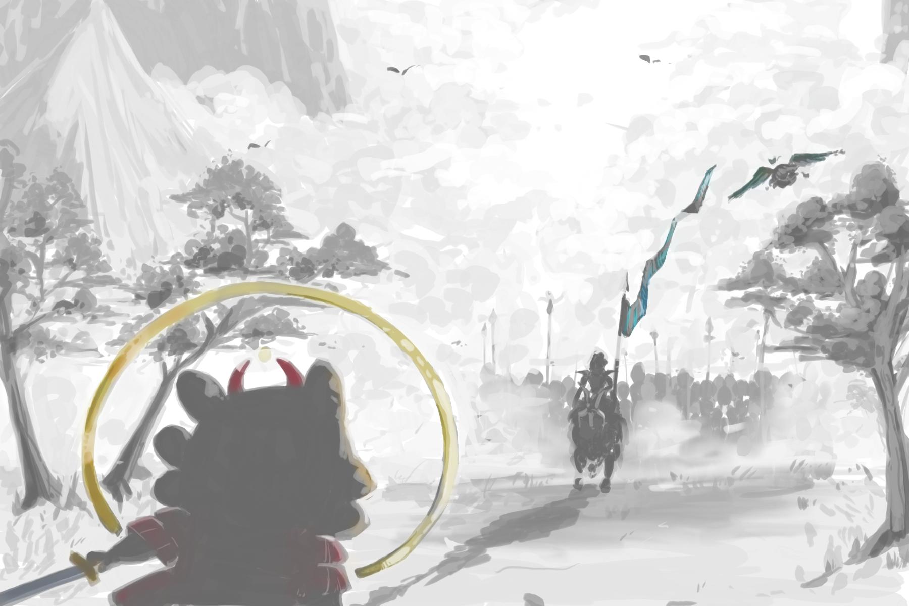
Third attempt is actually a commission by Murkmire of his D&D character, Scinniq, an owlin bard who acts very much like a rogue and has the edgiest backstory known to man. That said, the background I did for this was before the class but just generally using the tips I've heard of before in terms of rough thumbnail compositions, so it's definitely skill-level different from the official first and second (so "third" as in I finished this late but it's the official "zeroth"?

While the fourth attempt is still a work-in-progress (and might prove to be a mix of the first and second study so let's see), the fifth is something I made for my personal TTRPG campaign, Golden Glow. I didn't try as hard to make things super pretty, but definitely followed the basic composition guidelines that I barely recalled ahaha. At this point, I still have miles to go but I think I'm prepared to dive into the perspective part of the background piece and move on to the next study!

Well... I lied, I tried to make something using that one with perspective in mind too. This one I feel definitely encapsulates my progress with backgrounds combined with adding characters to it. Even if it's black and white, the goal of making the viewer just stare at the image works and solves a lot of problems I originally had in the previous pieces. Definitely something I'm proud of and am glad to finally make it this far at least!
He mentioned I'd need to have a solid idea first of all but I didn't, so I asked Sonata and Grey Bidoof for some. For the first two I'll be working on their prompts. Expect a bunch of scuff, and maybe a bit of the same thing. :') Since looking at the first attempt (the only art on here right now)... it's really scuff (sobs)
Spoiler: The first attempt:
So.... there were some obvious problems with it. At a glance it's fine, but it doesn't provide enough of an oomph for me. I like the movement characterized by the wheat field's movement, but the attempt at a foreboding perspective didn't turn out right with that kind of composition. Which is why obviously I had to try again. :) Center composition is usually good for backgrounds with symbolic meanings, and while this does have it, with my current ability it's to tricky for me to do it right.
The second attempt is a safer bet, landscape this time! I tried to work with both the rule of thirds and golden ratio ruling, so it's definitely less scuff as it should be. I can say for certain I improved at trees, but... composition-wise, I already see some thing I did wrong, and hopefully the next pieces would be somewhat better! (sobs again)
Spoiler: The second attempt:
Third attempt is actually a commission by Murkmire of his D&D character, Scinniq, an owlin bard who acts very much like a rogue and has the edgiest backstory known to man. That said, the background I did for this was before the class but just generally using the tips I've heard of before in terms of rough thumbnail compositions, so it's definitely skill-level different from the official first and second (so "third" as in I finished this late but it's the official "zeroth"?
Spoiler: The third attempt:
While the fourth attempt is still a work-in-progress (and might prove to be a mix of the first and second study so let's see), the fifth is something I made for my personal TTRPG campaign, Golden Glow. I didn't try as hard to make things super pretty, but definitely followed the basic composition guidelines that I barely recalled ahaha. At this point, I still have miles to go but I think I'm prepared to dive into the perspective part of the background piece and move on to the next study!
Spoiler: The fourth-fifth attempt:
Well... I lied, I tried to make something using that one with perspective in mind too. This one I feel definitely encapsulates my progress with backgrounds combined with adding characters to it. Even if it's black and white, the goal of making the viewer just stare at the image works and solves a lot of problems I originally had in the previous pieces. Definitely something I'm proud of and am glad to finally make it this far at least!
Spoiler: The sixth attempt:
Spoiler: Bonus Study: Texture Spheres
This is just a note to myself to do this
[2/12] Monthly Art Pieces
Spoiler: January: Art Studio Sticky Thumbnails
Spoiler: January BONUS: Perfume Bottle Character Design
Spoiler: February: Dainty Requests
Spoiler: February Special: Masumi's Valentine
Spoiler: March
Check again for March!
Last edited: