• Our software update is now concluded. You will need to reset your password to log in. In order to do this, you will have to click "Log in" in the top right corner and then "Forgot your password?".
  • Welcome to PokéCommunity! Register now and join one of the best fan communities on the 'net to talk Pokémon and more! We are not affiliated with The Pokémon Company or Nintendo.

Core's Sigs

Core-3X

New starter today
22
Posts
16
Years
  • Rates and comments on my sigs please =)

    A Zelda sig. I like it very much, and it's -said by others- one of my best sigs.
    Core's Sigs


    Here a very simple sig. Grunge and a little vector.
    Core's Sigs


    One of my Fire Emblem sigs, text sucks.
    Core's Sigs


    Won a sig tournament with theme 'Flower Power':

    Core's Sigs


    A comet like thing, smudge style.
    Core's Sigs


    Smudge style, I'm not very used to it, can you see it =)
    Core's Sigs


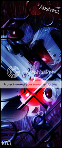
    Abstract, little vector
    Core's Sigs


    For a sig tournament with theme 'Collaboration'. So I worked with someone else.
    Core's Sigs


    Filter style, it was a gift.
    Core's Sigs


    Experiment of smudging and the pen tool:
    Core's Sigs


    Kakashi wallpaper, right side sucks, I know xD

    Spoiler:
     

    Mao

    Feeling F R E S H
    59
    Posts
    15
    Years
  • Were those done on Photoshop? I like the Fire Emblem Sig and I love your style overall
     

    Mao

    Feeling F R E S H
    59
    Posts
    15
    Years
  • Yes, I made them in photoshop. And thanks for the compliments ^_^
    Well, you are very skilled. I thought those looked fine, if I have time I might ask you to make me a theme or at least an avatar. ;)
     

    YOOM-TAH

    Piplup Fanatic
    920
    Posts
    15
    Years
  • The first thing you need to work on is the backgrounds. Try to ween yourself off of the downloaded brushes everywhere. They typically lack depth and flow because of the way they're made. A lot of the backgrounds you have going on are all over the place. They lack a direction and therefore distract from the focal.

    After that, work more on text. The text in the majority of these sigs do nothing more than distract, which is typically not what they're purpose is. The text should usually be noticeable, but not a focus of the sig in any way, unless it's a typography or minimal style sig.

    Lastly, lighting needs work. Always pay attention to the highlights and shadows of the render you're using, and make sure the rest of the sig follows with that lighting. For example, if the render has light coming from the upper left, make sure that light affects the rest of the sig, not just the render.

    You have the right idea as far as render placement and composition goes. Just keep practicing and improving. I suggest looking into other mediums such as Terragen and Cinema4D, as well as Fractal programs such as Apophysis. Or if you don't want to get those (C4D isn't free) you can always use resources until you feel comfortable using those in your sigs.
     

    Core-3X

    New starter today
    22
    Posts
    16
    Years
  • I know I'm not good at texts, and I'm trying to get it better. I should go find a good text tut, but there aren't much. My text is sometimes so horrible that I even don't use it (like in my first sig).

    You have the right idea as far as render placement and composition goes. Just keep practicing and improving. I suggest looking into other mediums such as Terragen and Cinema4D, as well as Fractal programs such as Apophysis. Or if you don't want to get those (C4D isn't free) you can always use resources until you feel comfortable using those in your sigs.
    C4D's etc. aren't my style. I don't like to use them, and I trust my Brush background etc. =)


    Thank you for your comments ^___^
     

    engage'

    a new horizon
    289
    Posts
    16
    Years
  • Very nice! Keep working, and soon you will be very good! I have been using Phtoshop for 2 and a bit years, and people who have used it for only a couple of months can produce better work than me. You look like one of those people! XD
     

    YOOM-TAH

    Piplup Fanatic
    920
    Posts
    15
    Years
  • I know I'm not good at texts, and I'm trying to get it better. I should go find a good text tut, but there aren't much. My text is sometimes so horrible that I even don't use it (like in my first sig).


    C4D's etc. aren't my style. I don't like to use them, and I trust my Brush background etc. =)


    Thank you for your comments ^___^

    Well I'm going to just be honest, the brushes don't usually get you too far. You'll find that the further you progress in sig-making, the less you use brushes other than the defaults. But if you feel comfortable using the brushes, stick with them for now. Just keep in mind things like lighting and flow still.
     

    YOOM-TAH

    Piplup Fanatic
    920
    Posts
    15
    Years
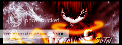
  • Back of this sig sucks, and I'm not sure of the pen tool:
    Core's Sigs

    Well here are the main issues with it from what I see.

    First thing is the background. The render doesn't seem to be a part of it. Like, the render and the background don't match, don't blend...the colors of it all are dull and monotonous too. For the Chibi style, try something simple. Ditch the special effects brushes and keep it to gradients and shapes. You can achieve depth and appeal that matches the style without going over the top. Look at this sig.

    Core's Sigs


    Notice how the background is just simple gradients and lines, plus some subtle lens flare work, yet it creates a great illusion of depth and works perfectly here. Something similar to that could work great for the Chibi style for SotW. Also don't erase the edges of the render. Looks like he's fading away which is not really good here.

    Next, we have the orange effect. Only thing I can suggest for that is to make it lighter near the center so that it doesn't look so flat, and then also make it skinnier in places, give it some size variances to make it look more realistic/appealing.

    Lastly the text, which I can't really suggest what to do for that right now because if you do what I suggested before, it will need a much different text.
     
    Back
    Top