• Our software update is now concluded. You will need to reset your password to log in. In order to do this, you will have to click "Log in" in the top right corner and then "Forgot your password?".
  • Welcome to PokéCommunity! Register now and join one of the best fan communities on the 'net to talk Pokémon and more! We are not affiliated with The Pokémon Company or Nintendo.

'coz moments told me to

177
Posts
13
Years
    • Seen May 9, 2012
    Introduction:

    short and sweet, this is my gallery. havent made anything for a long time so decided to make one and showcase some of my (bad) stuff.

    old to new

    'coz moments told me to


    never got around to finishing this one, should get around to it sometime... lol
    'coz moments told me to

    'coz moments told me to


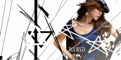
    dont really like these, it was like my "get out of rustiness and back into gfx" sigs.
    'coz moments told me to


    'coz moments told me to

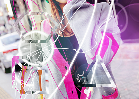
    working on this style, i want to try to mix pen tooling into it as well. I'll probably try something with it when I try making my lp, (hopefully sometime before the month is over)
     
    177
    Posts
    13
    Years
    • Seen May 9, 2012
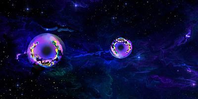
    two new stuff, one's just a continuation of the orbs

    'coz moments told me to


    'coz moments told me to


    i really want h nov, idk why, i guess i just want to reach it lol
     

    moments.

    quixotic
    3,407
    Posts
    15
    Years
  • sorry I didn't post earlier <3

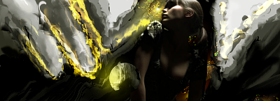
    First off, as a sort of general comment which I've told other people before, while we don't follow the classing here at PC, if you are aiming for a goal you need to work gradually from where you stand. The orb piece, and the light and dark piece you've done, I'd say would require a lot of skill to pull off. I'm not trying to pressure you into not feeling ready, but if you keen on progressing through the tagging classes (nov-pro) you basically need to get experience with tagging, whether or not it feels like you are going backwards or staying the same. Basically, the only secret to tagging, or any art form, is time. The more time you spend, the better you will get. So churning out heaps of tags, whether they end up good or bad will likely be better than trying really hard pieces that you struggle on and take longer time.

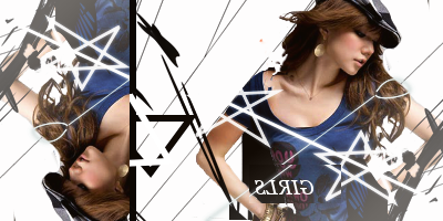
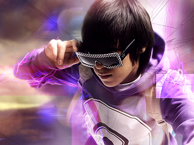
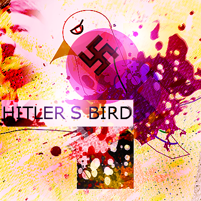
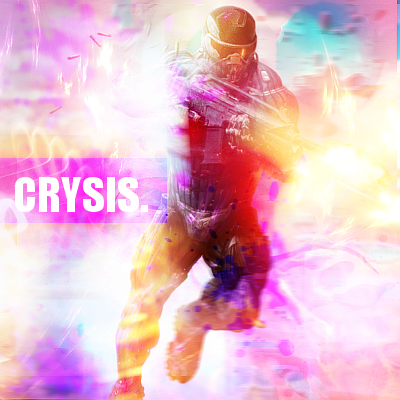
    So, scribblesareforcoolpeople.png. You should focus on stuff like this. Not the scribbles effect, just the format. Stock over background, effects in foreground and background. With that said, I'd be wary of sizing and stock position. I'd argue the stock is way too big in that canvas, and it leaves little room to make flow and use your effects. You could also make the canvas more rectangle rather than square so you have more room on the right side to make flow.

    That semi transparent rectangle on the right though is really good. It creates some highlights, some details without drawing focus from the stock.

    Another thing this piece needs are adjustments, or more of them. The colours are a little plain, and bordering on monotonous, but a few gradient maps will fix that right up.

    Anyways, as a general thing again, wireframes are easy to use, but hard to pull off. Unless you have some really unique way to pull them off, wireframes tend to look cheap and a bit rigid. Yeah, they create flow, but they're a bit boring truthfully.

    Sorry that was all over the place, let me know if you want specific feedback or whatever. <3
     
    177
    Posts
    13
    Years
    • Seen May 9, 2012
    dumping stuff

    'coz moments told me to

    'coz moments told me to

    'coz moments told me to

    'coz moments told me to

    'coz moments told me to

    'coz moments told me to


    there was more stuff but it was all bad l0l
     

    Rest

    Showstealer Pro: Trial Version
    353
    Posts
    12
    Years
  • Hey, Cycle!

    *referring to post above*

    If I had to choose your best tag, it'd have to be the Mario tag. Though I like the strong colors and the neat smudging in the lava-anime tag much more, I appreciate the simplicity on Mario.

    Firstly, colors are a big issue on most of your tags. Most of them sport really dull, weak colors (especially the first two and the Mario tag). I recommend referring to online palettes for a while, to get a sense of what color works best for the render/stock, and what color complements other colors. Also, some of your tags are really monotone (lava-anime and orange-smudge tag). Try using hints of colors from other shades, either with splatter, or really soft blended smudging. It complements the already-existing colors.

    Quality really suffers in that first tag. I don't know what you added on the smudges besides the splatter, but it really hurts the presentation. Remember that splatters, C4Ds, patterns, etc. are great, but a smudge tag should still look like a smudge tag in the end. Don't overdo the splatters too.

    Otherwise, you're great with smudging. What I can say now is to smudge with more fine detail. It takes longer, but a good tag takes a long while to make. Keep it up!
     
    177
    Posts
    13
    Years
    • Seen May 9, 2012
    aaaaaaaaaaaaaaaaaaaaaaaaaaaaaaaaaaaaah

    ok now here are the tags

    'coz moments told me to

    'coz moments told me to
     

    ruby

    [span="howdy;partner"][/span]
    1,390
    Posts
    20
    Years
    • Seen Mar 27, 2024
    aaaaaaaaaaaaaaaaaaaaaaaaaaaaaaaaaaaaah

    ok now here are the tags

    YUKI! I haven't done a graphic incorporating her in so long. D;

    It's great all round, I'd only have had the edges of the clouds(?) sharper to try shift the focal; It might just be me, but my eyes are drawn to her waist. xD

    The first one is fantastic though, not much to crit! :o

    wow_that_green_made_it_so_lq_by_trashinatorx-d4qjair.png is really nice, but i'd have had less harsh colours.

    wtf_pink_by_trashinatorx-d4qwvgc.png is my favourite


    *Goes off to make a Yuki tag*
     
    Last edited:

    moments.

    quixotic
    3,407
    Posts
    15
    Years
  • (referring to last post only)

    FIRST
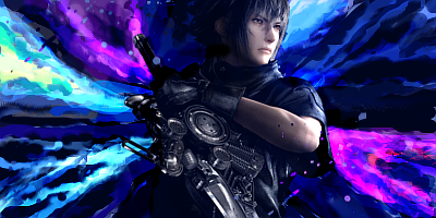
    This one is quite nice, but it needs more vibrant colours to really make it pop. Specifically the magenta, the blue is actually really nice, but the magenta is a little desaturated...
    Also, just watch the quality, looking anti-aliased and pixelly especially up the top around her hands, but all throughout the canvas. :/

    SECOND
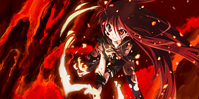
    Colours are much better on this one, but again, quality brings it down in areas. Especially her face, it looks like it needs a good sharpen, but I fear it might kill the quality further... Anyways, very good use of particles, and basically everything red in the canvas. The blending is a bit icky though, way too forced and not natural (that knee/leg on left).

    As general points, try and get more details, more finer smudging into your smudge tags, because they need it to be interesting. The second one would benefit SOOO much from more details as it feels quite flat.

    Also, don't stay on blue and magenta as a colour combination. It is definitely one of the nicest in tags, but when you are using nearly the same tones every time, it gets tedious.

    Nice smudge though! :D
     
    177
    Posts
    13
    Years
    • Seen May 9, 2012
    why does my quality always get messed up e_e

    thanks for the crits though!

    ps trippy gifs ugh

    last was worse though
     
    177
    Posts
    13
    Years
    • Seen May 9, 2012
    'coz moments told me to


    'coz moments told me to


    'coz moments told me to


    'coz moments told me to


    yeah, most of my stuff sucks, cant make anything at all

    four tags in almost a month UGH
     
    Back
    Top