• Our software update is now concluded. You will need to reset your password to log in. In order to do this, you will have to click "Log in" in the top right corner and then "Forgot your password?".
  • Welcome to PokéCommunity! Register now and join one of the best fan communities on the 'net to talk Pokémon and more! We are not affiliated with The Pokémon Company or Nintendo.

Dr. Salt's Labratory.

Dr. Salt

Rawr <3
24
Posts
15
Years
    • Seen Feb 26, 2009

    Okay, I'm new to making graphics and such. I've watched a few videos on Youtube and have learned some of the basics, but my work is still amateur. I would really appreciate it if some people could teach me how to make better banners and such. Caek?


    1.
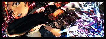
    Dr. Salt's Labratory.

    Probably one of the first sigs I made, I went a little crazy on the C4Ds, and I find it sort of bright.

    2.
    Dr. Salt's Labratory.

    I had just watched the six episodes of FLCL on youtube and I just had to have a banner with Naota on it. He is adorable :3

    3.
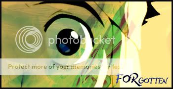
    Dr. Salt's Labratory.

    Same picture as two cept a lot different. :P I like this one better.

    4.
    Dr. Salt's Labratory.

    Not sure why I made this.
     

    Azonic

    hello friends
    7,124
    Posts
    16
    Years
  • omgomgomgomgSAAAAALLLT! <3

    'kay, firstly in banners 2, 3, and 4, I suggest you get familiar with the Size scaling feature. Number 1 is okay, but I have that render and found the head to be reeeaaally small compared to the rest of the body. plus, it's a boy. I didn't know that. o.o"

    So yeah, the focal of your banner needs more, uhh, focalization. :D
    I'm bad at explaining things. The focal, or the render of your banners need to attract more attention than the rest of your banner. For example, number 2 really has no focal since the render is pretty much the background. It's too transparent and blends in with the background too much, making less attention being drawn to it. So pretty much, the render of the banner has to attract more attention than the background. Such ways include darkening the background or contrasting the render by making it extreeemely bright and pop out against the dark background. :D

    So there's my fifty cents for you. Size down the humongous renders and work on the focals. XD;

    Oh, and try to make the render less transparent unless your doing motion blur... and work your way through brushing over the render. :>
     

    SL1MSHADY

    WATCH THE THRONE
    318
    Posts
    15
    Years
  • WOW really nice.
    Can you make an avatar of a really cute starter pokemon (1st evolution but dosen't matter which one).
    I really like your banners!
     

    Renyui!

    ascender
    1,402
    Posts
    16
    Years
  • Errr, Pokemaniac, he didn't say that you could request.
    Good stuff, Dr. Salt! You know way more than me when I was a beginner!
     

    Dr. Salt

    Rawr <3
    24
    Posts
    15
    Years
    • Seen Feb 26, 2009
    I've been playin with meh focal. :P Anyway, so I tried some of the stuff you said, Raikazu. I just don't know how to contrast.

    8D REQUEST! :DDDDDDDDDDD yay for me!

    I don't have anything to show off except for my request that I did to day. I'm lazy and don't really feel like doing anything but browse the internet for things that are lulz worthy.

    5.
    Dr. Salt's Labratory.


    I want some advice on borders. I know how to do a simple one, but not all cool and stuff.
     
    Last edited:
    Back
    Top