You are using an out of date browser. It may not display this or other websites correctly.
You should upgrade or use an alternative browser.
You should upgrade or use an alternative browser.
Egregious Onomatopœia
- Thread starter moments.
- Start date
More options
Who Replied?Would love to see
https://i233.photobucket.com/albums/ee207/mattimogalli/drownblue.png
with some text.
And
https://i233.photobucket.com/albums/ee207/mattimogalli/retire.png
With a bit more going on.
Like both of these btw ;D
https://i233.photobucket.com/albums/ee207/mattimogalli/drownblue.png
with some text.
And
https://i233.photobucket.com/albums/ee207/mattimogalli/retire.png
With a bit more going on.
Like both of these btw ;D
Yeah text wise I had something and I decided I didn't want it on there as I was just experimenting and wanted to spit more tags out but I had text there, but it is gone...
As for the other one, I had an idea, and it didn't work, then I kinda didn't know what to add and just left it and moved on..
Thanks Dukey!


As for the other one, I had an idea, and it didn't work, then I kinda didn't know what to add and just left it and moved on..
Thanks Dukey!


Doonesbury
Don't even worry about it.
- 41
- Posts
- 14
- Years
- Canada
- Seen Nov 2, 2009
https://i233.photobucket.com/albums/ee207/mattimogalli/55.png
This one is an effin' babe. I don't know what it is, (perhaps the colors?) but it's quite possibly your best here. The placement(s) of the render are amazing, and it's just an overall good tag.
https://i233.photobucket.com/albums/ee207/mattimogalli/vanishnotext.png
I also really like this one for it's simplicity. Amazing job with blurring.
Your later tags are starting to all look the same, though. Where's that unique style you started out with? Don't get me wrong, your later ones are still good, they just don't have that 'wow factor' anymore, y'know? Maybe try slowing down some, and putting more time and effort into one banner than trying to produce as many as you can in one day. An amazing tag is better than three half-decent ones.
And sorry for the lack of adjectives, it's like 6:14 AM. @_@
- 1,396
- Posts
- 16
- Years
- The suburbs, and no I don't need to describe much
- Seen Dec 21, 2015
to be honest this update is lol no.Guh, slump... Managed to throw together 2 tags today, though I'm not sure if I really like either...


Everything else is great. You have really grown into this whole new outlook on art, more concept with follow through, rather than the contrapositive.
Good stuff.
omg yes.
Thanks for the comment CT!
I only have one tag to show cause I have been in exam mode, but I had some time today and I whipped up a tag which I quite like. Background is 1 stock duplicated 8 times and repositioned and different layer modes and such. New style maybe. :O

Did another using a Tropius sprite...

I only have one tag to show cause I have been in exam mode, but I had some time today and I whipped up a tag which I quite like. Background is 1 stock duplicated 8 times and repositioned and different layer modes and such. New style maybe. :O

Did another using a Tropius sprite...

Last edited:
- 13,373
- Posts
- 14
- Years
- Age 29
- Seen Jan 28, 2019
I really like this one:

To me it seems like its moving O.o

To me it seems like its moving O.o
- 793
- Posts
- 15
- Years
- Seen Jun 24, 2011
I dunno why but I absolutley love this one. Your tags are pretty epic btw. Great work, love the sort of sepia style.
Gummy
by fire be P U R G E D
- 4,519
- Posts
- 17
- Years
- Brooklyn, NY
- Seen Dec 26, 2013
Lol still can't believe I haven't posted here yet. I really do love your stuff, moments. Pretty much everything in the first post and a few posts afterward blow my mind. At around October 5th you start to go into your slump, but even that stuff isn't half bad. Latest update is all I need to see that you've got your magic back. This new style looks very promising and I'd love to see more like it. My favorite creation of yours is:

Now go make some tutorials.

Now go make some tutorials.
Thanks for the comment!I really like this one:
To me it seems like its moving O.o
Yeah I liked that tag, the concept was taken from another tag I saw a while back but I couldn't get it quite right, so it looks a little eh, but thanks anyways!
Thanks a lot, I liked making that tag, one of my earliest ones with spamming light textures. :PI dunno why but I absolutley love this one. Your tags are pretty epic btw. Great work, love the sort of sepia style.
Lol still can't believe I haven't posted here yet. I really do love your stuff, moments. Pretty much everything in the first post and a few posts afterward blow my mind. At around October 5th you start to go into your slump, but even that stuff isn't half bad. Latest update is all I need to see that you've got your magic back. This new style looks very promising and I'd love to see more like it. My favorite creation of yours is:
Now go make some tutorials.
It really is about time...
Thankies for the comments, much appreciated. As for below.png, I am now considering make a tutorial, my first tutorial to be specific. Probably after exams though, or if I get some spare time this week.
Thanks everyone again!
EDIT: Made a tutorial!
And here a few tags made when I went on a Photoshop rampage the other day.


And the following two are both made from scratch using the pentool!


BHwolfgang
kamikorosu
- 3,906
- Posts
- 15
- Years
- Age 29
- Virginia
- Seen Feb 24, 2014

I love this! You've improved! :D What does the symbol mean?
Oh, and may I claim this, please, with an avatar? <3
Um the symbol I hope means Samurai, but it was taken from an online translator, so I don't half expect it to be accurate.. :P
Um, I don't think I'm giving away any of my graphics just yet but I might take requests in the not so distant future when I finish exams and get more confident with my work, and of course improve a little more.
Thanks for the comments!
Um, I don't think I'm giving away any of my graphics just yet but I might take requests in the not so distant future when I finish exams and get more confident with my work, and of course improve a little more.
Thanks for the comments!
THIRTY-SIX
Banned
- 8,174
- Posts
- 19
- Years
- Seen Nov 18, 2015
You didn't digi paint below? :O
Pentool doesn't mean vector. Rasterising layers means it's not a vector.
Pentool doesn't mean vector. Rasterising layers means it's not a vector.
- 541
- Posts
- 14
- Years
- In front of a computer
- Seen May 4, 2014
i like the tropius and naruto not because theyre EXTREMELY good its beacause i like the series but the pics are good too
- 6,390
- Posts
- 18
- Years
- She/They
- Dani California
- Seen yesterday
I'm not great at critiquing graphics since I suck at them and the ones I do critiqued have graphics better than mine. XD; I'll try my best, though.

I love the text effect you did on this banner (that is, if you did that ^^; ).

This I thought you did the render and the effects well, but for some reason the red-ish vertical box bothered me. Maybe it's because it's put there either for no reason or to fill space in the tag. Actually, a few other banners like Lone Wolf, Splash, and the Jay-Z banners you have vertical boxes either at left or right side. That's just me, though.
Like some of the others said, the typo you probably need to work on more. To me, the text font you use are good choices, but just needs more effects. However, you're improving in that area.
The update Comic Tragedy mentioned I actually think they're very good, but perphaps have the stocks/renders (sorry, but not exactly sure if you worked through renders or stocks in those banners) scaled smaller and then you can work on some effects more.
Pretty much everything else I have no critique on. Like you're trying a few different tag styles and each one you did well. Keep up the good work!

I love the text effect you did on this banner (that is, if you did that ^^; ).

This I thought you did the render and the effects well, but for some reason the red-ish vertical box bothered me. Maybe it's because it's put there either for no reason or to fill space in the tag. Actually, a few other banners like Lone Wolf, Splash, and the Jay-Z banners you have vertical boxes either at left or right side. That's just me, though.
Like some of the others said, the typo you probably need to work on more. To me, the text font you use are good choices, but just needs more effects. However, you're improving in that area.
The update Comic Tragedy mentioned I actually think they're very good, but perphaps have the stocks/renders (sorry, but not exactly sure if you worked through renders or stocks in those banners) scaled smaller and then you can work on some effects more.
Pretty much everything else I have no critique on. Like you're trying a few different tag styles and each one you did well. Keep up the good work!
BHwolfgang
kamikorosu
- 3,906
- Posts
- 15
- Years
- Age 29
- Virginia
- Seen Feb 24, 2014
Well, personally, I think you are already able enough to be confident in your own work. This gallery of yours is full of amazing sets. You don't need to feel so shy about it. :-]Um the symbol I hope means Samurai, but it was taken from an online translator, so I don't half expect it to be accurate.. :P
Um, I don't think I'm giving away any of my graphics just yet but I might take requests in the not so distant future when I finish exams and get more confident with my work, and of course improve a little more.
Thanks for the comments!
Thanks everyone for the comments!
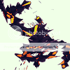
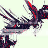
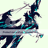
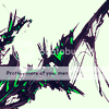
I have been toying with icons, and I have done a set of abstract ones because there are never enough abstract icons around. This is my first real try at icons using Selective Colouring and such.


Asian Pride, I am going to open up some requests and hope that having requests doesn't fail like it previously has. Plus, no more exams = lots of free time. :)
The below form must be used when requesting. Please post the links to high quality images peoples, can't stress it enough. And credit MUST be given for all art used.
image:
icon/tag:
text:
I have been toying with icons, and I have done a set of abstract ones because there are never enough abstract icons around. This is my first real try at icons using Selective Colouring and such.
Asian Pride, I am going to open up some requests and hope that having requests doesn't fail like it previously has. Plus, no more exams = lots of free time. :)
The below form must be used when requesting. Please post the links to high quality images peoples, can't stress it enough. And credit MUST be given for all art used.
image:
icon/tag:
text:
BHwolfgang
kamikorosu
- 3,906
- Posts
- 15
- Years
- Age 29
- Virginia
- Seen Feb 24, 2014
- 6,390
- Posts
- 18
- Years
- She/They
- Dani California
- Seen yesterday
The icons aren't bad. Not too familiar with selective coloring, but I think you did well. Like the third one on top best because you did well putting violet and light blue there.


