• Our software update is now concluded. You will need to reset your password to log in. In order to do this, you will have to click "Log in" in the top right corner and then "Forgot your password?".
  • Welcome to PokéCommunity! Register now and join one of the best fan communities on the 'net to talk Pokémon and more! We are not affiliated with The Pokémon Company or Nintendo.

engageForums

Tyler

PHP Scripter
620
Posts
18
Years
  • Hey everyone it's been a very long time since I've last logged in. It's awesome to still see the community still up and running. To bad you can't really say the same for the Webmaster Discussion..

    Anyways what I would like to bring to your attention is engageForums. engageForums is a forum software being developed by Kokkei Mizu (Chris), Kris, and I. We started eF 2 years ago but our lives caught up with us and we were unable to continue going forward with eF.

    The other night I was contacted by Chris, by phone, telling me that he had repurchased the domains for engageForums(.com,.net,.org) and that we would be starting to work on it again.

    Well I'm here to let you guys know that it would be very appreciative if you could take a look at what we have and give use requests for features and also just to let us know what you think.

    Here are the links:
    https://www.engageForums.com Main Website (Hasn't been updated)
    https://www.engageForums.com/support Support Forum (All updates will be posted here)

    PS. I know forum links aren't allowed but I figured I'm not trying to steal users and I'm just trying to get support for eF. If they're are any problems with the link please let me know and I'll remove it asap.

    Thank you everyone!
    Tyler Steinhaus
     
    2,096
    Posts
    15
    Years
  • I'm not too sure if you're asking for feedback on the site and forum or the actual forum software itself. So I'll just give some feedback for all three.

    Site
    So far I think that the actual site is very bland and empty. This is slightly because of lack of content which is to be expected with a new site but you don't seem to be doing much to compensate for it. You seem to have a lot of white space on either side, and I'm running a low screen resolution so that's saying something.
    Also the colour scheme seems a bit off as well. You've started off with a very light, fluffy sort of colour scheme which uses a lot of light airy colours. Then you dominate the page by having full on black body text. It ruins it for me.
    Sticking to the way the interface looks still, the header image doesn't seem too appealing. You've used a set of rotating cloud images which usually I'd have no problem with, but in this case I think the images are a bit too dark and low resolution. Usually when people see nice bright images of the sky they think of happiness and things looking up. However if it's a dark ,grey sort of sky image then it has the exact opposite effect which I think is letting down what your software has to offer.
    Moving onto the accessibility of the site I only have one bone to pick here. The size of the navigation bar is a bit of a problem. I have to admit it took me a few seconds to actually work out where it was. It's far too small and along with the fact it's on a semi-transparent background makes it even worse. If I were you I'd probably add a small background to each word and make it a little bit bigger just to make the whole thing a bit more eye catching to the user.
    One final thing I would consider putting up is more information about the actual software. I know you're probably going to do this soon, or might even be in the middle of doing it now, but it's pretty much top priority. I don't know what the main selling point of this piece of software is. I don't know what any of its features are and, without going onto the forum itself I didn't have a clue what it looked like.

    Forum
    Ok about the forum. I'm assuming that the forum style it's using now is the one that will be the default for the software? It's looking alright, it has a few of the same problems that the main site had but I won't repeat myself.
    The first thing that caught me off guard was the Last Updated parts. I wasn't too sure what I was suppose to be looking at first or what the most important thing was. I'd advise that you look up something called "Typographic Hierarchy". It'll basically show you how to layout text so that it looks good whilst helping the reader naturally look at the most important piece of information first.
    Second thing is the forums profiles. I'm not saying that you should go ahead and copy vBulletin or anything but I'd highly recommend setting it up in tabs or a list or something instead of just having boxes all over the place. It makes the whole place seem very confusing and untidy.
    I think that was all for the forum software. It's looking pretty damn good for something that was made for the sake of it.

    I think that's pretty much it for improvements. You've got a pretty good piece of software coming along there.
     

    aRedMoon

    Wait for me outside the lines
    11,127
    Posts
    20
    Years
  • Wow, Tyler, I didn't know you were even still alive. So that leaves... 2 of us 3 Minnesotans still floating around? I haven't seen Paul in forever.

    I'll agree almost completely with HM about everything - except for his comments on the profile. I personally hate how everyone is using the tabs now. I think it's extremely annoying and ugly. I'm not saying I like yours (because, for instance, on your own page, there is a huge break between the non-custom and custom fields) but please, don't do tabs. Or at least make it small amounts of tabs. :(


    And sad, apparently my account is no longer active. :'( Or you just wiped it from before. Dunno. *reregister, just to keep an eye on it

    One thing I might suggest is to add FB connect right away. It's become something so ~common~ that it's weird to register without it...

    --- Quick forum look around

    Registering

    When verifying, flip the Code/E-mail boxes so that e-mail is first.

    After registering, it said I was like 2/3 done with becoming a real member, and to add an avatar. The link didn't lead anywhere.

    Profile

    Birthday: Order the years opposite, so that 2012 is at the top.

    Is it even worth showing YIM/ICQ numbers anymore? TMK, they've basically died out. I'd suggest adding Twitter/FB instead.

    For Gender, I'd suggest adding "Other".

    Relationship status...? That's a new one for forums. xp

    Favorite forum... no option for XenForo? :(
     
    Last edited:

    Tyler

    PHP Scripter
    620
    Posts
    18
    Years
  • Thank you for the criticism! I did show Chris the thread and he agreed with most of the information. One thing he didn't understand was what Hybrid Trainer said about the last updated part. Even I have no idea what you're talking about. Could you please elaborate a little more?

    Chris and I both think the profile is fine. Obviously my profile looks messed up with all the text but I plan on fixing that tonight.

    Greg if you have msn or gtalk, you should add me. You'll find my stuff in my
    Profile.
     

    aRedMoon

    Wait for me outside the lines
    11,127
    Posts
    20
    Years
  • He's talking about
    12 hours ago:
    OMG an Update!! April ...
    by Tyler
    The order/sizing is a little whack. The time should be put down at the bottom probably, and you should make the thread title the most "important" part of the information.

    Have you guys looked into AJAXing stuff up at all? Not sure if either of you are familiar with it.
     
    2,096
    Posts
    15
    Years
  • Thank you for the criticism! I did show Chris the thread and he agreed with most of the information. One thing he didn't understand was what Hybrid Trainer said about the last updated part. Even I have no idea what you're talking about. Could you please elaborate a little more?

    Type Heirarchy is when you use fonts, type size and weight and such to set importance to text. So for example you could make the thread titles slightly bigger, or hae a different colour to the tst of the information.

    This is a reference for it. Its pretty much a step by step guide to how its done. It has some pretty good examples too.
     

    Tyler

    PHP Scripter
    620
    Posts
    18
    Years
  • Well Chris and I both like how the time is the first item, but we can always add an option to change it if the owner of the forum wants it the other way.

    I uploaded a copy to my server with the lastest updates that I've made. I also have auto refresh for the last updated on the index. Link is https://www.engageforums.tsteinhaus.com
     
    2,096
    Posts
    15
    Years
  • Well Chris and I both like how the time is the first item, but we can always add an option to change it if the owner of the forum wants it the other way.

    I quite liked the way the time was the first item, I quite like the order of the whole thing. I was suggesting you make the title the first thing you look at by making it in a bigger font or a more eye catching colour than the time stamp or making it into a more noticeable font all together.
     

    Alexander Nicholi

    what do you know about computing?
    5,500
    Posts
    14
    Years
  • The support forum layout is okay, and I think that the site index is good enough for its purpose.

    However, I think this might be a bit of a problem.
    Spoiler:

    >_>
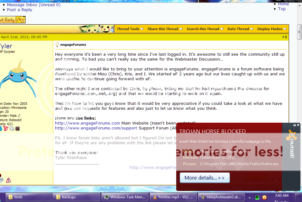
    Any reason why it did that? Avast blocked it at that point and it wont send anything to that URL again, so…
     
    Back
    Top