• Our software update is now concluded. You will need to reset your password to log in. In order to do this, you will have to click "Log in" in the top right corner and then "Forgot your password?".
  • Welcome to PokéCommunity! Register now and join one of the best fan communities on the 'net to talk Pokémon and more! We are not affiliated with The Pokémon Company or Nintendo.

Ep 174: The shock and overall disgust?!?! Rowan's clumsy return!!

Renyui!

ascender
1,402
Posts
16
Years
  • because i love moments
    Ep 174: The shock and overall disgust?!?! Rowan's clumsy return!!


    Ep 174: The shock and overall disgust?!?! Rowan's clumsy return!!


    Ep 174: The shock and overall disgust?!?! Rowan's clumsy return!!


    Ep 174: The shock and overall disgust?!?! Rowan's clumsy return!!

    (am I the only person still reading naruto? did anyone else have a fit of rage when they didn't update just before christmas? i did. cool story me.)

    Ep 174: The shock and overall disgust?!?! Rowan's clumsy return!!


    Ep 174: The shock and overall disgust?!?! Rowan's clumsy return!!


    i promise i'll get better
     

    moments.

    quixotic
    3,407
    Posts
    15
    Years
  • Love makes us do crazy things. Like open a gallery. :'D

    less.png
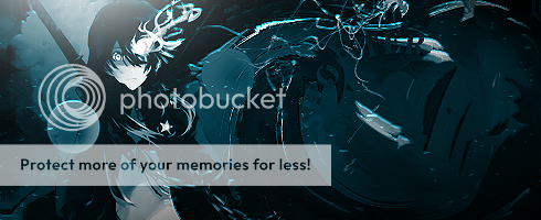
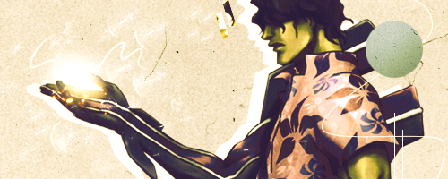
    With the two versions of this, I'd like somewhere in the middle. The first is too saturated, but the second too little methinks. Anyways, first thing, that squiggle over the text I am not feeling. The piece is fairly simple, it just feels a little messy / put there. As for the piece as a whole, I like it, the text and background. One thing I'd recommend though are more details of varying shades. It is a very monochrome piece, which somewhat works for it, but I'd like to see more dark blue / black and white elements in it to really make it pop and just give it a bit of variety.

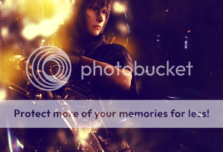
    sasukecolour-1.png
    Because the colour version is better. :) The black and white needs blacker blacks and whiter whites.
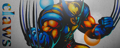
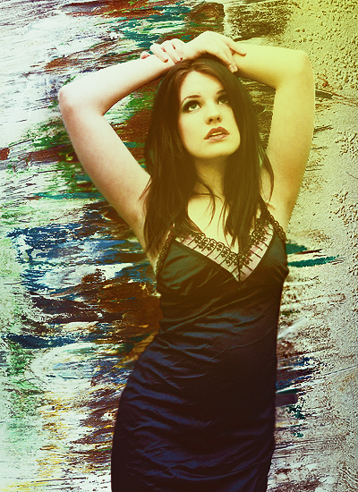
    Anyways, this is classic Rowan and definitely the best piece here. Depth, lighting and effects are all very good. The text I would ditch completely, generally text is less effective right on the edge of the canvas (unless it is super special). This applies for the other tags as well. As for the colours, mini rant coming. Your new style seems to insist of adding these colour schemes which are very dark, very washed out. Gradient maps on 'Luminosity'? ;)
    Anyways, it isn't bad, it actually works quite well on this tag, but I wouldn't recommend doing it on every piece. It's an iffy thing to have, it is sitting on a very fine line between being original and possibly bringing down a piece because of it. I'd like to see more vibrant and 'generic' colour schemes as well. ;)

    OHMYGODIDONTCARE.png
    iloveyou.png Seriously though, see text and colour comment from above. This is a piece where I feel this colour scheme isn't working perhaps as well as you intended. The murkyness isn't bad, maybe a fraction too murky, but otherwise it is too flat and monochrome because of it. Text could easily go. But the effects are good! The smudging and stuff is really good, and I only just realised the duplicate in the background, but it looks cool. :D
    The piece has pretty low quality, it might be the stock being that sort of cartoon look + your adjustments, but just watch that in the future.

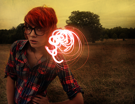
    radial.png
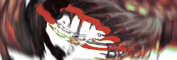
    I have no idea what the focal of this piece is and it feels kind of messy but that radial blur technique was done pretty much amazingly by Ezzo a while ago and this one just feels a little random to be honest. I'm assuming experimental, in which case I totally understand, but like colours, text and clarity all aren't at your usual standard.

    Anyway, general notes. Don't abuse the Rowan colour scheme. Try to avoid Serif fonts cause they look tacky. Don't stick text on the edge of a canvas unless it is super special.

    Sorry if that was all very harsh, I have become a whiz at rambling on, and it is meant for the best so you can grow and stuff. has troubles being positive without coming off brash.

    And that collab is still on once I actually do something I can send you. <3
     

    Renyui!

    ascender
    1,402
    Posts
    16
    Years
  • I have no life, as I update very quickly. WOO!
    (also thanks moments. totally baben')
    Ep 174: The shock and overall disgust?!?! Rowan's clumsy return!!

    Ep 174: The shock and overall disgust?!?! Rowan's clumsy return!!

    this album cover i did. check them out!
    ediiiiiit. Also this!
    Ep 174: The shock and overall disgust?!?! Rowan's clumsy return!!

    Ep 174: The shock and overall disgust?!?! Rowan's clumsy return!!

    Totally regained all my resources and tried to use them properly. The shock!
     
    Last edited:

    moments.

    quixotic
    3,407
    Posts
    15
    Years
  • Spoiler:

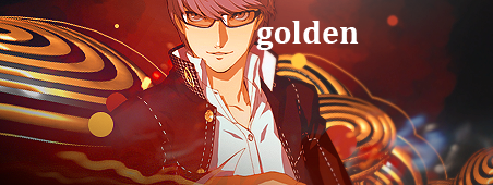
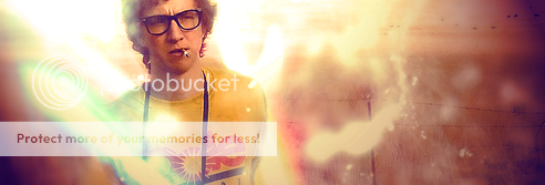
    Actually quite a nice simplistic tag! This is the kind of stuff I know you for Rowan. :D
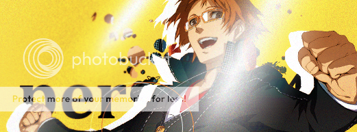
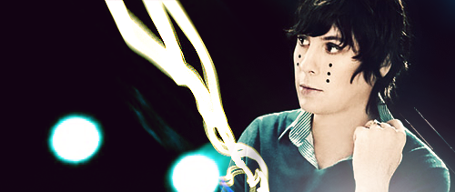
    Anyways, first thing that stands out to me is the lighting is a little obnoxious. I'd suggest instead a more yellow colour on Colour Dodge or something like that so it is a little more transparent and takes less attention. That or just move it a fraction to the right.

    Another thing is the quality, it looks like you've added a layer of noise, or a texture or something over the whole tag, which frankly doesn't look too good. Basically just makes the lighting and stock look really low quality which isn't good.
    But other than that, text is good, effects are very simple, but for the style good, and the colours are very good!

    Spoiler:

    First of all, for an album the text is somewhat troublesome. Firstly because the text at the top it sitting literally on the edge of the canvas, and is probably likely to get cut off more if it were printed / put in a CD case. I know it is not meant to actually be printed, but you might as well consider stuff like that if you're making an album cover.

    As for the actual art underneath, it feels way too simple. I'd add some more particles or textures or something, maybe tone down the bokeh a little bit so they aren't so obvious.
    But yeah, not bad for an album, just sort of lacks real solid appeal, bit generic.

    Spoiler:

    can't wait for the story
    Another one of your better tags. The version without text is definitely better.

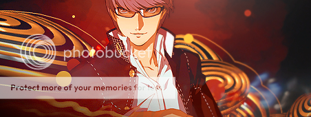
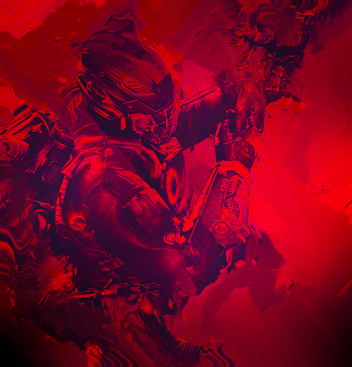
    My only qualms with this piece is the 'bokeh' looking circles, which I think would look better actually as bokeh, aka, more transparent rather than solid. That big C4D on the left side, I think would look better in the exact same position, but flipped horizontally, just so that narrow bit where the circles meet inside is near his shoulder. And lastly that it feels a little monochrome, really just over the stock which is feeling a bit too red.

    Otherwise it is really good stuff! :D
    See, you already got your swagger back!
     

    moments.

    quixotic
    3,407
    Posts
    15
    Years
  • Swagger has flourished further. :O

    TAG 1
    Besides being a fraction monotonous and lacking depth, this thing is great! More dodging and burning using really small brushes to bring out the details, particularly foreground and background effects to help the depth pop a little more, and that should help with the colours a little bit. Then you could soft brush colours on colour dodge / linear dodge which would suit the style and incorporate more colours into the piece, or you could use textures or whatever. Just need to break up the blue though.

    Not feeling those circles either side of the render either.

    LP
    Not going to give a massive rate cause I'm lousy at LPs and want to focus on your tags, so dot point formation agogo.

    Background is too simple, needs texturing so it has a little bit more appeal.
    Those circle effects on the left side are cut off on the very left edge and is noticeable.
    You've got lighting in the middle, but neglected parts of the C4D which show highlights, but you didn't dodge.

    TAG 2
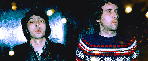
    Firstly, you are almost creating two focals here. The guys are not close enough together to compliment each other as a single focal point, however my eyes keep flicking between them. Either manipulate the stock to work for you and bring the closer together, or crop one guy out.

    The tag is also very simple, not a bad thing, but it definitely feels like a bit of a work in progress, needs some more particles / textures or effects to bind it together. Partially because the empty areas are pure black which makes it feel really empty and void-like, but also because the left side has that texture / blue and white thing behind him but the right has nothing, so it feels unbalanced and unfinished.
    The bokeh also feel a little weak. Feel positioned randomly and are too small.

    Colours are great though, just needs more to it.

    end obligatory moments. review! <3
     

    Renyui!

    ascender
    1,402
    Posts
    16
    Years
  • >:D
    Ep 174: The shock and overall disgust?!?! Rowan's clumsy return!!

    (shut up, i'm trying to get good at lps. be as hard as you want on this, i'm not really a fan.)
    Ep 174: The shock and overall disgust?!?! Rowan's clumsy return!!

    Ep 174: The shock and overall disgust?!?! Rowan's clumsy return!!

    Man, I dunno why Chad doesn't receive as much talk as other characters in Bleach. He's clearly the coolest character ever.
    Ep 174: The shock and overall disgust?!?! Rowan's clumsy return!!
     
    Last edited:

    moments.

    quixotic
    3,407
    Posts
    15
    Years
  • naruto-1.png
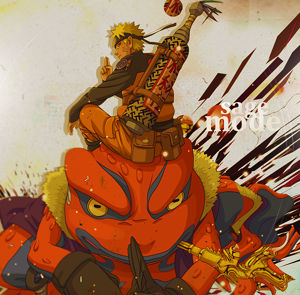
    don't tell me to shut up! >:U 'Tis actually a good looking LP, a little plain, and definitely needs more stuff happening, but what you have so far is looking good. Colours and quality are really good! The things I'd work on are depth, composition and effects to be honest. The depth is too sharp a step from in focus to out of focus. I don't really get why you've opted for so much blur in the bottom left, but it could definitely work with more gradual transition, perhaps more effects in between, even in the foreground.
    Which pretty much covered effects too: you need more of them. The C4D is alright, but it isn't enough. More textures, more particles and stuff to create a foreground, and to help make the piece feel more complete are definitely needed.
    Lastly, composition, really just the placement of the stock isn't amazing. It is very unbalanced and you've got part of the toad off the canvas. I'd say bring the whole thing up and get the whole stock into the canvas. Either make the stock smaller, or the canvas bigger if necessary, but it does need some playing with.

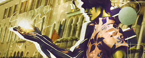
    sado2.png
    This one, with the buildings in the background is better, just because there is more happening (and it is sharper). Not a whole lot to say other than it just needs more. More effects, regardless of what they are really... Colours are a little bland as well, too brown with what looks like a bit of green or something. Not the greatest palette to be honest. :x

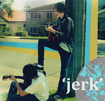
    jerk.png
    Again, it needs more happening, but what you've got is good. see the pattern here?
    That bottom right corner is sexy, I'd like to see that pattern with the almost inverted look carried out in the canvas more, maybe as the source of effects. That black duplicate of the text underneath the main white needs to go, or blur the carp out of it so it looks like a shadow. It just feels low quality at the moment. Text should be closer to the focal as well.
    Colours are alright, not really fresh and interesting though. I'd say, spruce it up a bit, just make it a little more interesting.

    Overarching theme: work more on your pieces, a lot of them are feeling like WIPs. What you are doing is really good, you just aren't doing enough, and your pieces are feeling unfinished and empty.
     

    Renyui!

    ascender
    1,402
    Posts
    16
    Years
  • Yeah, I'm feeling that I've been kinda rushing some things. :(

    Ep 174: The shock and overall disgust?!?! Rowan's clumsy return!!

    Ep 174: The shock and overall disgust?!?! Rowan's clumsy return!!

    (^that was more or less to show some dude how to do some decent colours, and i thought i'd put it up anyway. weeewt.)
    Ep 174: The shock and overall disgust?!?! Rowan's clumsy return!!

    This last one is unfinished, and I cannot think of anything to throw onto it. Ideas, ladies and gents?
     

    moments.

    quixotic
    3,407
    Posts
    15
    Years
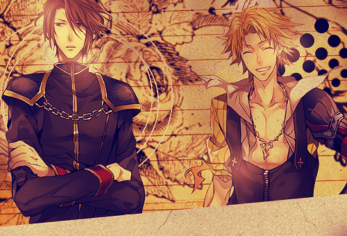
  • tidus_brooooooooo.png
    Classic old school style. <3
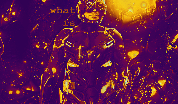
    There's not a whole lot to say about this tag, cause you executed the style really well, but overall, it's a little bland to be honest. One thing I will comment specifically on though, is the colour scheme. I'm not feeling the orange>purple gradient at all, it doesn't work on too many pieces this boldly, mainly because it is such an overused gradient when not used subtly. That's about it really, more vibrant, mixed colours would look good.

    bryce.png
    luminosity gradients = pro colours :P
    But it's fair, what you've got so far is fairly solid, especially the colours. Just some reworking, and adding a little more. The text has got to go I'm afraid. xP
    Other than that, just more effects and stuff. It's a fairly empty piece, but more crisp but grungy textures would go pretty far on this piece.

    wip.png
    First off, the filter you've got on the stock isn't working. Unless you can come up with a creative way to make the whole tag suit the aesthetic, it seems a fairly unsafe option. Also, I'd get the flow going the other way with this stock, so horizontal flip that light beam to the left, and get it over his shoulder. get rid of the filter on the lights as well.

    Not a lot to say for these ones, not your strongest, but not your worst. <3
     
    10,673
    Posts
    15
    Years
    • Seen Dec 30, 2023
    I shall dump on your dump little dumpling.
    Spoiler:

    First thing I'm gonna suggest is that you run, run fast and hard away from anime stocks. They're not helping your depth or you imagination in your works. But it's not just you. People who use anime stocks are the type who throw out some sloppy tags and the occasional nice anime styled one, and those who are super elite amazing like omgwow at making tags. Reason being is because anime renders are friggin' flat and don't give the artist much to work with at all.

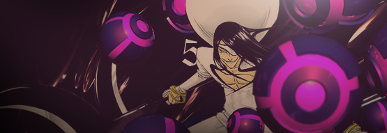
    With this tag, I can see how you were trying to work the depth, but I think in doing that you kind of forgot about everything else. The focal point isn't really standing out as it should. It's kind of lost amongst a bunch of C4D's which don't really relate to each other very much. And in saying that, this piece lacks depth if anything. The BG is completely empty. Just a solid colour with C4D's & a render above. You should experiment with space stocks, or get really good at brushing to make that background have more depth.

    However the tag falls flat on its face in terms of style and colour. You see, you should usually avoid flat renders (which anime stocks usually are), and you should defiantly avoid mixing them with C4D's. You see, C4D's are (ironically not 4D duh) 3D, where as the stock you used here is most definitely 2D, thus you have a style clash which doesn't really work. On top of this, there's no real attempt to make a palette of colours. Your colours should always try to be grouped and blended to work together. And it should usually be one group of colours. But here, you have the pinks & purple on one C4D, then the white and yellow on the render, followed by this mass of brown and miscellaneous dark colours. These are 3 groups of colours which don't go together. And it ends up just looking untidy and unappealing to the eye. Compared to some of your other work, this one falls below your average standard. Hopefully those comments will help a little though.

    Spoiler:

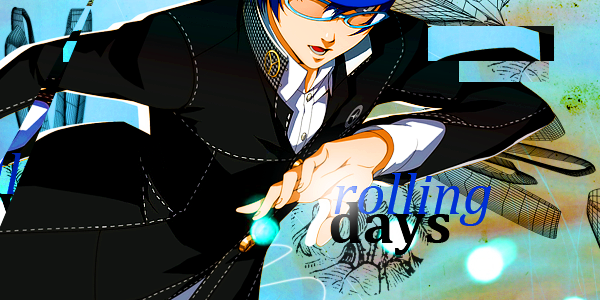
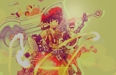
    In terms of the style, this one is pretty good. You have a nicer set of colours. The render here should be the indication of the colours you should be using, and for the most part you stick to that. Except for that bit of stray green on the almost upper right of the tag.

    Again though, when it comes to renders like this, you should be going for clean tags, and avoiding trying to add depth really. Vector styled tags work well with anime renders like this. Because it's so hard to pull depth out of it. Look closely at the shading of the render. Two tone. That's all you should really be going for it terms of filling the tag. So you have your base colours, then you have a shade darker for shadows and so on. Unfortunately, that's the sort of limits you're stuck to using stocks like this one. Outside of that however, I think you made the stock a little too larger, it takes up a little too much of the canvas. The text is also a bit understated. You should observe typography in some professional work or some graphic artists you like, and see how they compose their text. Here you have two fonts which are rather similar and rather unappealing when it comes to this tag. Too average, too business class. You need to think about what kind of fonts would suit the style, and on top of that, if you're going to use two different ones, make sure the styles are way more apart. So try something like using a sans-serif font and a more stylized one. These are both serif fonts and they look like they're from similar families. So it kind of breaks up the contrast and so on. Also that blue is a bit too strong, either change that, or change the black. Dark blue and black are two very harsh colours, and you should think carefully about using both when it comes to your type.

    I hope you venture towards less anime styled stuff, try using some people renders, work with space stocks, C4D's and so on and it might get you on the right track. Just think about colour, depth, style and always look carefully at your stock. Don't pull effects out of thin air all the time, because you need to think about what will work best, and don't be afraid to change the hue of your effects to meet your chosen palette. Looking forward to more buddy!
     

    Renyui!

    ascender
    1,402
    Posts
    16
    Years
  • Woo, a second contributor! Thanks for the crit, Gav (i believe?), you've pulled me out of my anime slump quite significantly.

    These have just pretty much been me abusing moments' resource pack :|
    Ep 174: The shock and overall disgust?!?! Rowan's clumsy return!!

    Ep 174: The shock and overall disgust?!?! Rowan's clumsy return!!

    Ep 174: The shock and overall disgust?!?! Rowan's clumsy return!!
     

    moments.

    quixotic
    3,407
    Posts
    15
    Years
  • invertyall.png
    This is really good. :O One of your better tags overall! Part of me wants to see this inverted, so black background with white effects, but I do really like it how it is now. The crisp simplicity / dirt particle look is grooving, big time, though on the right side, you've gone overboard with the lighting. It washes it out and negates all the details for pure white, which isn't terribly obvious, but if you look at it, you can tell. I wouldn't mind seeing a little more depth in this tag, cause that's really all it lacks, but it honestly is ok as it is. Just a thought, could make for some interesting effects.

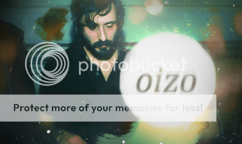
    mr_oizo_comeback.png
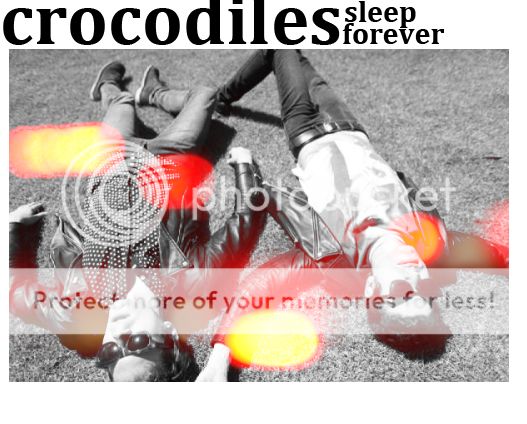
    Not feeling this, mainly quality wise, and not too keen on the radial blur either, but you could tweak it and make it neat. Go for grungey/noise filled/trippy style and it could be great. First, make all the colours in the stock inverted and trippy and stuff, then make the circle with text really strong and crisp in solid white/black rather than blurry. Could look cool with that stock. As it stands now, bit of a nothing piece really.

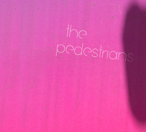
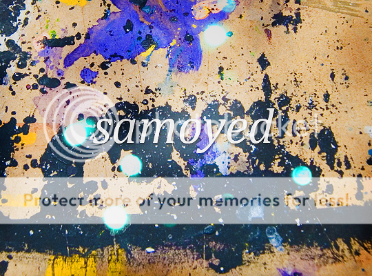
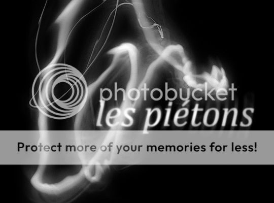
    The 'pedestrians' and 'samoyed' I'm not really feeling. Maybe it's just because I recognise the stocks/textures and can tell that not a whole heap has been done to alter/blend other stocks and textures into them, but they are too simple, and feels like not enough time/effort went into them. That said, I actually quite like the idea behind the 'pedestrians' one, though I think it needs some more realisation.

    Lastly, bakabt.png. For what it is, I actually really like it. You've rocked the canvas size really well through the stock and the negative space, and the colours are fabulous as usual. The only thing that irks me, is the text. I can see what you've gone for. It definitely works, I just wouldn't have done it that way. Take that as you will, cause it's completely subjective I know, but some bold, crisp, polished and formal type would work equally if not better, for my money in this. Arial Black, solid white, very little spacing between letters. <3

    Nice updates though, Rowan! :D
     

    Renyui!

    ascender
    1,402
    Posts
    16
    Years
  • cool amount of comments
    So I found out my school had the complete CS5 suite on their computers yesterday, and so that pretty much wrecked my learning for a while. Probably a bit more than a while.
    Ep 174: The shock and overall disgust?!?! Rowan's clumsy return!!


    Ep 174: The shock and overall disgust?!?! Rowan's clumsy return!!


    Ep 174: The shock and overall disgust?!?! Rowan's clumsy return!!

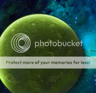
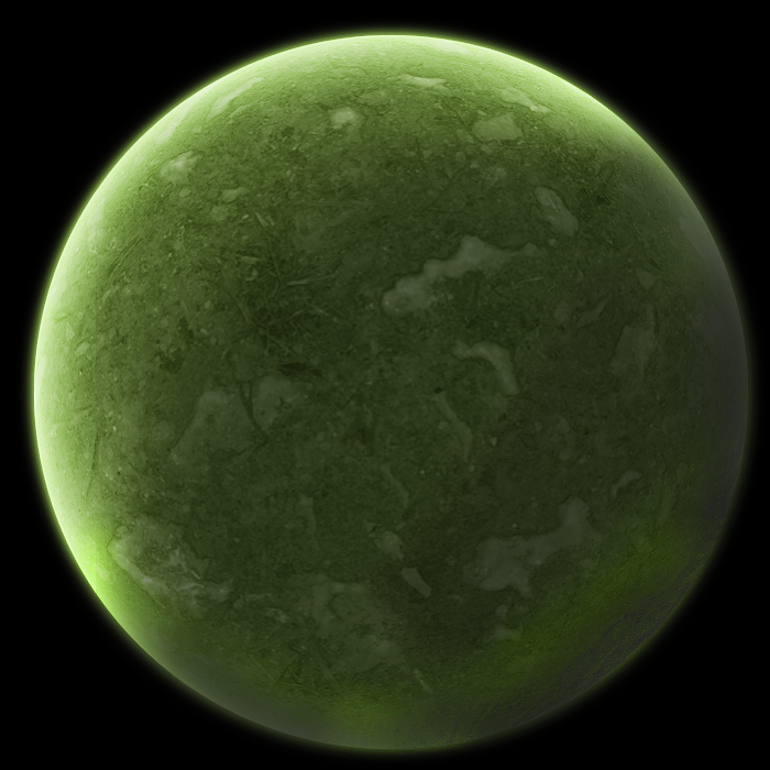
    And the planet for the above sig, made with some tut from PR!
    Ep 174: The shock and overall disgust?!?! Rowan's clumsy return!!


    Ep 174: The shock and overall disgust?!?! Rowan's clumsy return!!


    Ep 174: The shock and overall disgust?!?! Rowan's clumsy return!!


    Ep 174: The shock and overall disgust?!?! Rowan's clumsy return!!


    Ep 174: The shock and overall disgust?!?! Rowan's clumsy return!!


    Ep 174: The shock and overall disgust?!?! Rowan's clumsy return!!


    Ep 174: The shock and overall disgust?!?! Rowan's clumsy return!!
     
    177
    Posts
    13
    Years
    • Seen May 9, 2012
    sup

    you have some nice tags here. Just watch your quality a bit.

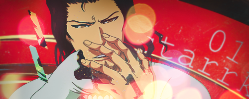
    starrrrk.png: The clipping masks at the left don't work. Just drop them and put something else in there. It also eems a bit empty, more effects would be good.

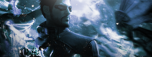
    deusexlols.png: It's a bit monotone, but not too much, it can be fixed with g maps probably. It's really messy though, you should clean it up a bit.

    watdafook.png: I'm a bit biased because I personally love this style, but the liquify in the back isn't working. Smudging a gradient would probably be better, but it's up to you.

    wolfy.png: Light source is a bit too obvious, but I dig the text and nice effects. My favorite of the bunch, keep it up.
     
    Back
    Top