• Our software update is now concluded. You will need to reset your password to log in. In order to do this, you will have to click "Log in" in the top right corner and then "Forgot your password?".
  • Welcome to PokéCommunity! Register now and join one of the best fan communities on the 'net to talk Pokémon and more! We are not affiliated with The Pokémon Company or Nintendo.

favorite fonts

27,753
Posts
14
Years
  • I love using Segoe UI for general usage and Segoe Script whenever I want to be fancy. Those two fonts seem to be the two I use the most whenever I'm able to set my own font on programs, except usually I use defaults on websites (such the forums I browse) unless I'm able to choose my own font without a default (which I've never run across tbh)
     

    Ace.

    Love Yourself
    324
    Posts
    11
    Years
    • Seen Dec 29, 2015
    My favorite font is Comic San MS. I like that it's similar to fonts used in comic books and have that fat-ish font feel.
     

    Legendary Silke

    [I][B]You like dragons?[/B][/I]
    5,925
    Posts
    13
    Years
    • Seen Dec 23, 2021
    I'm a big fan of Segoe UI. It's extremely readable at both high and low screen PPIs, even at about 9 point, and works especially well with light-on-dark themes, as on Windows Phone with its specific variant, Segoe WP. Helps a lot when you have to see the user interface for a long time.
     
    4,181
    Posts
    10
    Years
  • Segoe UI is alright, it's better than the Windows 7 font, it's just a guess was it Calibri?

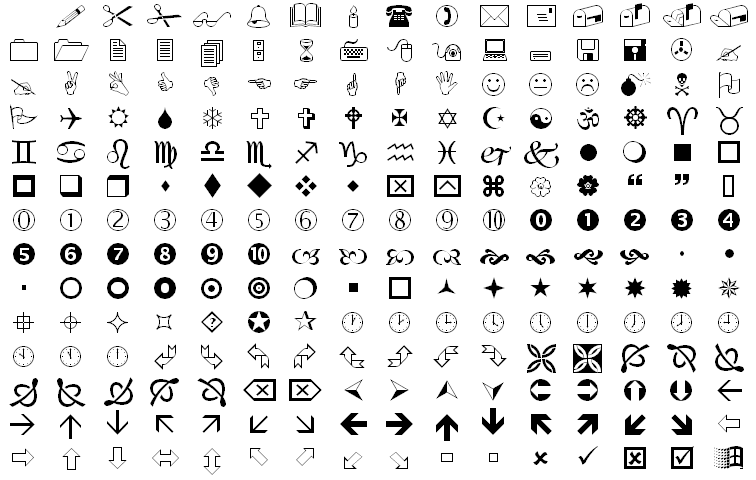
    Personally my favorite font is Trebuchet MS. Also, who can forget Wingdings?

    favorite fonts
     
    7,741
    Posts
    17
    Years
    • Seen Sep 18, 2020
    The Arial family, especially Arial Unicode MS as a matter of practicality; clean and readable at almost any size. I usually prefer Arial Narrow when aesthetics are concerned. I don't really care for any other font, honestly, except Code2000 since it has a wider range of glyphs than any other font I know, problem is it's serif.
     

    Cordelia

    Banned
    9,523
    Posts
    12
    Years
    • Seen Nov 21, 2014
    I quite like Ubuntu and Calibri... with Tahoma and Trebuchet MS close behind.
     
    41,420
    Posts
    17
    Years
  • I love trebuchet MS and cambria. <3 Georgia was a favorite for a long, long while too. Tahoma's simple yet beautiful as well and I always have it set as the default font for forum themes here.
     
    8,571
    Posts
    14
    Years
  • Having a quick look through the fonts I use the most on my computer, my favorites are Franklin Gothic Medium Condensed, Gill Sans MT Condensed, Myriad Web Pro Condensed and Tw Cen MT Condensed for regular typing (hmm... no pattern there whatsoever). I've also got about a dozen other go-to fonts any time I use Photoshop, but I can't remember them all by name.
     
    50,218
    Posts
    13
    Years
  • My faves are Cambria, Verdana, Tahoma and Calibri. But as far as font styles used for PC profiles go my fave is the one I'm currently using, Maven Pro.
     

    nimbo

    ~*~*~*~*~*~*~
    131
    Posts
    10
    Years
    • Age 30
    • Seen Jul 16, 2016
    Georgia is my all time favorite. Especially when it's italic and small, it's so gorgeous. I also like Century Gothic, it's so fat and thin, it's perfect.
     
    989
    Posts
    14
    Years
  • I don't really have a favourite font, if I'm being honest. If I had to choose one, it'd probably be Century Gothic. It's nice and simple, easy to read, etc. No problems with it.
     

    Legendary Silke

    [I][B]You like dragons?[/B][/I]
    5,925
    Posts
    13
    Years
    • Seen Dec 23, 2021
    Segoe UI is alright, it's better than the Windows 7 font, it's just a guess was it Calibri?

    Segoe UI is the default UI font starting from Windows Vista and Windows Phone 7 (as Segoe WP, a variant). It's tweaked in Windows 8 to look slightly different (it's closer to WP). It's definitely the default UI font in Windows 7. (Not all desktop applications respect that. Some might use Tahoma, Microsoft Sans Serif, or - worse - the bitmap version of the latter!)

    Some applications on Windows XP that came from later in its life also use Segoe UI. The Zune Software uses Zegoe UI - yet another variant. They're pretty similar, but do have subtle differences between each other.

    Calibri is the default font for Microsoft Office 2007 and Office Mobile 2010 onwards, as well as Windows 7's WordPad.

    It's not just Segoe UI that's in the "new fonts for the new operating system" game. Meiryo UI = Japanese equivalent, for an example. There are also a lot of "Segoe UI"s for other languages, which all come preinstalled in a new computer these days. Segoe UI itself also has a variant for symbols, fittingly called "Segoe UI Symbol" that has tons of symbols (as well as the basic set). (IRC users: this is to your great advantage.)

    Speaking of the Segoe family...

    Segoe Keycaps: Used for displaying letters as if they were actual keys. An "A" would look like an "A" with a rounded rectangle surrounding it, mimicking a keyboard cap.
    Segoe Marker: Has a "written with a marker" feel. Also usable for mathematical use.
    Segoe Script: Written like a script.
    Segoe Print: Less sloppy version of above - each letter is a print letter (non-cursive).
    Segoe UI: UI font.
    Segoe UI Mono: Fixed-width variant of above.
    Segoe UI Symbol: Used for Unicode symbols that is beyond Segoe UI.
    Segoe WP: Variant used in Windows Phones.

    Most of these fonts have multiple weights in addition to regular and bold. Some variant of "light" almost always exists.
     
    Last edited:

    Morkula

    [b][color=#356F93]Get in the Game[/color][/b]
    7,297
    Posts
    20
    Years
  • I love Palatino Linotype when I'm doing something that requires a serif font (like a concert program or a paper or something). I love Tahoma and Segoe UI for web design purposes - though you have to be really careful with Segoe because it can look like garbage if used improperly.
     

    Sirfetch’d

    Guest
    0
    Posts
    For me Tahoma is my favorite font. While I like all fonts that aren't too fancy or hard to read, I use Tahoma the most!
     
    Back
    Top