• Our software update is now concluded. You will need to reset your password to log in. In order to do this, you will have to click "Log in" in the top right corner and then "Forgot your password?".
  • Welcome to PokéCommunity! Register now and join one of the best fan communities on the 'net to talk Pokémon and more! We are not affiliated with The Pokémon Company or Nintendo.

Funkin Fakemon!

Humm96

Fly little Mockingjay!
176
Posts
13
Years
  • Hey, ive got some fakemon here, they have no use at all but to amaze!
    You may use them in a hack if you want BUT YOU MUST ASK FIRST!
    Heres a few, the rest can be happily viewed and favoured on DA!

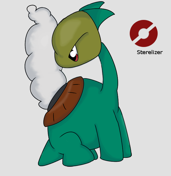
    Sterilizer- Boiling Pokemon
    Rock/Water

    Sterilizer keep their eggs inside the hole on their back, they keep their water on low heat whilst pregnant to keep their eggs at the right temperature, when they aren't pregnant a giant cloud of steam flows from the water on its back, scientists have found evidence that the water was hotter then lava when they were really angry.
    Spoiler:


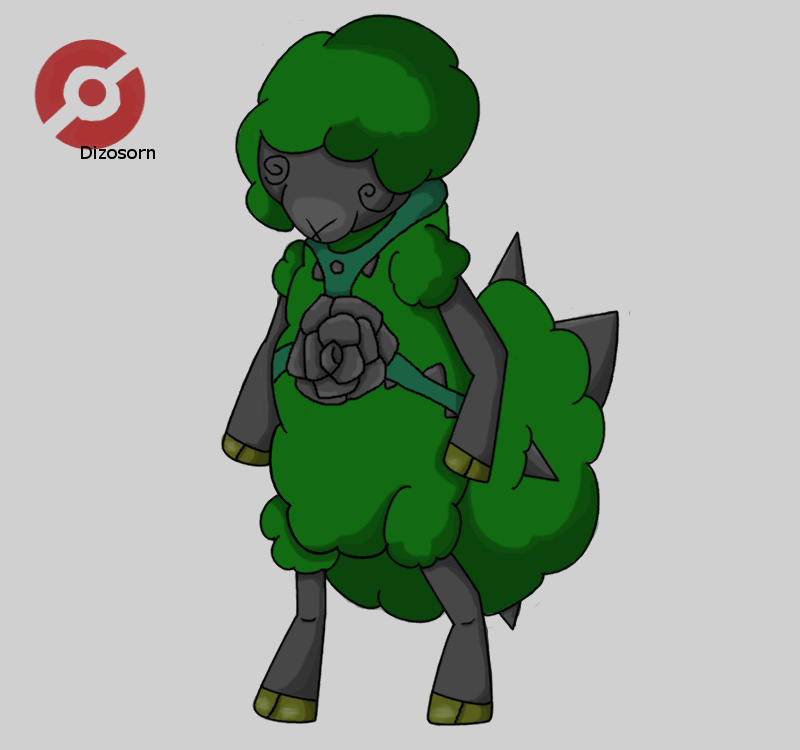
    Dizosorn- Thorn Pokemon
    Grass/Dark

    Dizosorn draws enemies in by looking dumb, but when opponents close in to attack Dizosorn swings its giant thorn filled tail at them, sending the enemy flying as well as inflicting damage.
    Spoiler:


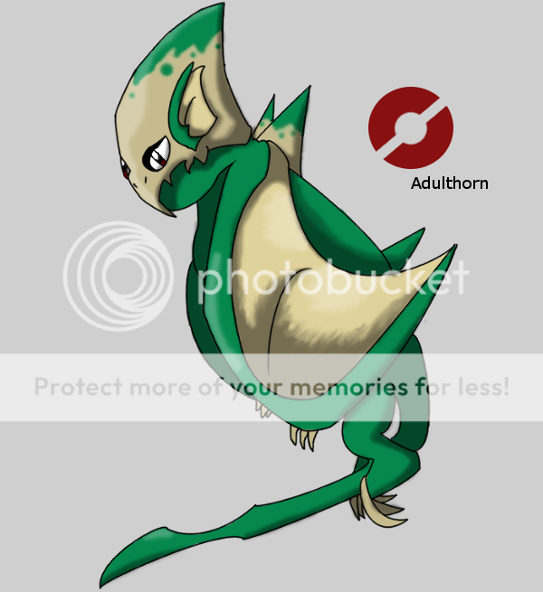
    Adulthorn- Adult Pokemon
    Dragon/ Poison

    Adulthorn will risk anything to protect their young, even their own life. Capturing one is a harsh task and was seen as a right of passage in medieval times.
    Spoiler:


    I will not post any more Fakemon here, only on my DA so any comments should be posted on my DA, have fun!
     

    ~*!*~Tatsujin Gosuto~*!*~

    Buffalo State College
    12,049
    Posts
    18
    Years
  • Okay:

    I like this one because its an angry cloud, but on the head, you might want to smooth the outtline a bit because it is a bit bumpy on the top of the head.


    I think for this one, you could make the thorn closes to the bottom a bit bigger. I like the Spinda eyes (thats what I call it) and the left arm towards the middle looks a bit awkward but that could be me or the position of the arm.


    Nice coloring and shading on this one. The outline on the top of this one's head can be smoothed a bit more. I also think the hands should be more visible. Other than that great job on this one.


    :t354:TG
     

    Castgurl

    The Cuban Artist ~
    36
    Posts
    12
    Years

  • For some reason I like this one the most out of the three. I like that the colors are not too saturated and "bright", makes it look as though it can fit right into someone's garden as a statue or bush lmao. Would be cool if you gave more to the head, or perhaps horns on top. Looks neat. :)
     
    1,542
    Posts
    16
    Years
  • I have to say, overall the Fakemon, I think Dizosorn had the best artwork.
    The Adulthorn had pretty god shading, but you could see lots of little smudge strokes. I think they're smudge strokes. Anyway, it looks like there was much more detail focused or spent more time on the wing. You want to make it look like you spent time on shading, coloring, just make the entire thing in general with time. All of the effort and details on shading, ect should be equal. Not having the wing with more shading strokes and details than the rest of the body.

    Hopefully that made some sense. =x Don't have one part of the picture with more details than other parts.

    I can say, overall, the colors are okay. I would have choose colors more saturated, but still that's my opinion. xD Really, good job with the Fakemon! I think the members before my post took care of other crits I was going to mention. ^..^
     
    41,411
    Posts
    17
    Years
  • You have some neat fakemon ideas here and I like how you presented them - Dizosorn is my favorite of this batch, I really like its swirly eyes and design in general. :D Great job!

    The Adulthorn looks good, though the gray shading on the eye makes it look like it's bulging out a little bit. I'd recommend putting the shade of gray on the top of the eye rather than the bottom; that way the darkened portion would be from the eyelash, where it would make much more sense. It does look like you used the smudge tool (or another equivalent, been a while since I used Photoshop for drawing specifically) for the wing, which kind of detracts attention from the rest of the body... I don't think it's necessary. As Ana said, you should make sure you put an equal amount of time in every part of your picture. Honestly, I think the Adulthorn would look a lot better if its wings were spread out, but that's just me. XD;

    Sterelizer's cute but I'm not too fond of the colors you chose to shade it with. Rather than choosing the color a bit darker than your base for shading, try to mix your base with another color and experiment. For the color you used for its body specifically, I'd have went with a color slightly darker than the base mixed with some more blue. I recommend #1D6C6D or something similar, if you're curious. The way you shaded the steam coming from its back is also a bit confusing - looks a bit more like a tangible, stretchable figure than steam. Kind of like cotton now that I think about it. Where the neck connects to the body and head could probably be altered a bit, too. I would recommend removing the little "bump" where it connects to the head and moving where it connects to the body a bit more down. This is what I'm talking about, if you're confused. ^^

    Moving onto the Dizosorn now - sorry for being out of order!

    This guy is my favorite but he still has a few things that could use tweaking. Firstly, the right arm (our left) looks bigger than the left and the way the feet are bent is slightly awkward. For the most part, this one is pretty good but it has its fair share of issues.

    All-in-all, watch the colors you use and work on your shading a little bit. Your anatomy is pretty good for the most part, though I'd still recommend practicing. Keep us updated! ^_^
     
    Last edited:
    Back
    Top