• Our software update is now concluded. You will need to reset your password to log in. In order to do this, you will have to click "Log in" in the top right corner and then "Forgot your password?".
  • Welcome to PokéCommunity! Register now and join one of the best fan communities on the 'net to talk Pokémon and more! We are not affiliated with The Pokémon Company or Nintendo.

Gol's Fakemon and other pixels

Status
Not open for further replies.

gol

72
Posts
14
Years
    • Seen Oct 8, 2010
    Welcome to my Fakemon (and other) sprite thread!


    Fakemon
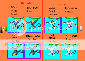
    Spoiler:

    Splices
    Spoiler:

    Trainers
    Spoiler:

    Pixel Overs
    Spoiler:


    Critiques are welcome.
     
    Last edited:
    Sora's Nobody

    The Official Roxas
    1,112
    Posts
    14
    Years
  • Well for crtiscisme. Try AAing (anti aliasing) the vine for example and make use of more colors. And for the tail try making a more round shape!
     

    gol

    72
    Posts
    14
    Years
    • Seen Oct 8, 2010
    the tail is round. I'll try to AA the vine, but the tail is round. Photobucket is just messing with the image :P it's stretching up a bit. Stupid photobucket.


    No more critiques? Come on!
     
    Last edited:

    gol

    72
    Posts
    14
    Years
    • Seen Oct 8, 2010
    HEY! No more critiques? I updated it with more of my work, and yes, some of the fakemon are in progress- well all of them! PLEASE CRITIQUE!
     

    Dots

    Temporary Avvie. ^^'
    99
    Posts
    14
    Years
    • Seen Apr 23, 2012

    Those guys need tons of work. First of all, they don't look like pokemon, which have large memorable faces, so the concepts are going to be in need of a major revamp.

    The pose their in doesn't fit, or make sense for that manner. Pokemon sprites tend to be standing (or hovering) when they appear in the grass/caves, and they're never clinging to any part of the scenery. The shading on them is too gradient like, so you might want to look at some tutorials explaining how to incorporate a light-source into pixel art.

    Reading Chesu's Spriting Tutorial https://www.pokecommunity.com/showthread.php?t=176686here would incredibly help you with making a pokemon fit into the official style and well ... look like a pokemon.


    It's better than the first one, but Gastly's smoke(?) is too obvious in that sprite. Also, the concept itself is too reminiscent of Gastly.

    The spheres all need to be shaded properly because right now they look too flat. Check the official sprites of Voltorb/Electrode/Gastly and try to imitate the shading style to make it fit in more.

    One thing I noticed too is that all of the smaller circles are identical, and that's a big no-no when spriting. If you're going to stick with that, try to disguise the fact as much as possible to hide that fact.


    The ball in the middle is the one from the other sprite, with the only different being the expression and Haunter's hands. The sphere's on it's sides are the exact ones too and you'd usually have the sprite look at the opponent's pokemon instead of directly at you. Same comments I made on the last one make sense for this one too.


    Overall, your scratch work needs loads of work, so you're going to have to look and read tutorials before making anything that fits with the rest. Try to follow the tips I've written and get the basics down before making anything else. I'll be looking forwards to seeing your improvements in the future.
     
    Last edited:

    gol

    72
    Posts
    14
    Years
    • Seen Oct 8, 2010
    like I said (and maybe you didn't read) all my fakemon are WIP. Yes, I will make Ooh-Ooh in a different pose, and will make the face larger (it's in GBA size, not DS size.) I did follow Chesu's tutorial, and the light source is coming from the left, not top left like most. (I am fixing that too). Yes, the concept for Groopeneye and Kingor is taken, but as Groopeneye's name suggest it will be an eyeball with smaller eyes floating around it. Oh, and the two behind Kingor or supposed to be there. He's a KING-like pokemon, and those are his followers.
     
    Last edited:

    Dots

    Temporary Avvie. ^^'
    99
    Posts
    14
    Years
    • Seen Apr 23, 2012
    like I said (and maybe you didn't read) all my fakemon are WIP. Yes, I will make Ooh-Ooh in a different pose, and will make the face larger (it's in GBA size, not DS size.) I did follow Chesu's tutorial, and the light source is coming from the left, not top left like most. (I am fixing that too). Yes, the concept for Groopeneye and Kingor is taken, but as Groopeneye's name suggest it will be an eyeball with smaller eyes floating around it. Oh, and the two behind Kingor or supposed to be there. He's a KING-like pokemon, and those are his followers.

    I never said they were finished products, because it's pretty obvious they're still in the tweaking process.

    I don't really think you've read what I was saying, because I was mentioning how you could improve their style and make them fit with the other pokemon. Compare Ooh-Ooh to the other pokemon, and you'll see he doesn't fit in that much. Pokemon have distinct features, with large memorable faces. Also, as I mentioned before, none of them are clinging to any part of the scenery, like Ooh-Ooh is.

    For your ghost pokemon, again, I repeat, I wasn't criticizing the concept. I was giving you feedback on how you can make the shading and overall look more fitting.

    Here are Gastly and Haunter, along with Groopeneye and Kingor for comparison purposes:
    Gol's Fakemon and other pixels
    Gol's Fakemon and other pixels

    (Gastly's sprite is the one from FR/LG while Haunter's is the one from R/S)
    Gol's Fakemon and other pixels
    Gol's Fakemon and other pixels


    As you can see, it's pretty noticeable that the 'gas' around Groopeneye is the exact same one from Gastly's sprite, that only difference being the fact that you flipped it. It's also the same one used for Kingor's sprite, which happens to have borrowed Haunter's hands, which are recognizable by many people.

    The sphere's around Groopeneye are the exact same ones, which means you Copy+Pasted it. Same thing occurs in Kingor's eyes, and both of those mistakes are obvious to even an un-experienced eye.
     

    gol

    72
    Posts
    14
    Years
    • Seen Oct 8, 2010
    Okey dokey. I'll probably post the new Groopeneye soon, when I have it in the first stage (no smaller eyes but just the large eyeball floating thing). Oh, and just so everybody knows, Ooh-Ooh has two forms, the wild one on a vine, then the trainer ones with no vine
     

    gol

    72
    Posts
    14
    Years
    • Seen Oct 8, 2010
    Sorry for the double post, just putting new stuff.

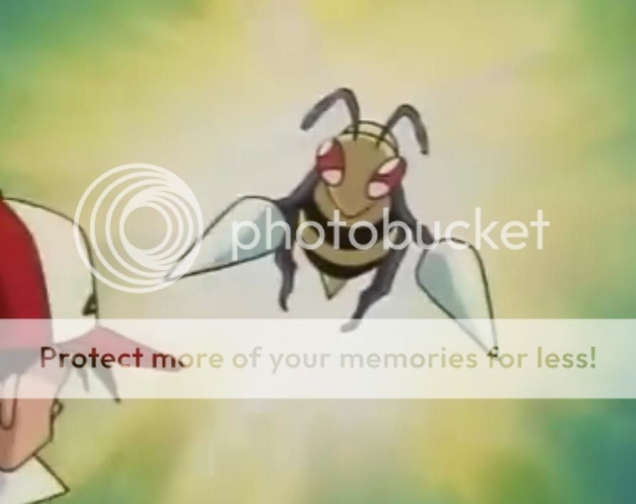
    Okay, any way here's this new pixel-over I made:
    Gol's Fakemon and other pixels


    It's Beedrill, obviously. Here's the original image:
    Spoiler:
    (it's kinda large)

    And the process:
    Gol's Fakemon and other pixels


    The two sprites at the top left are by Game Freak, I just put them there to compare to mine. it goes in order from far bottom right to the left then up. Repeat till you get to the top and there's the process :)

    Hope you like, it's my first pixel-Over. :D

    Oh, it's a WIP.
     
    Last edited:

    The Original Darkwiz787

    Stuck with text below my name.
    317
    Posts
    15
    Years
    • Seen Jun 24, 2014
    The shading on the Beedrill is really off in places. It just doesn't seem to match up with the lightsource.
     

    Dots

    Temporary Avvie. ^^'
    99
    Posts
    14
    Years
    • Seen Apr 23, 2012
    Um ... Gol, there are a few errors in your pixel-over.

    You're going to need to define a light source and make the shading/outlining smoother. By the way, where did the wings come from? I don't see them in the original picture.
     

    gol

    72
    Posts
    14
    Years
    • Seen Oct 8, 2010
    The shading on the Beedrill is really off in places. It just doesn't seem to match up with the lightsource.

    Like what places? be specific so I can change it!

    You're going to need to define a light source and make the shading/outlining smoother. By the way, where did the wings come from? I don't see them in the original picture.

    Okay, let's see... The light source is coming from the top left corner, like normal. Where is it different? Oh, and yeah, I am working to make the outlines smoother (like not making them all black to make it flow) and the shading smoother. Oh, I edited wings of other Beedrill sprites to make it look like it had wings, 'cause a wingless Beedrill is weird and I'm still working on the blur effect.


    Thanks ~GodricGryffindor9~!
     

    gol

    72
    Posts
    14
    Years
    • Seen Oct 8, 2010
    Sorry for double posting but...
    NO MORE CRITIQUES? COME ON!

    What? I don't what somebody coming in and posting after a month except me (yes, I consider my self a noob) cause it's okay if I revive this thread. I think. Okay, just read the message and critique!

    Oh, yeah if you haven't already, visit Itistheriz's Fakemon for some good sprites! He doesn't really like me but I don't take it personally... my sprites aren't that good...
     

    gol

    72
    Posts
    14
    Years
    • Seen Oct 8, 2010
    im just going to through this out here, but man. your pixels suck

    Well, thanks for being mean.

    If you think they suck, how bout telling me how to make them better? Remember, they're WIP!
     
    27
    Posts
    14
    Years
  • You said you wanted critique.

    Your spriting needs a massive amount of work. Ooh-ooh does not look remotely like a pokémon. The shading is completely wrong. Try comparing it with a real sprite and you'll see that the shading is not gradient-like, and that darkness is present in the areas that actual light wouldn't reach, e.g. under the armpit, below the chin. On a side note, your dark and light colours are too similar to the base colour, and the sprite must be looked at closely to properly see all of the shading. Also, as Dots stated, there are never any stray vines, rocks or foreign objects in any sprites. Needs work.

    You will never be a respected spriter if you:
    - Take body parts from official pokémon.
    - Resize sprites (minimizing Groopeneye in Kingor's sprite).
    - Copy-pasta (in both ghost sprites).

    Also, the shading is an issue again. Spheres do not look like that in real life. The shading is curved, not straight.

    Graboom is just a stolen sprite from Game Freak, basically.

    Your splices are all pretty "meh" as well. The body parts look askew and odd on most, and the scratched parts are just awful. Some of the recolouring is just weird and illogical, e.g. changing the stomach colour from Rattata to Raticate. Try and start with simpler splices before moving on to the more advanced stuff.

    The trainer. Isn't that just a normal trainer with sunglasses? And aren't the sunglasses stolen from another trainer sprite?

    The pixel over suffers the same shading issues as your other works. And the wings are snatched from an actual in-game sprite, which just makes them look disjointed and bizarre.

    Not great.
     
    Last edited:

    gol

    72
    Posts
    14
    Years
    • Seen Oct 8, 2010
    Okay, lets see... Well in my new Ooh-Ooh I'm removing the vine. But, maybe you didn't read all the posts, because I said Ooh-Ooh had two forms. One with vines, one without vines. But I'm working on that. By the way, most people think it's un-pokemonish because of the face, but that's because of size limitations. I am respriting it in 80x80. Oh, Groopeneye up there is only beta, which I should say earlier and will edit later. I'm still putting the finishing touches on Groopeneye, which looks COMPLETELY different. Also, I never said the trainer wasn't a splice. I'm sorry you think Graboom is a rip-off, but I explained why I made it under it. Splices.... Um, Rattarock's and Ratistone's stomach colors are the same.... if you mean from the original, it's because it's more of a retype then a splice, turning them into rock types. I know the shading is messed up on all of them, I'm working on making that better. The wings are only there because I'm still working on the blur effect. Maybe you should read all the posts next time... :P.
     
    Status
    Not open for further replies.
    Back
    Top