BreD
Where's ButteR?
- 125
- Posts
- 16
- Years
- Age 30
- I don't have a location, i'm just a figment of you
- Seen Dec 14, 2015
Hi, and welcome to my

This is part of the Graphics School.
Here I will be teaching you Design/Program class. That means I will be teaching you about the tools you don't understand or don't know about and I will also help you to make different kinds of graphics, mainly signatures. (I won't physically help, I will advice you.)
If you have any normal questions like "Where can i get c4d's? What are c4d's? Where can i get good brushes? Where can i get renders? Where can i get sprites?" or any other questions like that, don't hesitate to ask... as for the moment i am going to presume you know, unless you ask.
I will give out different assignments, i will give a new assignment when one person has finished the previous one, but it may not be instant because I have to think of new assignments. After you've finished assignments I will give you critique and advice on how to improve the signature you made. Take your time doing them, i don't want them rushed.
If you are joining the class late, that's ok! You will be able to follow previous assignments that I have posted, but if you do join the class late I expect you to start from the start.
Current Students
- Star Poochyena
- Kurogane
- DarkkChildd
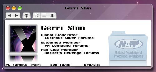
- Gerri Shin
- Chikara³
First Assignment is:
I'd like you all to make a new signature to the best of your ability, I'd like you to flow in mind whilst making it.
Flow is the direction of your signature, the direction should guide your eyes to the focal of the signature, the focal being the main thing in your signature being a render/picture most of the time. (remember text is part of the signature, not the main thing.. try to blend it in...)
If your thinking "wtf" about what i asked you to do... just make a signature to your best standard and i'll help you improve.
Second Assignment is:
To read what i have to say about your signature then edit it to improve it.
Third Assignment is:
To make a signature just using Clipping masks and Smudging... see this and this for help.
Fourth Assignment is:
Is just like the second assignment, read what i have to say about your signature and i'll help you improve it.
Post assignments when you've finished them.
This is part of the Graphics School.
Here I will be teaching you Design/Program class. That means I will be teaching you about the tools you don't understand or don't know about and I will also help you to make different kinds of graphics, mainly signatures. (I won't physically help, I will advice you.)
If you have any normal questions like "Where can i get c4d's? What are c4d's? Where can i get good brushes? Where can i get renders? Where can i get sprites?" or any other questions like that, don't hesitate to ask... as for the moment i am going to presume you know, unless you ask.
I will give out different assignments, i will give a new assignment when one person has finished the previous one, but it may not be instant because I have to think of new assignments. After you've finished assignments I will give you critique and advice on how to improve the signature you made. Take your time doing them, i don't want them rushed.
If you are joining the class late, that's ok! You will be able to follow previous assignments that I have posted, but if you do join the class late I expect you to start from the start.
Current Students
- Star Poochyena
- Kurogane
- DarkkChildd
- Gerri Shin
- Chikara³
First Assignment is:
I'd like you all to make a new signature to the best of your ability, I'd like you to flow in mind whilst making it.
Flow is the direction of your signature, the direction should guide your eyes to the focal of the signature, the focal being the main thing in your signature being a render/picture most of the time. (remember text is part of the signature, not the main thing.. try to blend it in...)
If your thinking "wtf" about what i asked you to do... just make a signature to your best standard and i'll help you improve.
Second Assignment is:
To read what i have to say about your signature then edit it to improve it.
Third Assignment is:
To make a signature just using Clipping masks and Smudging... see this and this for help.
Fourth Assignment is:
Is just like the second assignment, read what i have to say about your signature and i'll help you improve it.
Post assignments when you've finished them.
Last edited: