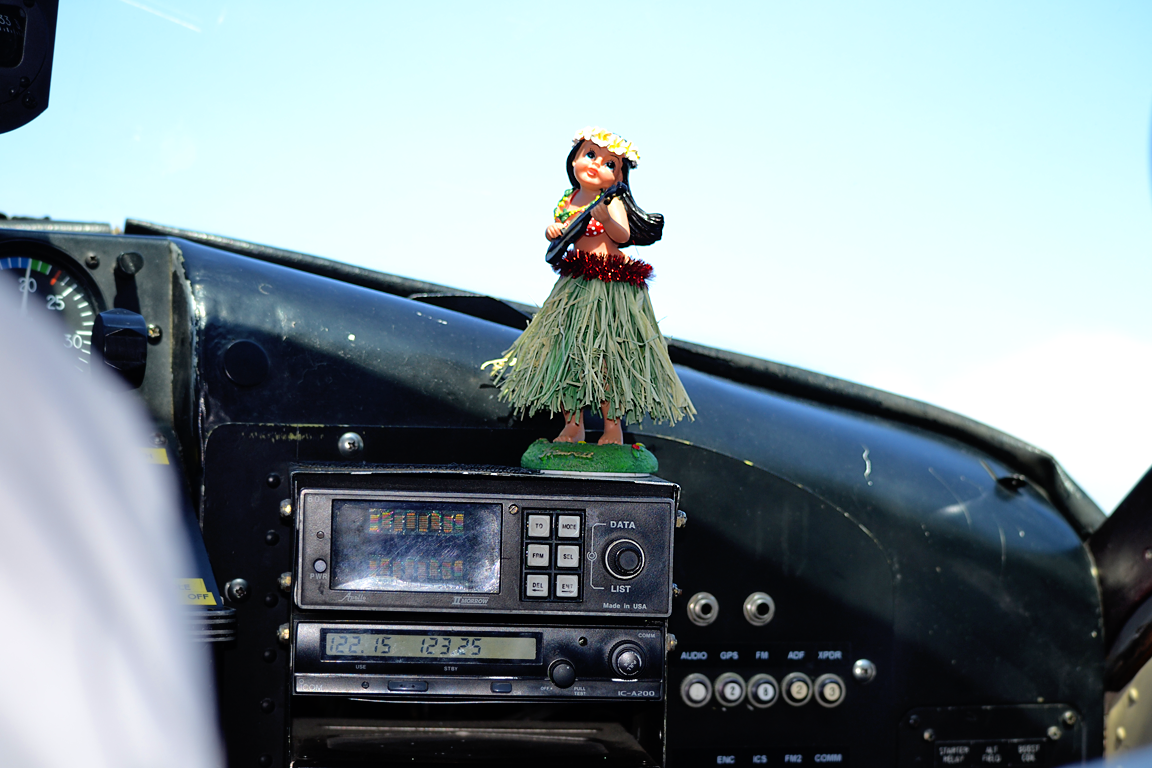
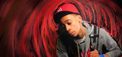
• Our software update is now concluded. You will need to reset your password to log in. In order to do this, you will have to click "Log in" in the top right corner and then "Forgot your password?".
  • Welcome to PokéCommunity! Register now and join one of the best fan communities on the 'net to talk Pokémon and more! We are not affiliated with The Pokémon Company or Nintendo.

I guess it's been a month...

NEW GALLERY SO I DONT BREAK PC RULES!

First some photography:
(warning there are some big images)

Blue Skied Mountain
Spoiler:


RELIEF
Spoiler:


Sea Lions!
Spoiler:


Hula Girls!
Spoiler:


Aaand some new tags.

flash.png


kreayshawn.png
 
10,673
Posts
15
Years
    • Seen Dec 30, 2023
    It's 2 months now dude, increased the revival rate a while back. Anyway, to the comments I go!

    http://fc09.deviantart.net/fs70/f/2011/234/1/8/blue_skied_mountains_by_kabla_moo-d47j53a.png

    Beautiful composition here. Stunning photograph, and probably the best I've seen from you. I love your positioning, and the area you chose to capture. Just watch out for your angles, you've gone a bit slanted when taking the photo, as you can see the piece is slightly slanted which takes away from the overall composition slightly. Otherwise, love this one, good work.

    http://fc07.deviantart.net/fs71/i/2011/234/0/0/sea_lion_2_by_kabla_moo-d47j4pi.png

    Another great one, good composition here once again. There's a strange bit of lighting on the photo on the top somewhere however. Between the two highest sea gulls. Something on the lens? Post-production? Anyway, nice shot. Though it looks edited in places due to the odd lightening and focus in areas, could be wrong though, there could have been any number of things that could have happened. Just try to keep your shots clean.

    http://fc02.deviantart.net/fs70/f/2011/234/0/0/sea_lion_by_kabla_moo-d47j4ix.png

    Not as big of a fan of this one in all honesty. The colours are nice, the composition is half decent, but again you've got all this loose darkened areas, which are really odd and striking. Refer to the last comment on the other photo above. Overall it's actually lacking a focal point, here, if possible, it would have been good to get closer to the sea lions, you have a lot of unnecessary background, from what I know, it's better to avoid having too much uninteresting space, without discrediting what would have been a good photograph otherwise.

    Not gonna comment on the hula girls and such, I find the focal points here just to be slightly typical or generic, I think your best shots are the spontaneous nature or the landscape shots you've taken, more of those ones plox :3

    On to the tags;

    http://i91.photobucket.com/albums/k284/andytoe/flash.png

    Liking the text here, I think it lacks in depth overall. It needs some more depth in the background, by use of C4D's or textures. However, I like the use of effects and the colours, they're pretty classy. The size of the tag and the render taking up quite a lot of it is a little odd to me, I think it kills any sort of flow that you could have created. The focal point is too large due to this, the most interesting part of this tag is actually the text, in my opinion, and the surrounding area. I would have liked to have seen this render used with a bit more emphasis on the face. It would have been nice to see this tag with a little less height and the focal being reduced in size a little. Watch out on the lighting too, seems a little heavy. And the second point of lighting to the right of the render is a no no, just keep to the one main point. Seriously, think about changing the size and the likes, and you'll have an awesome tag.

    http://i91.photobucket.com/albums/k284/andytoe/kreayshawn.png

    Not one of your best. The text is a little too much, if it had been smaller and closer to the focal point, and have a different colour on the GUCCI GUCCI, it would have been a lot better. Nice choice of fonts though, as well as the lines around it, they're pretty neat. What bothers me most however, is the use of colour. I think the pink is a little too heavy and as is the lighting. It's a little too washed out. You're pretty good with typography though, and your stock positioning is good, individually your techniques work really well, but you seem to struggle to get them to work together in some tags, which comes with a little more patience and re-touch with the do's and don't's of tagging.

    Anyway, some of your latest stuff is great, and I'm glad to see you back. Just keep workin' at graphics, I know you've been out for a while, but you have fantastic technique, just getting it to work together is the hard part. You're coming along with your photography too though, just work on having cleaner overall completion and adjust your angles at times and you'll have some great shots. Good to see you back bro.
     

    moments.

    quixotic
    3,407
    Posts
    15
    Years
  • I've already told you how I feel with that first tag, but just to add to what Gav said about the lighting, it is really washed out. I reckon you could get away with leaving the lighting as is if you pump the contrast up just a fraction on the top and sort of left of the tag (right and bottom right is perfect contrast).

    kreayshawn.png
    This one, is like almost a lot of things, but none of them. The text is definitely too big, but also because your font is really spread out and not bold/round enough. As for those lines, not feeling them at all. They aren't really giving you any flow, they honestly feel randomly thrown on there and distracting and not doing anything good at all in my opinion. This could be one of those like trippy tags with crazy colours and really sharp effects, but yeah, it sort of feels incomplete at the moment and kind of feels like you ran out of ideas so you threw heaps of random lines in and massive text.

    Sorry that wasn't too much, you need to post more tags so I can post more. xP
     

    moments.

    quixotic
    3,407
    Posts
    15
    Years
  • These two are sexy!

    wizz.png
    I love this style, and have always meant to start it, but I can see some sort of laziness perhaps shining through which is a bit obvious. I'm going to predict that you did not render your stock and started painting over the top. Basically, around his head especially, there is a distinct line where the brushing stops to go around him, and doesn't continue on behind like it would if it were rendered. That's basically the biggest irk in this tag, just looks dodgy, and could've been fairly easily fixed.
    Also, all the brushing to the right of him looks weird. It looks lower quality, rougher lines and the colours seem a little off too... Not sure if this was mistake/exporting issues, but I'm thinking just got a bit tired or something. :P

    As for the tag as a whole, it feels a little empty cause you don't have many foreground effects / no real pop. It looks really good so far, but it just needs a few more details. Either some more brushing in a lighter/brighter shade, or some textures or something to add some pazazz.
    I would've also moved him to the left a fraction and then up a bit too.
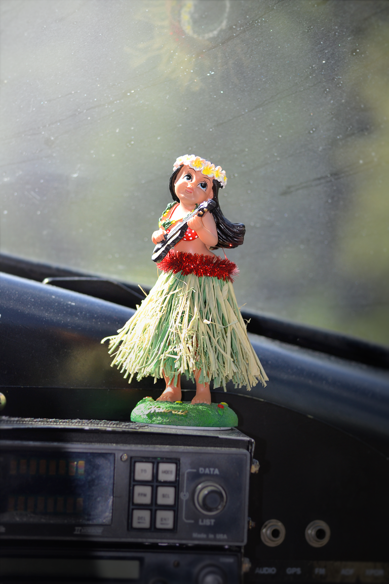
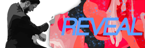

    REVEAL.png
    This one is so close to being truly amazing. And the only thing that lets it down is the text. I can see what you've gone for, and I probably would've gone for something similar, but it just isn't working I'm afraid. The colour blue over the top of that red just doesn't stand out enough and for that reason it is more distracting, it is hard to differentiate, it almost blends into the pentooling... So yeah, colour, but also maybe size /font, only because it covers so much of your pentooling which would've taken ages...
    I reckon a textless version could look very good, only to flaunt the effects and stuff, but yeah, the text definitely needs tweaking.

    And another thing, the edge of the white "sheet" looks really lq, like you've got a grey stroke or something. If you can tidy that up, it'd look perfect!

    Anyways, you're getting too good and original. :P
     
    Back
    Top