• Our software update is now concluded. You will need to reset your password to log in. In order to do this, you will have to click "Log in" in the top right corner and then "Forgot your password?".
  • Welcome to PokéCommunity! Register now and join one of the best fan communities on the 'net to talk Pokémon and more! We are not affiliated with The Pokémon Company or Nintendo.

5th Gen Logos A No-Go?

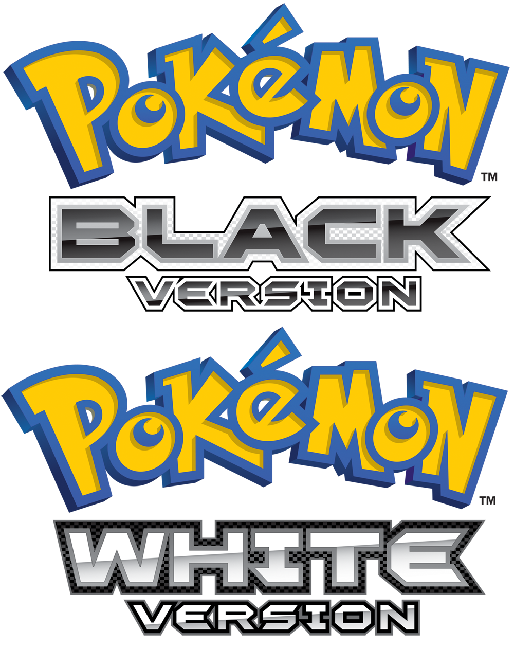
Do you like the English logos of Pokemon Black/White Versions?


  • Total voters
    92
Status
Not open for further replies.

Trap-Eds

Dig a hole, dig a hole........
  • 1,119
    Posts
    15
    Years
    Ehhh...yellow and blue against all that, well, black and white just doesn't look quite right. I remember in the Pokemon intro of Platinum, the traditional Pokemon US logo appeared in grey-why didn't they just use that?

    Then again, the yellow and blue makes it a lot easier to find in stores. xD It's weird, but it works. :P
     
  • 2,347
    Posts
    14
    Years
    I'm not quite sure how to respond to this poll...

    I like the English logos, but I like the Japanese more. I think it's simply because of how foreign the Japanese versions look.


    Seriously though, are logos really something to complain about?
     

    Aera

    The samurai.
  • 16
    Posts
    13
    Years
    I'm not quite sure how to respond to this poll...

    I like the English logos, but I like the Japanese more. I think it's simply because of how foreign the Japanese versions look.


    Seriously though, are logos really something to complain about?

    I seriously have to agree with you. It's just logos guys, deal with it.
    But yes, I like the logos just as much as the Japanese ones, it looks futuristic, it fits with the theme. But what bothers me is that "Pokemon" kinda stands out. Overall, it's quite nice.
     

    Austy

    Cannibal
  • 10
    Posts
    13
    Years
    BIG SADFACE. T^T

    I loved the Jap. logos... that's what made me so excited! Had I seen the English ones before I knew anything of the game, I would been "Bleh..." But oh well, I suppose. I'll live. I mean, I'm not playing the box. It seems like one of the anime logos to me, though.
     

    InappropriateGoat

    The Goldfish Lord
  • 20
    Posts
    13
    Years
    • Seen Apr 23, 2011
    I dislike the English one, and love the Japanese one (I'm a fan of the colours, Black & White), but I don't think the english one is bad.
     

    AadmM

    I AM THE BRAINWASHAAAA
  • 70
    Posts
    13
    Years
    They don't look too bad, aside from the traditional yellow lettering used for the word "Pokemon". As a graphic designer who loves working with type and logos, it really puts me off a bit--the bright yellow and blue create too much of a divide between the top and bottom portions of the logos. The Japanese logos are much more streamlined, color-wise, and feel more cohesive as a result.

    As someone has already demonstrated, if they would just recolor the word "Pokemon" to fit with the rest of the logo if would look much, much better. It wouldn't hurt them to freshen up the logo a bit anyway.
     

    mervyn797

    What? I'm right here. >D
  • 1,696
    Posts
    15
    Years
    • Seen Nov 28, 2011
    When it comes to the logos for the english version, I prefer Pokemon Black's logo over Pokemon White's. Pokemon Black looks neater.

    But I'm not surprised that they look bad, the English versions always ruin the smexy Japanese logos. :<
     

    King Gumball

    Haven't been here for ages...
  • 2,179
    Posts
    13
    Years
    The only big problem I really have for the logo is
    Logos A No-Go?

    this thing.

    Just... why? The localization team could've really put much more effort on making this match the spiffy words below! It's not hard at all!

    LOL it does stand out in a bad way. But I am sure everyone would miss it if it were gone this time around (Impossible but still ) or changed. I would hate for it to be changed, as that logo is what pokemon is recognised for. It would be like changing a flag of a country (bit extreme eg.)
     

    Corruptodile

    Ma chérie, Je t'aime.
  • 281
    Posts
    13
    Years
    • Age 30
    • UK
    • Seen Aug 19, 2016
    I kinda wish they'd adapt the logo more. Keep the same logo in English just, jazz it up a bit. The Black and White version logos themselves look nice, but the same generic Yellow/Blue coloring could be done away with. I don't like to point my signature. But, something like that. Where the Pokémon logo itself has some slight alterations and keep the same Black/White font that's on the current logos.

    I wish the logos were more like the ones in your signature. The blue/yellow looks completely out of place.
     
  • 40
    Posts
    19
    Years
    • Seen Jul 18, 2012
    I like the English logo. To you seasoned Pokemon fans, brand recognition is not a big deal. But for the rest of the population (e.g. moms and dads picking up games for their young ones), a drastic logo change may mean confusion and lost sales.
     

    The Red Chain

    Guest
  • 0
    Posts

    English BW Logos:

    Logos A No-Go?

    Eh, the Japanese logos always tend to be more beautiful than the English ones, so I'm not too surprised.
    I am a little annoyed though because I've gotten so used to the gorgeous logo that is Japanese White version, that it's hard to adjust to that.

    At least they did something a little more flashy with the "White version" and "Black version" text. Imitates what the Japanese did to their logo.

    Overall, typical Pokemon, so nothing too disappointing.
     

    TCB

    Tranquilo.
  • 565
    Posts
    14
    Years
    Personally, the logos are decent enough for me. The bright blue and yellow Pokemon logo kind of clashes with the futuristic and blocky look of the font usd for the logos though. Then again, all other past game logos didn't mean that much to me anyway. Its these though that I actually was interested in; that Generation Five hype I tell you.
     

    Cataclysmic

    A New Adventure
  • 112
    Posts
    14
    Years
    • Seen Jun 13, 2015
    They look horribly plain compared to the Japanese ones, but they're not that bad. Indifferent.
     

    Dooonerz

    @JackDonnellyy
  • 457
    Posts
    13
    Years
    Here's the conversation on making the logo:

    GameFreak Project Manager: "Okay guys we need a logo for Black and White. Our Japanese logo was a huge success and we need something that can match it. Any ideas?"

    Smart Employee: "Well why don't we keep the original template of the Japanese logo, translate it into English and tweak it a little to catch the eye of the buyer!"

    GameFreak Project Manager: "Nahh not good enough; the customer may think that the design is lazy."

    Stupid Employee: "Ooo! I know! We can have the Pokemon logo, and add it to 'Pokemon Black/White' the colours will totally not clash at all!"

    GameFreak Project Manager: "Yes! That's brilliant! Let's get right on it."

    Smart Employee: *-______________-*

    Come on GF, have a little creativity up in here.
     
    Status
    Not open for further replies.
    Back
    Top