• Our software update is now concluded. You will need to reset your password to log in. In order to do this, you will have to click "Log in" in the top right corner and then "Forgot your password?".
  • Welcome to PokéCommunity! Register now and join one of the best fan communities on the 'net to talk Pokémon and more! We are not affiliated with The Pokémon Company or Nintendo.

[Showcase] Looking for comments and suggestions to improve my spriting skills

29
Posts
13
Years
Hello everyone! I've recently started a fiverr page where I sell Fakemon pixelart (edok_1 if anyone is interested), so I wanted to post some of my practice work here to see if anyone has any ideas on how I could improve, or even suggestions on what I could draw next.

I'll start off with the starters for my hypothetical frozen region. The theme is woodland critters, and I tried to work around a different typing trio to the standard FIRE-WATER-GRASS combo.

JNJO3V8.png


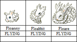
The first starter of the region, a pure FLYING bunny. Actually based on the photos of my own pet bunny, so it's a personal favorite. It is meant to be an animated cloud, with a focus on special attack and speed. I'm also toying with giving the final stage alternate weather forms akin to Castform.

JNJOyC9.png


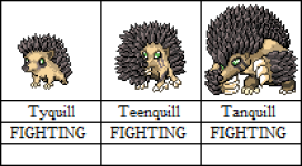
The second starter is the FIGHTING hedgehog. This little guy took AGES to detail, especially the middle evolution, which is essentially a giant spike ball. The final stage is in the same pose as mega Swampert, as it was the closest "round" muscular pokemon I could find.

JNJOgNP.png


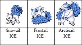
Finally, an ICE squirrel. The concept mostly focuses on the ice slowly encasing the entire squirrel, starting with the tail, and then spreading to the body and finally the claws. The middle stage is based on the famous Thor squirrel photo that floated around the internet a couple of years back.

Please let me know what you think, and I'll try to upload more soon!
 

Attachments

  • Bunny line.png
    Bunny line.png
    16.9 KB · Views: 16
  • Hedgehog line.png
    Hedgehog line.png
    19.2 KB · Views: 15
  • squirrel line.png
    squirrel line.png
    9.6 KB · Views: 16

Lordecoxinha

English might falter
269
Posts
3
Years
Hi! Let me start by saying I love the concept of a frozen region, specially because I love ice-types and somehow ice is the least common type so I'm all in for an environment that allows them to thrive!

Although I'm not a spriting specialist by any stretch, I'll try to help with what I can:

- First, I'd suggest toning down on the detail. I can see how much care and effort you put into the quills on Tanquill, for example, but Pokémon designs tend to use larger, fewer and rounder shapes than countless small ones. If you compare the fur on Floare to Zangoose's tail, the quills on Tanquill to Sandslash (which is arguably one of the most detailed examples) or the ice on Arcticail to Vanilluxe's bottom, you'll notice how simpler official sprites tend to be.
- Design-wise, I'd suggest having secondary themes in mind to give more diversity to your mons, even if not obvious or barely noticeable. Think of how Heatmor is based on an anteater but has some engine motifs to make it more unique.
- Try to vary color palettes a bit. Although not a rule of thumb, it tends to make evolutionary lines more interesting. Like how Charmander is orange, Charmeleon is red but Charizard is orange again. It's not a necessity, but it does help if you think the line looks too similar to one another.
- Finally, I'd suggest altering proportions a bit. Pokémon designs nowadays have shifted from pocket MONSTERS to POCKET monsters. What I mean is that they tend to focus on making even the Tyranitars and Aggrons look somewhat cuddly compared to how Kanto mons looked back in Gen I. (Compare Gen I Charmander to Chimchar, for example)
 
17,133
Posts
12
Years
  • Age 33
  • Seen Jan 12, 2024
Aw, I love the flying bunny. That's a great idea. :)

I feel like the anatomy/posing of Arcticail can be improved upon. The way it is now makes it look like the left leg is longer than the right, and the blue head decorator gets lost in the tail. Does that make sense?
 
29
Posts
13
Years
Hi! Let me start by saying I love the concept of a frozen region, specially because I love ice-types and somehow ice is the least common type so I'm all in for an environment that allows them to thrive!

Although I'm not a spriting specialist by any stretch, I'll try to help with what I can:

- First, I'd suggest toning down on the detail. I can see how much care and effort you put into the quills on Tanquill, for example, but Pokémon designs tend to use larger, fewer and rounder shapes than countless small ones. If you compare the fur on Floare to Zangoose's tail, the quills on Tanquill to Sandslash (which is arguably one of the most detailed examples) or the ice on Arcticail to Vanilluxe's bottom, you'll notice how simpler official sprites tend to be.
- Design-wise, I'd suggest having secondary themes in mind to give more diversity to your mons, even if not obvious or barely noticeable. Think of how Heatmor is based on an anteater but has some engine motifs to make it more unique.
- Try to vary color palettes a bit. Although not a rule of thumb, it tends to make evolutionary lines more interesting. Like how Charmander is orange, Charmeleon is red but Charizard is orange again. It's not a necessity, but it does help if you think the line looks too similar to one another.
- Finally, I'd suggest altering proportions a bit. Pokémon designs nowadays have shifted from pocket MONSTERS to POCKET monsters. What I mean is that they tend to focus on making even the Tyranitars and Aggrons look somewhat cuddly compared to how Kanto mons looked back in Gen I. (Compare Gen I Charmander to Chimchar, for example)

Thank you for the very thorough comment! I agree on the Ice Pokemon shortage, that's one of the main reasons I made the Squirrel, and am working on a couple others right now.
1. Detail: Yeah, agreed. As they are now, they are definitely over detailed to fit the traditional style. I guess I never saw it as a problem as I wanted to make a full Dex, not mingle them with the others. Maybe I'll just chalk that one up to my personal style :)
2. Design: Yeah, that's a valid point. One of the new ones I'm making is a Grass/Fire evergreen tree that's styled as a dancer. Although, as they are now, I'm not sure what kind of theme I could add to the starters... Something to ruminate.
3. Palettes: Yup, definitely. This was a kind of a shortcut to establish a connection, as it can be a bother to look up similar colors (I mostly just use colors from existing Pokemon.
4. Proportions: This is actually something I did by choice, as I feel that Pokemon "felt" better when the focus was on the MONSTER part :) BTW, I love the Fakedex you put out here, that's one of the motivations for me to start posting my own work!

Aw, I love the flying bunny. That's a great idea. :)

I feel like the anatomy/posing of Arcticail can be improved upon. The way it is now makes it look like the left leg is longer than the right, and the blue head decorator gets lost in the tail. Does that make sense?

I absolutely agree on the issues with Arcticail, that's the one I feel is a bit weak compared to the others. I originally wanted to make it fully encased in ice, but I couldn't make it work. I'll probably have to rework it from the ground up at some point. Thanks for the comment! And great art on your end!
 

Lordecoxinha

English might falter
269
Posts
3
Years
Thank you for the very thorough comment! I agree on the Ice Pokemon shortage, that's one of the main reasons I made the Squirrel, and am working on a couple others right now.
1. Detail: Yeah, agreed. As they are now, they are definitely over detailed to fit the traditional style. I guess I never saw it as a problem as I wanted to make a full Dex, not mingle them with the others. Maybe I'll just chalk that one up to my personal style :)
2. Design: Yeah, that's a valid point. One of the new ones I'm making is a Grass/Fire evergreen tree that's styled as a dancer. Although, as they are now, I'm not sure what kind of theme I could add to the starters... Something to ruminate.
3. Palettes: Yup, definitely. This was a kind of a shortcut to establish a connection, as it can be a bother to look up similar colors (I mostly just use colors from existing Pokemon.
4. Proportions: This is actually something I did by choice, as I feel that Pokemon "felt" better when the focus was on the MONSTER part :) BTW, I love the Fakedex you put out here, that's one of the motivations for me to start posting my own work!

Thank you very much! Believe me, this community is very supportive and you won't regret posting your art here!

Looking forward to seeing more of your mons! (Gimme ice-types!!!)
 
17,133
Posts
12
Years
  • Age 33
  • Seen Jan 12, 2024
I absolutely agree on the issues with Arcticail, that's the one I feel is a bit weak compared to the others. I originally wanted to make it fully encased in ice, but I couldn't make it work. I'll probably have to rework it from the ground up at some point. Thanks for the comment! And great art on your end!

Aw, thank you! I appreciate your willingness to take criticism! The sprite work overall is really solid so I think you have a good foundation with the basics, it's just little nit picks that need sorting out to make them feel more 'authentic'.

Definitely excited to see more of your work. :)
 
Back
Top