You are using an out of date browser. It may not display this or other websites correctly.
You should upgrade or use an alternative browser.
You should upgrade or use an alternative browser.
Map Rating/Review Thread
- Thread starter Christos
- Start date
- Status
- Not open for further replies.
More options
Who Replied?Ninja Caterpie
AAAAAAAAAAAAA
- 5,979
- Posts
- 16
- Years
- Best City OCE
- Seen Oct 18, 2021
Well, tree shading, for one.
But, uhm, apart from that, I don't really see any large problems. It looks fine to me.
But, uhm, apart from that, I don't really see any large problems. It looks fine to me.
~Hot n' Cold~
is too good for a title.
- 329
- Posts
- 15
- Years
- Michigan
- Seen Nov 4, 2016
@Ven
^
~Tile Use - 3/5 - I am not a fan of the purple houses, kind of burn my eyes~
~Shape - 5/5 - Not square, trees look great~
~Errors - 5/5 - Just the one in the corner, that was appareantly removed~
~Space Used - 4/5 - Kind of empty, you tried to use the path and it doesn't look good~
~Complexity - 4/5 - Alright for a small village~
Overall Rating:
~21/25 - Great~
NarutoActor
The rocks cry out to me
- 1,974
- Posts
- 15
- Years
- Age 30
- Brooklyn/Marlboro
- Seen Apr 2, 2016
Okay here is my map
Map Name: Mt. Cornria
Credits: ~
Extra comments: You can go up stairs, and there is a whole that takes you to the area with all the rocks. The switch then triggers an event which after the event it warps you out of Mt. Cornria.
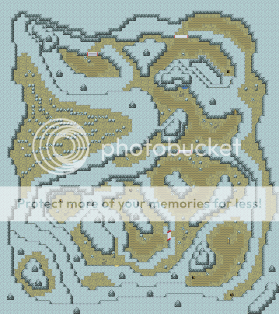
Map Name: Mt. Cornria
Credits: ~
Extra comments: You can go up stairs, and there is a whole that takes you to the area with all the rocks. The switch then triggers an event which after the event it warps you out of Mt. Cornria.
Spoiler:

~Hot n' Cold~
is too good for a title.
- 329
- Posts
- 15
- Years
- Michigan
- Seen Nov 4, 2016
@NarutoActor
Mt. Cornria
~Tile Use - 5/5 - I hate caves, but I love this one! It's amazing!~
~Shape - 5/5 - Ridiculously unsquare~
~Errors - 5/5 - Too small to see, so I'lll just give you 5/5~
~Space Used - 4/5 - If you add trainers, it will be great~
~Complexity - 5/5 - I don't even know how to get through there!~
Overall Rating:
~24/25 - Perfect!~
Ninja Caterpie
AAAAAAAAAAAAA
- 5,979
- Posts
- 16
- Years
- Best City OCE
- Seen Oct 18, 2021
I'm pretty sure the grey rock is only meant to be used for stuff that you can't walk on.
Muffin™
Knows your age
- 429
- Posts
- 14
- Years
- Age 13
- sucking balls
- Seen May 21, 2014
I'm a beginner at mapping so...


Rabbit
where is my mind?
- 484
- Posts
- 15
- Years
- BC, Canada
- Seen Feb 2, 2012
Okay here is my map
Map Name: Mt. Cornria
Credits: ~
Extra comments: You can go up stairs, and there is a whole that takes you to the area with all the rocks. The switch then triggers an event which after the event it warps you out of Mt. Cornria.
Spoiler:
Whoahhh...this is amazing. Easily the biggest cave I've ever seen (and this isn't the whole thing, right?) It has a very nice shape, overall. I like what you did with the rock-filled area. It's much more natural and easier to navigate than an actual maze.
I'd have to give you a C for playability, though. Personally, I would not have the patience to navigate through this monster of a cave. The long paths from entrance to exit are bad enough, but there are lots of paths that don't lead anywhere. Take the central set of stairs, for instance. Going up, the player can choose to turn left, and it will take him a hundred steps before he discovers it's a dead end. There are other paths like that. Even if you place some prize at the end, your players won't be very happy.
My rating: an epic map that should be resized. Shrink everything by 50% and block off the dead-end paths, and you'll have a fantastic cave.
Hm, just noticed a possible tile error. The tile with the entrance (light spilling out of it) can be reached by walking on the level above it. I don't think it's meant to serve double duty like that, which is why entrance tiles are usually in the very bottom of the map.
I'm a beginner at mapping so...

You're a beginner. So...so you want some pointers? OKAY!
1. You're using just one house in this map, and trying to modify it to make it look different. That doesn't work. In general, you should use houses only as Nintendo uses them. The bottom three houses look both skewed and blind because of the door placement and lack of windows. The top house looks low and long, like a hobbit's burrow. The overall effect is really wierd. If you want variety in houses, just use different houses (by changing your tileset).
2. Those flowers...are you trying to add variety to the landscape? Flowers can be used in two ways: arranged in lines/rectangles to mimic flowerbeds, or scattered in grass with no two adjacent. Don't try to do anything else with them. The flowers near the top house look good. They look like flowerbeds in front of a house. The other flowers look /bizarre/.
3. You seem to be using small bushes as a barrier. It just doesn't look right. Trees make good barriers. So do fences. But bushes have more of an ornamental function. They look good as hedges around buildings. You wouldn't normally find them in high concentration on the outskirts of a town.
Those are the main things I noticed about your map. And, indeed, they are the tiles you used most: blue houses, flowers, and small bushes. They really dominate this map. Give your map some variety by adding paths, more fences, and different kinds of buildings. Also, you might want to use more than one tile for the grass. A couple of tiles scattered around is all it takes to break up the pattern.
The signpost in front of the top building shouldn't be there. How often do you see a signpost on someone's lawn? (If it has a political message, I take that back.) Put it in the middle of the town instead.
Last edited:
Omega Zero
Is back...
- 444
- Posts
- 14
- Years
- Age 26
- I'm always living aren't I?
- Seen Dec 4, 2016
I just started mapping hopefully its not bad :) anyways what do you guys think
Map name: I dunno..
Game: Fire red

Map name: I dunno..
Game: Fire red

Last edited:
Matteron (96)
Can't Read Lookin Ass
- 270
- Posts
- 16
- Years
- Seen Feb 13, 2024
you're a beginner so I will only give you some tips and pointers.I just started mapping hopefully its not bad :) anyways what do you guys think
Map name: I dunno..
Game: Fire red
Spoiler:
First thing is the house on the other side of the mountain is to close to the trees move is back by a tile or two.
second, the mountain will cause border block issues.
finally your flowers are grouped unaturally.
Also one last thing, take out those bushes.
.Tactic.
x.Paranoid's BackAlley.x
- 1,309
- Posts
- 15
- Years
- A Dark Abbyss...
- Seen Oct 7, 2012
Map Name: Route 1
Credits: Me, Myself and I
Extra comments: Supposed to be kinda based on the Kanto's Route 1.
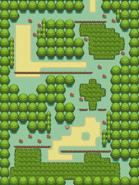
Credits: Me, Myself and I
Extra comments: Supposed to be kinda based on the Kanto's Route 1.
Spoiler:

- 3,411
- Posts
- 15
- Years
- Seen May 28, 2024
Credits: Me, Myself and I
Extra comments: Supposed to be kinda based on the Kanto's Route 1.
Spoiler:
Comments/Suggestions: I'm impressed! I don't see anything wrong with this. Border block is okay, grass placement is good, tree and path placement is great as well. I see some mapping errors though, at the bottom of the map, close to the grass and the trees. That part is kind of square by the way.
Rating: 75/100
~Hot n' Cold~
is too good for a title.
- 329
- Posts
- 15
- Years
- Michigan
- Seen Nov 4, 2016
@Septile
Unnamed Map
~Tile Use - 1/5 - Really bad house placement~
~Shape - 1/5 - Really square, absolutely square~
~Errors - 5/5 - None I can see of~
~Space Used - 2/5 - Using flowers and bushes in lumps are not attractive~
~Complexity - 1/5 - Walk straight to th exit~
Overall Rating:
~10/25 - Terrible~
@Ven
I dunno..
~Tile Use - 2/5 - I hate the colors, and the mountains don't look good~
~Shape - 3/5 - Quite square~
~Errors - 4/5 - You can exit out of the left and right sides of the map. I don't know if this is on purpose, but... why not comment?~
~Space Used - 4/5 - You did alright with the trees~
~Complexity - 4/5 - Mostly complex, mountains make it quite hard to manuever~
Overall Rating:
~17/25 - Average~
@Paranoid
Route 1
~Tile Use - 2/5 - I absolutely hate those grass tiles~
~Shape - 5/5 - Not square at all~
~Errors - 3/5 - If you are trying to map the Nintendo way great. But please don't. Grass in clutters like that doesn't look right~
~Space Used - 4/5 - Quite full~
~Complexity - 5/5 - Hard to get through going up, easy going down~
Overall Rating:
~19/25 - Average~
Ven
Tyrian
- 124
- Posts
- 14
- Years
- Seen Mar 19, 2011
*sigh* things are really starting to annoy me, for one, people are rating on the tiles thar the person used, even though this is the MAP rating thread.
Also there's nothing wrong with grass in clusters, they look really nice, and make the map a lot neater.
---------------
With that said, I've been trying out a new style of trees.

Also there's nothing wrong with grass in clusters, they look really nice, and make the map a lot neater.
---------------
With that said, I've been trying out a new style of trees.
Spoiler:

Ninja Caterpie
AAAAAAAAAAAAA
- 5,979
- Posts
- 16
- Years
- Best City OCE
- Seen Oct 18, 2021
@Ven
I dunno..
~Tile Use - 2/5 - I hate the colors, and the mountains don't look good~
~Shape - 3/5 - Quite square~
~Errors - 4/5 - You can exit out of the left and right sides of the map. I don't know if this is on purpose, but... why not comment?~
~Space Used - 4/5 - You did alright with the trees~
~Complexity - 4/5 - Mostly complex, mountains make it quite hard to manuever~
Overall Rating:
~17/25 - Average~
@Paranoid
Route 1
~Tile Use - 2/5 - I absolutely hate those grass tiles~
~Shape - 5/5 - Not square at all~
~Errors - 3/5 - If you are trying to map the Nintendo way great. But please don't. Grass in clutters like that doesn't look right~
~Space Used - 4/5 - Quite full~
~Complexity - 5/5 - Hard to get through going up, easy going down~
Overall Rating:
~19/25 - Average~
This is the Map Rating Thread, for rating Maps. Not tiles. No matter how horrible the mappers eye for graphics is, you should never take away points for bad graphics. If you can't stand the graphics, don't rate the map, because you're bound to be biased.
While I'm at it, your rating system doesn't help with telling the mapper how to improve, just tells them where they're bad. At least add a few comments about how to change things for the better.
EDIT: I just noticed something. Grass in clumps is bad? So what do you want, a checkerboard?
@Ven
I don't see anything particularly different
Muffin™
Knows your age
- 429
- Posts
- 14
- Years
- Age 13
- sucking balls
- Seen May 21, 2014
The signpost in front of the top building shouldn't be there. How often do you see a signpost on someone's lawn? (If it has a political message, I take that back.) Put it in the middle of the town instead.
...Umm that's where a "Poke Farm" is. (Not for a Hack though :D)
Omega Zero
Is back...
- 444
- Posts
- 14
- Years
- Age 26
- I'm always living aren't I?
- Seen Dec 4, 2016
Here is another one please rate again but it feels like i am missing something from it.


Matteron (96)
Can't Read Lookin Ass
- 270
- Posts
- 16
- Years
- Seen Feb 13, 2024
ugh you did it again, the mountain is going to mess up border blocks. The flowers are still unatural, and you have tile errors on the mountain.
Omega Zero
Is back...
- 444
- Posts
- 14
- Years
- Age 26
- I'm always living aren't I?
- Seen Dec 4, 2016
Damn it Lol! XD stupid border block mountain EDIT: how do you make the flowers look natural :S i want to learn!ugh you did it again, the mountain is going to mess up border blocks. The flowers are still unatural, and you have tile errors on the mountain.
- Status
- Not open for further replies.

