• Our software update is now concluded. You will need to reset your password to log in. In order to do this, you will have to click "Log in" in the top right corner and then "Forgot your password?".
  • Welcome to PokéCommunity! Register now and join one of the best fan communities on the 'net to talk Pokémon and more! We are not affiliated with The Pokémon Company or Nintendo.

Map Rating Thread

me2hack

Graphics Artist
286
Posts
14
Years
    • Seen Mar 12, 2011
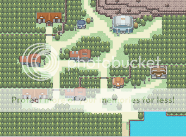
    So... Here's my re-do of one of the earlier towns in Cobalt Black. o.o
    Tell me what you think! ^_^
    Oh, and credit to Help-14 for his handy, dandy Map Maker tool.
    Anyway, Tyrian Town is above a tunnel that leads to Cordovan City. The two places are representative of fire and ice. Tyrian is right above heated spots in the tunnel and is warmer, but the climate dramatically drops as you go north. o.o
    Old Version:
    Spoiler:

    New Version:
    Spoiler:


    Credit to Kyledove, Veget@ (water autotile), and zetavares852 for tiles
    I must say the new version is a lot better than the old version.
    Although in the new version, it still looks a bit plain. Not sure what to point out, but for example the dirt path seems a bit boring to walk on. For the rest I like it, though. The is a tile error at the gate on the south of the map where the water over lapped the gate-thing.
     

    tImE

    It's still me, 44tim44 ;)
    673
    Posts
    17
    Years
  • Pallet Town, as I imagine it.
    This is a sort of crossover between the Anime and game version, to be used in a project of mine.

    Map Rating Thread


    Also, there are some tile errors due to the "corners" of the trees, that I am yet to fix.
    So you dont need to point them out.
    Might change the Stairs also.

    Credits: Kyledove/Kymotonian, Pokemon-Diamond and Dewitty (And myself ofc)
     

    Peeky Chew

    Master of Palettes
    829
    Posts
    14
    Years
  • Very nice, tImE. I love the different palettes on the trees and their placement. That's the only time I've seen that house style work. Yeah, I think the stairs need changing as well.

    Over all, really good job. You should put it on DA. That is you I'm watching on there, right..?
     

    tImE

    It's still me, 44tim44 ;)
    673
    Posts
    17
    Years
  • Very nice, tImE. I love the different palettes on the trees and their placement. That's the only time I've seen that house style work. Yeah, I think the stairs need changing as well.

    Over all, really good job. You should put it on DA. That is you I'm watching on there, right..?

    If it's 44tim44 your watching, then yeah, XD

    And yeah, I'll put it up there once I've fixed all tile errors and the stairs ;)
     

    DarkDoom3000

    Super Pokemon Eevee Edition
    1,715
    Posts
    19
    Years
  • ^ The town seems a little too displaced. It doesn't have a real.. Shape to it.

    I would remove the middle diagnol path and replace with a bunch of trees. As characters can't (usually) walk diagnol.

    the trees in the middle would tie up the place, giving it a focal point.
    Also, go group up some houses next to each other. Reduces displacement.

    Overall, good style, just too messy imo.

    ------------
    anyway mine. It's "Mine Valley".
    Spoiler:

    i am aware of the tiles of the mountain conflicting with the grass, unsure whether to keep for nostalgic effect.
     

    tImE

    It's still me, 44tim44 ;)
    673
    Posts
    17
    Years
  • @elarmasecreta

    The maps is really good, but lacks form.
    It's really empty everywhere.

    Why would people build their homes so far away from each other? It doesn't make sense.
    Either move the houses closer to each other, or fill out the empty space between them with, trees, lakes, rocks or anything that would force the people to have the houses where they have them:

    tldr; Too big, too much empty space, houses to far from each other.


    I'd give the map 7/10
     

    Arma

    The Hyena
    1,688
    Posts
    14
    Years
  • I think I've posted nearly every type of map here except indoors, which I'm not good at.
    Uhm here's a indoor map of some random NPC's house. It's featured in my game Pokémon Fiesta.
    Map Rating Thread

    EDIT: Oh and btw, I got the thread for my game up, link's in my sig.
    And yeah I noticed the tile error at the exit.
     

    Karel_Kazuki

    Wants to Learn about PKMN Rmxp
    359
    Posts
    16
    Years
  • Well,here is a revamped version of the start town I posted a few pages back.Comments ,questions?
    Note that the building is a Pokemon School.
     

    me2hack

    Graphics Artist
    286
    Posts
    14
    Years
    • Seen Mar 12, 2011

    @elarmasecreta: I looks fine, though just missing something. Can't put my finger on it, though.
    @Karel_Kazuki: It's kinda hard to comment on a map that's zoomed out.
     

    Yuoaman

    I don't know who I am either.
    4,582
    Posts
    18
    Years
  • Well IDK how to capture the whole thing zoomed in.

    While in RMXP mapping you'll see the 1/1, 1/2, and 1/4 options. Choose one of the other ones (1/2 is the one usually used), get a print-screen of that, then crop the image to contain only the map. If your map is too large to do this, then you should take multiple screenshots and then paste them together to form a single image.
     
    182
    Posts
    13
    Years
    • Seen May 16, 2014
    Well,here is a revamped version of the start town I posted a few pages back.Comments ,questions?
    Note that the building is a Pokemon School.

    I think that your map looks good, I especially love the tiles. When I first saw it something felt off, and I figured out what it was. I think you should add a building onto the platform towards the top-left. That space just looks empty. Its zoomed out to far for me to see what(if anything)is actually there, nothing negative about anything else though. Good job.

    Here's a map mine.
    Map name: East End
    Game: FireRed
    Comments: It took me about an hour & a half to make this, and I'm pretty happy with it. The map is all mine, but major credit goes to Zel & all those who worked on Shiny Gold because the tiles/palettes are his(theirs?)
    Map Rating Thread
     
    Last edited:

    Gigatom~

    Pokemon Ruthenium Creator ~
    117
    Posts
    14
    Years
    • Seen May 25, 2012
    I think that your map looks good, I especially love the tiles. When I first saw it something felt off, and I figured out what it was. I think you should add a building onto the platform towards the top-left. That space just looks empty. Its zoomed out to far for me to see what(if anything)is actually there, nothing negative about anything else though. Good job.

    Here's a map mine.
    Map name: East End
    Game: FireRed
    Comments: It took me about an hour & a half to make this, and I'm pretty happy with it. The map is all mine, but major credit goes to Zel & all those who worked on Shiny Gold because the tiles/palettes are his(theirs?)
    Map Rating Thread

    Overall, I'll give you 7/10. It would be better if you don't let any empty space between the trees. And there are a stairs missing at the cave so that you coudn't keave this little place there. And that's a rom-hack, right? So you should better post it in the Rom-hacking section. But nice map anyway.
     

    tImE

    It's still me, 44tim44 ;)
    673
    Posts
    17
    Years
  • I think that your map looks good, I especially love the tiles. When I first saw it something felt off, and I figured out what it was. I think you should add a building onto the platform towards the top-left. That space just looks empty. Its zoomed out to far for me to see what(if anything)is actually there, nothing negative about anything else though. Good job.

    Here's a map mine.
    Map name: East End
    Game: FireRed
    Comments: It took me about an hour & a half to make this, and I'm pretty happy with it. The map is all mine, but major credit goes to Zel & all those who worked on Shiny Gold because the tiles/palettes are his(theirs?)
    Map Rating Thread

    You really should have posted this in the rom-hacking section, but since you've posted, I might aswell rate it.


    I give it 4,5/10

    I know, a little harsh but anyway here's my opinion:

    Pro's:
    -Your natural mountain placement is pretty good.
    -Real nice natural tree placement.
    -Fluid, nice placement of water.
    -Good use of other elements (Flowers, small grass straws, headbutt trees, etc.)

    Con's:
    -There's WAY too much space. You should make it so wherever you stand, you can see SOMETHING of interest on your screen area. If you can place your character somewhere, and pretty much only see grass, then you have too much space.
    -Empty rows between trees. Trees dont' grow like that. Remove the small trees and fill out the empty space with one more line of trees.
    -Too few roads. Dirt roads appear where people walk a lot. So there should be significantly more roads from the PokeCenter for example.
    -Flowers in grass. Don't place the flowers in the middle of the tall grass. Place them separately in regular grass, like you did in the town-part.
    -Move houses closer to each other. People build houses closer to eachother in real life, than in this map. Study nintendos maps a little more.

    I think I've posted nearly every type of map here except indoors, which I'm not good at.
    Uhm here's a indoor map of some random NPC's house. It's featured in my game Pokémon Fiesta.
    Map Rating Thread

    EDIT: Oh and btw, I got the thread for my game up, link's in my sig.
    And yeah I noticed the tile error at the exit.

    9/10

    Excellent map!

    One thing though; Try placing white kitchen tiles as floor in the northwest part of the house! (Look at some of nintendos inside maps)
    Then, it'll be perfect!


    tImE~
     

    Geeked

    Pokemon Crimson Version
    352
    Posts
    16
    Years
    • Seen Oct 9, 2012
    West Point Academy.

    The Academy you attend in Crimson Version

    Mapshot:
    Spoiler:
     
    Last edited:

    me2hack

    Graphics Artist
    286
    Posts
    14
    Years
    • Seen Mar 12, 2011
    There's too much empty space, walking from house to house is gonna be a drag on this map. D:
     

    Geeked

    Pokemon Crimson Version
    352
    Posts
    16
    Years
    • Seen Oct 9, 2012
    There's too much empty space, walking from house to house is gonna be a drag on this map. D:

    Don't know if you realize it, but that's how Pokemon Maps are meant to be made. The game is meant to be played that way. I'm mapping for playability not Graphical appeal.
     
    Back
    Top