Konekodemon
The Master of Pokemon Breeding
- 2,074
- Posts
- 17
- Years
- Age 39
- NC
- Seen Nov 20, 2023
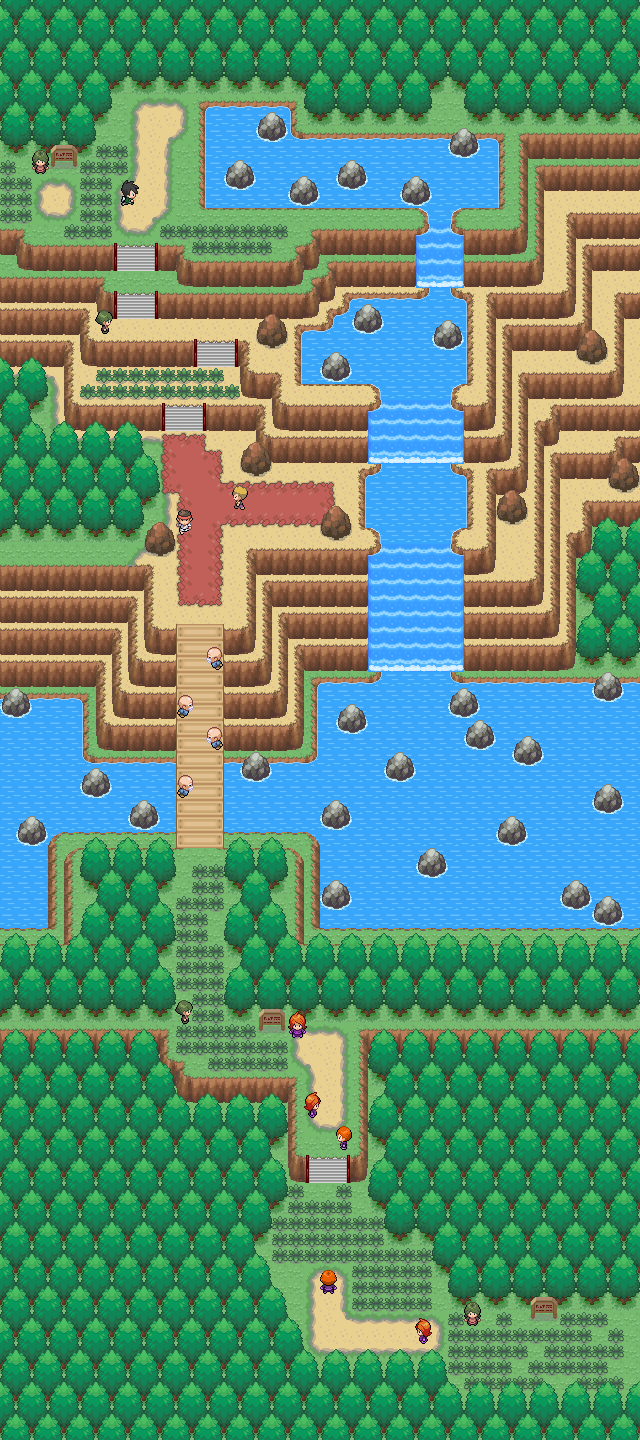
Your home town and a sea route below it. I haven't added in any people yet.
Last edited:

I don't know how people are posting the maps without the lines on it. If I post the layers under the event layer it looks glitched.
Open the drop-down menu "View" in RPG Maker, and un-check "Dim Other Layers".
That makes the other layers not become dark.
Simply check the option again, when you are done.

Spoiler:
Your home town and a sea route below it. I haven't added in any people yet.
That's the problem, you need to learn everything about maps to create them effectively, look at some tutorials for mapping check out ЩѻƦḽᶑʂḽдƴƹƦ™'s tutorial, it's an awesome tutorial for learning to map and will cover everything to start making good maps.Could you explain better? I have no clue what you mean by the names for things you're using.
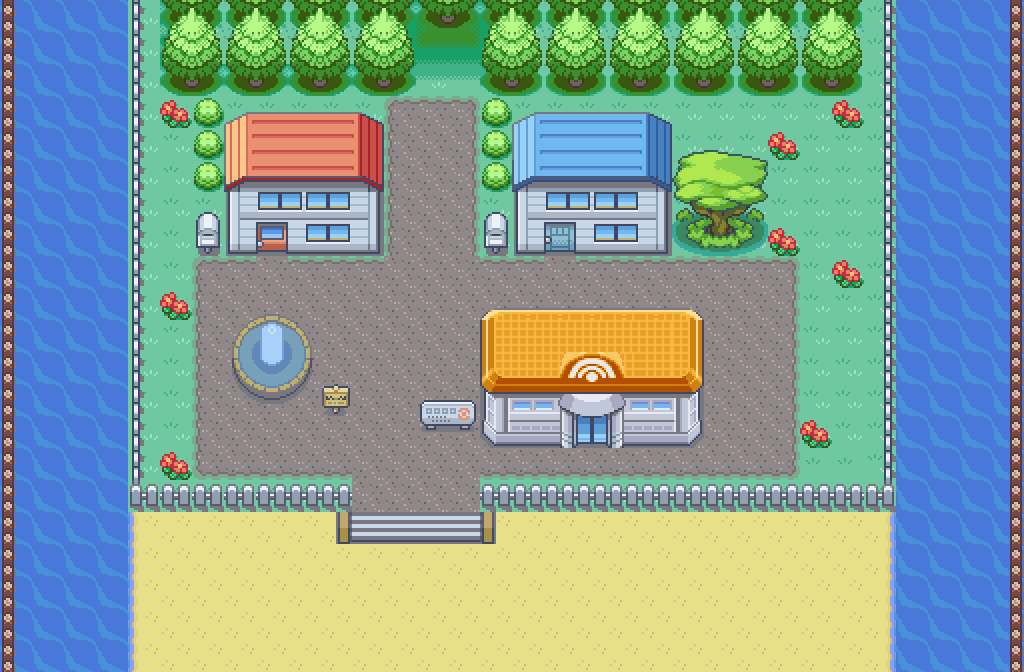
Alrighty, been a while since I last posted something here. Here's my latest map, Wetland Woods.

Feedback would be very much appreciated.


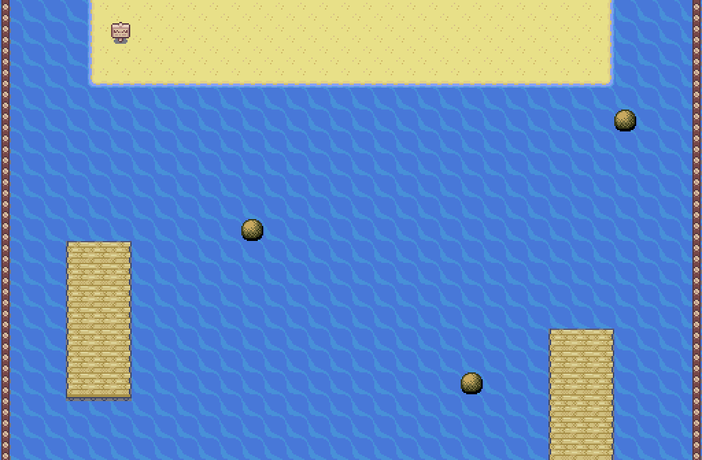
Question for the pros: what's the best way to go about making a cliff? I want to have a ledge that appears high above ground below, possibly with a sunset/sunrise in the background. But I'm stuck on how to implement it. Here's what I've got so far:
What should the blue space be? Ground tiles won't work, because then it just appears to be at the same elevation as the ledge. And is it even possible to portray a sky or horizon when the view is top-down?