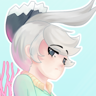
cool design! do you have more information on what your inspirations were for it? that'd help a lot with coming up with a name
for shading tips, there's 3 different "styles" that pokemon has done, so id take your pick from the following and decide from there:
1. Gen 1 & 2's style is watercolor, done by sugimori himself.
2. Gens 3 - 5, (and a little bit of 6), uses a shading style that is a bit more messy, but solidifies the philosophies for the modern artstyle. contrary to popular belief, a majority is done by sugimori, but gens 5 and 6 have some pokemon that were not rendered by him. gen 6 in particular is when the style is starting to shift into #3's artstyle.
3. Gens 6+ use a shading style that is much simpler, usually only having just 1 or 2 shading colors compared to #2. This is the much more evident in much recent gens like 7 and 8.
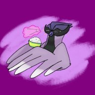
Based on your art, you seem to be going for either #2 or #3. In that case, I would suggest making sure the shading is much more distinct than the base color. You can do this by making the shading color much darker, and avoid "blending" the base and shade colors too much, otherwise it creates a gradient effect instead of a cel-shaded style that the modern artstyles use. what i personally like to do is apply the shading in another layer, and then go over the edges of the shading with an eraser at 50% opacity. that way you can create a "banded" shading region that matches more with #3's artstyle. for an example, here's a zoomed in pic of what i mean by banded shading:
you can see how distinct the non-shaded and shaded parts are, with a small "band" of color that's sort of a mix between the two