• Our software update is now concluded. You will need to reset your password to log in. In order to do this, you will have to click "Log in" in the top right corner and then "Forgot your password?".
  • Welcome to PokéCommunity! Register now and join one of the best fan communities on the 'net to talk Pokémon and more! We are not affiliated with The Pokémon Company or Nintendo.

[Developing] Pokemon Symphonic Horizon

Who is your favorite main character from the pre-emptive bio and their official artwork

  • Vice Braving

    Votes: 12 21.1%
  • Marissa Brennan

    Votes: 3 5.3%
  • Eevee

    Votes: 20 35.1%
  • Krista Harper

    Votes: 2 3.5%
  • Vivian Vance

    Votes: 5 8.8%
  • Hiro Monochroma

    Votes: 7 12.3%
  • Allan Monochroma

    Votes: 5 8.8%
  • Helena Brennan

    Votes: 3 5.3%

  • Total voters
    57

Radical Raptr

#BAMFPokemonNerd
1,121
Posts
13
Years
  • The map is just way too large, this kind of style is best left to those who are experienced mappers or who specialize in such maps.

    I am just so confused by your map; you say there's different sectors but if you hadn't said that I wouldn't have really noticed, there isn't much of a distinguishing feature of each one, and I don't even understand why you would do it that way or what you're trying to accomplish by doing it that way...
    You have way to many different kind of trees and buildings and grass, the only thing consistent is the inconsistencies. I'm honestly impressed at how inconsistent it all is. The mapping style is laughable - you're trying to separate the left and right side by seasons for whatever reason, but the path leading up just before the cutoff fountain has all the same color grass and it changes abruptly and awkwardly behind the pillar where you can just tell, and it's so weird. You even have the water area near the bottom of the map which really killed me. Rather than continuing it in the same area, the way it is now, behind the pillars, it goes left for some reason.

    Speaking of which that leads right into the terrible depth you're creating with this trainwreck. I am legitimately pissed off by your whole map now that I think about it. You have parts where you're on top of the terrace and when you walk up near the top, rather than there being accurate depiction of depth, the next area that should be feet lower is actually visually right adjacent to it.

    Continuing off of that, navigating this map would not be fun, there is literally no direction or flow, it's all boring, you have WAY too much wasted space boring layout design and just an empty town. The entire thing looks so boring and visually annoying to deal with. Not to mention the map looks like it was made just to spite the player. Nothing is created for the ease of the player - when you fly to this town, you're put in the lower left rather than the center of town, and when you get there you force the player to navigate long paths just to get anywhere. Again, because of your shitty depth creation thing, you don't allow the player an easy way to get from the top of the terrace to the bottom layer via the top, which is where the PC is.

    The paths are way too huge and open and the design for the whole town including the way things are placed and the just certain long stretches of openness have nothing interesting going on, and way too much of your map is just legit empty space, not even just a boring area, but instead legit literal empty space.

    The map looks as though 4-6 different people were told a different part of the design, and then you had those 4-6 people tell 4-6 other people to make a map, and then those 4-6 maps were just put together randomly. Nothing about it is consistent and it has no flow to it. But I will say this, the tileset you used was very nice, I like the tiles you used. Everything else needs a hell of a lot of work before it's anywhere near playable.
     

    Radical Raptr

    #BAMFPokemonNerd
    1,121
    Posts
    13
    Years
  • I didn't feel like I covered enough in my last critique of this map, so I feel obligated to continue it.

    I cannot stress enough how terrible a big map like this looks - it's not dynamic at all, it's not interesting and the entire thing is made as though ease of the player means nothing. Having to walk around a huge boring and empty area with no sense of direction doesn't make for a good map. You can't even justify this wasted space with saying "My OW's are big" because I have seen them, and this space is lost on them. Sure you have PLENTY of room to move around, but why would you need it? There are areas with just nothing there at all, that is a travesty - there is nothing interesting going on at all in your huge city, and you have too much diversity without any unity.

    What do I mean? Take a look at those god-awful trees you have. Lets go one by one, you start off the introduction of the city through that small path with 2 x/y style trees for some fcking reason. While at the same time you have the smallest trees you show here on either side on the upper layer of the terrace. That is just mapped wrong, since it just looks bad visually, you have 2 clumped together at the bottom, then a huge space and then 1 tree. Why? why space it like that? That's just stupid and draws more attention to it when it should instead just be a nice visual thing and not distracting.

    Now, I have to mention THIS IS THE ONLY TIME YOU USE THOSE X/Y TREES AT ALL. Never again do they show up, why? Idk, I doubt you do either. But those small trees sure show up a hell of a lot, why? Idk, no real reason tbh. They're just sort of there.

    Then you have those seasonal trees, let's try and set aside the fact how incredibly retarded that is on it's own, you have these trees in an area that you claim to be a different season, and yet there s no area for the cherry blossoms. If you mean to tell me that the center is summer while the left and right are cherry blossoms and autumn when you're at the top or bottom sector then that is also really stupid. The areas don't have justification for something as weird as that, and could easily be replaced with some other stupid gimmick. That isn't necessarily a bad thing, but when your map lacks a purpose for something you're trying to throw in there as a gimmick and you have to try and make the map work with it, it just seems sort of pointless.

    Now, I'm just going to come right out and say it, but I hate your whole depth perception thing you're going for here, even if you take everything else I've said as deranged ramblings of a jerk, there is literally no denying the fact that the way you mapped the depth perception is utter garbage. Instead of mapping under the terrace which you would because depth, you map around it - and you even have it right adjacent to the area right below it as though it is right next to it. Because you have made the map so huge, this becomes an issue as it makes it hard for the player to really understand where they are in the map and how to move around it. Because you just had to make a map so huge rather than several smaller maps, you're stuck with one big pile of trash.

    I know you're ignoring all critique, a pretentious move on your part, but when you have people saying "this is great" or that this is the "best game evar" or when people say it's "a triumph of geometry" I have to come and set the record straight. This map is bad, it's huge it's boring, it's uninteresting, it's confusing, it's not made for the ease of the player to walk around without feeling lost or punished for needless back tracking, there's no direction to it at all, it's just a pile of thrown together madness you are diluted enough to thing is actually good when in actuality it is just trash. I hope you see this and realize how bad this map is and seriously consider redoing it. The idea of a large city encompassing a lot isn't a bad one in theory, as you can have it be the central area for your whole region. But when you have a whole bunch of nonsense going everywhere that all looks the same, that is all boring, that is empty and that is just so bad it does more harm than good. I would hate to think that you would actually keep a map like this in your playable demo.
     
    51
    Posts
    8
    Years
    • Seen Jul 5, 2016
    Pretty awesome game you've got going there! I am really digging the idea of having multiple playable characters with different abilities, Pokemon and stories. The characters all seem pretty well conceived, characters designs and all, though I kinda question Hiro possessing Dialga - doesn't that make her a tad overpowered? It would be better if there was some kind of restriction preventing her from using Dialga's full power earlier in the game, which would fade away shortly before the final battle or something. I even like the villains, though I wonder if all of them are evil (Falset is, that's for sure) or if most of them are actually brainwashed by that 'Dragon Force Transmitter'. You said that Nero's true personality was erased by Falset - is it possible that somewhere along the line, we can redeem him and bring his personality back? That would be good IMHO.

    At any rate, you've got a very deep, story-oriented Pokemon game going on here - the kind of Pokemon game we deserve and may even need. Props to you for that alone!

    Also, this is entirely up to you, but it would be cool if you could implement 3D graphics in this game, like those in Pokemon HGSS and other Gen 4/Gen 5 games.
     
    30
    Posts
    10
    Years
  • I didn't feel like I covered enough in my last critique of this map, so I feel obligated to continue it.

    I cannot stress enough how terrible a big map like this looks - it's not dynamic at all, it's not interesting and the entire thing is made as though ease of the player means nothing. Having to walk around a huge boring and empty area with no sense of direction doesn't make for a good map. You can't even justify this wasted space with saying "My OW's are big" because I have seen them, and this space is lost on them. Sure you have PLENTY of room to move around, but why would you need it? There are areas with just nothing there at all, that is a travesty - there is nothing interesting going on at all in your huge city, and you have too much diversity without any unity.

    What do I mean? Take a look at those god-awful trees you have. Lets go one by one, you start off the introduction of the city through that small path with 2 x/y style trees for some fcking reason. While at the same time you have the smallest trees you show here on either side on the upper layer of the terrace. That is just mapped wrong, since it just looks bad visually, you have 2 clumped together at the bottom, then a huge space and then 1 tree. Why? why space it like that? That's just stupid and draws more attention to it when it should instead just be a nice visual thing and not distracting.

    Now, I have to mention THIS IS THE ONLY TIME YOU USE THOSE X/Y TREES AT ALL. Never again do they show up, why? Idk, I doubt you do either. But those small trees sure show up a hell of a lot, why? Idk, no real reason tbh. They're just sort of there.

    Then you have those seasonal trees, let's try and set aside the fact how incredibly retarded that is on it's own, you have these trees in an area that you claim to be a different season, and yet there s no area for the cherry blossoms. If you mean to tell me that the center is summer while the left and right are cherry blossoms and autumn when you're at the top or bottom sector then that is also really stupid. The areas don't have justification for something as weird as that, and could easily be replaced with some other stupid gimmick. That isn't necessarily a bad thing, but when your map lacks a purpose for something you're trying to throw in there as a gimmick and you have to try and make the map work with it, it just seems sort of pointless.

    Now, I'm just going to come right out and say it, but I hate your whole depth perception thing you're going for here, even if you take everything else I've said as deranged ramblings of a jerk, there is literally no denying the fact that the way you mapped the depth perception is utter garbage. Instead of mapping under the terrace which you would because depth, you map around it - and you even have it right adjacent to the area right below it as though it is right next to it. Because you have made the map so huge, this becomes an issue as it makes it hard for the player to really understand where they are in the map and how to move around it. Because you just had to make a map so huge rather than several smaller maps, you're stuck with one big pile of trash.

    I know you're ignoring all critique, a pretentious move on your part, but when you have people saying "this is great" or that this is the "best game evar" or when people say it's "a triumph of geometry" I have to come and set the record straight. This map is bad, it's huge it's boring, it's uninteresting, it's confusing, it's not made for the ease of the player to walk around without feeling lost or punished for needless back tracking, there's no direction to it at all, it's just a pile of thrown together madness you are diluted enough to thing is actually good when in actuality it is just trash. I hope you see this and realize how bad this map is and seriously consider redoing it. The idea of a large city encompassing a lot isn't a bad one in theory, as you can have it be the central area for your whole region. But when you have a whole bunch of nonsense going everywhere that all looks the same, that is all boring, that is empty and that is just so bad it does more harm than good. I would hate to think that you would actually keep a map like this in your playable demo.
    Says the one who has had his game in demo stage for about 3 years now.
     
    24
    Posts
    8
    Years
    • Seen Aug 26, 2020
    Says the one who has had his game in demo stage for about 3 years now.

    Say what? Are people not allowed to post their opinions and critiques simply because they haven't finished their own games now? You should be careful with those kind of statements because they can easily backfire on you, specially considering the fact you haven't even started a single project yourself (neither have I but you get my point). Besides, if you want to complain about the progress of a game then you should do so in their own thread.

    Nevertheless, I do agree that the map is way too big and looks a bit complicated to maneuver around. I suggest doing what Reborn did - an entire city split into different zones - its a lot better for the player to keep track of what to do and where to go, plus its bound to be less laggy too. If the time and resources permit it, I would also add a list of events that can/will happen through out the city, just to make it more interesting and less empty. Everything else is fine - I like the overall design of it - from the colorful trees at the bottom to the park in the middle and even the little café street near the entrance. The different looking trees do not upset me, I actually think they look nice and add some "spice" to the vanilla looking flora we all know and recognize in these ROMs/RGSS.
     
    Last edited:
    30
    Posts
    10
    Years
  • Say what? Are people not allowed to post their opinions and critiques simply because they haven't finished their own games now? You should be careful with those kind of statements because they can easily backfire on you, specially considering the fact you haven't even started a single project yourself (neither have I but you get my point). Besides, if you want to complain about the progress of a game then you should do so in their own thread.

    Nevertheless, I do agree that the map is way too big and looks a bit complicated to maneuver around. I suggest doing what Reborn did - an entire city split into different zones - its a lot better for the player to keep track of what to do and where to go, plus its bound to be less laggy too. If the time and resources permit it, I would also add a list of events that can/will happen through out the city, just to make it more interesting and less empty. Everything else is fine - I like the overall design of it - from the colorful trees at the bottom to the park in the middle and even the little café street near the entrance. The different looking trees do not upset me, I actually think they look nice and add some "spice" to the vanilla looking flora we all know and recognize in these ROMs/RGSS.
    Actually, yes. If you cant finish one project and have the nerve to go and act rude on someone else's I don't need justification to do so, he came off as a huge dick on this thread so I called him out.
     
    24
    Posts
    8
    Years
    • Seen Aug 26, 2020
    Actually, yes. If you cant finish one project and have the nerve to go and act rude on someone else's I don't need justification to do so, he came off as a huge dick on this thread so I called him out.

    I agree that he could have worded it in a nicer way. That kind of attitude rarely incentives anyone to read what you have to say, even if you do make some good points, but at least he was honest and wrote a well-though critique, which is more than what some people would have done in his situation. They would've probably settled with a response like "your map sucks", which would have helped no one nor clarify what the problem was. Both of his posts have likes so I assume he's not the only one disappointed with the design of the city.

    The fact the author stated they are going to bypass all critiques regarding the new map is a bit... troublesome. I understand it was a pain to design, the sheer size of it kind of hints at that, but considering some people aren't too happy with it (and some even wrote concise opinions on it) I think it should at least be looked at. Projects like these are extremely complicated, from start to finish, and if you're not willing to re-do some of your work because "its too much of a pain", then you're kind of endangering the future of your entire project, as well as its overall quality.
     
    Last edited:

    Radical Raptr

    #BAMFPokemonNerd
    1,121
    Posts
    13
    Years
  • Actually, yes. If you cant finish one project and have the nerve to go and act rude on someone else's I don't need justification to do so, he came off as a huge dick on this thread so I called him out.

    So your opinion only matters if you have a completed game? Ok, that makes complete and total sense, my years of experience means nothing because I'm not finished with my game.

    Regardless, all of my points were spot on and complete truth based on existing mapping basics he refuses to accept. Not to mention the fact that he says he will be ignoring all C&C is bullshit and I called him out on it as well. If you're going to ignore any and all criticism and only want to hear good things then you deserve to hear the most blunt and harshest of critiques.
     
    30
    Posts
    10
    Years
  • So your opinion only matters if you have a completed game? Ok, that makes complete and total sense, my years of experience means nothing because I'm not finished with my game.

    Regardless, all of my points were spot on and complete truth based on existing mapping basics he refuses to accept. Not to mention the fact that he says he will be ignoring all C&C is bullmuk and I called him out on it as well. If you're going to ignore any and all criticism and only want to hear good things then you deserve to hear the most blunt and harshest of critiques.
    In my eyes what you said was not a critique it was shit posting.
     

    Maruno

    Lead Dev of Pokémon Essentials
    5,286
    Posts
    16
    Years
    • Seen May 3, 2024
    Knock it off, you lot. While crudely worded, it was valid feedback. What this game's developer chooses to do with it is up to him, although making personal attacks against the feedback giver is unacceptable.

    Drop it.
     
    1
    Posts
    8
    Years
    • Seen May 4, 2016
    Hello, This game that you are creating looks amazing and i would love to be a Beta-tester for the game. I know that you most likely will not do this but could you please make me a Beta-Tester. If you would do so then please contact me and i will send you an email address.

    Thank you for reading this post!
     
    6
    Posts
    8
    Years
    • Seen Jul 29, 2018
    I've been watching your youtube videos while making this game for a little while and dang! This looks like it'll be fantastic.
     
    9
    Posts
    8
    Years
    • Seen Jan 16, 2021
    I would love to beta test for your game and have beta tested several fangames/indie games in the past.
     

    Dylanrockin

    That guy
    276
    Posts
    12
    Years
    • Seen Jun 9, 2016
    I have been gone from this forum for almost all summer haven't I? I have no idea what has been going on, since I have been busy with life, but, all I have to say is, I did read around and yes, I did fix the problems that were mentioned awhile ago, which took me quite some time...

    But, I do have videos to show off, in regards to a lot of what I have learned in the past few months that I have been away. I managed to learn how to program in Ruby, on my own, and now I am going to show off some of the stuff that I made for my game.

    Verdant Transformation: https://www.youtube.com/watch?v=8YMXifVe2CE

    If you don't know what Verdant Transformation is, see one of my earlier posts mentioned several months ago. It will explain everything ;)

    Enhanced Trainer Cards (back side is shown in the video above) https://www.youtube.com/watch?v=r61M1Vhrlkc

    Vice Braving's Encounter None Ability: https://www.youtube.com/watch?v=emb90Tg9yg4
    Vivian's Shadow Sneak Ability: https://www.youtube.com/watch?v=4Ia7O_ect1I

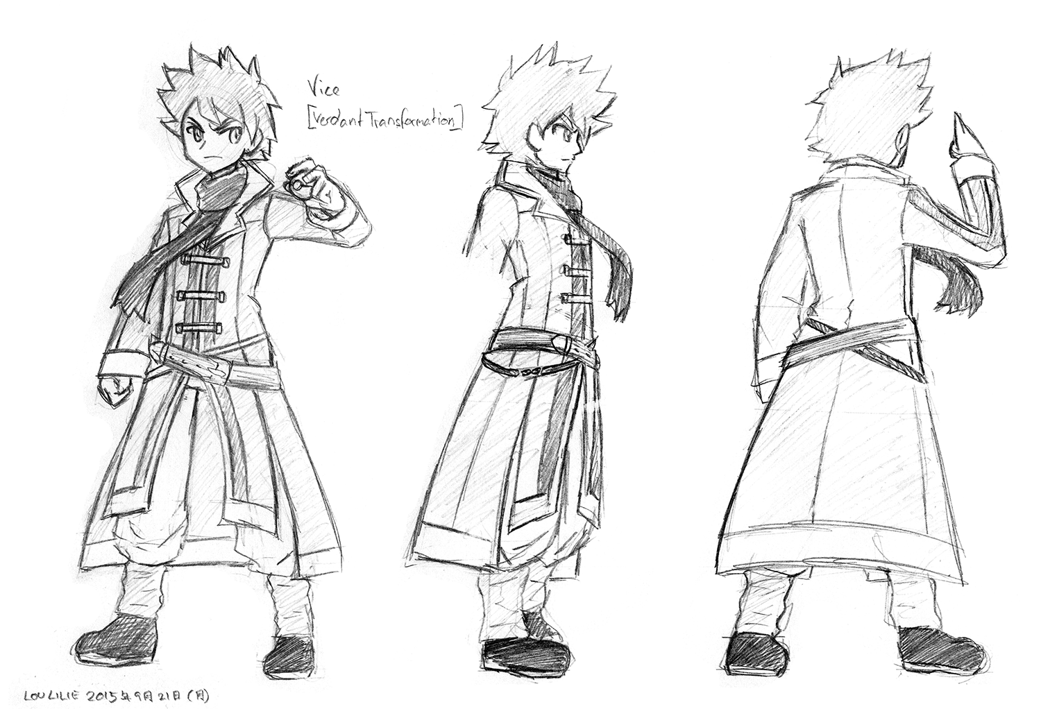
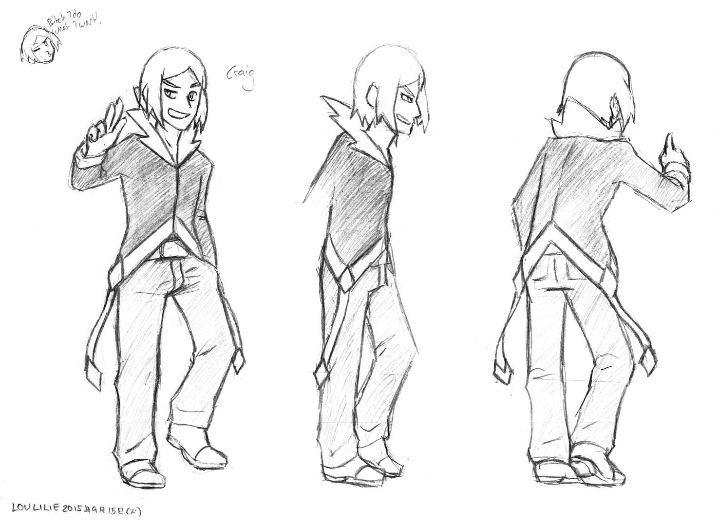
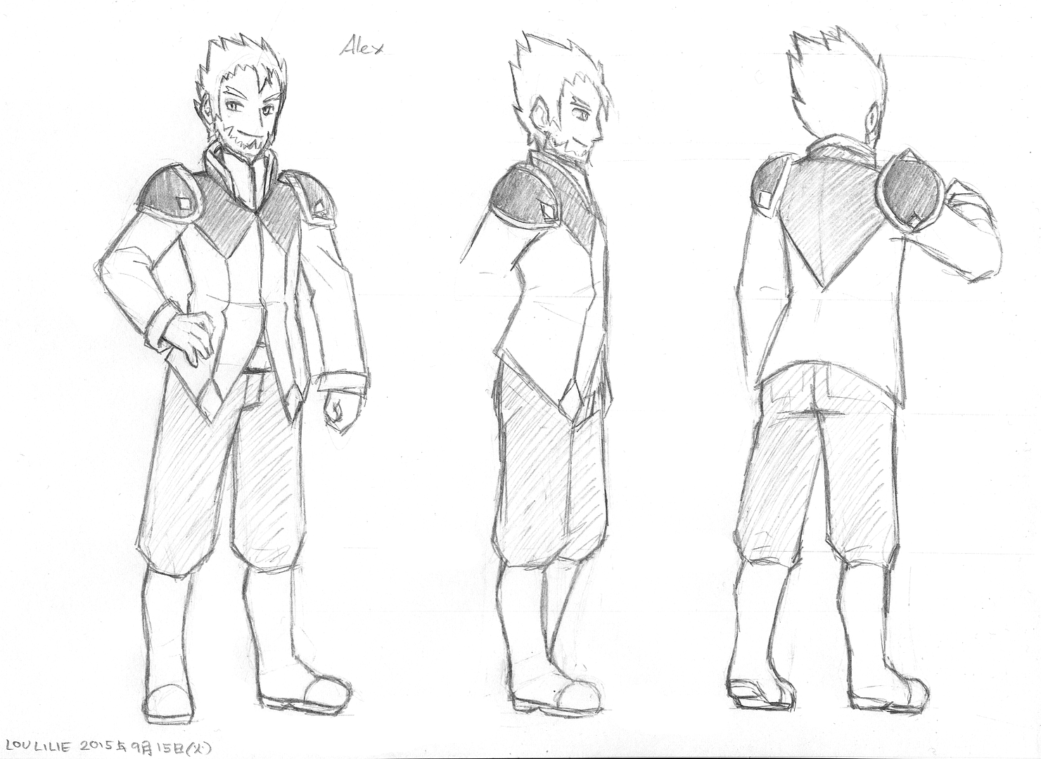
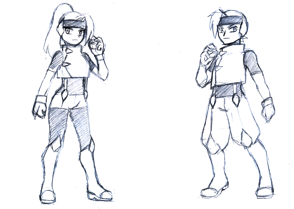
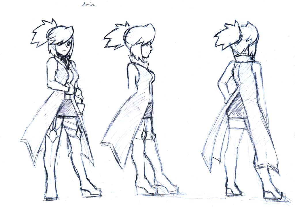
    Concept Artwork:

    Aria:
    Spoiler:

    Vice Braving [Verdant]:
    Spoiler:

    Craig Flyn:
    Spoiler:

    Alex Briggard:
    Spoiler:

    Alan Monochroma w/ Arcanine:
    Spoiler:

    Dark Fangs:
    Spoiler:

    The Horizon Seekers:
    Spoiler:
     
    Last edited:
    Back
    Top