
You are using an out of date browser. It may not display this or other websites correctly.
You should upgrade or use an alternative browser.
You should upgrade or use an alternative browser.
Rate The Signature Of the Person Above You
- Thread starter abnegation
- Start date
- Status
- Not open for further replies.
More options
Who Replied?
Netto Azure
Kiel
- 9,468
- Posts
- 15
- Years
- Alistel, Vainqueur
- Seen Dec 21, 2023
I dun't liek Spoilers.
Otherwise, it's fine. :P
6/10
Otherwise, it's fine. :P
6/10
Netto Azure
Kiel
- 9,468
- Posts
- 15
- Years
- Alistel, Vainqueur
- Seen Dec 21, 2023
Someone needs to watch Hetalia. >____>
Awesome. Tl;Dr Text is a nono.
7/10
Awesome. Tl;Dr Text is a nono.
7/10

Aizuke
[b]long sword style[/b]
- 3,025
- Posts
- 16
- Years
- Canberra, Australia
- Seen Nov 6, 2015
Icon signatures are for the win. :3
10/10
10/10
Netto Azure
Kiel
- 9,468
- Posts
- 15
- Years
- Alistel, Vainqueur
- Seen Dec 21, 2023
I really think you can do better. ^____^
3/10
3/10

Usagi-Chan~
What are you doing my love?
- 626
- Posts
- 16
- Years
- Age 26
- US
- Seen Apr 7, 2024
OMG KITTEH! <3 <3 <3 Obviously 10/10!

BHwolfgang
kamikorosu
- 3,906
- Posts
- 15
- Years
- Age 29
- Virginia
- Seen Feb 24, 2014
Hm, an exceptional ability at CSS. The only problem I have are effects on the stock. Her arm looks like a blur, and the background really doesn't blend well with the person.
7//10
7//10
Honest
Hi!
- 11,676
- Posts
- 15
- Years
- Age 28
- New York City
- Seen Sep 30, 2023
Drizzle, I always love your stuff, brother. : ]
10/10
10/10

World King
Twilight Silver Beast
- 1,501
- Posts
- 16
- Years
- Age 32
- Twilight Dimension; waiting for my rebirth as the
- Seen Aug 26, 2023
Nice how you¡'re showing off your pairing, but you could do far better, aura. 6/10
Aizuke
[b]long sword style[/b]
- 3,025
- Posts
- 16
- Years
- Canberra, Australia
- Seen Nov 6, 2015
no picture. poem? IDK.
but it's pretty "good" whatever it is ;) 7/10
being nice.
What there is an image.. Obviously your computer has issues.
Spoiler:
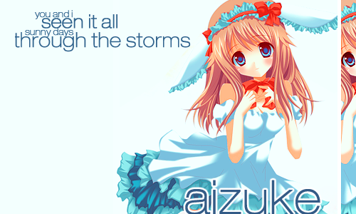
Anywho, it's okay. I think the banner would look better with a border, and the white is kind of hard to see. Luckily the theme I have on has a light blue background, which makes it barely visible.
6/10
Flamboyant
Girlpowershipping fangirl ♥
- 106
- Posts
- 14
- Years
- Canada
- Seen Mar 12, 2013
Let's see...
Yeah, I'd give a 10/10.
Simple, yet it has a certain style that appeals to me. The image is beautiful, so are the colors (AND they match 8D)
Also, I love how you wrote your name on the side of the banner.
Yeah, I'd give a 10/10.
Simple, yet it has a certain style that appeals to me. The image is beautiful, so are the colors (AND they match 8D)
Also, I love how you wrote your name on the side of the banner.
ReyRey-Pyon
THREAD KILLER
- 1,006
- Posts
- 15
- Years
- Age 30
- Seen Feb 6, 2015
the banner is alright. though it'd looked better without your username in the corner
Userbars ruin signatures
4.5/10
Userbars ruin signatures
4.5/10
Aizuke
[b]long sword style[/b]
- 3,025
- Posts
- 16
- Years
- Canberra, Australia
- Seen Nov 6, 2015
Oh, I always see your themes. They appeal a lot to me, they're always so pretty and I really like them. :3
This one is no exception either, and I love the icons and the text, it just fits so well together. Icons are my weakness~
10/10
This one is no exception either, and I love the icons and the text, it just fits so well together. Icons are my weakness~
10/10
- Status
- Not open for further replies.